August is a special month. The whole of Italy is on holiday, and so is most of Paris. Hippies and artists across the US and beyond are getting ready for Burning Man. Elsewhere, we’re enjoying gorgeous summer weekends while slowly getting re-adjusted to the working rhythm. Type-wise, the world looks pretty sunny too. Lots of great new alphabets on our Hot New Fonts list, from foundries old and new. Here’s a selection of the month’s most popular fonts.
This month’s Rising Stars
Brooklyn-based designer, illustrator and lettering artist Jessica Hische has many fans, to whom her website is a constant source of delight and inspiration. Her lettering pages show an astonishing variety of ideas, an inventiveness bubbling with pure joy. While very much in demand as an illustrator, she confesses: “My true love is typography.” We are most pleased that Jessica’s first typeface Buttermilk is now available at MyFonts, and doing so well. Buttermilk is an attractive display script, feminine but bold, and equipped with lots of goodies. Its comes with decorative caps that make great drop-caps, fancy numerals, and an abundance of ligatures, substituted automatically in programs that support OpenType functionality. A beauty.
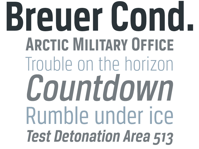
TypeTrust’s Breuer Text was one of MyFonts’ Typefaces of the Year 2008. “Breuer Text has a straightforward nuts-and-bolts logic,” we wrote, “but despite the underlying squarish structure it is also rather elegant and reader-friendly.” Based on the same concept of a mechanical-yet-readable sans-serif, Breuer Condensed was specially designed for captions and headlines. Thanks to its open shapes and clarity it is also suitable for medium-sized text settings. The italics are optically adjusted obliques with a selection of refined lowercase characters to provide a warmer read. Its overall impression is one of technical precision in a personable tone.
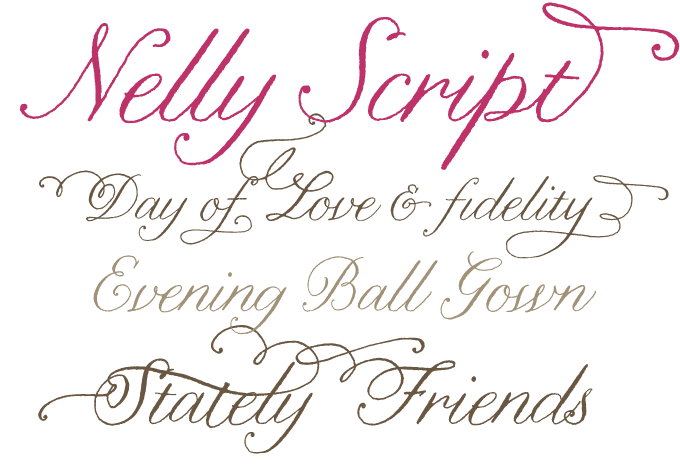
Nelly Script is the latest offering from lettering artist/illustrator Crystal Kluge, whose delightful Darling Monograms and sassy Henparty have graced our bestseller list in the past. In Nelly Script and Nelly Script Flourish, she has taken her hand-drawn letterforms to a new level of sophistication — assisted, as usual, by type wizard Stuart Sandler. Elegant and romantic, Nelly Script strikes a beautiful balance between the liveliness of the hand-drawn and the class of a formal script. In case you want to add a little drama, there’s Nelly Script Flourish, a vibrant collection of flourishes & embellished letters with a large variety of alternate upper and lowercase forms in OpenType format.
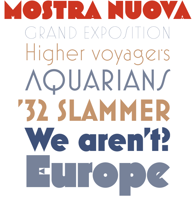
Mostra Nuova is an expanded and enhanced version of Mostra, a striking display face inspired by Italian posters and advertising of the 1930s. Designer Mark Simonson decided that Mostra’s Art Deco concept was a good starting point for a more versatile typeface family. By adding a lowercase to what originally was an all-caps display family, he turned Mostra Nuova into a typeface for many occasions, from posters and advertising to pull quotes and intros in magazines. Mostra Nuova contains many alternate characters, representing commonly found variations in Italian Art Deco lettering. There are six weights, ranging from the almost invisible Thin to the ridiculously bold Black.
Text family of the month
Last month, we featured Augustin, a handsome new text face from Ludwig Übele. This month’s text face Safran was designed by Hubert Jocham, who for years was a mentor of sorts to Übele. The two German designers share a similar approach to type: pragmatic and unprejudiced, both armed with a sharp sense of form and style and a desire to create original letterforms.
Hubert Jocham’s Safran is his first text typeface to become available on MyFonts after many successful script and display fonts. Although he has designed several more text faces — which he has promised will come our way soon — Safran is something of an anomaly in Jocham’s body of work. ‘An exercise in style,’ he says. Type geeks may recognize some affinity with contemporary type from the ‘school of The Hague’ that spawned such modern classics as Proforma and Caecilia. In fact, Safran was the designer’s reply to a client who specifically asked for a typeface in that vein. Instead of taking any specific model, he designed a new typeface from the ground up, adapting the characteristics of a Dutch-style humanist sans to his own methodology and vision.
The result is a smooth, elegant-looking and very usable sans serif. Thanks to its open shapes and subtle humanist contrast it is perfectly legible at all sizes, including small footnote and caption settings. Flexible, unobtrusive, and equipped with small caps as well as a broad range of numerals, Safran is a excellent tool for high-end typography: non-fiction books, lifestyle magazines and annual reports.
Follow-Up
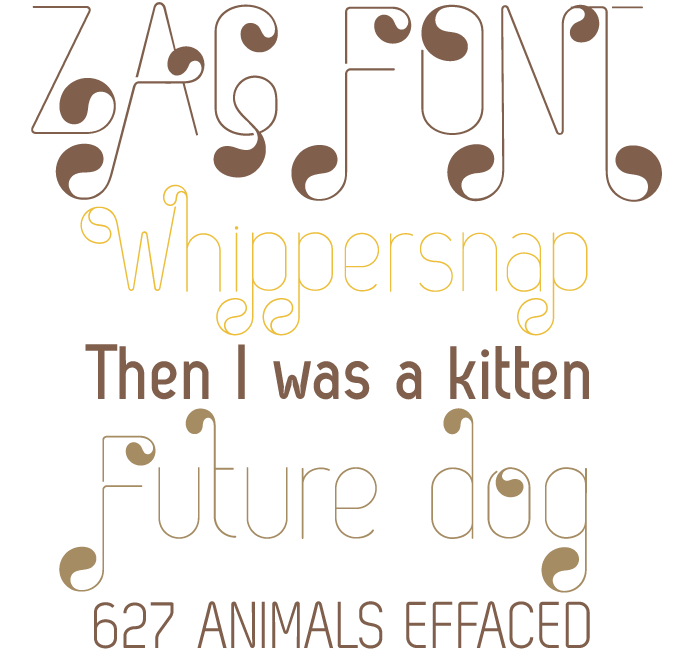
Each month, we revisit one of the previous month’s Rising Stars and show you a trio of fonts from the foundry that produced it. Zag by Svetoslav Simov has been very successful — which presents us with an opportunity to feature some work from Simov’s Fontfabric foundry, based in Sofia, Bulgaria. Fontfabric specializes in geometric fonts with a distinct 1970s–1980s flavor. Zag is exceptional in that it combines constructivist forms with exuberant swashes and ornaments.
If you like this typeface by Fontfabric, check out some of their other fonts:
Colo
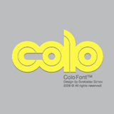
Colo is reminiscent of Dubbeldik, a 1970s classic from Dutch designer Ad Werner. Colo is less strictly modular, combining the geometric double-lane structure with shapes that subtly refer to the flow of handwriting.
Avatar
Avatar is an all-caps alphabet that has all but abandoned the idea of counters. However, the fat, black shapes are playful enough to emanate a sense of fun. Fontfabric’s outline typefaces like Clou and Dovde play with similar ideas.
Grant
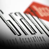
Grant, which Simov co-designed with Jordan Jelev, represents a departure from geometric minimalism. With its compressed stiff shapes, referring to broad-nibbed pen calligraphy, Grant is a kind of postmodernist, slightly ironic fraktur.
Sponsored font
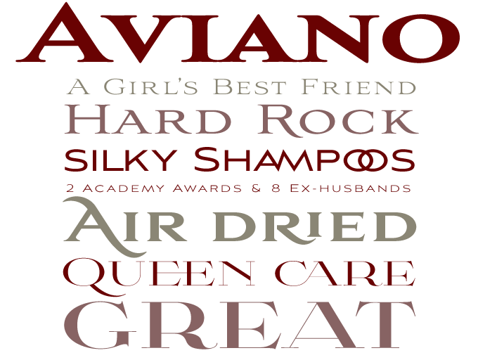
Jeremy Dooley’s Aviano has won an award for being one MyFonts’ most successful typefaces of the year — twice. The family’s original members, Aviano and Aviano Sans, were at the top of our 2007 bestseller list. And last January Aviano Serif was the recipient of MyFonts’ award for “display sequel of the year.”
Aviano is a personal interpretation of the stone-carved capitals of the Roman Empire. Being distinctly wider and less stern than its ancestors, Aviano emanates style and luxury. A multi-style suite of dignified all-caps display faces, the family is perfectly suited for invitations, brochures, packaging… and movie posters.
Both Aviano and Aviano Sans have recently been updated with new weights: Light and Black for Aviano and Thin and Black for Aviano Sans. Dooley also added a range of new ligatures and alternate features, making Aviano even more versatile. We can’t think of a better reason to upgrade your collection of Aviano fonts.
This week insigne released the latest typeface in the Aviano series: Aviano Didone. In the international typeface classification, “Didone” (think "Didot" mixed with "Bodoni") refers to “Modern” or classicist oldstyle typefaces — letters with a pronounced vertical contrast and thin, rectangular serifs. Aviano Didone is an extended interpretation of this model, breathing elegance, luxury and romance. It comes with a wealth of ligatures, fancy swashes and alternates.
Have your say
—Garrett in California
12 June, 2009
Your opinion matters to us! Feel free to share your thoughts or read other people’s comments at the MyFonts Testimonials page.
Colophon
The Rising Stars nameplate is set in Auto 3 and Bryant, and the Have your say quotation in Safran.
Subscription info
Want to get future MyFonts newsletters sent to your inbox? Subscribe at myfonts.com/MailingList
Comments?
We’d love to hear from you! Please send any questions or comments about this newsletter to [email protected]


