This month’s selection of popular new fonts is a pretty wild bunch. None of these fonts is conventional or easy to classify. Classic forms are rounded or chopped off. Flourishes go all over the place. Letters are jotted down as if in haste, but with expert precision. And the sixteenth century comes alive in bold yet balanced strokes. Striking new faces all, but none too unorthodox for our forward-thinking customers: each of these typefaces has been very successful these past few weeks — that’s why they are featured in this newsletter. Strap yourself in for another short but thrilling ride through the land of letters.
This month’s Rising Stars
It’s been a while since we last heard from Jan Fromm, the designer of the successful sans serif Camingo. But he has come back in style: his brand new Rooney is one of the most beautifully drawn text-and-display faces we’ve seen in a while. The family has leaped to the #1 spot of our Hot New Fonts list in no time — and deservedly so. The idea behind Rooney was to create a rounded serifed typeface without getting too playful or cheesy. Based on the proportions of oldstyle text types, Rooney strikes a beautiful balance between functionality and individualism, seriousness and expressivity. Rounded serifs and terminals help create a strong effect in large headlines, while lending the text a warm and friendly feel when set in body sizes. Rooney comes in six weights from Light to Black with matching italics.
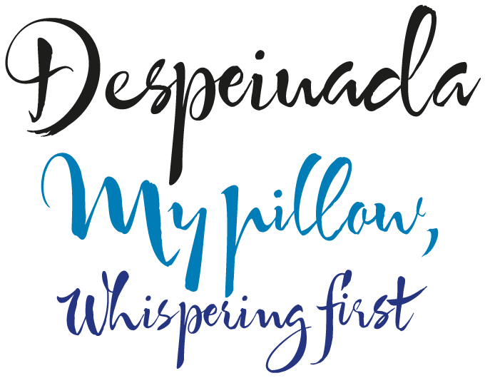
Argentinean-born Ricardo Rousselot is one of the unsung heroes of 20th-century lettering; during a career spanning almost six decades he has created some of the most spectacular packaging designs you’re ever likely to come across (think dessert wines and luxury cigars). Based in Barcelona, Rousselot has finally begun publishing his hand-rendered alphabets as digital fonts. Despeinada is the first release from his foundry EdyType, and it has been an immediate success. Its name means “uncombed” in Spanish — an apt name for this loose, spontaneous script that is rough and precise at the same time. Its character set offers a nice set of alternate letter pairs to create a convincing hand-lettered look. For optimal effect, use a layout program with full OpenType functionality.
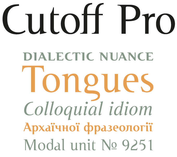
During lunch at MyFonts, staff members sometimes make bets about which fonts are going to be really, really successful. We were all wrong about Cutoff Pro. None of us would have guessed that this transitional roman with parts missing would do so well. After all, “deconstructing” a classic typeface by cutting off some of its defining parts is still a pretty radical proposition, even if the idea goes back to experiments done in the early 1990s. But designer Fulvio Bisca knew what he wanted with Cutoff: glyph shapes were optimized “in order to soften the ’90s deconstructivist effect and obtain a more balanced and readable design.” The designer then collaborated with URW++ to create a complete OpenType Pro font family with advanced typographic features.
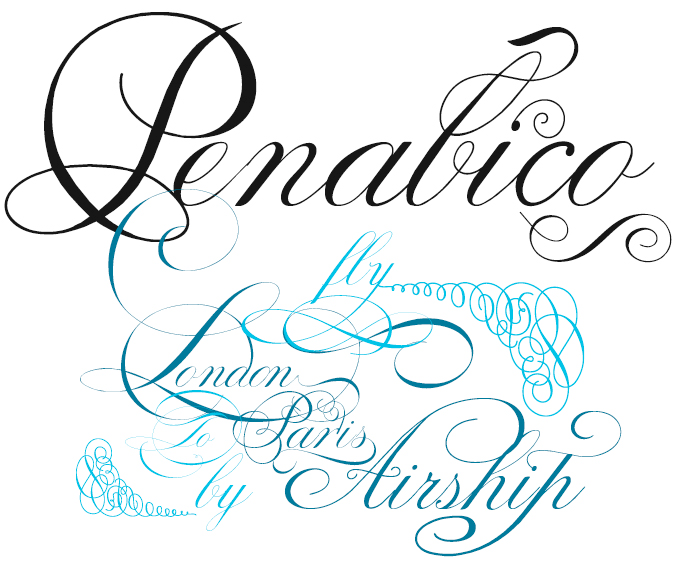
In 1733, London master letterer George Bickham collected penmanship samples from 26 of his contemporaries and published The Universal Penman. Thanks to Bickham’s monumental compilation, eighteenth-century English Roundhand became one of the most popular styles of formal writing; in recent years it inspired digital typefaces from Snell Roundhand to Champion Script Pro and, of course, Bickham Script. The new Penabico is Intellecta Design’s free interpretation of the genre. It comes with loads of stylistic alternates, ligatures, ornaments and fleurons, as well as abbreviations and intricate, ready-made calligraphic words. While the enhanced OpenType version contains all these goodies and more, some of the ornaments, catch words and other glyphs are accommodated in supplementary fonts for easier access in non-OpenType-savvy programs.
Text family of the month
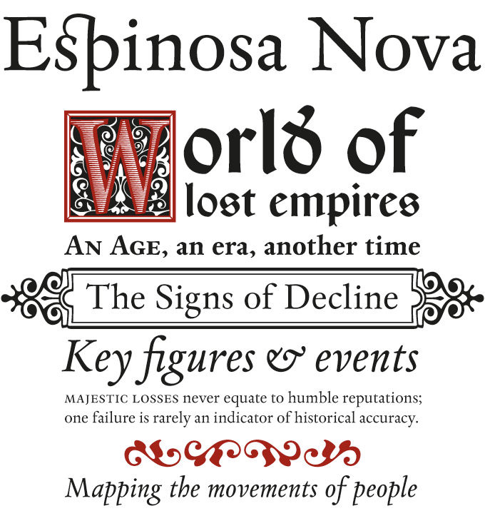
MyFonts is proud to present Cristóbal Henestrosa’s Espinosa Nova, a landmark in contemporary Mexican type design. This award-winning typeface family was eloquently praised by the Canadian writer and typographic guru Robert Bringhurst as “...an unusually intelligent family of type, reaching back to one of the most exciting moments in typographic history and reaching forward to the typographic future.” The historical model is the work of Antonio de Espinosa, the most important Mexican printer of the sixteenth century and very probably the first punchcutter anywhere on the American continent.
Henestrosa chose to give his family an unusual and interesting structure, capturing a broad picture of the typographic culture of Espinosa’s era, from the purely functional to the solemn and ornamental. The alternate “Aldine” italics with their upright capitals are a nice touch. The designer also made sure that Espinosa Nova meets the demands of contemporary typographers, filling out the text fonts in the series with small caps, five sets of figures and many ligatures. In addition, the Capitular fonts enable interesting effects by overlapping layers. This family feels very comfortable in books, but it can be used everywhere a touch of classical elegance is required.
Follow-Up
Illustrator-designer Ulrike Wilhelm’s LiebeErika has continued to be hugely successful. A thin, compressed typeface with a hand-drawn look, the charming yet resolute LiebeErika is the ideal companion to Ulrike’s picture fonts, a growing collection of witty and graceful drawings covering a wide range of themes, including cats, fish, Christmas, Easter, tweeting birds and food culture.
If you like this typeface from LiebeFonts, check out some of their other fonts:

LiebeChristmas
LiebeChristmas is a hand-crafted collection of Santas, Rudolphs, gifts, treats and more holiday items in countless variations and sizes. More than 100 drawings are included in this single font which can be used in any text or graphics application.

LiebeMenuLettering
LiebeMenuLettering is a collection of commonly used words and phrases found in restaurant signage and menus. Every phrase has been hand-lettered to give your menus or dinner invitations the handmade but professional look they deserve.

LiebeKitty
Do you like cats? LiebeFonts loves them! Ulrike spent many hours doing cat-watching research, resulting in a collection of over 50 cats and kittens for a wide range of creative applications. Happy cats, mad cats, bad cats, hungry cats, Egyptian-walking cats, and more. LOLZ!
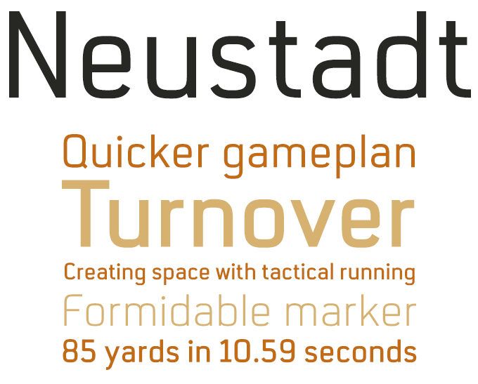
Sponsored Font: Neustadt
The Neustadt family was originally designed as a corporate font for Sport 2000, one of the leading buying groups in the European sport retail industry. Now that identity has been successfully established, the font has been made available to the general public in a revised version. The Neustadt family is a clean, modern sans serif, highly legible both in print and on screen. As part of the URW++ SelecType collection, Neustadt meets the highest quality standards and covers more than 30 European languages. The letterforms have smoothly curved corners and low contrast, combined with a large x-height. Their functional shapes are stripped of all unnecessary detail. These characteristics make Neustadt perfectly usable for a wide range of typographic applications, such as signage, headlines, text and branding.
Have your say
— Angelique, Teneriffe Village, Qld, Australia, October 15th 2010
Your opinions matter to us! Feel free to share your thoughts or read other people’s comments at the MyFonts Testimonials page.


