It has been a month since MyFonts’ webfonts collection was officially launched, and it has taken off in a spectacular way. We now have over 30,000 webfonts: an unparalleled resource for web designers to lend individuality to any web page.
We are not forgetting our regular clients, of course. Our library of modern desktop fonts for personal and professional use keeps growing at a steady pace. And believe it or not, each month sees a new crop of original typefaces that go where few fonts have gone before. This newsletter is one way of keeping in touch with what’s going on in type today.
Oh, and in case you’d like to give your loved one a typographic Valentine gift without imposing your own taste, how about a gift certificate? With a true font geek, they work wonders.
This month’s Rising Stars
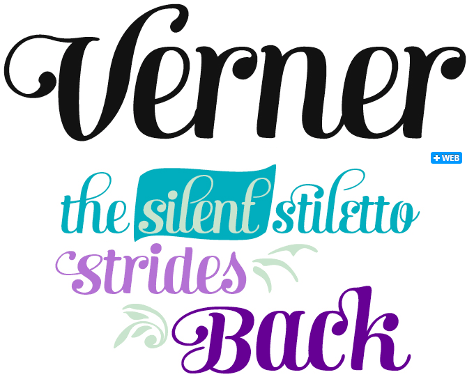
Fenotype’s Verna was a minor hit a few months ago — and designer Emil Karl Bertell has now released Verner as its ‘script brother.’ The male/female contrast shouldn’t be taken too seriously: while Verna is playful yet strong-willed, Verner is clearly in touch with ‘his’ feminine side. Verner strikes just the right balance between the handwritten and the orderly, between legibility and decorative whim. It comes with a set of nicely drawn ligatures, swash characters, a selection of ornaments and some alternate characters, all of which can be easily accessed in any OpenType-savvy program. For the best price purchase Verna together with Verner!
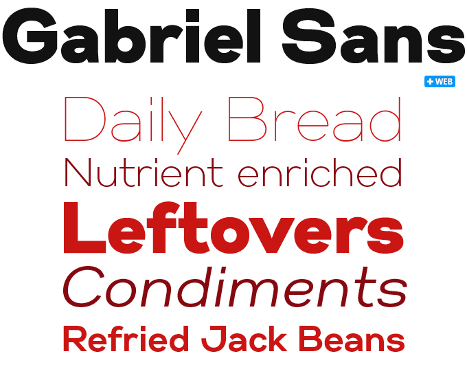
After a string of 1970s-inspired geometric faces, Gabriel Sans is something of a departure for Fontfabric. The new wide family was inspired by classic sans-serifs such as the industrial Grotesques or the modernist Futura, but with a contemporary twist. Gabriel Sans is clean, elegant and to-the-point. There is a bit of 1950s cool in it as well (think Helvetica or Folio) but it is less smooth and neutral. Use it for graphic identities, logos, or to lend an unmistakable personality to your editorial designs. Gabriel Sans comes in six weights with their respective italics.
Text family of the month
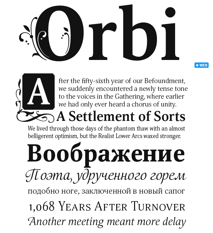
Based in Siberia, Natalia Vasilyeva is one of the most prolific designers contributing to Moscow’s ParaType foundry. Her latest offering is Orbi, a type system with a wide array of styles. Orbi consists of ten roman and italic faces of different proportions and weights and three decorative calligraphic fonts. To add a romantic and/or classical touch to your designs it contains three additional fonts of decorated capitals. Initials Three is our favorite: one of the few ornamented alphabets that combines negative (white) and positive ornaments within the same letterform, as in the large ‘O’ in the title of our specimen.
With small capitals for the regular weight and a variety of numerals, the font can be used in many areas: the basic styles are perfect for books and periodicals, the narrow styles work well in the columns and tables of business publications, and the decorative styles stand out in festive typography, packaging, menus and the like. True to its name, which means ‘for the world’, the font comes with extensive language support including, of course, a fine cyrillic set.
Follow-Up
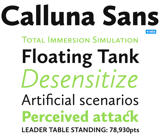
Calluna by Jos Buivenga is one of the most successful oldstyle text fonts of recent years, and the new Calluna Sans is its very welcome sans-serif companion. Like the serifed original, it respects oldstyle proportions and makes lucid statements with crisp, contemporary details, but it does so in its own confident, sans-serif way. Many users have recognized this humanist sans as a wonderfully readable typeface with all the attributes needed for sophisticated typography, and Calluna Sans has continued to do well, lingering comfortably in the top 10 of our current Best Seller list.
If you like this typeface from exljbris, check out some of their other fonts:
Calluna
Buivenga’s first fully-fledged roman for text and display, Calluna grew out of the Museo design process. While trying out various serif shapes, Buivenga discovered a nice way of giving his serifs a forward direction. The principle became the starting point of a new typeface — a robust and contemporary face with interesting details and a forward flow.
Fertigo Pro Script
When working on Fertigo Pro Italic, Buivenga suddenly saw possibilities for yet another Fertigo variety — a connected script. The resulting Fertigo Pro Script is a somewhat old-fashioned script font — charming yet vigorous, and great for packaging or branding.
Geotica
The idea behind Geotica was to build a font using — more or less — simple geometrical elements. The open wire frame could then be left open or (partially) filled. The result is a Bodoni-like display face in four varieties that is suitable for a broad range of uses. Each grade has four styles and is loaded with swashes, alternates and ornaments.
Sponsored Font: Magistral
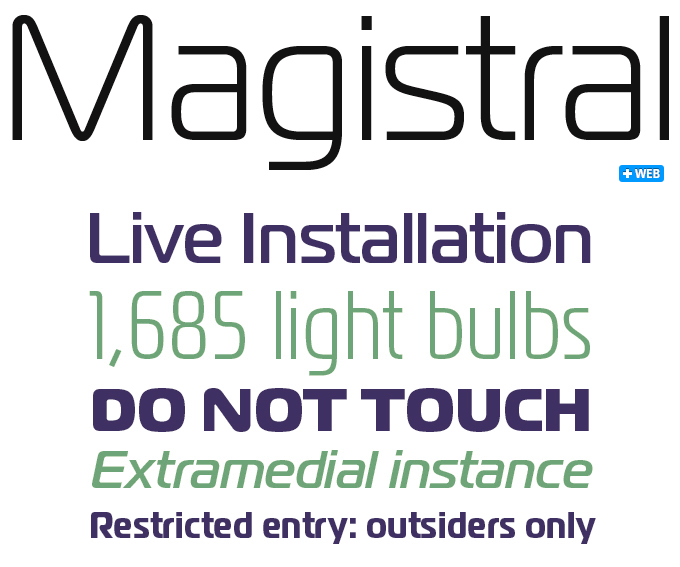
Magistral is one of the great examples of Russian retro-futurism in type design. Originally developed in the late sixties by Moscow designer Andrey Kryukov for the Russian railways, the original alphabet took some of its cues from Aldo Novarese’s modern classic Eurostile (1962). The digital Magistral is a ParaType original: its first three weights were designed in 1997 by Dmitry Kirsanov for use in advertising and display typography. A rigorous update was released in 2009, when Kirsanov added a wide range of new styles, corrected the old ones and enhanced them with an extended character set. Magistral is now a versatile family for display and medium-sized text settings; it comes in three widths and up to five weights, with extensive language coverage and (needless to say) an impeccable, futurist cyrillic set.
Have your say
— Bruce Campbell, February 1, 2011
Your opinions matter to us! Feel free to share your thoughts or read other people’s comments at the MyFonts Testimonials page.


