This month’s Rising Stars
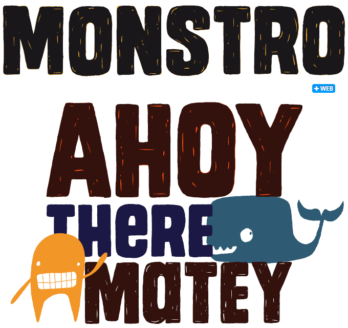
When we interviewed Erica Jung and Ricardo Marcin of PintassilgoPrints a few months ago, they made it clear that nonchalant lettershapes and sloppy fonts are not the same thing. There may be deliberate “mistakes” in the way their letters are drawn — but on a technical level, the fonts must work impeccably. Monstro is a case in point. Its letters look rough and quickly sketched, yet the font family was produced to be a reliable typographic tool. An all-caps font, Monstro comes with different lettershapes in the upper- and lowercase slots, allowing you to avoid having the exact same lettershape twice in letter pairs such as ‘LL’ or ‘MM’, even when working with normal office software. If your program does support OpenType features, Contextual Alternates can take care of that automatically, and the Stylistic Alternates feature will add in even more variations. Monstro comes in two versions, Sketchy and Solid — layer them for a two-tone effect, as in the word AHOY above. There is a matching picture font with a bunch of irresistible monsters and other graphic elements.
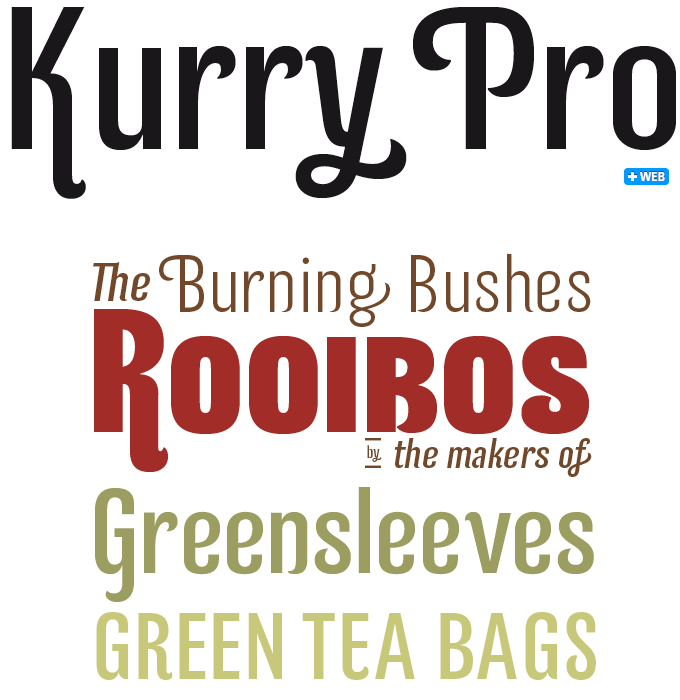
While many fonts from Bangkok-based foundry Cadson Demak are cool, clean corporate-looking sans-serifs, designer Ekaluck Peanpanawate likes exploring slightly more exotic areas. His squarish Clarendon-like Kondolar was a big success a year ago, and now Kurry is among the best selling fonts of the moment. Kurry’s basic structure is simple — a sans-serif drawn on a narrow rectangular skeleton rounded at the top and the bottom — but it’s the somewhat quirky details that make it stand out. Many of the terminals end in a softened point, as do some strokes where curves join straight stems. Most letters have a swashed alternate version, and special English-language keywords such as WITH, OF and BY (the latter two in upper- and lowercase) add to the font family’s versatility. There’s also a wealth of ligatures and various numeral styles. Use for packaging, brochures, identity and poster projects.
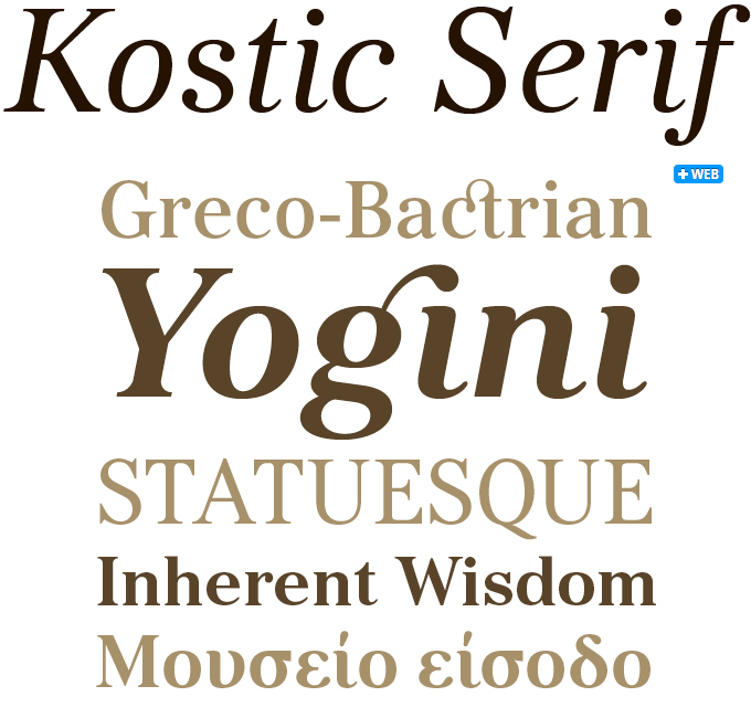
Based in Belgrade, Serbia, the father-and-son team of Zoran and Nikola Kostić has published a string of interesting, well-made typefaces during their first year on MyFonts. The recent Kostic Serif is their most successful typeface to date. Conceived in the classicist, transitional style of Baskerville or Miller, it was begun by Zoran Kostić around 2002, then abandoned, and redesigned eight years later by Nikola. With tall, clean characters and a large glyph set to support all European languages — Greek and Cyrillic included — Kostic Serif is a good choice for setting body text and excellent for international publications. With multiple figure sets and 31 ligatures, the family is a versatile and superbly legible face for large and small texts.
Text family of the month
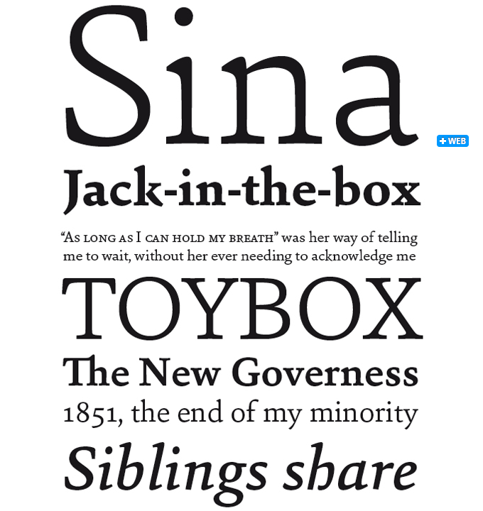
The range of typefaces released over the past year by Germany’s Hoftype foundry has breadth as well as depth. Each font family is impeccably drawn and equipped with all that is required from a multi-purpose text face; and they are all remarkably different. Designer Dieter Hofrichter is a modern traditionalist in the best sense of that term — his faces represent centuries of expertise, yet there is hardly a hint of nostalgia about them. They also offer excellent value for money.
Sina, his latest release, is clearly a typeface from the same designer who made last year’s Cala. But where Cala was a modern take on the Venetian model from around 1500, Sina echoes late baroque and transitional shapes and the ties to the past are even looser. The lettershapes are crisp and rather low in contrast, and while the individual letters are of elegant simplicity, the designer’s craftsmanship is shown off most convincingly in the evenness of color over an entire page of text, be it on the screen or on a printed page. Naturally, the family offers small caps, multiple figure sets with matching currency symbols, and more.
Follow-Up
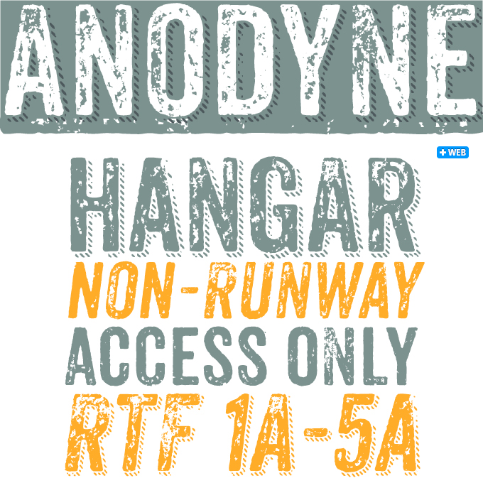
Anodyne, the friendly family of distressed capitals from Yellow Design Studio, has continued to do very well indeed after last month’s feature in this newsletter. An all-caps font with a hand-printed texture, Anodyne is significantly more sophisticated than the early grunge fonts we saw twenty years ago. Much like Monstro, above, it comes in four distressed variations for each letter and at least two for other characters. Layering regular and shadow versions allows independent control of the shadow color. Switch between lowercase and capital letters to change texture, or use OpenType contextual alternates for extra-distressed variations.
If you like this typeface from Yellow Design Studio, check out some of their other fonts:
Melany Lane
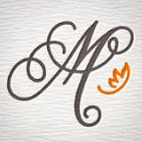
Melany Lane was one of our Fonts of 2011: a typeface with the flourished shapes of traditional lettering, drawn with the quirks and warmth of informal hand-rendered type. Melany Lane comes with swashes and stylistic alternates for extra funkiness and fun, as well as 118 lovely ornaments and a set of 14 seamless background patterns.

Wausau
Based on nineteenth-century wood type for posters, the Wausau font comes with multiple levels of worn-ness: the uppercase, lowercase, small-caps and uppercase small caps slots of each letter have the same basic shape, but in increasing grades of distress. The font includes a complete set of ornamental caps and double-letter ligatures as well as dozens of ornaments.
Skitch
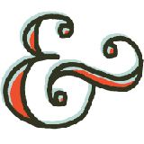
Released in early 2011, Skitch was a clever addition to the popular genre of fonts that emulate hand-sketching. A funky hand-drawn serif with regular, solid, and fill options, it can be layered to multi-colored effect. Skitch is accompanied by an eccentric collection of ornaments, and a set of expandable borders that can be mixed and matched for endless fun.
Sponsored Font: Breathe
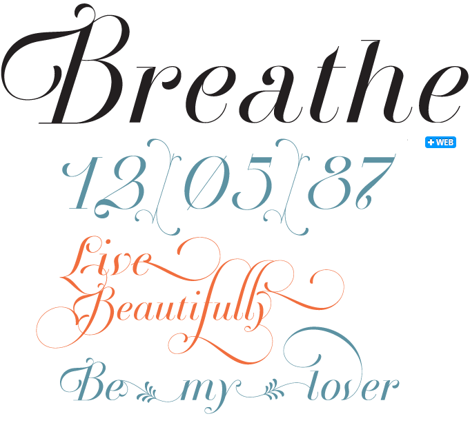
Breathe Pro is a subtle unconnected script font from Buenos Aires-based designer Maximiliano R. Sproviero. Following his Parfait Script, Sproviero wanted to make something more universal. Inspired by the work of Didot and other typographic designers from around 1800, he began working on a font that would travel from very formal and conservative letterforms to a world of swashes and flourishes. His aim: to makes the letters feel alive. “Cuando las letras respiran...” became his catchphrase, which translates as “when letters breathe” — hence the name. Breathe Pro comes with over 1000 glyphs, including huge sets of alternates, swashes, historical forms, ligatures and more. If you want a less intricate font in the same style, choose Breathe Standard.
Have your say
—@1mrlee, via Twitter, February 29, 2012
Your opinions matter to us! Feel free to share your thoughts or read other people’s comments at the MyFonts Testimonials page.
The Webfont Showcase wants your work!
Let us know about the exciting work you’re creating with our webfonts.
We want to see webfonts used in navigation, layered over images, in logotypes and mastheads, in extended body settings ? anywhere text can be set using webfonts.
Send us work using our submission form, tweet us @myfonts or share something with us at our Facebook page.
We’ll feature the best examples in our Webfonts In Action pages, plus we’re on the lookout for projects to cover in more depth in our case studies.


