|
|
|
A rich vein of playfulness runs right through our selection this month, with a distinct sense of fun evident in some exuberant flares and swashes, a spontaneous marker script, a layerable grotesque and even a deadpan geometric sans created with an irreverence not normally associated with that most straight-faced of typographic genres. Last but not least, we present the product of a Swiss designer who has ditched the rulebook and created a font with no letters at all… have fun unpacking that lot!
|
|
|
|
|
This Month’s Rising Stars
|
|
|
|
|
Sofa Sans Hand is livened up with a large range of swashes, layer effects, and other bits of prettiness by Austrian designer Georg Herold-Wildfellner, master of the genre. From his earliest work — Ivory, a weird and beautiful collaboration with our friend Marcus Sterz — Herold-Wildfellner has always tried to mix aspects of Victorian and Art Deco/Secessionist decoration with more mechanical forms. This newest release certainly fulfils that mission, and is jam-packed not just with a lot of interesting display features, but multiple optical sizes and more.
Sofa Sans’ introductory promo ends April 17th, at midnight EST — grab it today!
|
|
|
|
A month without a Nicky Laatz script would be a rarity these days, wouldn’t it? Not to fear, though: her new three-font Born Ready package is a full-featured marker script with ligatures, alternates and more. Check out Laatz’s other families, like the beautiful Just Lovely, Saturday Script, and Lucky Fellas.
|
|

|
|
|
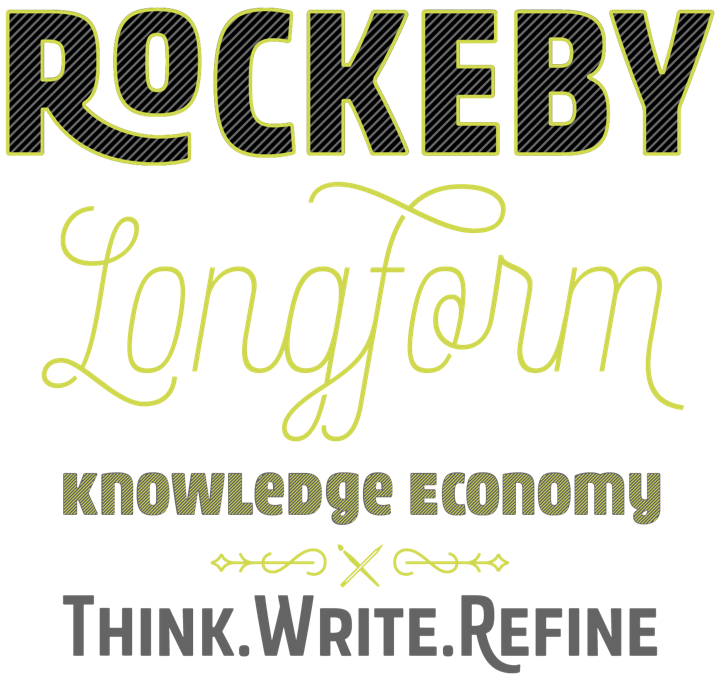
British designer Elena Genova took Block Berthed and brought it into the twenty-first century with her new Rockeby. This condensed sans display family has got a lot of extras, too: hatch, inline, and outline variants, a pile of catchwords and ornaments, and plenty more. In a nod to the designer’s extensive experience building calligraphic scripts, there’s even a connecting script variant (which contains a large number of ligatures and swash characters itself) that works quite well, even in the same line, with the primary sans. Two of the cuts are currently being offered for free, but we are confident that you’ll find the full family useful enough that you will want to own the whole thing.
Rockeby is 50% off until midnight EST, April 17th, 2017.
|
|

|
|
|
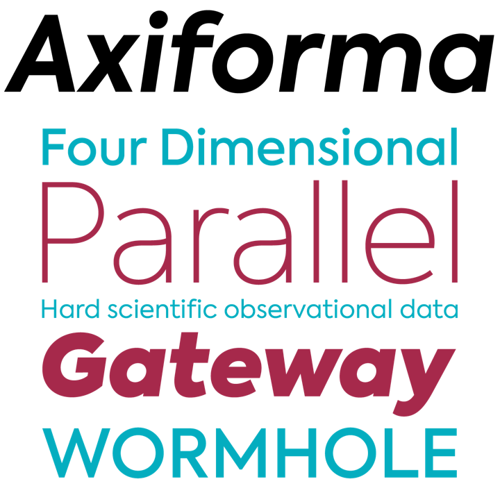
“Axiforma was designed with the single idea of creating a font that starts with the letter A, because let’s face it, this is the best letter.” And, if such a thing is even possible, it gets better from there: a ten-weight geometric sans with italics, 600+ glyphs (including both Latin and Cyrillic alphabets), multiple sets of numerals and more. Are there a lot of similar geometric sans families out right now? Sure. But this one is friendly where many others are cold, humble where others are proud, and generally very pretty on the page.
Axiforma is 50% off for five more days, until midnight April 17th, 2017.
|
|
|
|
Text font of the Month
|
|
Typesetting for books, magazines or annual reports requires font families with special qualities: excellent readability, a generous range of weights with italics and small caps, multiple figure sets (lining, oldstyle, table) and ample language coverage. Here is this month’s pick from the recent, high-quality text typefaces.
|
|
|
|
|
Paratype’s newest is an expansion and reinterpretation of John Downer’s excellent 1990 work of the same name. This newest expansion of the Iowan Old Style design is now on sale at 70% off and includes hundreds of new glyphs, including Cyrillic, courtesy of Paratype’s Natalia Vasilyeva. The tighter letterfit and slightly more open shape make it just as legible for text as it is elegant in display work.
The introductory discount for Iowan Old Style ends might EST, April 17th, 2017.
|
|
|
|
Under the Radar
|
|
With so many releases every month you might miss some noteworthy new typefaces. To help you discover them, we shine a spotlight on a hidden gem.
|
|
|
|
|
The modern/Victorian mashup that is Fab Figures — whose beauty & originality overcomes its numbers-only limitation — comes in two optical sizes and multiple styles, including multiple layer effects. Swiss designer Fabian Widmer has been playing with layers quite a bit lately (check out his Modular and Nord), and this is certainly his most polished work so far. I myself am considering having my house number, set in Fab Figures, printed on a ceramic plate and mounted by my front door…
|
|
|
|
News Round-up
|
|
In this section, we pick out interesting news snippets from MyFonts’ own kitchen and from the greater world of fonts, lettering and typography.
|
|
|
|
|
Update your Skyfonts App

Improve your experience using SkyFonts by keeping the app up to date. For the latest version, open SkyFonts and install updates, or download the latest version here. Our developers release updates often to continuously make the app & your experience better and better. Happy font installing!
|
|
|
|
We want to know what you think
|
|
|
|
|
Get in touch at [email protected] and tell us what you think of this newsletter. We’re looking forward to hearing from you!
|
|
|
|
MyFonts on Facebook, Tumblr, Twitter & Pinterest
Your opinions matter to us! Write to us at [email protected] or join the MyFonts community on Facebook, Tumblr, Twitter and Pinterest — feel free to share your thoughts and read other people’s comments. Plus, get tips, news, interesting links, personal favorites and more from MyFonts’ staff.
|
|
|
|
|
|
|
|
Colophon & Credits
The Rising Stars nameplate is set in Aniuk and Rooney Sans. Body text (for those using supported email clients) is Rooney Sans.
|
|
|
|