Is it just us, or did 2009 seem shorter than usual? Those 365 days went by in a flash! Was it due to the time spent networking online? The MyFonts team has been tweeting and blogging and Facebooking on a daily basis; but it certainly hasn’t been a waste of time. We’ve felt a more direct connection to our users than ever before, and many of our readers have been active friends and followers.
As for typography itself: the quest for quality in font design that we reported last year has continued. Many fonts were updated and improved, while new typefaces are getting ever more sophisticated. This newsletter lists the year’s ten most successful typefaces from a variety of genres. It’s a list based on sales: you, our faithful customers, have all been part of the jury. Thank you for your service! As we pass the one-year anniversary of releasing our new site design, we’re looking forward to continued improvements and refinements of the font shopping experience in the year to come.
Champion Script Pro
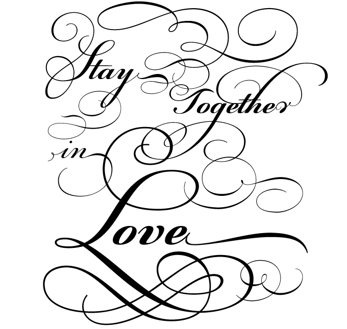
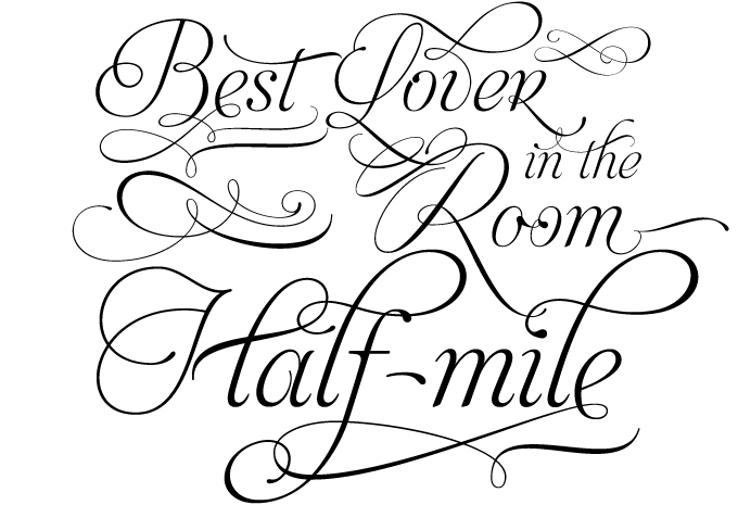
Based in Athens, Greece, the Parachute foundry joined MyFonts in April 2009 and immediately got the attention of our quality-conscious customers. Sophisticated, original text families such as Beau Sans and Centro became great sellers. The icing on the cake was Champion Script Pro, the year’s most successful formal script font. Based on the manuscripts of the 18th-century English calligrapher Joseph Champion, it was announced as “the most advanced and powerful script ever made.” It sounds pretentious, but there’s truth in it. With two weights, each loaded with 4,280 glyphs (!), Champion Script probably has the largest number of alternate glyphs ever offered in one script font. Its functionality is powered by nifty OpenType programming. Read the Champion Script Pro article to learn more about the font’s design principles and features.
Geogrotesque
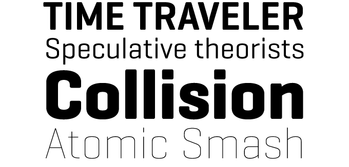
It was introduced shortly before New Year, and as 2009 took off, so did Geogrotesque. Not only is it the year’s most popular squarish sans-serif, it was also the all-around best-selling new font. With Geogrotesque, Eduardo Manso produced one of the most interesting recent sans-serif designs, striking a smart balance between geometry and user-friendliness. Based on a simple basic shape — a rectangle with curved top and bottom — the typeface is pure and regular without becoming bland or mechanical. With seven weights, Geogrotesque is a great headline family for magazines or annual reports, but will also work in text of intermediate length and point size. Its companion Geogrotesque Stencil offers an unusual and flexible set of headline fonts.
Liza Pro
It’s no secret that Liza Pro comes from the same type design collective that produced the MyFonts logo, recently listed as one of the year’s most successful new identities. So it is with some pride that we announce (based on objective sales figures) that Liza Pro is the brush script of the year. Its designers — the multi-national trio that calls itself Underware — set impressive standards for the genre years ago with their seminal Bello. Liza Pro uses the wizardry of OpenType architecture to create a font that approaches human hand lettering as closely as possible. When using an OpenType-optimized design program, Liza will create the optimal combination for each word out of a stock of 4,000 handcrafted glyphs; automatic substitution will make your text look different and fresh all the time. Check out the introductory and the connoisseurs’ PDFs for details on how Liza’s five styles work together.
Calluna
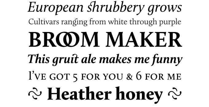
Jos Buivenga’s Calluna has been doing very well ever since its midsummer release, and consequently wins the crown for most successful serif text font of the year. Calluna was initially a by-product of the design process leading up to Buivenga’s popular Museo typeface. While trying out different serif shapes, the designer chanced upon the possibility of giving his font “slab-serifs with a direction.” Instead of using the resulting asymmetrical serifs for a new Museo version, Buivenga incorporated the concept in a completely new typeface. Calluna was the designer’s first serifed text family — a robust, clean and contemporary face with interesting details and a forward flow. Its recent use as a book typeface has demonstrated that it works perfectly even at small point sizes; thanks to its striking details it also acts as a display typeface with personality.
Memoriam
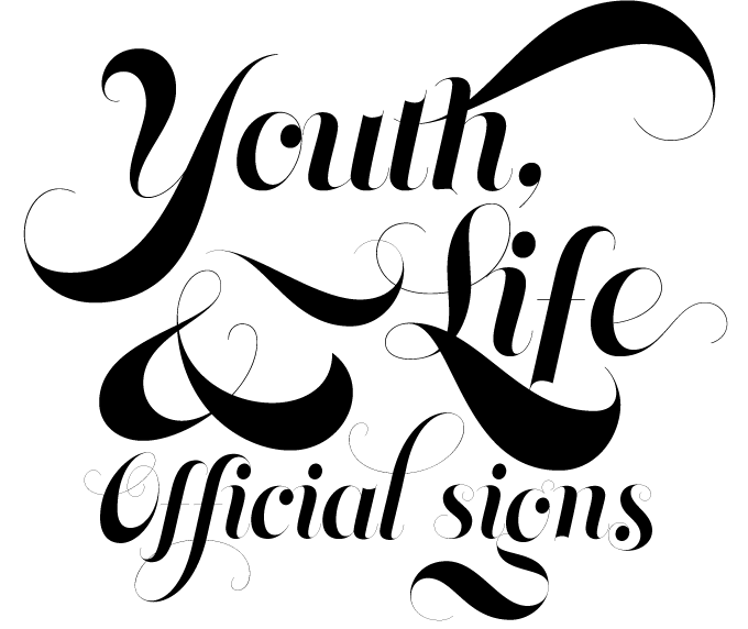
Memoriam, our calligraphic display font of the year, was originally commissioned for the December 2008 “memorial” issue of New York Times magazine. Canada Type’s Patrick Griffin drew a luxurious calligraphic poster font loosely based on ideas found in the foundry’s Jezebel and Treasury typefaces. A great success with the editors and designers, Memoriam ended up being used all over the magazine instead of just the cover and became an instant hit as soon as it was made available for retail at MyFonts. Memoriam contains a lot of alternates, which are distributed across three separate fonts for the PostScript and TrueType formats. Memoriam Pro, the OpenType version, combines all three fonts plus some extras, in one OT-programmed file.
Alright Sans
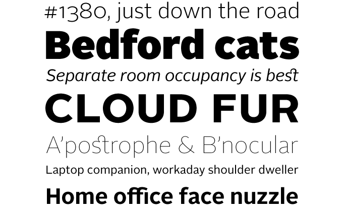
A year ago we joked that 2008 could be dubbed “The Year of the Sans.” The trend continues — the 2009 crop of sans-serifs was again overwhelming. What did change was the originality of the designs. While many of 2008’s sans-serif fonts went for the dry and super smooth approach, this past year there was a lot of variety, and some new flavors. Take Alright Sans: an amalgam of what are usually referred to as humanist and geometric models. Representing a new category in these font-of-the-year awards, Okay Type’s Alright Sans is the most successful workhorse sans-serif of 2009. It is lucid and modest without being bland or stiff. It is also open and relatively wide. Alright Sans comes with a robust set of typographic features, such as small caps (in both the roman and italic), eight sets of figures, case-sensitive punctuation and more.
Ivory
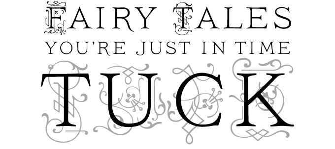
Inspired by a titling typeface from an 1882 compendium about fruit, Ivory is a carefully crafted combination of classical capitals and fancy ornaments. For their digital version, FaceType artfully separated the pears from the apples… in other words: the letters and the ornamentation were accommodated into separate fonts. By layering a text set in “NoSwashes” over the same text set in “Swashes”, wonderful two-color headlines can be created. For those who simply want to set one-color titles using ornamented characters as initials, there’s Ivory “Headline”, a font that has the swashed capitals in the uppercase section, and the straight ones in the lowercase section. Ivory has been quite a success: it is the ornamented font of the year.
Narziss
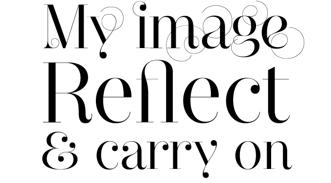
Of all the recent trends in type design, the “swirligig” fashion is one of the most remarkable and exuberant. Like an animated cartoon telling tales of unstoppable vegetation, typeface after typeface has grown flamboyant swashes and curls. It works when done tastefully, as in Narziss, the serif display font of the year. Not unlike Memoriam from Canada Type, Hubert Jocham’s Narziss explores the extreme contrast of the neoclassical style, with thin hairlines and whimsical details — but the overall impression is hugely different. Choose the “Drops” version if you like ball terminals, and “Swirls” if you prefer your headlines curly. And if you want to set small text in a compatible typeface, use the lovely Narziss Text.
We Love Nature
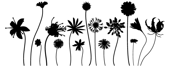
London-based Kapitza joined MyFonts last spring, and we were delighted. The studio is run by sisters Nicole & Petra Kapitza, who share a passion for everyday life, minimalism, patterns and color. They specialize in the creation of versatile picture and ornament fonts. Their collection includes meticulously drawn silhouettes of people and snow crystals. Their most popular sets are those that picture botanical forms. We Love Nature was a big success: a vaseful of lively stem flowers. The drawings are equally striking as single illustrations and in multi-colored combinations. We Love Nature is MyFonts’ picture font of the year.
Aphrodite Slim Pro
Early in the year, Typesenses published Aphrodite Pro,
a complex script chock full of specially drawn letter combinations. They followed up with, Aphrodite Slim,
the typeface’s lighter sister. Aphrodite Slim is a more mature design than its predecessor, tapping into a variety of calligraphic styles. It also has many
more special characters, reaching a total of over 1,000 glyphs, including a
large number of pre-designed words and syllables in English, French, Spanish
and German. Aphrodite Slim Pro is a curious but attractive hybrid, combining
elements from uncial, copperplate engraving, cancelleresca and more, winning Typesenses
the medal for festive script of the year.
Colophon
The Top 10 fonts of 2009 was written by Jan Middendorp and designed by Nick Sherman. The title graphic is set in Alright Sans.
Subscription info
Want to get future MyFonts newsletters sent to your inbox? Subscribe at myfonts.com/MailingList
Comments?
We’d love to hear from you! Please send any questions or comments about this newsletter to [email protected]


