This is a listing of all glyphs contained in the
font, including
OpenType variants that may only be accessible via OpenType-aware
applications.
Each basic character (“A”) is followed by Unicode variants of the same
character (Á, Ä…), then OpenType variants (small caps, alternates,
ligatures…). This way you can see all the variations on a single
character in one place.
You can use this font in any of the following places. Read the full EULA text for details about each license. If
you have a usage in mind that's not covered by these licenses, contact us and we'll see what we can do.
Desktop: for use on a desktop workstation
For the most common uses, both personal and professional, for use in desktop applications with a font
menu.
For example:
Install the font on your Mac OS X or Windows system
Use the font within desktop applications such as Microsoft Word, Mac Pages, Adobe InDesign, Adobe
Photoshop, etc.
Create and print documents, as well as static images (.jpeg, .tiff, .png)
Desktop licenses are based on the number of users of the fonts. You can change the number of users by
clicking the quantity dropdown option on Buying Choices or Cart pages.
Please be sure to review the listing foundry's
Desktop license agreement
as some restrictions may apply—such as use in logos/trademarks, geographic restrictions (number of
locations), and products that will be sold.
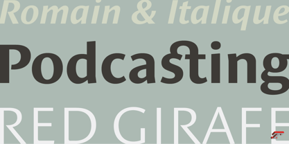
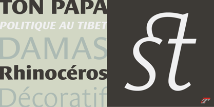
Designed by Jean François Porchez, Le Monde Sans is a sanserif based on Le Monde Journal — a practice that become commonplace from early nineties. Designed originally in 1994 for the Le Monde newspapers, it was expended over the years to the large family we know today. Le Monde Sans features a “traditional g” in addition to the usual 1994’s g. Le Monde Sans is offered in numerous weights — in roman, italic to meet all kinds of situations. It will help designers to select the best weights depending their needs, from glossy paper printing to high resolution screen.
Superfamily
The design of Le Monde Sans continues the basic common structure found in the members of the Le Monde family: its proportions, a relatively narrow width, a fairly oblique axis, etc. The typographer can, at all times, switch between Sans & Journal or Courrier without any disruption in the composition. The verticals metrics and proportions of Le Monde Sans are calibrated to match perfectly others Typofonderie families.
This family was designed in 1994 as bespoke typeface family for the French newspaper Le Monde. The family is not used any more by this newspaper from November 2005.
Le Monde® Sans Std
is a registered trademark of Le Monde Newspaper.
About Typofonderie
Founded in 1994 by Jean-François Porchez, Typofonderie is an independent digital type foundry in France, designing, manufacturing and distributing a selection of high quality typefaces for adventurous digital typographers. This is the first place in the world to buy our digital fonts.
Based in Clamart (France) from the end of 2008, Typofonderie as foundry, is dedicated to the distribution of a selection of high quality typeface designs, while ZeCraft focuses on the bespoke typefaces and lettering projects.
Many of the Typofonderie typefaces have won prizes in international competitions.