fy{T}i - Font Field Guide
The Font Field Guides are single-page modules that address the most commonly asked questions about typefaces and their use. Each will be dedicated to an important typeface family. In them, you learn:
- The typeface’s designer and style classification
- What’s available in the family
- Important legibility factors of the design
- Best practices for using the design
- How to identify/recognize the typeface
- Pairing recommendations
- A brief history of the family
- Interesting facts about the design
- Alternative typeface choices
Gotham’s unfussy directness and authority, especially in its heavier weights, create a brawny mien, while lighter weights are elegant and stylish.
Drawing inspiration from Windsor™ and ITC Souvenir®, the Gazpacho typeface family is approachable and friendly, without being saccharine. It has a charmingly quirky personality. If it were a person, it’d be someone you’d want to hang out with.
FF Clan is a friendly design that melds a strong geometric aesthetic with humanist warmth. It’s appropriate for a wide variety of typographic applications, from branding to display heads and lengthy text copy, in hardcopy and digital applications.
Benton Sans has the same range of uses as typefaces like Helvetica® Now and Univers® Next but differs from other grotesque sans serifs in its organic shapes and subtle transitions of stroke width – all contributing to a slightly more rustic tone of voice.
Classic Grotesque™ Font Field Guide
When asked about the intended uses for Classic Grotesque, McDonald’s answer was, “Graphic and interactive designers will probably use Classic Grotesque in ways that I would never imagine. I’ve used pre-release versions of the family in ads and in books, and they worked remarkably well in both. I can’t think of many places where Classic Grotesque won’t perform well.”
Diotima Classic® Font Field Guide
Diotima Classic Regular and Bold are distinctive – and still highly legible at text sizes. Diotima Classic Light can also be an excellent choice for short blocks of text copy. It, and the Bold and Heavy weights, create striking headlines.
While “Text” weights have been designed, Neue Plak is essentially a display design. Neue Plak’s somewhat quirky design traits, make it an excellent alternative to more structured geometric sans serif typefaces.

The breadth of the Formata family makes it an excellent choice for a wide range of applications, from blocks of textual content to billboard size display headlines. Its subtle characteristics are not readily apparent in small sizes but add a distinctive mien as point size is increased.
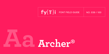
Although the lighter weights can be used for short blocks of textual content, captions and subheads, Archer is primarily a display typeface. It’s bold weights bring a commanding, but friendly, vibe to headlines and other large-size copy
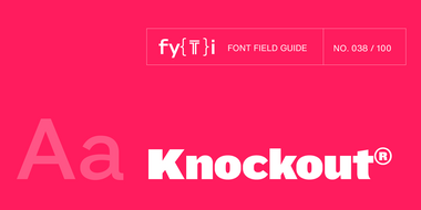
This is not a “crystal goblet” kind of design. Knockout is at its best in large sizes. Use it for headlines, branding, and packaging.
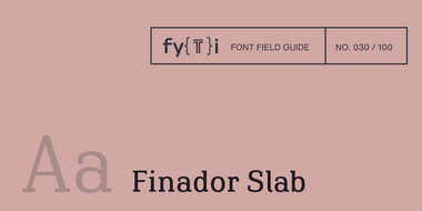
Finador Slab is a soft slab-serif family. It has a strong character and can be used for many applications, especially for editorial, branding, packaging and logos. The family supports almost every of your needs. It has all the requirements to become your next favorite workhorse family.
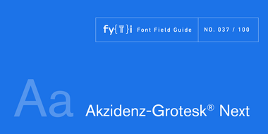
Akzidenz-Grotesk® Next Font Field Guide
Akzidenz-Grotesk Next x-height was readjusted and additional designs were created to obtain a more consistent design than the original family. It’s many weights and range of proportions make the family ideal for a wide range of uses.
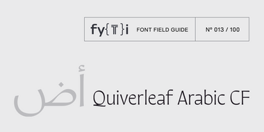
Quiverleaf Arabic CF Font Field Guide
With delicate shapes and an airy, light design, Quiverleaf Arabic CF does best when used as a display typeface. For very large text, including logos and posters, the lighter weights can be used for the most dramatic visual effect.
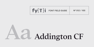
Addington CF is built for use at small to medium sizes, in print and digital environments. Its middle weights are designed for use in longform text, articles, books, footnotes, and documents.
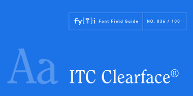
ITC Clearface® Font Field Guide
ITC Clearface is ideal when space is at a premium. It features small (almost slab) serifs, a large x-height and minor contrast in stroke weight. ITC Clearface also contains many distinctive characters which distinguish the design from other faces.

Garino can be used in both a restrained and expressive way. The wide selection of styles makes it suitable for strong headlines and extensive body text. Completed with an extensive character collection, it becomes a real workhorse.
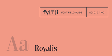
Royalis is an expressive and extravagant serif typeface family. It is characterized by a high contrast and dynamic features in the details, such as long terminals or deep inktraps. Royalis is available in three versions: a display version in six weights, a corresponding condensed version also for display applications, and a text version for body text in four weights.
Neue Swift was designed for use in text sizes in publications. It can be used just about anywhere maximum legibility is a requirement. It’s also a striking design, making it both distinctive and easy on the eyes.

Olivette CF is a display typeface with fine details and high stroke contrast, and is best used at large sizes in print, digital, and film. Ideal usage includes magazines, posters, headlines, film and game title cards, logos, album artwork, fine art, and more. Given its extreme contrast, the bigger point size, the better.

ITC Souvenir® Font Field Guide
ITC Souvenir is prominently a display typeface, and shines at large sizes. It is equally at home in digital and hardcopy environments. The light weight can also be an excellent choice for short blocks of text copy.

Finador is a modern, soft sans serif family. The functional style of a sans-serif has been soften by open apertures and rounded corners. This makes Finador functional and friendly.
As a display typeface with fine details, Wayfinder CF is best used at large sizes in print, digital, and film. Ideal use cases include short texts headlines and posters — Wayfinder is especially stunning in print – titles, logos, album artwork, signage, fine art, and more.
Harmonia Sans™ Font Field Guide
Harmonia Sans has a clean subtle modern up-to-date look. It is an excellent alternative to using dated geometric sans designs. The family contains a broad range of weights, widths, and language support, which makes it a complete solution for any virtually any design project, from high-resolution print and large-scale signage to low-resolution text displays and mobile devices.
Spitzkant is a serif typeface family characterized by strong contrasts. Pointed, sharp serifs and edges contrast with round and fine forms, making it very individual and expressive. Spitzkant is particularly suitable for branding, editorial, packaging and advertising.
PMN Caecilia® Sans Font Field Guide
While individual characters, weights and basic structure are based on PMN Caecilia, PMN Caecilia® Sans is optimized for on-screen imaging. Web pages, blog posts, newsletters, UX design, etc. are all within its purview.
Novaletra Sans CF Font Field Guide
Novaletra Sans CF is built to excel at small to medium sizes, in print and digital environments. Perfect for text, captions, books, and documents, Novaletra’s elegant construction helps text flow and is easy to read, even at very small sizes. Learn more
Ardena can be used in both a restrained and expressive way. The wide selection of styles makes it suitable for strong headlines and extensive body text. Completed with an extensive character collection, it becomes a real workhorse.
Visby CF is versatile, and its different strengths come into play in different use cases. At large sizes, Visby has been used for headlines and logotypes. Due to its clean design, it also reads well at small sizes, making it an excellent choice for subtitles and captions – just be sure to track it out a bit to improve legibility.
PMN Caecilia® Font Field Guide
The PMN Caecilia family is a suite of designs that are ideally suited to branding, headlines and short form text copy in print and on screen. Its simple shapes, large x-height, open apertures and robust serifs also make it a good choice for print and on screen environments.
Palatino® Nova Font Field Guide
Because of its expanded proportions, Palatino Nova can, and in many cases should, have somewhat longer line lengths. It’s also a typeface which does not tire the eye, when longer line lengths are specified.
Cygnet CF is best when used in large to medium sizes. Though it reads well at smaller sizes, its unique flourishes and cheerful character are more evident when given space.
Neue Kabel has a strong personality that limits its use in long form text. It can be, however, an excellent choice for advertising copy, promotional material, catalogs and brochures in print and on screen.
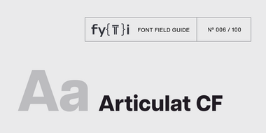
Articulat CF is built for use at medium sizes, in print and digital environments. It excels in digital spaces, including the web, user interfaces, games, and informational displays.
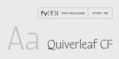
Quiverleaf CF Font Field Guide
With delicate shapes and an airy, light design, Quiverleaf CF does best when used as a display typeface. For very large text, including logos and posters, the lighter weights can be used for the most dramatic visual effect. In bolder weights, Quiverleaf is a striking choice for headlines and other short texts.

Vary is at its best in large sizes. Each variation brings its own personality to the eclectic family. Use Vary when you want to make a statement. This is not a “crystal goblet” kind of design. Use it for headlines, branding and packaging.
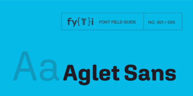
Aglet Sans is intended for text to display sizes, both in print and on screen. It is spaced more towards display use, so very small point sizes will need a touch of tracking to read best.
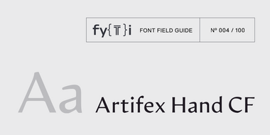
Artifex Hand CF Font Field Guide
Artifex Hand CF is built for use at small to medium sizes, in print and digital environments. Its Book weight is designed for use in longform text, articles, books, footnotes, and documents, while the thicker weights can double as headlines, subheadlines, and captions.

Guzzo is a left of center design, that performs well in a wide range of sizes and application. It is not, however, a design that you would bring home to your mother. Well, maybe for a quirky Mother’s Day Card.
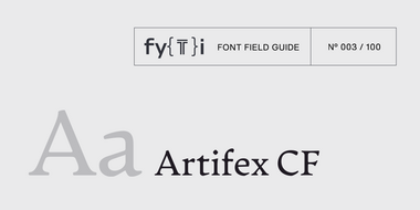
Artifex CF is built for use at small to medium sizes, in print and digital environments. Its Book weight is designed for use in longform text, articles, books, footnotes, and documents, while the thicker weights can double as headlines, subheadlines, and captions.
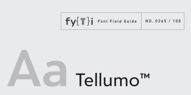
Tellumo melds a clear personality with legibility characteristics, making it ideal for display copy as well as modest blocks of running text.
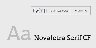
Novaletra Serif CF Font Field Guide
Novaletra Serif CF is built to excel at small to medium sizes, in print and digital environments. Perfect for text, captions, books, and documents, Novaletra’s elegant construction helps text flow and is easy to read, even at very small sizes.
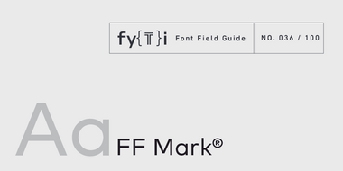
Ten weights with more than a thousand characters each, provide for a wide range of applications. Everything from advertising and packaging and long form text to branding, on screen and in print is within FF Mark’s range of capabilities.
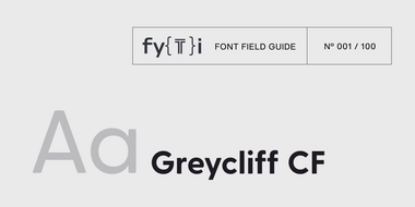
Greycliff CF is versatile and designed to hold up to almost any use-case. It has been used in user interfaces, on-screen text, signage, and logotypes.

The design of Avenir Next is clean, straightforward and performs with confidence in long blocks of text copy and headlines. It also pairs well with well with so many contemporary serif text typefaces.
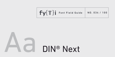
DIN Next makes a statement. It does not fade into the background. It’s character shapes are distinctive and can be distracting in long blocks of text copy.
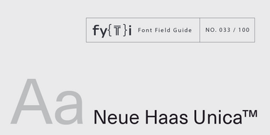
Neue Haas Unica™ Font Field Guide
There are few applications outside the range of Neue Haas Unica. It is an excellent choice for text and display content – in hard copy or on screen.
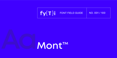
Mont is a versatile family that can be used at both large and small sizes. When used in headlines the typeface can be set in thin or heavy weights that displays the refined geometric forms at their extremes.

Univers® Next Font Field Guide
There are few applications outside of Univers Next range. It is an excellent choice for text and display content – in hard copy or on screen.
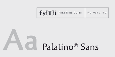
Palatino® Sans Font Field Guide
The characters in Palatino Sans based on written letter forms and the pressure of the hand. The lighter weighs can be excellent alternatives to many traditional serif and sans serif designs.
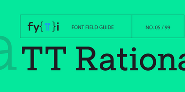
TT Rationalist Font Field Guide
The font looks beautiful in printed products: books, brochures, and posters. The design is well-suited for setting in large sizes as well as in text arrays.
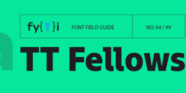
Thanks to the font’s uniwidth and versatility, TT Fellows is ideal for use on websites or in periodicals. Bold styles will work harmoniously in headlines or as accents in print or on packaging.
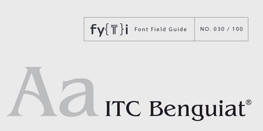
ITC Benguiat® Font Field Guide
Originally drawn to be a display design, ITC Benguiat works best at large sizes. It’s also a distinctive design, and ideally used in short headlines and for branding.
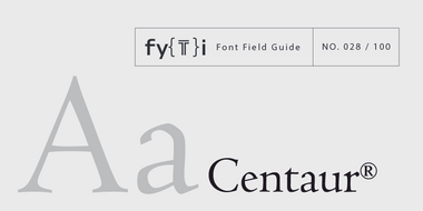
A distinctive design that performs best at larger sizes in headlines and short blocks of text copy. Centaur should not be combined with equally distinctive designs.
TT Travels Next Font Field Guide
TT Travels Next is a trendy wide sans serif designed to attract attention. Just after its release, it has found its place in the world of show bills and posters, as well as on packaging.
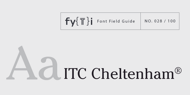
ITC Cheltenham® Font Field Guide
Originally drawn to be a display typeface, The ITC Cheltenham family works best at large sizes.
TT Commons Pro Font Field Guide
TT Commons Pro is a versatile tool. It has a wide area of application: app interfaces, websites, printed materials, branding.
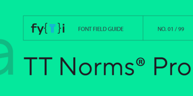
TT Norms™ Pro Font Field Guide
TT Norms™ Pro is a font for a wide range of applications, a workhorse.
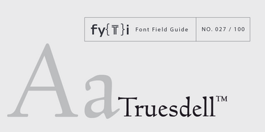
A distinctive design that performs best at larger sizes in headlines and short blocks of text copy.
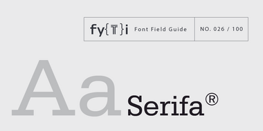
The Serifa family is a slab serif design that benefits from a humanistic design foundation.
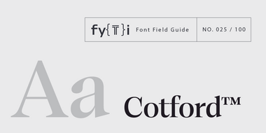
Cotford is a versatile serif family of elegant display and robust text styles. This range makes Cotford suitable for a variety of print and digital applications.
The Plantin design has a narrow, paper-conserving, width and a large x-height, making it an excellent choice for long-form text copy. It is, however, a heavy face and needs room to breath. The Plantin family also performs best in uncomplicated typographic arrangements.
ITC Stone® Sans II Font Field Guide
There is virtually no limit to ITC Stone Sans II range of applications. Fine books, annual reports, restaurant menus, business correspondence, corporate identity programs, movie credits and advertising campaigns have all been set using this design.
ITC Legacy® Sans Font Field Guide
An excellent design for both hardcopy and interactive applications. The standard weights are full-bodied, while the condensed designs provide economy of space with little loss of legibility.
ITC Novarese™ Font Field Guide
The contrast between thick and thin strokes is noticeable but not extreme, giving text set in ITC Novarese sparkle and color without sacrificing readability.
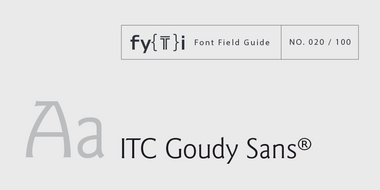
ITC Goudy Sans® Font Field Guide
While typefaces with strong personalities have limitations, few applications are outside the range of ITC Goudy Sans.
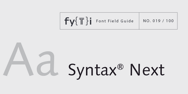
Syntax is distinctive from geometric and grotesque sans serif typeface, making it a good alternative choice. Open line spacing and narrow columns are the best environments for reading ease.
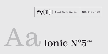
With its particularly small ascenders and descenders, Ionic N°5 have tight linespacing for a solid texture and impressive space-saving performances.
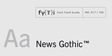
Somewhat condensed and slightly angular, Bitstream News Gothic is an efficient user of space and holds up well on screen.
Optima nova should be set more open than tight. The unhurried elegance and light gray color created by the face is disrupted when letters are set too tight.
ITC New Baskerville Font Field Guide
The original Baskerville typeface was created for setting books, and its modern revivals are ideally suited to the setting of continuous text.
Because of its fine hairlines and delicate serifs, Perpetua should be set a little larger in on-screen applications that in print.
Antique Olive Font Field Guide
Antique Olive design is not intended for continuous text copy. It can, however, be used for short blocks of textual content if given ample line space. Somewhat squared curved shapes and vertically clipped strokes allow for tight, even display setting.
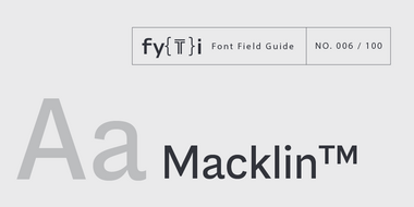
The Macklin family is a strong, adaptable family that is excellent for branding, headlines and other display uses. The simple shapes, open counters and apertures are wide and clear make it a good choice for short blocks of text copy in both print and on-screen environments.
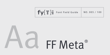
The Meta design is somewhat condensed (saving space) and benefits from stroke weights and character spacing that withstand poor printing and modest resolution digital imaging.
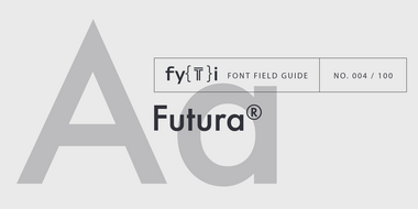
Futura Font Field Guide
An exceptionally versatile family, the Futura Bold and Condensed designs are powerful display typefaces. The Futura family is also a good choice for space-sensitive environments. Its simple letterforms allow it to be set at surprisingly small sizes with little drop in legibility.
Coming soon.
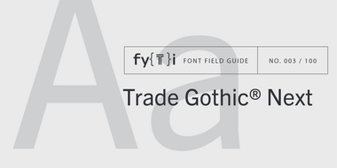
Trade Gothic Next
The Trade Gothic Next family maintains the distinctive early 20th century design traits of the original Trade Gothic design, but benefits from a large systematic suite of weights.
Coming soon.
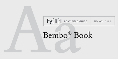
The Bembo® typestyle has been the go-to typeface for fine text typography since it was first released in 1929. The Bembo® Book family carries on the tradition of the design maintaining the grace, elegance and legibility of the of the early 20th century typeface.
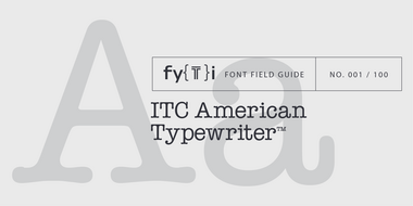
ITC American Typewriter Font Field Guide
The ITC American Typewriter typeface is a remarkably forgiving design in print, on screen uses and in under less than ideal reading environments. Its serifs, however, are quite long and can cause letters to link-up if copy is set too tight.