“For those who regret what keyboards and touch screens have done to their penmanship, typographer Harald Geisler has an answer: Sigmund Freud.”
—
The Wall Street Journal
Sigmund Freud was a neurologist who lived from 1856 to 1939. His research and studies led to the foundation of ‘Psychoanalysis’.
When I first saw Freud’s century old letters, I was fascinated by the beauty of these historic manuscripts. It made me smile to imagine a person writing his or her shrink a letter set in Freud’s handwriting. I started to plan creating a font based on his manuscripts.
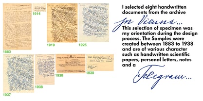
I contacted the Sigmund Freud Museum Vienna and Freud Museum London. To start the creation I selected eight handwritten documents from the archive in Vienna – This selection of specimen was my orientation during the design process. The Samples were created between 1883 to 1938 and are of various character such as handwritten scientific papers, personal letters, notes and a telegram.
A successful Kickstarter Campaign
"The Sigmund Freud Typeface - A Letter to your Shrink" with over 1400 Backers enabled me to visit the archive in Vienna and study the original manuscripts of Sigmund Freud. After a year of preparation and design work, I finished four alphabets based on Freud’s handwriting.
What are the different Versions PRO, Kurrent, #1, #2, #3 and #4 about?
“This project gives people the convenience afforded by the computer while maintaining the romantic nostalgia, beauty, and character of letter writing with real handwriting.”
— Daniel Vahab,
The Huffington Post
When you write with your hand, every letter looks a little different. When you write a text on your computer every letter looks exactly the same. In order to make type look like handwriting, I chose four different variations of each letter from Freud’s manuscripts, drew and stored them in the font. The font is then programmed to exchange letters while you are typing. This makes the rendered result on your screen or print look like unique handwriting.
PRO
While you are typing… the
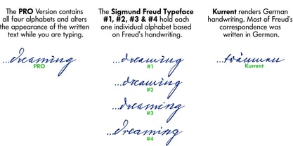
PRO Version actively combines all four alphabets and exchanges them automatically. Through this mechanism never the same two
o’s will stand next to each other. With every touch a unique look is generated. This works in certain applications i.e. Word 2010(or newer), Pages, TextEdit, Editor(Pre-installed on Windows 7 or newer), InDesign, Illustrator…
→Here you can see an animation of what this effect looks like in action.
(Please Note: some applications like LibreOffice, OpenOffice do currently not support this feature. Date: December 2013)
#1 #2 #3 and
#4
The Sigmund Freud Typeface
#1, #2, #3 and
#4 each hold one individual lowercase alphabet based on Freud’s handwriting.
Kurrent
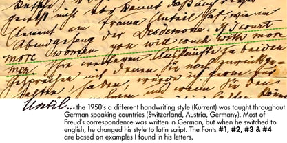
Most of Freud’s correspondence was written in German. Until the 1950′s a different handwriting was taught throughout German speaking countries (Switzerland, Austria, Germany). This style is called
Kurrent. The name Kurrent and Cursive derive from the Latin word currere - to run, hurry - both styles were designed to write fast. As you can see in the samples above, Freud practiced both Kurrent and when writing english Cursive (Latin script or Joined-up). Kurrent has three significantly different letters (s,h,e). Use Kurrent to render the authentic look of an historic Sigmund Freud letter in German.
Bundle
On the Top of this page you can get all six fonts of the Sigmund Freud Typeface Family in a bundle.
International Typeface
All styles of the Sigmund Freud Typeface feature a wide range of accented letters so you can write to all your friends in Sweden (Bj
ørn) France (Chlo
é & Zo
ë), Ireland (D
áirine), Poland (
Łucja), Germany (J
örg) and almost everywhere around the globe (Find a complete list in the tech specs).
Usage recommendations
I hope that this design will be valuable to you and most of all that you have fun with this typeface!
1. Point Size — To reproduce the size of Sigmund Freud’s handwriting adjust the type size between 18-24 point in your word processor. If you are using an imaging software like Photoshop set the resolution to 300dpi and adjust the point size between 18-24.
2. Line Spacing — Narrow the line hight until swashes of capital letters touch the baseline above. This also happens when you write a letter and gives the document a unique handwritten look.
3. Right Aligned — Freud had the habit to write towards the right edge of the page and start loosely on the left. Set your text alignment to ‘right’ to incorporate this dramatic expression also to your documents.
What do other People say about the Sigmund Freud Typeface?
“Wouldn’t you love to write a letter to your shrink using the Sigmund Freud typeface?”
— Dorothy Tan,
Design TAXI
''“JUST DON’T WRITE A LETTER TO YOUR MOTHER WITH IT…
…until the reader looks a bit closer, and they see 70+ years of modern science weighing in on turn-of-the-century pop psychology."''
— Mark Willson,
Fast Company
“Doctor, what does it mean if you dream of creating a font of Freud’s handwriting?”
— Ayun Halliday,
Open Culture
“…geekily romantic, at once artistic and scientific”
— Edie Jarolim,
Freud’s Butcher
“…sympathisch”
— Jürgen Siebert,
Fontblog
!WOW!
Thank you for reading the complete font description! You are awesome! If you still have a question please contact me through MyFonts or my website haraldgeisler.com.
Credits
This project was made possible by the help of
1481 Backers on Kickstarter and the kind support of the
Sigmund Freud Museum Vienna and the
Freud Museum London. Thank you. All of Freud’s Manuscripts shown are © Sigmund Freud Museum Vienna. Poster Image: IN17 - Sigmund Freud, Germany 1932. © Freud Museum London. Flag Image: IN19 - Sigmund Freud 1930’s. © Freud Museum London.


