Select this license type when you are developing an app for iOS, Android, or Windows Phone, and you will be embedding the font file in your mobile application's code.
Hamptons BF™
by Bomparte's Fonts

- Aa Glyphs
-
Best ValueFamily Packages
- Individual Styles
- Tech Specs
- Licensing
Per Style:
$26.33 USD
Pack of 3 styles:
$79.00 USD
About Hamptons BF Font Family
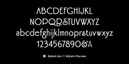
Hamptons BF is a beautiful, elegant sans serif with dramatic individuality. A font that steps out in Art Deco style.
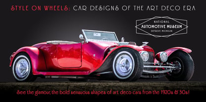
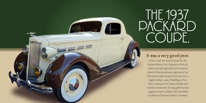
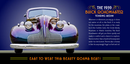
As a design movement Art Deco came into prominence during the 1920s and 30s when forms were typically sleek, symmetrical, geometric or highly stylized. Today the influence of this enduring style can be clearly seen in architecture, industrial design, fashion, art, graphic design, and yes, even type design.
Art Deco style exemplifies luxury, glamour and modernity. I believe Hamptons BF captures something of that retro look in a nod to the past without ever looking dated, all the while retaining a contemporary flair.
Named after the well-known New York resorts synonymous with style and elegance, this gothic or sans serif type is based upon University Roman, an early 1970s serif design which in turn was influenced by yet another serif design called Forum Flair (late 1960s); and that in turn owes its pedigree to the late 1930s’ Stunt Roman, which is the original source of inspiration for all of these. Quite a family tree!
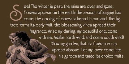
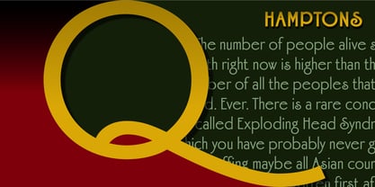
There’s dynamic interplay between certain wide, full-round letters such as C, D, G, O, P, Q, R, S and narrow ones like A, E, F, H, K, L, M, N, U, etc. This contrast repeats throughout certain lower case letters and serves to create a unique look of distinction. Light and Regular weights communicate a romantic, feminine appeal while the Bold offers a complementary emphasis.
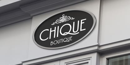
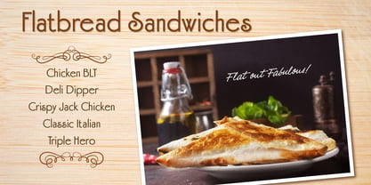
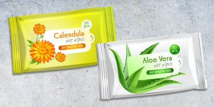
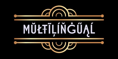
The font is somewhat versatile as in addition to its primary purpose for display, Hamptons BF also succeeds in settings containing short blocks of large text. It’s right at home in a variety of typographic environments: branding, packaging, signage logos, magazine headlines, invitations, menus, trendy cafes and more. Among the included OpenType features are Stylistic Alternates, Automatic Ligatures and Fractions. There is extended language support for Western, Central and Eastern Europe and Turkish.
Designers: John Bomparte
Publisher: Bomparte's Fonts
Foundry: Bomparte's Fonts
Design Owner: Bomparte's Fonts
MyFonts debut: Jun 18, 2006
About Bomparte's Fonts
Bomparte’s Fonts, is a modest type foundry that was launched in 2006 by type designer John Bomparte, at the urging and encouragement of his friend and colleague Bob Alonso (BA Graphics). John’s love and passion for letters began while in art college, and in the middle of studies in typography. His eyes were suddenly awakened to the rich diversity of various lettering styles. He would sometimes stare for hours on end, at the different typestyles shown in such dry-transfer lettering catalogs as Letraset® and Zipatone®. To John, this was “eye candy”! It wasn’t long after that he discovered he’d been blessed with the ability to remember and identify the many typefaces to be found everywhere, from supermarket aisles to bookstore shelves. Later on, John’s experience in type design blossomed at the legendary Photo-Lettering, Inc. where he was assistant to renowned type designer, Ed Benguiat. Working in such an environment also offered him the unique opportunity to be surrounded by such other great type designers as Tony Stan, Vic Caruso, Vincent Pacella. However, with the emergence of the new computer technologies, the once photogenic letter inevitably had to go digital. So John embraced this new reality, as much of what used to be done laboriously by hand, could now be done in a fraction of the time. Bomparte’s Fonts endeavors continually to offer an eclectic array of high-quality fonts. These range from experimental to retro-inspired. Most are original designs, while a few are updated revivals. In addition to producing fonts for his own type foundry, John Bomparte also digitizes the type designs of Harry Warren (Breauhare).
Read more
Read less
- Choosing a selection results in a full page refresh.