


Select this license type when you are developing an app for iOS, Android, or Windows Phone, and you will be embedding the font file in your mobile application's code.
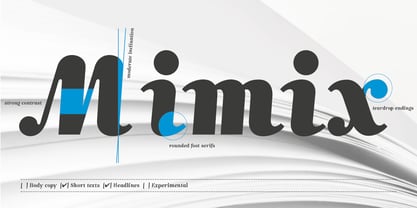
Mimix™
by FSdesign-Salmina
Individual Styles from $0.00 USD
Complete family of 12 fonts: $149.00 USD

Mimix Font Family was
designed by
Filippo Salmina and
published by
FSdesign-Salmina. Mimix contains
12
styles and family package options.
More about this family
- Aa Glyphs
-
Best ValueFamily Packages
- Individual Styles
- Tech Specs
- Licensing
Basic typesetting
Letter case
Numerals and scientific typesetting
Typographic variants
Reset
About Mimix Font Family
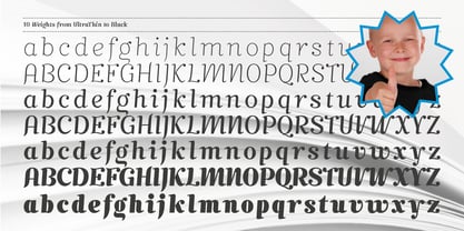
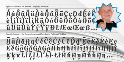
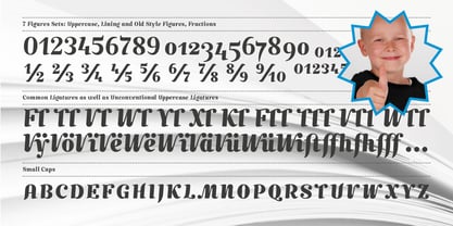
Mimix is designed especially for comic fans and all typographers who like to play. It’s ideal to express spontaneity and the joy of life. Where Mimix is used, there’s life. The characters are lined in a row, a face looks out from the page. Big ears surround an oval head. A mouse moves without haste, but dynamic and modern through the lines. Mimix skillfully combines the elegance of a modern roman with the spontaneity of a casual handwriting. The mouse shows its versatile character in its broad range of use. Without exaggeration, it’s always delicate and elegant. The quiet form and good readability is a result of its moderate inclination. Well developed, Mimix includes ten weights from Ultrathin through Black. The free trial pack includes two weights with a reduced number of glyphs. If you like it you will be then be able to buy the fonts itself complete with ligatures, special characters for Eastern European languages, uppercase, lining and old style figures as well as fractions and different Opentype features. Declare war on desert lead – with Mimix, those with charm.
Download a free trial version of Mimix
with a reduced character set. Check it out!
Designers: Filippo Salmina
Publisher: FSdesign-Salmina
Foundry: FSdesign-Salmina
Design Owner: FSdesign-Salmina
MyFonts debut: Jul 31, 2008
Mimix™
is a trademark of FSdesign-Salmina.
About FSdesign-Salmina
FS Design offers original typaces that you would not necessarily expect under the term “Swiss Design”. Nowadays, practically the same, more or less “accurate” variants of the Helvetica font are re-proposed again and again in the Swiss font design scene. Terms like “readability” or “functionning” are often misused to justify this form of conformism. We do not appreciate this development and see it as a form of flattening. Even Adrian Frutiger and Hans Eduard Meier, the intellectual fathers of the Swi...
Read more