


Select this license type when you are developing an app for iOS, Android, or Windows Phone, and you will be embedding the font file in your mobile application's code.
Asterism Clean
by Great Lakes Lettering
Individual Styles from $30.00 USD
Complete family of 3 fonts: $60.00 USD

Asterism Clean Font Family was
designed by
Dathan Boardman,
Molly Jacques Erickson and
published by
Great Lakes Lettering. Asterism Clean contains
3
styles and family package options.
More about this family
- Aa Glyphs
-
Best ValueFamily Packages
- Individual Styles
- Tech Specs
- Licensing
Basic typesetting
Letter case
Numerals and scientific typesetting
Typographic variants
Reset
Per Style:
$20.00 USD
Pack of 3 styles:
$60.00 USD
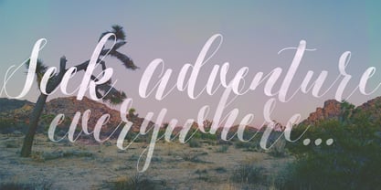
About Asterism Clean Font Family
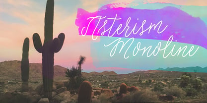
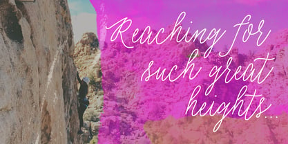
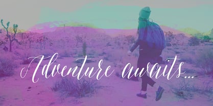
Asterism Clean is the smooth lined version of Asterism. It is a calligraphy style font with a moving baseline and lots of shining personality.
Also contains a bold and a monoline version.
This hand written style font is based on one of Molly’s signature calligraphy styles and pairs beautifully with Frosted, Icing, Saint Agnes.
Designers: Dathan Boardman, Molly Jacques Erickson
Publisher: Great Lakes Lettering
Foundry: Great Lakes Lettering
Original Foundry: Great Lakes Lettering
Design Owner: Great Lakes Lettering
MyFonts debut: Apr 4, 2015
Asterism Clean
About Great Lakes Lettering
Dathan Boardman and Molly Jacques Erickson founded Great Lakes Lettering with a mutual appreciation for artful calligraphy. “In 2012 I had been working on lots of calligraphic fonts and came across Molly’s work and was immediately struck by how visceral it was and how it didn’t really look like any other kind of calligraphy that I’ve come across,” Dathan says. “I reached out to her wondering if she had any interest in turning her lettering into fonts.” The duo’s first typeface, Frosted, was released later that year. Dathan and Molly’s bestselling typefaces include Asterism, a calligraphy style font with a moving baseline and lots of shining personality, and Kailey, a hand lettered typeface that was inspired by Molly’s signature lettering style, consisting of bold brush strokes, fluid flourishes, and distinctive characters. Alissa Mazzenga joined the team in 2014 with the the foundry’s debut of her design, Feast; a typeface whose magic seems to reside in the ethereal movement of fluid wisps of ink, forming soft arched lines and design that stands alone. The group’s fonts are best known for working in a variety of settings, both formal and informal. They’ve worked with brands such as Nike and Martha Stewart and have a lot more ahead of them. “We have a lot of exciting collaborations ahead. As our fonts are becoming more refined and more formal, we are reaching a new level of elegance that makes us excited to keep going and keep perfecting our working method.
Read more
Read less