Select this license type when you are developing an app for iOS, Android, or Windows Phone, and you will be embedding the font file in your mobile application's code.
Superclarendon
by Typodermic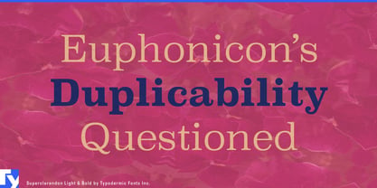




- Aa Glyphs
-
Best ValueFamily Packages
- Individual Styles
- Tech Specs
- Licensing
Basic typesetting
Letter case
Numerals and scientific typesetting
Typographic variants
Reset
Per Style:
$21.24 USD
Pack of 8 styles:
$169.95 USD
About Superclarendon Font Family
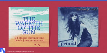
Superclarendon isn’t just a typeface—it’s a typographic time machine with rocket boosters. This powerhouse font bridges the gap between 19th-century gravitas and 21st-century swagger, delivering a visual punch that resonates across centuries.
Born from the DNA of classic Clarendon, Superclarendon flexes its muscular serifs with pride. These aren’t your grandmother’s delicate flourishes—they’re chunky, unapologetic statements that command attention like a town crier with a megaphone. The subtly squared letterforms stand as solid as ancient monoliths, yet their superelliptical curves whisper of modern aerodynamics. But don’t mistake Superclarendon for a mere historical reenactor. This font has been hitting the gym, bulking up its presence for the digital age. Its austere curls and sturdy terminals create a visual architecture so robust, it could support a skyscraper of ideas. Whether you’re crafting headlines that need to shout from the rooftops or body text that demands to be taken seriously, Superclarendon delivers with the precision of a well-oiled printing press and the impact of a precision-guided smart bomb.
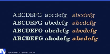
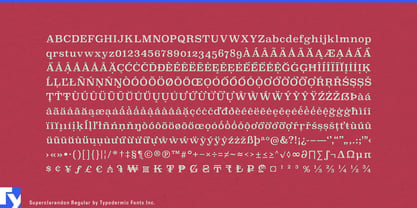
Versatility? Superclarendon’s got it in spades. With four weights, italics, and old-style numerals, it’s like having a typographic Swiss Army knife at your disposal. From light to bold, from upright to slanted, this font family’s got more range than a globetrotting polyglot. Speaking of language, Superclarendon is fluent in more tongues than a United Nations interpreter. Its extensive language support ensures your message resonates from the fjords of Norway to the sun-drenched plains of Africa, and nearly everywhere in between. It’s not just a font—it’s a cultural ambassador with a booming voice.
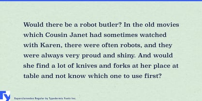
Choose Superclarendon when your design needs to make a statement that can’t be ignored. It’s perfect for brands that want to exude authority without sacrificing modernity, for editorial layouts that demand both readability and personality, or for any project that needs to stand tall in a world of typographic whispers. So go ahead, give your designs the Superclarendon treatment. Watch as your message transforms from mere text into a resounding declaration, echoing through the corridors of time and leaping boldly into the future.
Designers: Ray Larabie
Publisher: Typodermic
Foundry: Typodermic
Design Owner: Typodermic
MyFonts debut: Oct 11, 2007

About Typodermic
Welcome to Typodermic Fonts, a spirited type foundry rooted in Nagoya, Japan, started by the Canadian typeface designer, Raymond Larabie in 2001. Our library brims with 500+ diverse typefaces to fuel creativity in graphic design, advertising, web, and app development. As digital type pioneers, we adopted web fonts and app licensing early, consistently pushing the design envelope. With Canadian heart and Japanese precision, we're your global partners in extraordinary typography. Explore Typodermic Fonts—where creativity meets character.
Read more
Read less


