
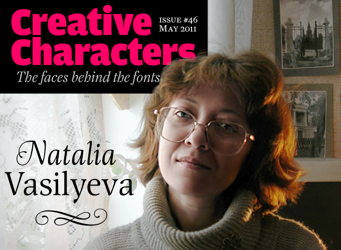
One thing that is truly amazing about today’s typographic scene is that it is so thoroughly globalized. In these past twelve months alone, we have interviewed type designers from Europe, North and South America, Thailand and Japan. Each gave us valuable insight into what is specific and what is universal about their typographic culture. This month we venture into a region few of our readers will ever visit — Siberia. Our interviewee is one of the most prolific designers of pragmatic text fonts and accomplished calligraphic typefaces for ParaType, Russia’s principal typefoundry. Yet her type designs represent only a fraction of her interests. Part scientist, part artist, in meeting Natalia Vasilyeva we discovered a designer with a technician’s head and a calligrapher’s hand, happy to show us around her lab.
You are engaged in a wide range of activities: apart from being a very productive type designer, you’re a book designer and calligrapher, editor, publisher and photographer. Could you tell us something about your background and current activities? What got you into calligraphy and type design?
Book and type design have attracted me since my school years. It’s hard to explain rationally, but I enjoyed reading a textbook titled Text Editing when I was in 9th grade, even though it seems that there’s no romance in the terms like “indentation”, “justification”, “text block” and “footer”. This manual is still on my shelf now. The technologies described in there are, of course, outdated, but many of its principles of text layout are still relevant. A little later I got the Russian translation of Albert Kapr’s book Ästhetik der Schriftkunst (“Aesthetics of typography”), and then after graduation, I read his major work “Schriftkunst” in German. I am steadily assembling a fairly good library of design books.
I graduated from the pharmaceutical faculty of a medical university and taught chemistry for a while. Computers weren’t around yet and my interest in fonts and design were only of use in making posters and greeting cards, as well as visual aids for lessons — pictures on sheets of paper. The work and study were interesting, but when personal computers and desktop publishing appeared, I changed jobs, moving to the publishing group of my university.
For the last few years I’ve worked mostly as a freelance designer. My science education has been useful, because I often have to work with books on natural science. I like to prepare a book from nothing to its final phase; that is, to receive a plain text Word document from the author or authors with a set of, alas, very unprofessional illustrations, and in the end send the result to a printer as a prepared layout with a designed aesthetic and high quality images. I have to work with raster as well as vector images, and sometimes with basic 3D graphics.
Dealing only with editing or typography would be rather boring, I always want some diversity. Fortunately the benefits of modern technology make it possible to combine several functions, and I consider a book as a whole: its design is dictated by its content. In addition, when working with interesting books you learn a lot of fascinating things — the pleasant combines with the useful. Actually, I think that the work should bring pleasure, otherwise it won’t be effective, and in the case of creative work it’s a critical matter. You’re unable to work well if your heart isn’t in it.
You live in Barnaul in southwest Siberia. To foreigners, the word “Siberia” conjures up associations with endless forests, long winters, industrial cities and, sadly, labor camps. But what is your region really like?
Siberian winters are really snowy and frosty; there are forests too, as well as heaths and mountains. Barnaul is a modern city with a rich past, a historical center of the mining industry (silver and copper). Yes, unfortunately Siberia’s history is, among other things, connected with the labor camps and with places of exile, but there is certainly more to it than that. The Altai Mountains are now a popular place for tourism, famous for beautiful scenery and archaeological sites. As for me, however, I’m something of a metropolitan, and prefer big, civilized cities. I wouldn’t call myself a staunch patriot of Altai and Barnaul.
Living so far away from Russia’s cultural centers, Moscow and Saint Petersburg, is it difficult for you to maintain contacts with your colleagues in type design and book design?
It’s not difficult, thanks to the Internet, but in many cases, of course, I would prefer personal contact. It is not so common to meet interesting people in the provinces; they tend to move to the capital. I have a much broader and more interesting social circle in Moscow than in Barnaul. Here, the level of intellectual and cultural life is qualitatively different. Generally speaking, Moscow is my favorite city. (I don’t like St Petersburg.)
I know Moscow well, and even studied photography in order to capture it the way I see it. All the walls in my room are plastered with pictures of Moscow. I haven’t really considered moving there; housing in Moscow is very expensive and out of reach. That is a critical obstacle for me. I go there once a year, I can’t imagine myself without it; that is where I am truly at home. I love the metropolitan rhythm of life and never tire of it. On the contrary, I “collect energy” for the whole year.
Orbi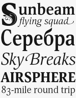
Vasilyeva’s description of Orbi as a “humanitarian” typeface is a subtle insight, and goes beyond the traditional notion of a humanist typeface. Orbi is a sophisticated set of six fonts spanning regular to black weights, including swashed characters in the regular italic. In addition there are complementary ornamental initials, a four-font Narrow version and a delightful, cursive Calligraphic.
orbi sans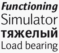
The versatile Orbi text family is well supplemented by the recently released Orbi Sans, a low-contrast sans serif with elegant forms and a humanist feel.
Nat Flight + nat vignette
Vasilyeva’s understanding of the “architecture of handwriting” permeates her entire practice, and not only her script work, as evidenced by Nat Flight, a narrow text family of four fonts with a clear calligraphic influence. Nat Vignette is a two-font set of elaborate ornaments and borders.
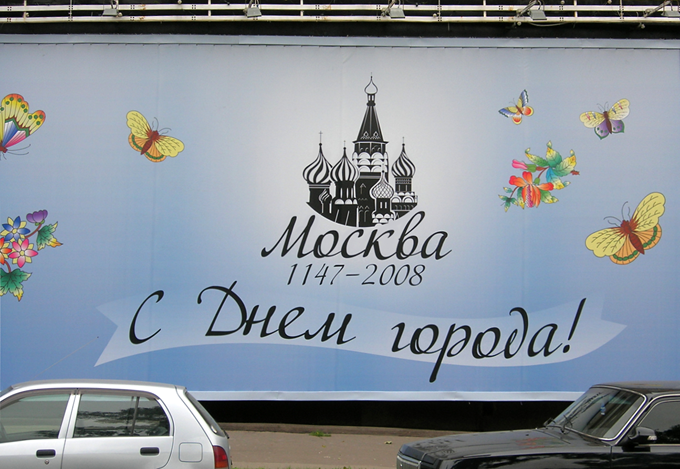
ParaType fonts by Natalia Vasilyeva and others are often seen on billboards across Russia. This one, celebrating Moscow, uses Vasilyeva’s calligraphic font Adventure.
How did your collaboration with ParaType come about?
I was at refresher courses on publishing at the University of Printing Arts once and asked one of the teachers if any of the university’s staff were engaged in font design. He referred me to the TypeMarket company, and I met its director Alexey Shevtsov, who seemed to appreciate my enthusiasm and offered to cooperate. When TypeMarket teamed up with ParaType, I was invited to work for them. I’m very grateful to ParaType’s staff and especially to Vladimir Yefimov for the opportunity to learn a lot. It was like that — I didn’t receive any coaching or formal training but instead, meaningful communication with qualified, friendly professionals and interesting people contributed so much to my professional progress. In general, the company’s staff were understanding and supportive of me. It’s an excellent yet informal community of enthusiastic people.
The list of typefaces you have designed is quite impressive, and many of them are original designs. How do you decide what new typeface families to work on? What are your sources of inspiration?
It is hard to articulate in a nutshell. I started by designing text faces for setting books, since the choice of existing fonts was very limited, and I had this inner drive towards more creative design. Some of these early experiments, naturally very imperfect at first, were subsequently refined, corrected and then released by ParaType, while others are still waiting for their turn. Sometimes ideas will just leap into my mind; other times I notice and like some detail in a typeface and want to evolve a design idea; and sometimes it’s necessary to make a type for a specific requirement. I’ve liked calligraphy ever since I wrote a variety of gifts and festive slogans by hand. Now I prefer digital technologies, but because I know the architecture of handwriting well, it helps make its electronic version more natural.
In general, the art of type attracts me because aesthetics are so important to its proper form; the image does not refer to some graceful object or landscape, like painting does, but exercises an aesthetic effect of its own. A beautiful typeface is similar to a beautiful melody. It can be compared to music as much as architecture.
You sent some very nice sketches of fonts. Is sketching (or in the case of calligraphic fonts, writing) on paper still an important part of your type design process?
No, I usually draw directly in outlines [on the computer]. For me, working with Bézier curves is a habit. Exceptions are just sets of vignettes and some images for a picture font which were drawn on paper, then scanned and traced. Computer drawing has already become natural for me. I use a graphic tablet: movements and feelings are almost the same as in a real drawing on paper, but possibilities to edit and modify results are much greater. Similarly, I work on (technical) illustrations for books, including images of people and objects. I even used a graphic editor (Corel Photo-Paint) to draw my family’s New Year greeting cards featuring figures of animals.
I begin working on a new typeface with Latin, starting from the most representative letters — a, c, g, s — which mostly determine the nature of the text. Cyrillic symbols are constructed according to the style established in the Latin alphabet. I proceed to work directly in a font editor, and not “from scratch”, but using some existing font file as a template ? it’s more convenient technically.
I rarely make sketches on paper, and only ever for a few individual letters or their elements, as there is nothing to prevent experimentation on the screen. The pen of a graphic tablet is the same as a pencil, and to move the point of a Bézier curve isn’t more difficult than drawing a line on paper. There’s a stereotype that computer graphics are something mechanical and formal, but in reality it all depends on the author; the tools used to implement the plan don’t matter.
Deca sans & Serif
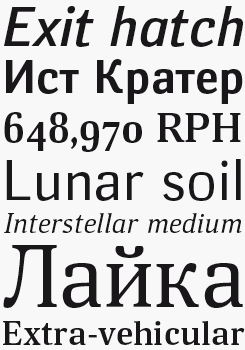
Deca Sans & Serif combine to form a robust and businesslike ten-font superfamily, with six fonts supplied from the sans side, and four from the serif. Its official air and sturdy squarish shapes will suit sober-minded projects in the legal and scientific worlds, especially those with complex text hierarchies to manage.
Barnaul Grotesque
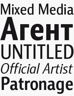
Barnaul Grotesque, named for Vasilyeva’s home town in southwestern Siberia, is pragmatic titling and display font in eight weights. Its low contrast and even proportions will make it a practical choice, especially online where its tall and rather narrow uppercase characters will suit the current vogue for all-caps titles.
As you have a scientific background, are you specifically interested in the programming aspects of type design, such as OpenType, automation of the process, and Python scripting?
Yes, computer technologies always interested me. By nature I’m much more of a developer and researcher, rather than user. Ever since childhood I’ve been wondering (for a variety of objects and processes), “how is it organized, how does it work?”
Pressing the keys mechanically is rather boring. I was fond of programming and wrote some application programs for data processing (building of spectral curves, statistics) while working at university, since there was a lack of suitable software.
When I work on type, my goal is to create a full-scale final product, that’s why it must include all the advantages of OpenType, high quality kerning, etc. So, my immediate interest is the technological aspect of working on type. I had to learn the basics of Python for writing macros, since I had not used it before (I was familiar with BASIC, Pascal and partly with assembly language). However, I’ve never found anything really complicated there, it was rather interesting to practice writing scripts in a new language. I’ve also got a great opportunity to automate routine tasks and make it in a way so that it’s convenient for my workflow.
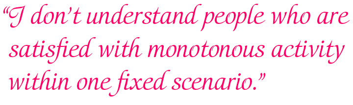
To learn new technologies and to study in general is very interesting, and in my opinion we have an obligation to understand the internal essence of any object we’re dealing with. I don’t understand people (and there are plenty of them) who are satisfied with monotonous activity within one fixed scenario.
The script you use on a daily basis is Cyrillic; did working with the Latin alphabet feel alien to you when you first started working with type? Do you find that you favor one alphabet over the other?
No, I don’t consider the Latin alphabet as alien. On the contrary, it seems to me far more attractive than Cyrillic and gives more opportunities from a design point of view. There are more variations in character shapes, many more descenders and ascenders and more rounded contours, which make a text line, firstly, more lively, not monotonous, and secondly, more gentle and not so regular. Cyrillic reminds of a fence due to the abundance of identical vertical strokes.
Furthermore, English quotations and names of literature sources occur very often in the scientific texts that I work with constantly, which is why the Latin alphabet is also important for me in the practical sense.
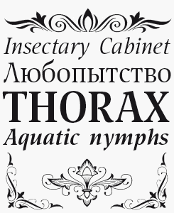
Adonis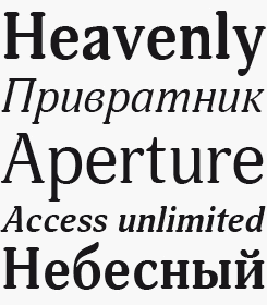
A soft and rather narrow text and display face, Adonis is a general purpose typography tool, perfectly legible at small sizes, compact enough to make it an efficient space-saving choice, and with enough character to work well in headlines — on both screen and paper.
Liana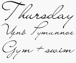
One of Vasilyeva’s early pieces for ParaType, Liana remains one of her bestsellers — an unembellished, yet rather attractive handwriting font with a distinctive set of expansive capitals. A good choice for anything requiring a legible, informal script, from packaging to book covers.
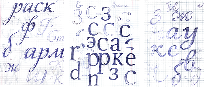
Ballpoint pen sketches for Elina Decor, Nat Flight and Orbi Calligraphic.
Many samples of Cyrillic handwriting I’ve seen have certain characteristics in common — they are charming, very carefully written and kind of picturesque. This seems to have influenced Russian type design: even book faces are often more baroque than type from Western Europe or North America. While many of your typefaces have slightly painterly qualities, some of your more recent typefaces, such as Orbi and Deca, seem to move in a more sober and international direction. Is that a conscious decision? Have you looked at specific examples for those families?
I’m not an art critic and I cannot claim to have an authoritative opinion, but I don’t have the impression that Cyrillic fonts are more decorative. On top of that, many popular Cyrillic text fonts (Literaturnaya, Academy, Schoolbook, Baltica) were based on prototypes designed by Western foundries. In Russian culture (of which type is but a small part) there are a lot of things adopted from the west, and I don’t consider it as something bad, quite the contrary. In general, the history and tradition of Latin writing are much richer than Cyrillic and the range of Latin types, both historical and contemporary, is much more extensive.
I often look through catalogs of fonts designed by foreign companies “for inspiration”, but I don’t engage directly in copying. I also don’t set out to create a typeface in a certain style or direction, the design is just taken out of my head (Deca and Orbi included). But when I work on any font family, I think about the scope of its possible use. I have designed fonts for humanities textbooks and for books of natural science disciplines. The first kind of typeface are sleeker and contain more decorative freedom, the second are simpler and more rigorous. Deca is a “natural science” face, Orbi is rather “humanitarian”. This division is subjective, but there’s no doubt that type has an emotional impact on readers, even if they do not realize it. For me, it’s one of type design’s most attractive qualities: the ability to convey a certain emotional attitude through abstract forms — in essence, through the letters themselves.
Thank you! It has been a pleasure getting to know you. We’re curious to see what fonts you’ll come up with next!
Elina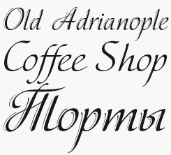
Featuring normal and decorative versions, Elina is a fine example of Vasilyeva’s calligraphic ability. Replicating a broad-nibbed pen technique, the decorative variety adds a shadowing keyline — perfect for a more tasteful approach to setting advertising headlines without having to resort to a drop-shadow effect.
Emploi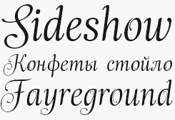
Emploi Ingenue and Travesti are a pair of non-connecting display scripts which would work well in a multi-level hierarchy requiring several types of headline or section title.
MyFonts is on Twitter and Facebook!
Far from being an anonymous conglomerate, MyFonts is a (surprisingly small) group of real people passionate about type, design and digital communication. Our team members all contribute to our Twitter and Facebook pages on a daily basis, so join the MyFonts community and enjoy tips, news, interesting links, personal favorites, musings and more from MyFonts’ staff.

Who would you interview?
Creative Characters is the MyFonts newsletter dedicated to people behind the fonts. Each month, we interview a notable personality from the type world. And we would like you, the reader, to have your say.
Which creative character would you interview if you had the chance? And what would you ask them? Let us know, and your choice may end up in a future edition of this newsletter! Just send an email with your ideas to [email protected].
In the past, we’ve interviewed the likes of Michael Doret, Laura Worthington, Jonathan Barnbrook, Chank Diesel, David Berlow, Hannes von Döhren, Veronika Burian and Jos Buivenga. If you’re curious to know which other type designers we’ve already interviewed as part of past Creative Characters newsletters, have a look at the archive.
Colophon
This newsletter was edited by Jan Middendorp and designed using Nick Sherman’s original template, with specimens and type descriptions by Anthony Noel.
The Creative Characters nameplate is set in Amplitude and Farnham; the intro image features Emploi, Nat Flight and NatVignette One; the pull-quote is set in Orbi Calligraphic Three; and the large question mark is in Farnham.
Comments?
We’d love to hear from you! Please send any questions or comments about this newsletter to [email protected]
Subscription info
Want to get future issues of Creative Characters sent to your inbox? Subscribe at www.myfonts.com/MailingList
Newsletter archives
Know someone who would be interested in this? Want to see past issues? All MyFonts newsletters (including this one) are available to view online here.