photo by Eben Sorkin / Eyebytes
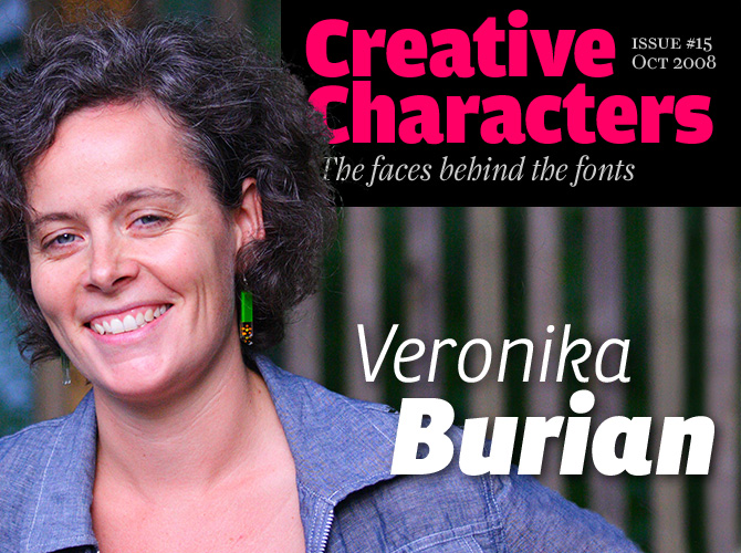
She’s one of the type world’s most cosmopolitan type designers, having lived across Europe and recently moved to the United States. She was one of the first graduates of the renowned MA program in Type Design at the University of Reading, possibly the most multi-cultural curriculum in type design. After spending several years as an in-house designer at the Dalton Maag foundry in London, she founded TypeTogether with Argentinean José Scaglione in 2006. Their long-distance collaboration has resulted in a rapid succession of quality typefaces. Meet Veronika Burian (Vik to friends and colleagues), one of the hardest working women in type design.
Veronika, you were born in Prague, grew up in Southern Germany, worked as a designer and teacher in Milan and learned the fine points of designing type in England. To what extent has each of these cultures influenced your work?
These different experiences deeply influenced my general personality and made me, I believe, tolerant and open-minded. I think this also manifests itself in my work, because I don’t feel I have a specific style in my typefaces (but please correct me if I am wrong!). One could possibly summarize it this way: From the Czechs I learned expressionism and vitality, from the Germans perseverance and methodology, from the Italians openness and warmth, and from the Brits I got contacts and marketing skills.
Your initial education was in Industrial Design. What made you switch to type? Do you think your approach is different from other type designers because of that background?
I came to designing type via some detours. I was getting disillusioned with the reality of product design and moved increasingly towards graphic design. A friend, who is a type enthusiast, introduced me then to the world of type design and it was like falling in love. I knew I had found something I really enjoyed and felt at home with. There is actually a link to my previous education as product designer. Both fields ideally endeavor to improve the experience of an object from the user’s point of view, be it a good piece of typography or a comfortable chair. Creating things that have meaning and a function is very satisfactory.
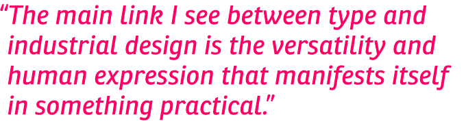
I don’t think I am particularly influenced by my previous education as product designer. However, it surely sharpened my eye for detail, proportions and sense for shapes in a way that is different than a graphic designer would have. The main link I see between the two is the versatility and human expression that manifests itself in something practical.
Bree
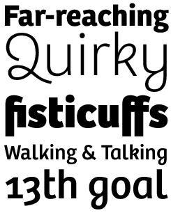
Based on the TypeTogether logo, Bree can be considered the foundry’s signature typeface. Like many of TypeTogether’s faces, Bree was a joint project by the Veronika Burian and José Scaglione. Bree’s design is clearly influenced by handwriting and has many characteristics of an upright italic: a single-story a, cursive e, curved outstrokes on v and w, and more. When a more classical look is desired, alternate lettershapes are available for each of these. Bree is a pleasant and lively sans-serif with a polished look — ideal for branding or magazine headlines.
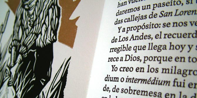
Athelas in use in the edition of a selection of works by Pastor Obligado: Tradiciones Argentinas, published by The Society of Argentinian Bibliophiles
You perfected your type designing skills at the University of Reading, one of the few institutions that offer a specialized course in type design. Would you say there’s something like a “Reading School”: a specific methodology or stylistic approach?
Well, I guess many people would say there is. The MA course was at its beginnings when I was there, so the curriculum wasn’t very fixed yet and [program director] Gerry Leonidas improves it continuously as a result of his students’ feedback. Something particular to Reading, though, is the focus on non-latin typography. They have amazing resources there and people like Fiona Ross are fabulous teachers in that particular field. Also, the academic part of the course is rather strong. Personally I enjoyed that and found it important for my general development in the field. They’ve reduced it a bit since I was there, though. Other than that I don’t really think there is a specific design style being imposed on the students. They are left free to experiment and find their own sources of inspiration. However I did notice, in some of the students’ work since my time there, a clear influence from Gerard Unger, who has a special style himself.
Many type designers are self-taught. Would you say that a formal education in type can help you acquire skills or open up perspectives that are hard to arrive at when finding out things on your own?
I wouldn’t say that a self-taught type designer is by default worse than somebody that was formally educated. However, I do think that it is faster and easier to learn when attending a type course such as the one offered in Reading. There is better and broader access to resources such as archives, teachers and guest-lecturers. This will deepen one’s knowledge and skills and it will establish future contacts. There is also intellectual and direct exchange with people with similar interests, who will give you important feedback. I learned almost as much from my fellow students as from the teachers themselves. Also, not to forget the fact that doing an MA or similar, guarantees one year of concentration on type design. This rarely happens in the real world and therefore it takes much more effort to learn type design on your own. However there are online forums, conferences and small courses that surely allow for some degree of exchange and learning.
Ronnia
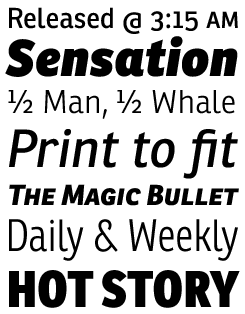
Ronnia, another joint design by Burian and Scaglione, is a versatile sans-serif in two widths (Normal and Condensed) and five weights, from Light to Heavy. Ronnia has the qualities of a typeface engineered for newspaper and magazine applications: economic in use, highly legible, and approaching the reader with friendliness and charm. Ronnia’s personality performs admirably in headlines, but thanks to its humanist touch and open shapes it is also highly legible in continuous text. Ronnia features about 800 glyphs per weight, including small caps, fractions, and many styles of numerals. Ronnia Basic has a reduced character set, although its language support does include Central European and Baltic.
Who have been your main teachers, either through their personal teachings or through their work and writings?
At Reading there were mainly Gerry Leonidas and Gerard Unger, both of whom were influential teachers for me. I still admire Gerry for keeping his confidence in me and encouraging me despite my amateurish sketches at the beginning. Also I should mention Maxim Zhukov, who was incredibly helpful when I was designing Maiola Cyrillic. He made me understand the subtleties and typographic rules of Cyrillic. And last but not least, there has been the example of two designers who are long gone — Oldřich Menhart and Vojtěch Preissig, who influenced me through their passion and vigor in their work.
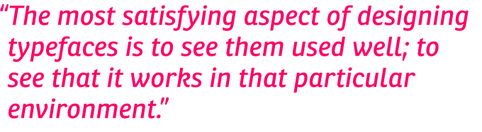
What is the most satisfying aspect of designing typefaces?
The most satisfying aspect of designing typefaces is to see them used well; to see that it works in that particular environment.
You mentioned Menhart and Preissig as influences; you even wrote a lengthy essay on the former. What is it that attracts you in their work? Is part of the attraction in their specifically Czech or Central European spirit? What are the most important things you’ve learned from them?
When I started at Reading, I didn’t know anything about Czech type design. So I was delighted when I found some books in the library that showed some beautiful Czech specimens. I looked into it further and discovered Menhart’s and Preissig’s legacies. Their work attracted me not only because they were Czech, but also because they showed such vitality and vigor. At the same time as being expressive, their typefaces — in particular Menhart’s — are also very legible and functional on the page. This combination fascinated me. In addition to their approach on designing diacritics properly, Menhart’s typefaces also taught me that calligraphy, in a broader sense, is important; it is where the origins of our alphabet lie. Studying the flow of a broad-nibbed pen is crucial for understanding the correct letter structure and contrast. However, I am not fully embracing his credo of calligraphy being the cradle of type design.
For several years, you worked for Dalton Maag in London, developing mainly custom typefaces such as Tondo. Does designing a custom typeface require a different attitude or approach than making a self-initiated font for retail?
Well, one big difference is time, I’d say. With client work there is always a deadline, often a very tight one. It is common to design a four-weight family within a few weeks. Also you have to be flexible, and sometimes design something you don’t particularly like or agree with. Ideally the client trusts your judgment and authority on this subject, but it also happens that you have to explain typographic terms and conventions to them; all of which can be very difficult.
Crete
Veronika designed Crete after spotting an interesting piece of wall lettering in a chapel on the Greek isle of Crete. The result is an unusual display font in two variations: Thin, with flat, Bodoni-like serifs, and Thick, sporting sturdy slab serifs. Both varieties have exactly the same width, so they are fully interchangeable without causing the text to reflow — opening up great possibilities for experimental mixes. However, Crete also works nicely in a more conventional text environment.
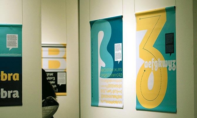
Posters showcasing Bree at an exhibition of TypeTogether’s work in Rosario, Argentina at CEC (Centro de Expresiones Contemporáneas)
Having published one typeface, the wonderful Maiola, as part of the FontFont library, you founded TypeTogether with José Scaglione, whom you met while you were both studying in Reading. What made you decide to create your own foundry, and do it together?
I always enjoyed working independently more than being employed. I decide what I want to do and when; and quite honestly, financially it’s more lucrative too. José told me about his wish to create a foundry some day, and at some point I thought it would be a great idea to share our skills and experiences. So we started to work on the project that later became Karmina. It worked out really well and things developed from there.
You live in the Denver area and José in Rosario, Argentina — do you actually meet sometimes to work together?
This past May, I went to visit José in Rosario on the occasion of our exhibition and that was the first time we saw each other since we started TypeTogether, over 2 years ago. It was great to actually sit in the same office and discuss projects directly, but I don’t think it’s necessary in order to have a fruitful collaboration. It is more important to have mutual trust and respect, and obviously a fast internet connection with Skype! As a design process, usually one of us has an idea for a new typeface or thinks it necessary to expand an existing one. José or I then prepare some characters, we discuss the design direction, start to expand the character-set and give each other feedback. Basically we send the files back and forth and mark the glyphs we worked on. We also talk almost every day and discuss the workload.
Your typefaces are all quite serious and well wrought. Would you see yourself designing a display or script typeface?
One should keep the options open and I have done some display style typefaces for Dalton Maag. However, there are already some very good script and display faces around, so I don’t feel I can contribute as much as I can with text typefaces.
What does TypeTogether have in store for us in the near future?
We’re working on several new typefaces, both serif and sans-serif, and we’re preparing some extensions to our existing library. There are also some exciting releases planned from our third-party designers, all of them Reading graduates.
Karmina
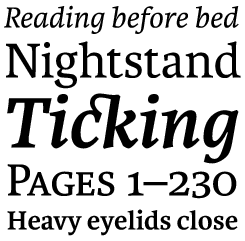
The prize-winning Karmina was designed to be virtually indestructible, even under poor printing conditions and on low-quality paper. It is ideal for pocket-sized books or periodicals printed with high-speed presses.Karmina’s structure is characterized by a large x-height combined with relatively narrow letterforms, resulting in outstanding legibility and economy. Its sharp-cut shapes and long serifs lend it suppleness and clarity, as well as optimum legibility in small sizes.
 Veronika’s partner in TypeTogether is José Scaglione, based in Rosario, Argentina. Having worked in branding, editorial design and multimedia projects since 1995, he left Rosario in 2003 to complete his MA in Type Design at Reading, and moved back home after graduation. He now leads his own studio for editorial and corporate design. We asked him a few questions about his work as the other member of TypeTogether…
What is it like to collaborate with a designing partner whose studio is a few thousand miles away?
Well, it is certainly different from collaborating face to face, but nowadays there are good tools to allow this kind of collaboration to be successful. We use internet-based tools for communication, which works very smoothly. What we can’t easily solve is the time zone difference. I am usually three or four hours ahead of Veronika. But since I often oversleep and she is an early bird, I would say it is not a big problem.
When you co-design a typeface, who does what?
We don’t really look at it in terms of splitting tasks. We like working on several typefaces at the same time and doing different stuff so we don’t get bored. Both of us can take care of any part of the process. The basic and most important rule is that the one who designs a shape should not correct it. In other words, if I design a few glyphs it is up to Veronika to check them and fine-tune them, and vice versa. The font goes back and forth many times until we are happy with it. I think we trust each other’s judgment a lot, and that makes it a very easy and interesting collaboration methodology. Plus, it can accelerate the type design process significantly.
If I understand correctly, you’re now permanently based in Argentina again after a prolonged stay in Reading. What do you think about the recent developments in Latin American type design?
Yes — I moved back to Argentina a couple of years ago. We are seeing very exciting times on the Latin American font scene. This year’s type exhibition Tipos Latinos showed that more and better fonts are being produced than ever, with more than 400 fonts submitted. There are now three schools in Latin America where it is possible to study type design, and I understand attendance will be very good for 2009. I also see that the rest of the world is observing the growing Latin American type scene with a lot of interest. For instance [the worldwide typographic association] ATypI will host next year’s conference in Mexico, the first time ever in a Latin American country. All this being said, I have no doubt that type design in this region is still in its adolescence, and I expect an improvement in quality over the next couple of years, partly driven by these new design courses and the growing interest in the field.
Thanks, guys! We are looking forward to those new fonts from TypeTogether!
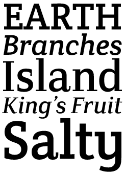
Athelas
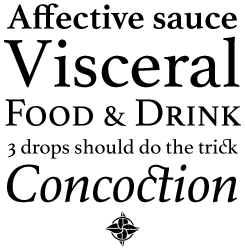
Athelas originated as a project by Scaglione and was completed as a joint venture with Veronika; it is probably the most traditional-looking of TypeTogether’s faces. Inspired by the great literary classics, Athelas is an homage to fine book printing. According to its designers, “Athelas takes full advantage of the typographic silence, the white space … between the columns, the lines, the words, the lettershapes and within the characters themselves.” Athelas will look best in carefully designed book editions, printed on a quality offset press.

Who would you interview?
Creative Characters is the MyFonts newsletter dedicated to people behind the fonts. Each month, we interview a notable personality from the type world. And we would like you, the reader, to have your say.
Which creative character would you interview if you had the chance? And what would you ask them? Let us know, and your choice may end up in a future edition of this newsletter! Just send an email with your ideas to [email protected].
During the past year, we’ve interviewed the likes of Christian Schwartz, Dino dos Santos, Jim Parkinson, Mário Feliciano, and Underware. If you’re curious to know which other type designers we’ve already interviewed as part of past Creative Characters newsletters, have a look at the archive.
Credits
This month’s interview was conducted & edited by Jan Middendorp and designed by Nick Sherman.
Supporting fonts
The Creative Characters masthead is set in Amplitude and Farnham; the intro image features Bree, as do the pull-quotes; the large question mark is set in Farnham, and the small URL at the top is set in Unibody 8.
Unsubscribe info
This message was sent to:
[email].
It is never our intention to send unwanted e-mail. If you no longer wish to receive this newsletter, you may change your subscription settings at: www.myfonts.com/MailingList
Comments?
We’d love to hear from you! Please send any questions or comments about this newsletter to [email protected]