
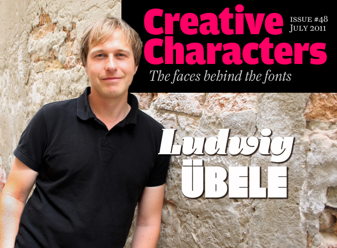
This month’s Creative Characters newsletter marks the fourth anniversary of our series of type designer interviews. One of the things that people find most amazing about these portraits is how different all these designers are. Take this month’s interviewee. In an era abounding with businesslike sans-serifs and exuberant script faces, he chooses to design text families that are quietly unorthodox: sophisticated in detail, modest and readable in small sizes. For this designer, typography means being able to see both the forest and the trees; serving the content while still providing it with a unique voice. Throw in some extremely inventive display faces, and it’s clear that, in root and branch, Ludwig Übele has typography covered.
We conducted the interview in German; the original text is available on our German sister site, MyFonts.de.
Following your graduation, you worked for several design agencies. Did you find the work rewarding or satisfactory? How did you get to type design as a specialization?
I was already interested in type and typography as I was studying for my graphic design degree at Augsburg College, where it was my primary focus. I’ve always felt that type offers more substance because it is such an integral part of our culture, with a history that goes back thousands of years. And although letters are everywhere, and everyone is constantly using them, only very few people are consciously concerned with the forms of the letters themselves. I also liked the restriction to simple shapes: black and white, form and counterform. It was while working in those agencies that I realized that the jobs that dealt mostly with typography and fonts were the ones that were most interesting to me.
About five years ago you decided to take a year off and move to The Hague, the Netherlands, to take the renowned type design course at the Royal Academy (KABK). How important a decision has that turned out to be? How has the learning influenced your approach and style?
The Hague was an important turning point in my career. Only after completing that course did I feel ready to concentrate fully on designing type. It was a very productive period in which I learned a lot about type design. To see a font as a whole, for example, and to work simultaneously across the entire alphabet instead of getting lost in details. I am convinced that a typeface that consists only of interesting details is not a good typeface. Those details that one believes to be original can actually be disturbing.
I’m not sure if I have a style of my own. But I must say I tried, in The Hague and later, to achieve a personal approach to type design. Right from the start I’ve tried to avoid the typical “The Hague look”. If you look at my Marat, which for the most part was developed there, I believe you can see that I managed to make something of my own.
Augustin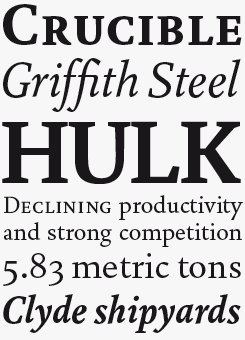
Neither a revival nor exactly a re-interpretation, Augustin is Übele’s contemporary Jenson renaissance oldstyle book face. A compact text family of just two weights and three styles (regular, italic and small caps) won’t be the all-purpose workhorse that many of today’s superfamilies present themselves as, but confident typesetters will relish the opportunity to build their own sophisticated hierarchy using Augustin’s clean, crisp elegance as a base, while its comprehensive character set makes it a very suitable tool for expert book typography.
Indeed, your letter forms are often rather striking and original. Do you have examples or heroes in the field of writing and lettering?
I love the typefaces of Bram de Does and Roger Excoffon. Bram de Does’ Trinité and Lexicon are among the most beautiful contemporary oldstyles I know. Their calligraphic character lends such warmth to the overall text image, making it a pleasure to read. As for harmony and regularity, I think de Does has perfected type design. No single character is conspicuous, but as a whole his typefaces constitute a very unique, lively text image on the page, full of character.
Excoffon’s faces are more experimental, even tougher in a way. Antique Olive is totally weird typeface in its details, and yet it works brilliantly. Vendome, which he created together with François Ganeau, has always fascinated me because of its distinctive and self-confident forms.
Gerard Unger’s typefaces, too, have influenced me a lot. I like the clarity and objectivity of his designs; the idea behind them is more clearly visible, and they are somewhat more technical in their drawing than most others. Finally, I think the sans-serifs of Georg Salden are among the best that have been designed in the digital era.
Georg Salden is considered a special case in German typography — highly original, but also a lone wolf who, for instance, never wanted to work with distributors. You now take care of his website and shop, TypeManufactur. Can you tell us something about this collaboration?
It happened by coincidence. Initially, I was just supposed to make an OpenType version of Polo, his most successful type family. Salden didn’t know that I had admired his type designs since my college days. We immediately had an understanding, and he asked me if I could take over the distribution of all his fonts. I now produce the OpenType fonts, and digitize those typefaces that do not yet exist digitally. You know, Salden has designed type for over 50 years, and in that time has created more than forty families, drawing all the individual styles by hand. I still have quite a lot to do there…
Daisy
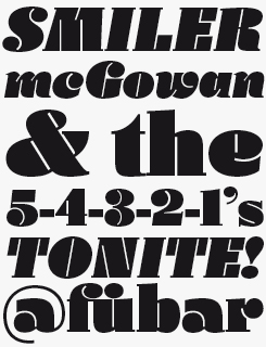
One of the harder aspects of typeface design for non-type people to grasp is how the counterform — the white, negative space of a letter — can be so important. Yet it’s often the counterform that defines the letter, especially in something as heavy and thick as Daisy. Übele says of his concept for this typeface: “The counter consists only of a thin line, which defines the drop-shaped terminal. Most heavy typefaces are sans-serifs with no contrast; why not create an extremely fat typeface based on classic old face letterforms?” While many extreme display faces are only suitable for a couple of uses, Daisy is different; its origins in more conventional letterforms will ensure it will work well in a wide range of applications, from advertising, branding and packaging to editorial and titling work.
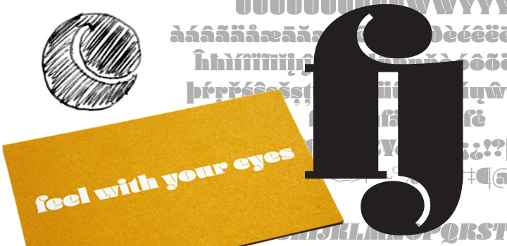
Daisy’s details. Above left, the original sketch of the counterform’s basic principle. Right: the gorgeous ligature you need to spell “fjord”. Bottom left: business card designed with Daisy by Jürgen Hefele.
Many quality-conscious type designers see a well-developed text font family as the highest goal. You have successfully combined serious text families such as Marat and Augustin with playful fonts like Daisy. How you manage this balancing act?
I am simply trying to design new, lively and readable letters. In the first stage of a project it does not matter to me whether it is going to be a text or a display font. Having said that, I often find so-called text faces more interesting because they are designed for immersive reading and need to work well in small sizes. I’m interested in how to make a font as a whole — not so much the individual letters — and how to create a specific text image that is both interesting and enjoyable to read. The framework for the design of text fonts is much narrower than for experimental fonts. In order for me to be able think freely and to come up with new ideas, it is important for me to simply sketch away and not think about the eventual uses of the typefaces. The next design phase will determine whether it is any good for a text face, or whether it is more experimental.
The Daisy typeface is a good example to illustrate my design process. My initial idea was the c (see illustration, above). I liked the idea that the inner counterform of the letter only is only a fine white line that marks the drop serif. That white line then provided the gauge for all other inner shapes. At first, the counters were much finer than in the final version, and it would certainly have been possible to refine it down to the barely perceptible. I did, however, want the font to remain enjoyable in smaller sizes as well, and did not want the white lines to disappear completely. Later, the shape of the c changed again, to make it fit better with the other letters.
Is it important for your work as a type designer to have worked as a “user” in design agencies for a considerable time?
Not really. But it is important to work with your own fonts during and after the design process. Often when using them, you discover certain inconsistencies that could not be recognized on test prints. It is of course even more interesting to have a typographer use the typeface in the development stage, so that you get feedback.
Can you describe the working process, when making a text typeface like Marat??
It always begins with an idea. With Marat, there were actually two. On the one hand, it was to be a typeface for magazines, brochures or corporate use rather than for, say, novels. Unlike books, most magazines contain many different types of information (from long, linear texts up to very fragmentary information). Different weights, styles and sizes appear on a page. Marat was to cater to these different needs: open and readable for small point sizes, compact for headlines and narrow columns.
But also (on the other hand), some formal features of Marat were the result of an experiment with Erik van Blokland’s Superpolator. I moved ink traps gradually from right to left and from top to bottom, and then decided on one specific option from a large number of results. [Type geeks can find the relevant drawings on our German blog.] Originally Marat was intended to be a sans, and in fact, the very first drawings had no serifs. Therefore there will soon be a Marat Sans.
Do new sophisticated font design tools from people like Erik van Blokland and Tim Ahrens play an important role in your design process?
No, they don’t really play a role when designing. Whether I design using a pencil, or directly on the computer screen, nothing in the initial phase is automated. It seems that some designers automate the design of the serifs, or stroke thicknesses, resulting in equal values in every letter. That’s not the way I work. On the contrary, I think that leads to lifeless monotony. However, these tools naturally play an important role when it comes to expanding the design into a full font family, for instance when making accented characters or creating many weights.
Marat
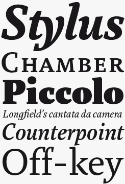
Originally conceived of as text face for magazine design, Marat’s obvious advantages in that category — good legibility at small sizes, compact letterforms that make narrow columns and compressed headlines easier to set — have seen its appeal broaden to include book design as well as corporate design and branding. Available in Standard and Pro versions, the former would suit most everyday uses such as corporate literature, newsletters and so on, while the Pro is suited for those with more serious plans for complex books, journals or newsprint.
Mokka
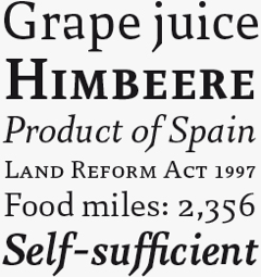
Of Übele’s three oldstyle text faces, Mokka is the one with the most idiosyncratic detailing, which, thanks to a few interestingly individual letterforms, makes for some striking headlines while managing to retain an even tone in text settings. It won’t always be a popular choice for mainstream corporate literature, but those brands and publishers who like a little edginess to their image will appreciate its subtle little convention breakers.
Is the use of digital tools for you always a positive thing, or do you like making things without using a computer?
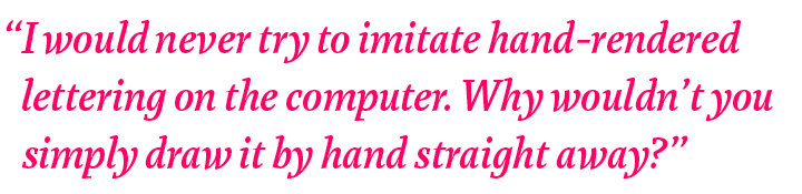
I try to do as much as I can by hand, even more now than before. Not necessarily because I think it is better, but because it I think it is more fun to sketch with a pencil, than to just sit at the computer. But of course, the digital outlines offer unbeatable advantages: for example, I can immediately print out a text in various sizes and am immediately able to see how the font functions. But I would never try to imitate something “hand made” on the computer. I’ve never understood why people use digital fonts that look like hand-rendered lettering. Why wouldn’t you simply draw it by hand straight away?
When you published your first fonts, you did it through a type label of your own, rather than at one of the larger existing type foundries. Why did you decide to “go it alone”?
Because it was so easy. One does not really need a big foundry any more today. You can make fully functioning fonts all by yourself. To sell them you only need a website. Done! However, I did not realize how difficult it would be to draw attention to myself and my typefaces. So that was why I began offering my types at MyFonts — to reach a wider circle of people that might be interested. My latest typeface, Tundra, which has won a TDC2 Award this year, just like Daisy, has just come out as part of the FontFont type library. That, too, is an attempt to reach a new clientele.
You don’t only make retail fonts, but also do commissioned work. What kind of clients do you work for? And what does your work week look like?
There’s a few corporate identity and packaging companies for whom I work regularly. It’s almost always a font-related thing, mostly lettering and logos, and from time to time a custom-made font. However, I spend most of my time on my own designs. I usually work on several typefaces at the same time. In the end there are many that remain hidden in the drawer because I do not think they’re good enough. Or that I plan continue working on at a later stage.
Berlin, where you now live, has become one of the most prominent cities of the type world, with many successful young designers living there, among them Hannes van Döhren, Verena Gerlach, Ulrike Wilhelm, Jan Fromm, Dan Reynolds. Why is that, do you think? And what does it mean for you to work in this city?
Berlin is very attractive for creative people in general. The cost of living is low, the environment and the surroundings are inspiring. But that does not influence my work directly. Only perhaps in the sense that I can work calmly, because I have less overhead.
Walhalla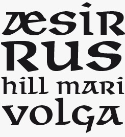
Inspired by the work of 1940s Czech designer Oldrich Menhardt, Walhalla is an uncial script — the category of hand lettering that originated in the latter half of the first millennium and eventually led to our modern lowercase characters. In many readers’ minds, this style will evoke a kind of celtic/gaelic/medieval feel, so Walhalla has obvious possibilities for certain genres of entertainment packaging, branding for heritage tourist attractions and fantasy fiction.
Walhalla Sans
Walhalla Sans is Übele’s experiment with making a sans uncial — with interesting results that feel more like science fiction than the historical variety.
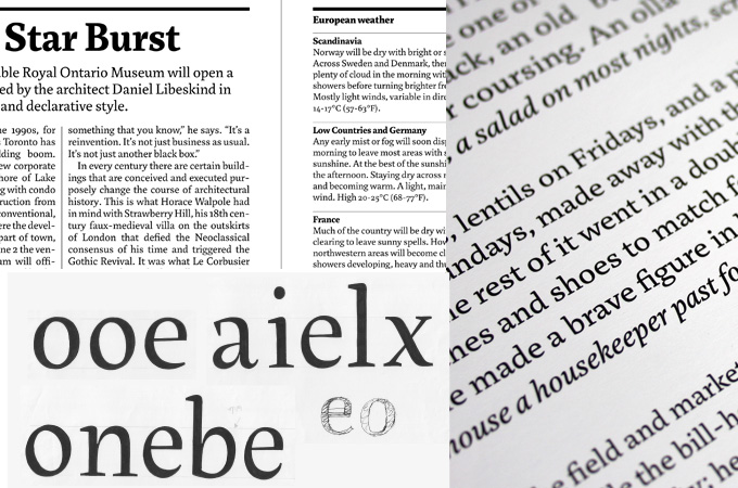
Sketches for Marat, and examples of its use in magazine and book typography.
Do you often get to see what others do with your fonts?
No, I rarely get to see my fonts in use. But I am happy when my typefaces become part of a beautiful project, a good book or poster, for example.
What would be your dream typographic project?
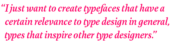
I do have a few dreams, but they have little to do with typography, really. I could say that I would love to create a special typeface for a major institution, such as a famous museum or a large publisher or a major newspaper. And that is certainly true. But in fact I just hope to create typefaces that have a certain relevance to type design in general, types that inspire other type designers.
What is a type designer’s worst nightmare?
Hard drive and backup down the drain with all the data gone. But luckily all the font files are still on the MyFonts server. :-)
There are more and more graphic design students wanting to specialize in type design and lettering. What would you recommend to them?
I would advise them to think about it very carefully. Type design is a craft that you acquire only with great effort and work. Like any other craft, it takes a lot of experience to become a master. As for me, I have been designing type for more than ten years, and would still describe myself as an apprentice.
Thank you for your wise words. We’re looking forward to seeing Marat Sans soon.
Helsinki
Übele’s only sans-serif to date, Helsinki’s suitability for longer text settings belies its origins in the realm of engineering — specifically, the engineers who created Finland’s road signs. That legacy in signage is most obvious in the two weights at the extreme ends of the spectrum (Hairline and Fat) which are both very effective headline faces, while it’s the middle weights that have received Übele’s expert attentions, ironing out the rough edges to create an even text page.

Who would you interview?
Creative Characters is the MyFonts newsletter dedicated to people behind the fonts. Each month, we interview a notable personality from the type world. And we would like you, the reader, to have your say.
Which creative character would you interview if you had the chance? And what would you ask them? Let us know, and your choice may end up in a future edition of this newsletter! Just send an email with your ideas to [email protected].
In the past, we’ve interviewed the likes of Gerard Unger, Laura Worthington, Jonathan Barnbrook, Hannes von Döhren, David Berlow, Veronika Burian and Jos Buivenga. If you’re curious to know which other type designers we’ve already interviewed as part of past Creative Characters newsletters, have a look at the archive.
Colophon
This newsletter was edited by Jan Middendorp and designed using Nick Sherman’s original template, with specimens and type descriptions by Anthony Noel.
The Creative Characters nameplate is set in Amplitude and Farnham; the intro image features Daisy Kursiv and Helsinki Fat; the pull-quote is set in Marat Medium Italic; and the large question mark is in Farnham.
Comments?
We’d love to hear from you! Please send any questions or comments about this newsletter to [email protected]
Subscription info
Want to get future issues of Creative Characters sent to your inbox? Subscribe at www.myfonts.com/MailingList
Newsletter archives
Know someone who would be interested in this? Want to see past issues? All MyFonts newsletters (including this one) are available to view online here.