
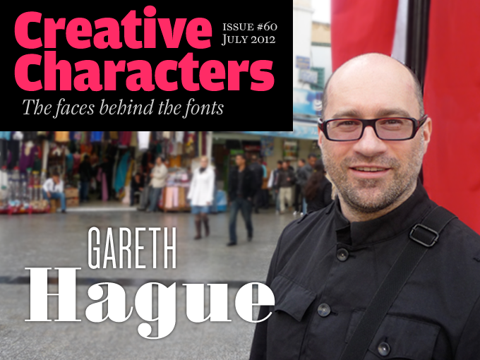
Our July interviewee is the co-founder of Alias, a London design studio that made a name for itself producing cutting-edge designs for magazine publishers, music labels, fashion designers and more. To lend their designs an unmistakable personal touch, they make individualist fonts that MyFonts offers under two labels: Alias Collection and Alias. Most of the Alias typefaces were designed by the man whose offbeat headline font for the London 2012 Olympics will be on a billion TV screens as of this week. Meet Gareth Hague, not your average type designer.
Gareth, Alias is quite a productive foundry, but the fonts originally were a kind of by-product of your graphic design studio, weren’t they? Could you describe the kind of graphic work you produce?
The type design evolved from logo designs, usually but not always for the music industry. Elephant was the first complete typeface, developed from a logo for a film production company. Nowadays, they’re either originally from graphic design projects, recent-ish examples of this being Ano, Asphalt, Aspic and Oban, or personal projects, ideas I wanted to explore, such as Lily and the forthcoming Caustic. The main reason for drawing type has always been to explore ideas. Coming from a graphic design rather than type design background, I’ve always viewed them as expressions of a graphic idea, ideas about particular combinations of shapes and angles, geometry, mixes of references. Like everyone else (I hope), I try to find a point of difference in what I do. Type design takes time, so it needs a sense of separation from what’s around it.
When working for the music industry, do you often work with clients who are somehow typographically conscious? Do you ever discuss your type designs with them?
When I developed logos into larger character sets, for example DIN Mitteslschrift photocopied, cut up and rearranged for System 7 and Shades Of Rhythm, these new typefaces tended to appear on the back covers, unexpected and unbriefed. So, while important to me, for the record company the main focus was always the logo. As long as you could read the stuff on the back, they were generally happy to focus on the front. In the recession of the late ’80s and early ’90s budgets were being cut and the CD was introduced. Record companies were much more commercially focused than during the heyday of sleeve design in the ’70s.
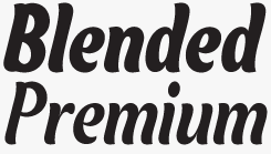
Perla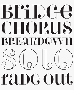
Perla is one of several Alias typefaces firmly rooted in the high-contrast, vertically stressed display types created by the Didot family of type designers and printers in Paris. Developed in the late 18th and early 19th centuries, the distinctive Didot style has been rediscovered and revived by dozens of designers these past few decades, but Hague invariably gives his reinterpretations a special twist. In Perla, it’s the unicase approach, mixing upper- and lowercase in a single alphabet; besides, the rigidity of the neo-classical model is livened up with curly references to picturesque, decorative Cyrillic styles.

Music packaging designed by David James and Gareth Hague was the birthplace of fonts like Granite and Metsys.
Who were your exemplars, type-wise, when you started out developing your own typographic style?
I was looking at the work of graphic designers, particularly record sleeve designers, rather than type designers. The individual, eclectic spirit of Hipgnosis, Barney Bubbles and Peter Saville, whose work I became interested in as a teenager exploring record shops locally and in London. My older brother and my sister’s boyfriends introduced me to punk and post-punk and bands such as The Residents and Pere Ubu and I always focused on their (great) record sleeves. On leaving college and starting my career I collected books on graphic design and studied type sample books, rather than the work of particular type designers.
Have you ever considered becoming a full-time type designer?
I’ve always considered myself a graphic designer who also draws type rather than a type designer. What works for me is combining both, for example in projects such as AnOther Man and AnOther magazines where the type is designed to work in particular sets of ways, where I design the type and the layout. Ultimately, I like using as well as designing type — for me they balance and inform each other.
Being a graphic designer who also designs fonts, do you think you have a different approach to typeface design than people whose only occupation is to design type?
It has an effect on how I approach designing type. Whether it’s different to other people I don’t know. I view individual letters as independent graphic entities as much as part of a system, and type designs as expressions of ideas about combinations of shapes or references. It is very important to me that my work, including my type design, expresses ideas and messages that are (hopefully) new and relevant to now. Type design can be an insular and inward-looking discussion of arcane historical models. While I absolutely accept the need and importance of understanding the amazing history of type, this tendency to look backwards can be at the expense of exploring new ideas.
When designing display fonts to support a graphic concept, legibility is not always the main issue, is it? How far can you go in “coding” or obfuscating the alphabet?
Headline typography, particularly in the fashion magazine or record sleeve work we do, needn’t be immediately legible. In this instance the typography (rather than typeface design) is about the expression of an image and is used as an illustrative device or symbol. Its informational role is less important. The overall design of the magazine or packaging often includes type that is functional and readable, and this is the supporting framework that allows more expressive typography in the headlines.
For example, with the luxury of more space, the typographic constructions of AnOther Man become more complex, so the reader understands and becomes familiar with the idea. If there is a difficulty in its readability this is for a reason, it’s about involving the reader in the layout and typography in a progressive way throughout the magazine.
Some of my graphic design work, again particularly the magazine work, has allowed for the opportunity to work with typefaces and typography as image, as pattern or as texture. In this case the letters are not much more than starting points as ideas for shapes. This isn’t about coding or obfuscating in any way, more about image making and having fun with pattern- or texture-making.
Presumably if you obfuscate an alphabet too much it’s not an alphabet any more.
Aminta
For years, trendy graphic designers have adopted the mildly subversive strategy to use fonts with an “undesigned” look — drawn by engineers, such as DIN, or monospaced typewriter fonts like Courier or Letter Gothic. Those who find those choices a bit too bland, may have a lot more fun with Aminta. It has some of the Courier machine aesthetic, but it is more expressive, incorporating elements of traditional text faces, and even some references to handwriting. It has characteristics of a fixed-width font (like the huge serifs on the ‘i’) but isn’t truly one. The italic in particular is a very effective headline face.
Sylvia
Sylvia is clearly a relative of Aminta. Not quite a sister typeface, more a cousin. With its a simplified, geometric construction and monolinear strokes, it has some of Aminta’s typewriter aesthetic; but it has neither the serifs nor the suggestion of being a fixed-width (monolinear) font. Aminta’s rounded corners make it a personable and, in spite of its high-tech construction, quite readable sans-serif.
Do you ever have heated discussions with type designers (or clients) who think your typefaces are too experimental, not conventional enough?
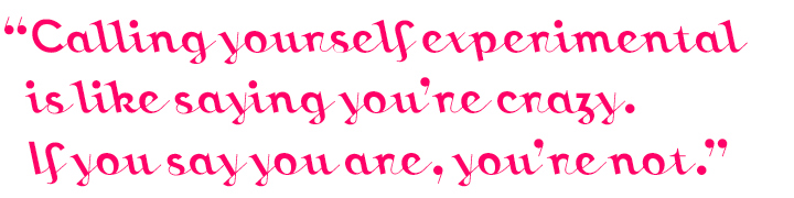
Calling yourself experimental is like saying you’re crazy. If you say you are, you’re not. Despite that, I’d be very surprised if my type design was seen by other type designers as being particularly experimental. Maybe it is unconventional, due to my lack of training in type design, the idiosyncrasies of my way of working, and my ideas and reference points. I tend to skip typographic subtleties or nuances and focus on big, high impact graphic shapes, which is partly why I am interested in Didone and blackletter typestyles, which (for me) are essentially simple, graphic forms.
Elephant for example was a version of a Grot typestyle. Whereas the original had quirks based on drawing by hand, or the carving of lettershapes in wood or metal, Elephant was an attempt to capture that same idea of oddness of character shape, but with rules derived from drawing with the super-rational aesthetic of the computer rather than the pen — a kind of digital anti-quirk. So how the typeface looks is appropriate to how it was made using the computer — the devising and utilizing of modular systems, perfect geometry, the copy and paste ethic, however quirkily applied. It became something different from its starting point and very specific to how I work.
Do you do any hand-sketching when working on a new font, or are you 100% digital?
I enjoy and always seem to be doodling letters or words, but they have nothing to do with my type design, more ideas or designs in their own right.
It is often said than type designers only see black and white, both literally and figuratively. To you, how important is color in design? And nuance, in life?
Type design for me is a very solitary activity, whereas my graphic design work is (usually) collaborative. Graphic design has the nuance of shared opinion and experiences; in type design there is a lack of nuance, it’s a very black and white resolution of an idea. In my graphic design, whether consciously or not, bolder use of color means the design is less about text and typography – color and process are maybe an antidote to the monochrome of type design. So there’s a number of opposites: solitary versus collaborative, color versus monochrome, right- versus left-brain. I believe it makes both my type design and graphic design better, and through using type you certainly notice the successes and failures of your own type designs.
As we speak, the London Olympics are about to begin. The much discussed logo by Wolff Olins was inspired by your Klute typeface, and you subsequently developed the headline typeface. On your blog, you’ve written critically about the Olympic Games identity and the way it has been received. Doesn’t it take a fair amount of courage for a designer to speak up like that?
In my blog post, I haven’t been critical of the identity itself. I discussed the Olympics and how it’s perceived; about the reaction to the identity and how that was presented in the media.
I wonder whether an opportunity was missed to somehow engage the public in the design process. There seems to be a disconnection and distrust between the creative industries and how they’re presented in the mainstream media. I think the logo was a brave approach, different to the standard totemic formula of cultural symbol + word + five rings, and as such unlikely to be popular in Middle England or with the conservative press. The UK has a deserved reputation for its creative industries, but an equally deserved reputation for its fondness for nostalgia. However, I understand the criticisms that the identity, typeface included, is pastiching youth graphics – and that the logo could have been more beautiful.
Other factors didn’t help its reception. It was unfortunate that after London won the race to stage the Games this year, the banking system collapsed — with its repercussions still being felt. In a time of austerity, the suggestion (not necessarily true) that money directed to the Olympics was coming from welfare payments and hospitals was doubly problematic. With this perceived lack of value and lack of inclusion in the games were stories of draconian and aggressively implemented rules on branding, of gun emplacements on tower blocks. Not great PR for an event that despite its image of being a gold standard in sporting prowess perhaps doesn’t engage with people and local communities as much as it does with its sponsors.
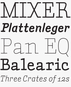
Union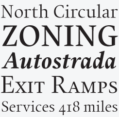
While most of Gareth Hague’s typefaces are made to create eye-catching headlines and logos, Union belongs to a different breed. It has sharply cut details, so it works well on a large scale; but it also has the classic proportions and modest behavior to make it a usable text face. Small caps and oldstyle figures have been accommodated in separate fonts, which is an advantage for use in software without full OpenType functionality.
Klute 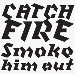
Klute is a wonderfully ambiguous display font that references various stylized forms of writing — historic blackletter styles, graffiti, tagging. In its eclectic choice of sources Klute provides a tool to say something particular and individualistic, reflecting the idea that the spontaneous gesture of writing is more personal and human than the craft of calligraphy or the mechanics of typing.
Asphalt & Aspic
Asphalt & Aspic are two script-like typefaces that are great for packaging and branding. Both are expressive, derived interpretations of hand-painted or brushed lettering, both combine a mix of influences including signwriting, the brush-style typography of cereal packets or toilet rolls, and the calligraphy of Berthold Wolpe. Asphalt could have been painted by a sign writer, maybe with a brush dipped in too much paint, as it has an extra gloopy, fluid quality. Aspic references a more orderly brush-written sign lettering.
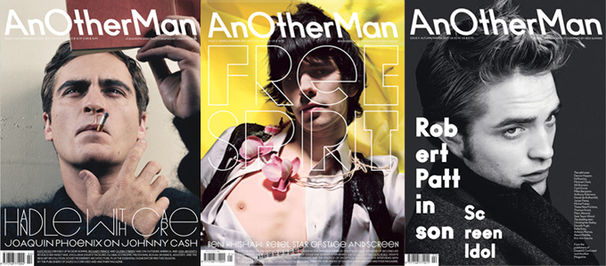
Evolving type treatments (based on what became the Ano type family) on the covers of AnOther Magazine.
Back to lettershapes. Your extensive Ano type family is a striking sans-serif originally developed for Another Man magazine. How did the design reply to the magazine’s editorial formula and requirements?
It was unusual to have that amount of freedom and trust from a client. The layout was very luxurious in terms of use of space, for example headline text running over two or three spreads. The consistency of idea and direction between the layout, typography and art direction all gave Another Man its point of difference in a market place where the different magazines can blend into one, Jefferson Hack’s strength as a client and editor was that he understood that.
The starting point for Ano was a simple but striking idea: a row of sans-serif lowercase letters at two sizes but with the same line weight. This geometrically simple monoline framework allowed for a stylistic consistency over three variations: Regular, which is a “standard” alphabet; Upper Lower, where uppercase characters are replaced with oversized lowercase; and Wide, where uppercase characters are the width of a square and lowercase the same style at half the width of a square. Each style has italic and back-italic versions. That’s nine variations in six weights: 54 fonts in total.
Ano’s different styles and mathematically derived weights allowed for a variety of layout options. The different layout ideas suggested by these options defined the separate sections of the magazine — Essays, Front Of House, Mains and Fashion. The choice available when mixing point sizes and choosing letters between upper- and lowercase in the Upper Lower and Wide styles meant that words could be made to fit specific shapes.
For the Essay and Front Of House sections, headline and standfirst text was typeset to fit into blocks and L shapes, combining with columns of text and grid-based photography. Headline, standfirst, text and image made a single irregular blocky shape on the page. The type design for Mains and Fashion sections changed from issue to issue, exploring the twin ideas of linear and geometry in a variety of ways. The typeface was outlined, filled in and combined. Heavy weights were stretched and squeezed to make blocks, and letters sliced and chiseled into different angular shapes in a kind of blown-up, micro-justified typesetting.
You already mentioned the fact Perla, Oban and Alias Didot are all based on “modern face” or “Didone” types from around 1800. Could you say some more about your fascination for that style in typography?
The idea of a set of letterforms being constructed from a thick and thin weight of line connected with a minimal amount of curve, or no curve at all, feels to me very graphic and contemporary somehow. There is a starkness that I find very striking. Having said that, these three types all started as commissions for branding projects or magazines, they aren’t necessarily ideas I would develop for a new Alias typeface from scratch.
Though Oban and Alias Didot in particular are very obviously historically referenced, their mix of reference points makes them look modern, or different. Oban takes inspiration from Thorowgood types and from sample books of wood type from the late nineteenth century, with their spirited and expressive, heavyweight graphic, sometimes naively drawn forms. Oban has a modular geometry and its character shape has an extra sharpness, with the slight curve connecting vertical to horizontal and curve to straight line of the originals reduced to a sharp angle. The backwards italic suggests the kind of self-consciously quirky idea a nineteenth century type founder might have had. Alias Didot isn’t a Didot at all, the italic in particular jumbles styles, the numerals swap between Didot, Bodoni and others.
Those Didot-like faces reference the style without being literal revivals. What’s your attitude towards revivals?
I think that in drawing a version of a popular or classic design you are connecting yourself to that design, to its history and its connotations. It can be a problem-solving shortcut, particularly for the challenges of designing text typefaces, and I question whether this is at the expense of exploring new and therefore more risky ideas.
What is the purpose of a revival of a classic historic font, one that exists in multiple versions already? I’m not sure that I understand the need for more Caslons or Baskervilles (for example), or the need for new versions of more recent “Next” series Avenir or Univers designs, beyond their obvious marketability. I like that the newly released Neue Haas Grotesk by Christian Schwartz is a kind of anti-redraw of Helvetica, being an accurate rendering of the original drawings of the typeface that would become Helvetica, but was originally called Neue Haas Grotesk. So, seeking the input of the original designer, or returning a type to its original form, where enough source material is available, is worthwhile. But these new versions, or belated additions such as serif or sans serif versions, rounded, outline, condensed or whatever, feels like gaining revenue from a marketable name, rather than investing in new work.
Older types present a different problem, though. Jonathan Hoefler has discussed the variables in recreating old forms from old sources, where printing discrepancies produce degradations and differences in character shape which produce various possibilities when redrawn. In this case, how can revivals of old historic types be termed authentic, or accurate? As with the Next series, who decides?
Historical models are a huge, rich source of inspiration and reference, and mixing these can make something new, different and relevant, while keeping historical context. This can make them new, relevant and progressive.
Many thanks, Gareth. We’re looking forward to seeing even more Alias typefaces appear on MyFonts.
Ano
Its name refers to its original use: Ano is the typeface that defines the evolving typographic style of AnOther Man magazine. It’s an impressive display suite of 54 styles, reflecting the endless experimentation that has been taking place on the mag’s pages. Gareth explains the family’s unusual structure in the main interview. Not the alternate, backslanted italic: a rare stylistic element taken from 19th-century advertising typefaces.
Oban
Inspired by the pioneering display types of William Thorowgood and various styles of heavyweight poster typefaces from the nineteenth century, Oban presents an unsentimental reworking of that spectacular model. The result is an idiosyncratic, contemporary display face. As for the name: Oban is a town in Scotland with a great single malt whisky and a “folly” in the shape of the Colosseum, McCaig’s Tower. Asked which of the city’s aspects influenced the decision to name a typeface after it, Hague answered: “I was thinking more about the castle, and a kind of Scottish toughness or sharpness of character. Though I rather wish I’d named it after the folly...”
Cactus
Cactus is made for big headlines, or for those powerful, Feltron-style information graphics that are now almost ubiquitous. Like most other Alias typefaces, Cactus artfully mixes a number of influences. There are elements of DIN Condensed in there, but also condensed Gothics and poster types from the wood type era. Mixing rigidity with quirky shapes, Cactus provides a subtly personal addition to the well-known genre of compressed industrial sans-serifs. In case you want to use it in small text settings, some extra spacing may be called for.
MyFonts is on Twitter and Facebook!
Join the MyFonts community on Twitter and Facebook. Tips, news, interesting links, personal favorites and more from MyFonts’ staff.

Who would you interview?
Creative Characters is the MyFonts newsletter dedicated to people behind the fonts. Each month, we interview a notable personality from the type world. And we would like you, the reader, to have your say.
Which creative character would you interview if you had the chance? And what would you ask them? Let us know, and your choice may end up in a future edition of this newsletter! Just send an email with your ideas to [email protected].
In the past, we’ve interviewed the likes of Michael Doret, Laura Worthington, Jonathan Barnbrook, Rob Leuschke, David Berlow, Ronna Penner and Jos Buivenga. If you’re curious to know which other type designers we’ve already interviewed as part of past Creative Characters newsletters, have a look at the archive.
Colophon
This newsletter was edited by Jan Middendorp and designed using Nick Sherman’s original template, with specimens and type descriptions by Anthony Noel.
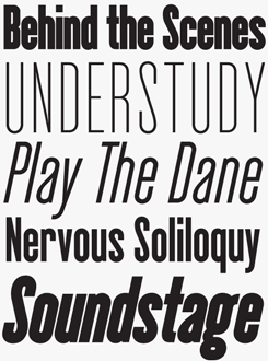
The Creative Characters nameplate is set in Amplitude and Farnham; the intro image features Cactus and Oban; the pull-quote is set in Lily; and the large question mark is in Farnham.
Comments?
We’d love to hear from you! Please send any questions or comments about this newsletter to [email protected]
Subscription info
Want to get future issues of Creative Characters sent to your inbox? Subscribe at www.myfonts.com/MailingList
Newsletter archives
Know someone who would be interested in this? Want to see past issues? All MyFonts newsletters (including this one) are available to view online here.