
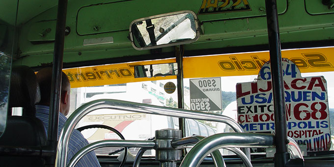
photo: Carlos Fabián Camargo
September brings several new foundries to MyFonts, along with a number of exciting new faces from designers already represented. Bookfaces, icons, scripts and all other sorts of display type are represented, with some especially interesting new work from Mark van Bronkhorst, Discourse Type, Veronika Burian and others. Additionally, we are very proud to note that the entirety of the 2Rebels collection, which includes a number of important distressed scripts and geometric display faces, is now available here at MyFonts.
Font Garden specializes in handwriting fonts. Mostly low-contrast and informal scripts, whimsical and feminine faces like April, Jennifer and Typical are all excellent choices for a wide variety of advertising applications. Other more systematic approaches include Elias and various other scripts based, sometimes loosely, on architectural handwriting. Designer Ellinor Rapp tells us that beautiful handwriting “has always been an obsession,” so much that she needs to concentrate to see words and sentences over letters, something we can sympathize with; this certainly is an ailment that many typographers and type designers suffer from.
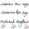
The Font Garden face Jasmine, an early experiment with manipulating the technology to more realistically mimic the informality of handwriting, includes two different lowercase variants. She strives for a truly hand-written look, and is beginning to experiment with Opentype’s contextual alternates, something we’ll be happy to see in her upcoming work. Ellinor has noticed an increase in the use of handwriting fonts and attributes much of the growth to the rise in popularity of digital scrapbooking, but notes that her work is equally at home in children’s books, greeting cards, embroidery applications and advertising. Her work is used on commercial packaging and greeting cards in Sweden and elsewhere, as well as on e-card sites like sentwithlove.com and imadeapostcard.com and by numerous commercial designers in the UK, Sweden, Germany and the United States. Ellinor would like “everyone to have at least 30 handwriting fonts to choose between,” MyFonts is certainly the place to find them, with over 950 fonts categorized as “handwritten.”

César Puertas is an independent graphic designer in Bogota and recently organized the 2006 Letras Latinas conference in his home country. His Urbana, an economical sans for headlines and other display use, is the first of what we hope are many of his faces to be seen here at MyFonts. Urbana’s mixture of modernism and organic hand-lettering saves space and, at the same time, catches a bit more attention than the average mechanical heading face.
Prokopios Tzoulis’ distorted space-age type is produced under the aegis of Tzoulis Graphic Design / TZ-Design, an Athens design firm working in both Greek and English. Tzoulis’ fonts – with complete Greek and Latin alphabets, and all in Opentype format – are distorted almost to the point of illegibility, but never further; he seems to take great care in playing with readers’ expectations of letterforms and carefully altering characters to evoke just as much of a mood as they communicate language.
Tzoulis has been drawing alphabets and developing fonts since a young age – long before his formal design education, which he finished in 2002. “I search for the evolution of form,” he writes, “trying to be perfectly unique and personally satisfied.” He designs more as personal expression than anything else, and is pleased that his work may find some commercial use.
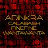
AKOFAType is the type design wing of AKOFA Creative, a Marietta, Georgia-based design consultancy firm. Their first family sold through MyFonts is Adinkra, composed of three 66-character fonts – similar shapes, all inspired by African iconographic designs, in bold, fine and distressed styles. Finding an original source for the artwork was the most challenging aspect of the design process, writes Kwesi Amuti, principal of AKOFA Creative, who tells us that the original forms were influenced by textile designs – usually produced with relief printing techniques from calabash gourds or woodcuts – of the various ethnic groups of Ghana, and would be eminently useful for border and pattern making. The font is named after Nana Kofi Adinkra, a warrior king beheaded during the Ashanti-Jaman wars in what is now modern day Côte d’Ivoire and Ghana .
Rotograf, Polish designer Jacek Judkiewicz’s one-man foundry, recently released Kalchynsky Script, a digital recreation of a very unique handscript he found in a book at a local church. Judkiewicz has owned his own design studio and print shop since 1989, and became a type designer not for the more typical reason of artistic expression but through need: when he migrated from Windows 98 to 2000, he found – as many of us did – that fonts he had bought earlier no longer worked with the new operating system. So, rather than go bankrupt re-buying type he had already paid for, he took the very original direction of making his own. We hope to see many other original faces from Rotograf!
2Rebels is the typefoundry of Denis Dulude (a former ballet dancer) and Fabrizio Gilardino (a designer from Milan), based in Montreal. Ever since their first font catalog came out in 1995 they've been producing some of the most cutting edge, distressed and modern digital type available. We're delighted to welcome them, and the numerous type designers they represent, to MyFonts!
We can’t profile all 114 of the 2Rebels faces available on MyFonts in this space, but rest assured that there’s a trove of high-quality type in this collection. Traditional forms like the Flembo and Flembo Sans family, Garaline, and Pilgrim; distressed fonts like Lescript, Marsh Mallow and Marcel Duchamp; pictograms and dingbat fonts such as Angry and Yisana, and many experiments in geometry and futuristic style, including LearnedBehavior, Esteile, Snowslider, Design and Doufff.

Blushbutter Fonts sprang out of Vanessa Trendle’s digital scrapbooking company based in Melbourne. She recently brought three original and complementary typeface designs to MyFonts; Blushbutter Fae, a collection of 26 original illustrations of cavorting Alphonse Mucha-inspired fairies; Blushbutter Fairy Floss, which imposes those fairies on decorative capitals; and Blushbutter Whimsy, the same capitals from the previous face, sans fairies. All three are designed specifically for craft applications, but would be appropriate for a wider range of decorative uses.
Jon Bennett, aka Discourse Type, has two geometric but not especially strict contributions. Lazar is a somewhat blocky face whose playfulness takes a cue from El Lissitzky’s less formal work, and includes alternate characters, small caps and a number of discretionary ligatures. Lazar started out as drawings for a collectors’ magazine – for collectible classic athletic shoes (trainers) – and, after numerous suggestions from friends that it be digitized, was finally produced last year. Diglossia’s three weights are both Egyptian, geometric and firmly Art Deco – again, stylistic alternates and ligatures round out a large character set.

Joachim Frank is a graphic designer based in Filderstadt, Germany, and is the sole proprietor and designer in his eponymous foundry. His first family, Waldorf, echoes the German Expressionist and Secessionist letterforms, specifically the organic forms of Rudolf Steiner’s graphic work and emphasis on organic visual and intellectual forms. It comes in three weights, an oblique, and outline, narrow (“schmal”), two-tone and shadowed varieties. Waldorfschrift was originally digitized in 1994 but was recently revisited, with the addition of new characters and weights.
Mark van Bronkhorst has held a place of honor as both a publication and type designer ever since he got a chance to really show off his chops as art director for ITC’s Upper & Lower Case in the ’90s. His newest work includes Sacre Bleu, a very attractive and slightly rough-edged informal script loaded with alternates and ligatures and Solano Gothic, an eminently readable and flexible sans created for the City of Albany, Mark’s home (and where your Editor grew up as well), which uses it for everything from civic signage to advertising.
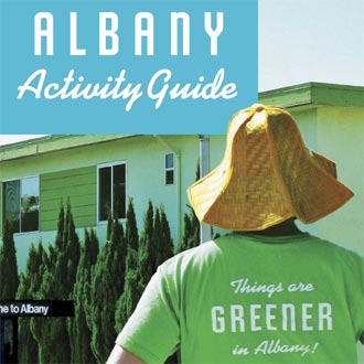
Solano Gothic’s six styles and straightforward features make it an easy choice for an enormous array of applications, from packaging to street signage to video and television titling and a hundred other things. An alternate “retro” style which can be used by itself or in concert with the standard bold weight or small caps style evokes American display type of the 1930s through early ’50s, and its narrow width – which is economical without sacrificing legibility or style – make it a natural for signage and in other applications where copyfit is a consideration.
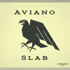
Jeremy Dooley – also known as the insigne type design studio – has been especially productive in recent months, with a number of releases including Aviano Slab, an extended small-caps face that bridges the gap between Egyptian & Roman, and Lourdes, a fluid and expressive hand-drawn display type
Jeremy writes that “I get most of my inspiration from potential uses for my typefaces,” and notes that he gets many of his best ideas while “eating lunch at my favorite sandwich shops.” He designs for use, which is why the simple and straightforward typefaces he produces – including Montag, Aviano Sans, the unicase Questal, Aviano, Chennai and others – remain such strong sellers at MyFonts. We hope that Jeremy has many excellent sandwiches in the years to come, and that we are able to take advantage of the resulting fruits of his labor.
Certainly the name Canada Type will be familiar to most North American type aficionados; their rich and varied body of work includes everything from the messiest “grunge” scripts and almost-unreadable distressed display types to much more refined type informed by historic designs, like Kofi’s nods to Lucian Bernhard and the many German Expressionist woodcut letterers of the early 20th century.

Their most recent work includes VIP, a high-contrast formal script with sans capital characters in place of a lower case, and Vox, a round-cornered, grid-defined type ideal for your next sci-fi project. Rebecca Alaccari, designer of VIP, tells us that she had been interested in reviving VGC’s 1970 Constanze Initials face ever since she first saw them in 2002; recently, on a trip to Montreal, she came up with the original idea of using “minicaps” – a different but explicitly complementary style of letterform for the lower-case, rather than work up an original lowercase script component.
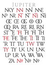
Other recent releases include Jupiter, a conservative Roman titling face based on the Trajan lettering; it is accompanied, like much of Canada Type’s work, by a “busload” of alternates, ligatures and other extras that serve to make everyday settings seem that much more hand-worked. Canada Type’s Patrick Griffin designed Jupiter as “the ultimate statement about customer power,” a response to several of his clients’ requests for a reworked Trajan, which seeks to respond to the designer’s own feelings that many existing Trajan-based faces were too weak or delicate by making it a more commanding, masculine type with the addition of an enormous stable of alternates and ligatures. It takes the best aspects of a half-dozen Trajans – work by Goudy, Matthew Carter, Jason Castle, Schneidler, Poppl and various other, mostly contemporary, designers – concatenating them into something that not only addressed Griffin’s clients needs but also, we hope, yours.
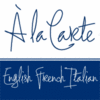
Aviation Partners – known to his friends as Nicholas Garner – recently completed La Carte, an extremely playful wire-lined script with huge, expressive capitals that cradle a more delicate lowercase. La Carte was based on a series of hand-lettered restaurant menus Garner designed in 1980 for British chef and television personality Antony Worrall Thompson, and ties together modernist Italian and French influences in a surprisingly readable informal script. A recently-completed bold weight of La Carte will be added within the next month. Other recent additions are the six-weight / sixteen-style Sky Sans fonts, part of the Sky family (Sky Sans was preceded earlier this year by the delicious slab Sky Serif).
Since 2000, Ingo Krepinsky and Stefan Kroemer have been producing various thematic display types as Die Typonauten. Their most recent face is B-Movie Splatter, a distressed brush script that combines quite well with their slightly earlier B-Movie Retro face. Splatter’s large character set is available in both “clean,” “splash” and “extreme” variants, and characters of different colors can be layered to great effect. An additional style includes dozens of words – “thrilling,” “danger!,” “hot,” “suspense,” etc. – taken from the marquees of classic pulp films. All Die Typonauten fonts have additional styles for pictograms, symbols or catchwords.
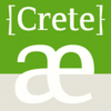
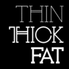
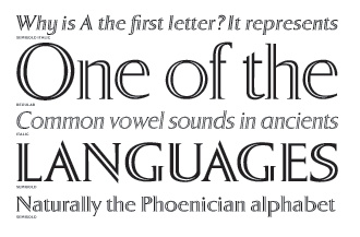
Crete, the experimental yet elegant display face from Veronika Burian which we admired in the last In Your Face, has gained a new weight and speaks more languages. The unusual serifs and terminals compliment the delicate grace of Crete Thin and make the new Crete Thick even more robust. The two styles are metrically interchangeable, eliminating text re-flow when switching between weights. Crete supports over 40 languages, and has two sets of numerals and a number of stylistic and practical ligatures.
Sister-company to newspaper design firm A4, T4 is a Swedish type cooperative made up of graphic designers and typographers Martin Lexelius (nee Fredrikson), Ludvig Grandin, Bo Berndal, Torbjörn Olsson and Pelle Anderson. T4 draws from the rich and varied experience of its staff, and continues to produce a tremendously wide array of type – from the most conservative body types to graffiti-inspired display type – without ever getting “stuck in a rut.” T4’s most recent additions include the distinguished graffiti artist Lexelius’ Kantor, and Berndal’s Sergel and Garamont.
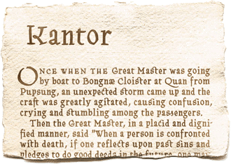
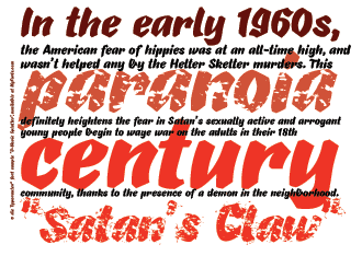
Kantor, an original design formed equally from graffiti and blackletter inspiration, has – like all of Martin’s work – a tremendous amount of humor and style. “I wanted to do a classic design,” writes Lexelius, “but not a Jenson, or a Garamond, or a Bodoni or a Fette … they already exist, so what’s the point?” After discarding a too-stiff earlier version called Baptisma, Martin redrew the entire character set by hand, with additional influences coming from 15th-century Venetian sources and more attention to consistency in contrast. The finished product has a sort of formal beauty, while keeping the humor that we see in his graffiti and graphic design work. Ligatures and alternates increase the liveliness and variety of the printed type.
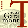
Berndal has also been very busy, although Pelle Anderson points out that he always is – “Bo is very productive!” – recently finishing several new faces, two of which are new on MyFonts this month. TYMA Garamont comes in five styles – a regular, smallcap, italic, semibold and semibold italic – and is a sort of amalgam of the Berner-Egenolff sample from the 1560s and a great Granjon italic design from that same decade. The prefix “TYMA” is short of “AB Typmatriser,” a Swedish type foundry and equipment manufacturer established just after the second world war. Bo began working at TYMA in 1949 and stayed there until the company’s bankruptcy a few years later. He credits the typeface to librarian Sten Lindberg at the Royal Library of Stockholm (Kungliga Biblioteket), who procured copies of the original specimens, and Henry Alm, who started the family in 1948; Bo has finally finished the work they began a half-century ago in an eminently readable and usable OpenType edition.
Bo’s other new release is Sergel, a four-style incised display family. Named after the greatest Swedish sculptor and draughtsman of the 18th century, Tobias Sergel, the type has sculptural qualities, although luckily it does not reflect much of the life of its namesake (who spent much of his life “drinking, singing and whoring with Carl Michael Bellman, whose lyrics and songs are known by every Swede.”) Berndal credits the mix of Rococo and Empire styles in the letterforms to Bellman, who also mixed seemingly opposite styles to great effect in his own work. Bo writes that Sergel would be best used “on diplomas, gravestones or as signage type for Sergels Torg” (the city square in downtown Stockholm).
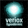
The endlessly productive and very talented Ray Larabie has a number of new Typodermic faces available and more to come in the next few weeks. Veriox, a condensed display sans that is both organic and mechanical at the same time, is an evolution of Ray’s earlier Milibus family – those same bent diagonals recur, although the letters are a bit more uniform and narrow. The “cut ends” technique used in Ray’s first font, Wyvern, recurs in Veriox Italic; the face works well as a friendlier, less-technical display alternate to DIN and similar faces.

Containment evolved from Tandelle Italic, which in turn came from an early version of Ray’s Doradani font – “one of those ‘News Gothic with contemporary open shapes’ of which you can probably find 100 examples of.” What he calls the “gravel effect” is the end-result of experiments with an automated system for filling up letterforms with various textures.
Augustine “is a Tuscan with no particular historical influence.” Ray writes that he designed the entire face upside-down “just to make it interesting,” and it certainly succeeds. While he concedes that there are some distressed Tuscans on the market, Ray suggests that the combination of a distressed, rubber-stamp or wood-cut styles make this an ideal face for music marketing, specifically for folk (or alt-country) posters.
Finally, Snowa is an original take on an old standby, the useful-at-least-part-of-the-year (unless you live really far up north) snowcap font. Where most snowcapped fonts are based on pre-existing hard-edged sans faces, Ray’s is an original design, using a hand-drawn sans, which lends it a soft and organic quality. “Obviously,” he writes, “it’s a Christmas font.”
The mysteriously-named Paulo and Iza W of Intellecta Design specialize in revivals of historic advertising types, specifically metal and wood display types of the Americas, from the early 19th to mid 20th century, but they also produce plenty of original designs as well. Recent releases include the distressed typewriter face Erased Typewriter 2, the abstract forms of Swirlies, Bruce Hairline, the Deco Experiment faces, Rough Fleurons, Ulma, American Advertise 011 and 012, Breite Italienne, Fofucha, Estanho, I Am A Worm, and many others.
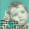
Among his most recent work, standouts include both original designs and historic revivals. Certainly Breite Italienne, an extremely high-contrast 7-style family based on the Didot and Bodoni faces Paulo favors, is both “sensual and mystical” – the latter influence coming from the designer’s attraction to the Fraktur types.

The American Advertise series has two recent additions; fonts 011 and 012 are both mortised caps, straight out of an early ATF catalog, and are digitized very well. Pirates De Luxe includes many dingbats related to high-seas piracy (as opposed to that of typefaces); skull & crossbones, eyepatches and more, ye mateys! This font is certainly a must for anyone living the life of a high-seas swashbuckler, or any designer whose clients include aforementioned swashbucklers.
[email].
If you no longer wish to receive this newsletter, you may change your subscription settings at: http://www.myfonts.com/MailingList