
eptember is here, and for many of our customers this means that business is picking up again after a couple of slow months. As always, MyFonts is here to help you make quick and informed choices whenever you need the perfect typeface for that new job, now! In fact, it’s quite possible that what you need is one of this month’s Rising Stars!
This month’s Rising Stars
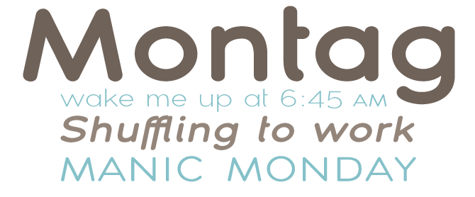
Like several other typefaces from insigne, Montag confidently strolled to the number one position on the Starlets list in early August. While other recent faces from this foundry (like Aviano and its sans serif companion) were wide and somewhat solemn, Montag is equally wide but deliberately quirky. The characters are geometric but informal and, as the designer puts it, “gloopy”, as if they were drawn with a lot of syrupy ink. Highly legible, simple, and idiosynratic nonetheless: Montag is your choice of the month when you need a headline face with a lot of character. In case you wondered: Montag is German for “Monday”.
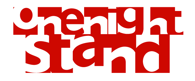
The basic shapes of Torbjörn Olsson’s One Night Stand are those of an inconspicuous modern sans-serif — his typeface Esans, to be precise, designed for the Swedish quarterly Pejling. But for One Night Stand, Olsson zoomed in on the details and cropped each character to its essence, squeezing it into its own square box — black-on-white when using the lower case alphabet, negative when hitting upper case. A clever operation which has resulted in a dramatic, contemporary look that will work wonders in magazine headlines and advertising copy. It probably won’t be long before you start seeing logos based on One Night Stand!
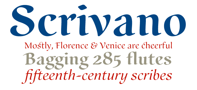
Scrivano was designed by Ricardo Esteves Gomes, who gave us the successful calligraphic font Maryam earlier this year. Inspired by certain samples of handwriting from the Middle Ages and Renaissance periods, Scrivano does a great job at suggesting authentic, elegant handwriting. There are four organic font styles (Regular, Italic, Bold & Bold Italic) that remain surprisingly readable even when setting texts of moderate length. We loved the superb oldstyle-figures, the nice extra ligatures and the specially drawn mathematic symbols.
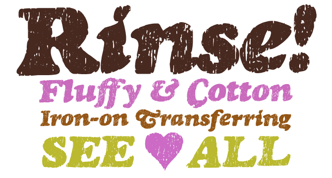
There was a time (not so long ago) when no typeface designed before 1960 was safe from young fontmongers who would turn classic typefaces into quick-and-dirty grunge fonts. Typodermic’s Ray Larabie is a survivor from that generation, but today his work goes way beyond the mere de(con)struction of existing designs. When he takes his mouse to a classic font, he knows what he’s doing.
With Rinse, he turned Goudy Heavyface Italic into a “vintage t-shirt font”. Not only does Rinse have a convincing stone-washed look, its OpenType version also comes with dozens of ligatures in upper and lower case to eliminate the awkward effect of obviously-repeating letters.
Text family of the month
Clarendon is one of those quintessential 19th-century typefaces that are still popular today. Having been rediscovered by a new generation of cutting-edge graphic designers, it has even enjoyed a kind of renaissance. Although there are several good digital Clarendons with a wide range of weights, these existing revivals are limited for use as text faces.
Canada Type’s Patrick Griffin solves that problem with Clarendon Text, this month's choice for Text family of the month:
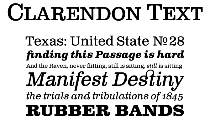
This new typeface is a radical but respectful makeover of a classic, re-tailoring it to the complex demands of international commmunication. It makes ample use of the possibilities of OpenType, extending the family with small caps and four styles of figures – which makes it a milestone in Clarendon history.
Clarendon Text offers remarkable clarity and readability; it also has a fine italic, which takes its cue from Aldo Novarese’s Egizio Italic (1955). The new typeface slightly departs from the original Clarendon to make it better suited for immersive reading. For instance, the shapes of the letters like a, g, q, and t were simplified to better melt into word shapes. Not to worry if you prefer the traditional shapes: they are still available as alternate characters. Check out the complete story and the 4-language test PDF.
Follow-Up
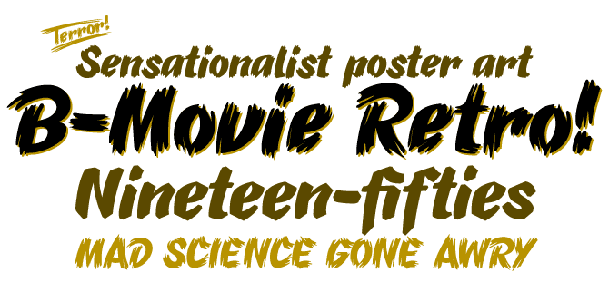
B-Movie Retro by the German Typonauten foundry convincingly captures the atmosphere of hand-lettered 1950s film posters. In those days, posters often weren’t just made to lure the public to the theatres; they also had an even more important economic function, as they were made before the movie came out and were used by the studio to help secure distribution. With B-Movie Retro, that would have been a piece of cake!
If you liked this typeface by Die Typonauten, check out some of their other fonts:
Newsletter
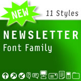
Created between 2002 and 2007, this font family was inspired by OCR fonts, DIN and Erik Spiekermann’s business-like fonts. Newsletter has the feel of a monospaced font, but on closer inspection it is proportional. Consequently, it has a computer-related aesthetic but is more legible and elegant than most real monospaced fonts. Newsletter is eminently suitable for correspondence use – Die Typonauten even use it in their own office!
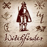
Witchfinder
This font family is the first one to bring together pictograms, signs and letters that refer to the topic of White Magic, witches and witch hunts. The family contains witch symbols, astrology signs, woodcuts and letters. Each symbol font comes with a companion font containing explainations. The script alphabet comes in two versions: one is based on an original manuscript from the late 18th century, another on a more contemporary script.
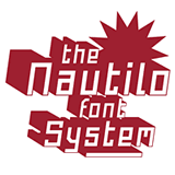
Nautilo
Nautilo is based on simple forms with straight lines only; but designer Ingo Krepinsky has added some interesting features to an otherwise straitghforward geometric alphabet. The ‘rough’ versions give the typeface a rusted, hi-tech look. The Variations 3-D font makes each character into a toy-like three-dimonsional block. As Die Typoauten say: “Technical systems rule!”
Have your say
— Eric Armstrong from Toronto, Canada, August 9th 2007
This issue’s font credits
featured fonts
supporting fonts
- “MyFonts, September 2007”: Bryant
- “Rising Stars” masthead: Auto 3
- drop-cap “S”: Centennial Script
- Have your say quote: Clarendon Text
Comments?
Please send any thoughts you'd like to share with us about this newsletter to: [email protected]
This e-mail was sent to [email].
Not interested in receiving this newsletter anymore? To unsubscribe, go here: http://www.myfonts.com/MailingList