
It is often the most spectacular new typefaces that draw the most attention, and this month’s crop is no exception. We have a joyously flourishing connected script by one of our master lettering artists and a rugged piece of faux handwriting that hops and skips across the page. There is also a mouth-watering, lusty advertising script, and we revisit an eye-catching, award-winning, over-the-top queen of a typeface we introduced last month. All this lavish beauty is balanced by a couple of rather subdued, no-nonsense sans-serif families which are great for, well, reading. Enjoy this month’s most successful new fonts.
This month’s Rising Stars
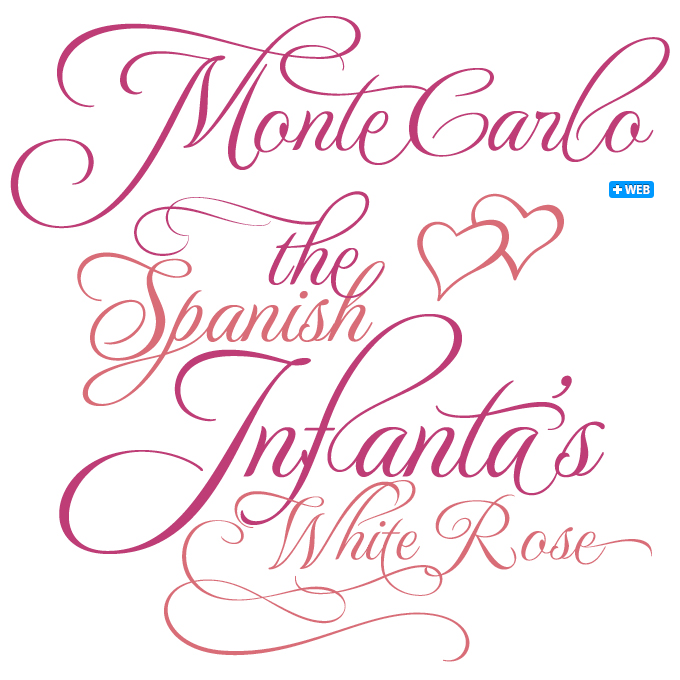
Lettering artist and type designer Rob Leuschke is a master of high-quality scripts. Like few others, he knows how to create spontaneous-looking fonts with painstaking precision. His new, wildly successful Monte Carlo is a more formal font than most of his offerings — elegant, stylish and exuberant. Both contemporary and traditional, Monte Carlo is slanted at a slight angle, making it an extremely legible design. It comes with additional flourishing options which offer truly diverse possibilities for customization of display. Acquire all the typeface’s possibilities in one single OpenType font with Monte Carlo Pro.
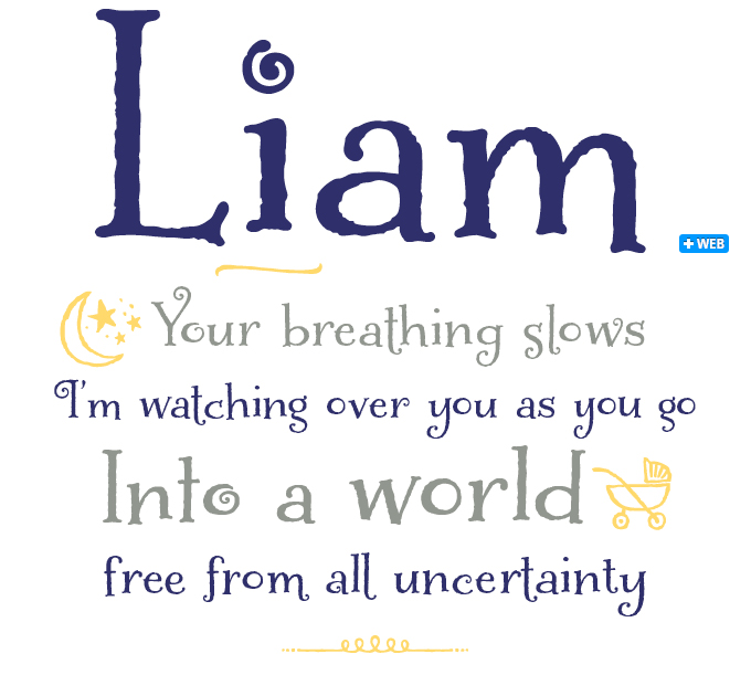
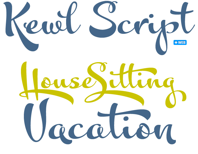
Laura Worthington often names her fonts after friends and relatives. At the rate she is currently turning them out (without, mind you, ever compromising on the impeccable quality we have come to expect from her) it is only to be hoped that her family is huge. Her current bestseller Alana, presented here a mere two months ago, was named after her sister. The new Liam, which has climbed our Hot New Fonts at lightning speed, is dedicated to her nephew. A playful, hand-lettered serif typeface, Liam bounces off the page with exuberance and spontaneity. It features 130 alternate letters and takes advantage of contextual alternates (accessible in OpenType-enabled software) to give the text a natural, hand-written look and feel. Liam comes with 52 playful illustrations.
Text family of the month
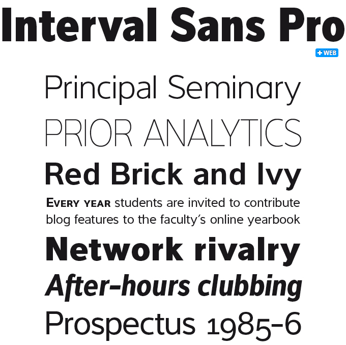
MyFonts offers a huge choice of recently designed contemporary sans serifs, and the collection keeps growing. Interval Sans Pro from France’s Mostardesign is a recent surprise success in this genre. Its basic design strikes a balance between the geometric skeleton of, say, Avenir and the renaissance-inspired proportions of myriad humanist sans serifs. With its two widths, each in seven weights, this family of 28 fonts is a practical and versatile choice for editorial typography, signage and branding. Its alternate one-story ‘a’ enables the discerning typographer to create a markedly different text image using a different Stylistic Set of the same font. Equipped with built-in small caps and multiple numeral sets, Interval Pro shows strong consistency across its range of styles and weights.
Follow-Up
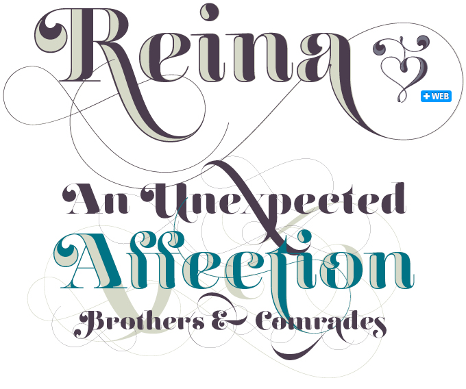
Reina is probably Lián Types’ most sophisticated typeface to date, and it’s been hugely successful since its introduction a couple of months ago. With its vertical stress and strong contrast between fat strokes and gossamer hairlines, Reina is a joyful exaggeration of the classic Didot and Bodoni styles, with traces of Herb Lubalin, copperplate and Spencerian scripts. When none of its alternate characters are activated, Reina works well in medium-sized texts; when activating its OpenType capability and using the swash and decorative varieties, you get a toolkit (and plaything) for making dazzling headlines.
If you like this typeface from Lián Types, check out some of their other fonts:

Breathe
In the well-established genre of exuberant formal script fonts, Breathe is a special case. Designed to look alive, fresh and airy, the font takes a jump from the work of Didot and his contemporaries from around 1800 to today’s fashion of endless swashes and flourishes. Choose between the intricate Breathe Pro series or the more restrained Breathe Standard.
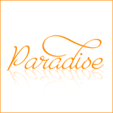
Paradise Script
Paradise Script is a playful calligraphic font in six styles. Instead of packing all the alternates, beginnings and endings into one fully loaded OpenType font, designer Maximiliano Sproviero chose to accommodate the variants in separate fonts. This is good news for those users who want to use the font in Microsoft Office programs and other software that isn't OpenType-enabled.

Parfait Script
Parfait Script takes influences from the nineteenth-century Spencerian scripts, and combines them with pointed brush lettering to create a flourishing and whimsical font with over 850 glyphs. Many of the alternate characters have elaborate swirls and curlicues attached, producing charming and sometimes dazzling results.
Sponsored Font: Ratio Modern
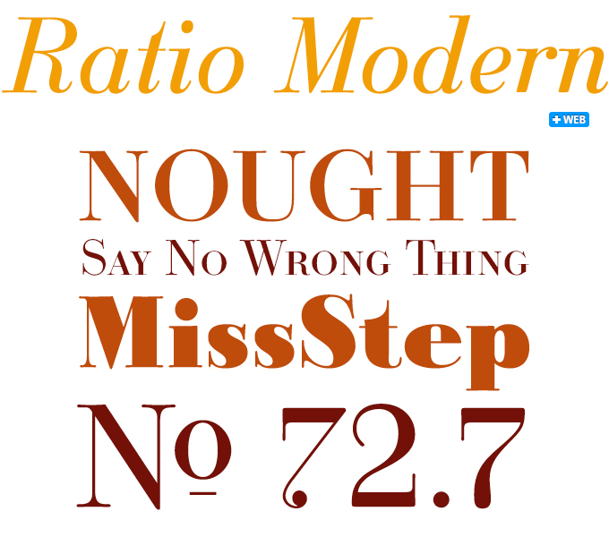
The brand new Ratio Modern from Canada Type is a digitization of the original Ratio, a typeface from 1923 designed by Friedrich Kleukens for the Stempel foundry. Ratio was one of the first metal faces to bring the Didone genre to industrial mass publishing as a headline and magazine face. Though essentially modern in construction, Ratio incorporates some traits from the oldstyle and transitional genres, summarizing the European evolution of this particular aesthetic — witness its soft roundings and subdued italic, the variation of its shapes between weights, and the obvious fat face influence in the ExtraBold. Canada Type’s digitization expands on the original metal set by including small capitals and many alternates in all the styles. It also boasts larger than usual linguistic support.
Have your say
— Jessica, May 11, 2011
Your opinions matter to us! Feel free to share your thoughts or read other people’s comments at the MyFonts Testimonials page.