
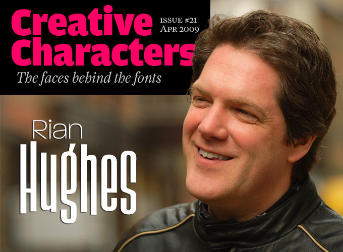
Photo by Eben Sorkin / Eyebytes
In the 1980s, Londoner Rian Hughes was one of the brightest young artists on the British comics scene. He went on to become a versatile designer, illustrator and lettering artist working for clients in the fields of publishing, music, sports, telecommunications, fashion and more. He is also the creator of an ever-growing library of typefaces — hundreds of them, in an amazing array of styles and atmospheres. Most of these have been published by his own type foundry, Device. Besides that, he is a writer and editor, and will be publishing two huge books later this year. Meet Rian Hughes, a designer who wants to do it all.
Rian, what are you working on at the moment?
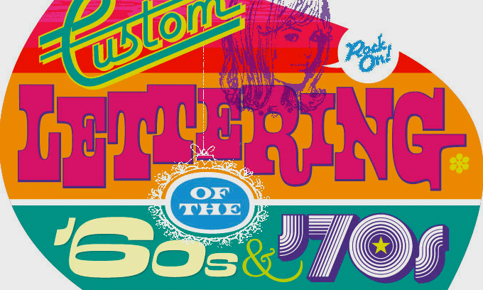
There are always several projects in various stages of completion. At the moment, the main deadlines that are looming are: Finishing the final layouts on two books I’ve edited and designed: Custom lettering of the ’60s and ’70s and Lifestyle Illustration of the 60s. Both are 576-page doorstops, and represent the culmination of a good few years work. Watch out for them later in the year.
Other than that: Logo designs for two Wolverine comic launches, the rebooted New Mutants, and a logo for a new Batman series from DC; A logo for Archaia Studios, an independent publisher; A series of illustrations for new ranges from Clairefontaine, a French stationery company; A CD for the Priors, a French band; The cover design for the Fat Freddy’s Cat Omnibus — this will be stylistically in keeping with last year’s Freak Brothers Omnibus — in other words, a hippy feast.
Converting the Device library to OpenType (this one has been pending for four or five years, but I’m getting there! It’d be faster if I didn’t keep adding new ligatures and other OpenType fanciness). I have a couple of people — Silas Dilworth, whom you recently interviewed, for one — helping out. 500+ font conversions, plus additions, is quite a project…
Bubbling underneath, a return to drawing comics: a collaboration with old mucker Grant Morrison, another with American Virgin Steve Seagle, and a book for Fluide Glacial that will probably be a collection of pin-up images.
That's quite an impressive to-do list. Of all the things you do, is there a particular thing you like best, or do best?
I have a low boredom threshold, so really variety is what keeps me interested. Almost any commission can be interesting if you look at it the right way (if the client allows you to look at it the right way!).
You’re probably as close to stardom as a type designer and illustrator is likely to get. What are the advantages and disadvantages of that position? Do you often have to refuse work because it simply gets to be too much?
I’m sure I’m not up there in the stellar firmament — there are so many more capable designers with a lifetime of work behind them. Type design can occupy a large or a small chunk of my time, depending on which projects come in. Up until last month when we started on the OpenType conversions, I had not touched type design for almost a year. I have sketchbooks and doodles though, and these will get developed when time allows. Really, rather than having a great plan, what so often happens is the phone rings, or an e-mail comes in with an interesting proposition, and off I go… it’s quite often reactive rather than proactive, though I have been trying to change that with the new books and other more authorial projects. I’m pointing myself in a certain direction…
Your roots are in comics. Has there been a moment in your life when you thought you were going to be a full-time comic strip artist for the rest of your life? What is it that is so attractive about comics?
I was pretty much a full-time comic strip artist for six years. After hitting weekly deadlines for so long, I felt it was time for a break and to explore other creative avenues. But comics are in my blood — there’s something about the form, the authorial control, that appeals to me. I need to clone myself, and then I could do everything I’d like to do, right now. I’m impatient like that.
Paralucent

Rian Hughes has created a kind of parallel universe of forms and characters that somehow look familiar, but are wholly his own. Paralucent, for instance, is Rian’s take on the Helvetica/Akzidenz model — a sans-serif inspired by the industrial types of the late 19th-century — but it is much more personal and lively. While the forms and counterforms of each letter were carefully balanced to obtain an even image, the result is neither cold nor uniform. Check out the details, such as the quirky “g”, the long italic “f” or the sturdy squarish dots. A grotesque with a difference! A tip: in small sizes, add some extra letterspace (tracking) to enhance legibility.
September

September is an unlikely mix of calligraphic sensibility and techno-inspired geometry. The secret is in the diagonal contrast between the thin and the thick parts — recalling the stroke of the broad-nibbed pen — combined with careful modular construction. The alternation of angular and round endings and joints give the eye something to feast on when the type is big, and something to cling to when it’s small.
Design for Rian's upcoming book, Custom lettering of the ’60s and ’70s
You’re a brilliant draftsman, and an able user of software like Adobe Illustrator. But do you really, really like working with computers — do you ever miss the pre-digital era?
Thank you — I did draw four new illustrations and endpapers using brush and ink for the Yesterday’s Tomorrows book last year. It’s a collection of my comic strips — collaborations with writers like Raymond Chandler and Grant Morrison — and I did really enjoy it. It was very quick, strangely — I think though I’m fast with Illustrator, I’m faster with a brush. I was commissioned by a French stationery company to produce four duotone illustrations using brush and ink for a range of items recently — waste bins, folders, binders, that kind of thing, and it was a bit of a nostalgia trip. I then overlaid the images with digital elements and color, something I’d not have been able to do before, so in the final analysis the images were very much hybrids.
As an illustrator, you master several different styles. However, in most cases there is a reference to the atmospheres and styles of the 1950s and early 1960s. What is it — fascination, admiration? Nostalgia perhaps for an era when things seem to be less complicated, and when commercial art was more naive?
I think that it’s not an attempt to be knowingly retro — it’s more that the colors and shapes, the juxtapositions and motifs that appeal to me tend to be angular, brash and colorful — “graphic”, perhaps — so the periods in design and illustration where those concerns were to the fore will appeal to me more, sing in tune with my visual heart. I’m not so lit up by Nouveau noodlings, even though it’s great fun to work on, for example, the Freak Brothers projects where a hippy pop culture riff on those themes is entirely appropriate. I’m sure you could analyze someone’s worldview by looking at their preferences for certain curves or angles, colors and shapes. Are you a yellow circle or a blue square?
Or typefaces. Are you a Space Cadet or an English Grotesque?
I’m a Slack Casual. With contextual ligatures.
The range of genres and styles represented in your font library is huge. What is it that inspires you to draw new typefaces?
All manner of things. Like design in general, if there’s a cohesive internal structure, an idea expressed through every character, it works for me. Sometimes I’ll purposefully set myself up to work against familiar approaches, just to make things difficult and interesting. I currently have a few loose scripts on the drawing board, and am playing with the possibilities of contextual ligatures. I’ll probably find a way to make the technology do something other than what it was intended for.
Most of your typefaces capture a certain style or atmosphere without copying a specific model. Do you feel you’re a “character actor”, in some way? Which of your typefaces come closest to being “you”?
Ministry is the only straight revival I’ve done, though I’m working on a new, unrelated, American revival. Rather than pastiche, I’d say “essence” is what I’m after. Paralucent and Blackcurrant are very “me”. The rough wood types are less “me”, but have been hugely popular. Give the public what it craves!
Roadkill

Roadkill takes us to Hong Kong, where the writing on the road looks more or less like this. The original, which Rian photographed years ago, provided almost all of the key character shapes, rough and worn, with the remaining characters being designed to keep the unique hand painted feel intact. It is an all-caps alphabet, with alternate versions of many letters in the lower-case set. Roadkill Alternates provides more versions for many of the characters, Heavy provides an even grittier, blacker weight, and Symbols takes arrows and other road symbols directly from tarmac to Mac (or PC).
Blackcurrant

Blackcurrant is one of those Rian Hughes fonts that blend in seamlessly with his colorful style of outline drawings. No need, though, to commission illustration work from him to get that vintage cartoon atmosphere: this family does it all by itself.
Whimsical and cheerful, Blackcurrant’s asymmetric forms add fun to flyers, packaging and Tourist Board brochures. “Squash” is the more condensed version, “Black” is rather wide, and “Cameo” — now pay attention — is priceless.
Your English Grotesque clearly refers to the Johnston Underground/Gill Sans model. What was your motivation to design something in that direction?
Again, I was after the “essence” — that clunky Englishness, that ruler-and-compass sans that was derived from earlier serif proportions. I took it back to the sources before Gill to see if I could distil the characteristics further, get at the real evocative heart of that style.
When designing type, are your decisions purely intuitive, or are they in some way function-driven?
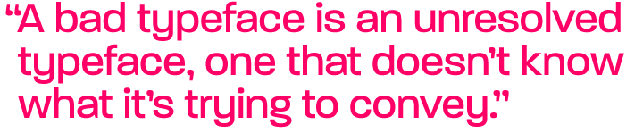
They are rarely driven by function if you define that as designing for a specific technical use — but they do need to function as clear expressions of an idea. A bad typeface is an unresolved typeface, one that doesn’t know what it’s trying to convey. Font design is a curious mix of the technical and the aesthetic, the left and right brain.
As a designer and illustrator working in digital media, you don’t really depend on being in a metropolis like London for making a living. Ever thought of leaving the city?
Geographical proximity to clients is much less of an issue than it used to be, especially as many of them are in the US and Japan. Every time we move studio, it seems to be a bit further out of London. We’ve moved from Wardour Street to Clerkenwell to Bayswater to Portobello to Kew, which means I now actually travel out from the centre instead of in. It’s nice here, though — mellow atmosphere, trees, Kew Gardens and a traditional pie shop. (Wednesday in the studio is Mushy Peas and Pie Day — we even have a site: pie-day.com.) However, London is a cultural hub, an inspirational resource that always refuels the inspiration — “When one is tired of London, one is tired of life, for there is in London all that life can afford.” (Samuel Johnson)
Regulator

In much the same way as Paralucent is an alternative Akzidenz Grotesk, and English Grotesque explores the Gill/Johnston idea-space, Regulator ventures into the realm of the geometric sans, the land where Futura is king, Avenir a lofty queen and AvantGarde a wayward prince. Regulator is definitely the non-royalist newcomer, with its unapologetic simplicity, wide body and drastic solutions (look at that “g”!). Now here comes the twist: it is surprisingly legible. Even at very small point sizes, Regulator performs better than you’d expect from such a geometric character.
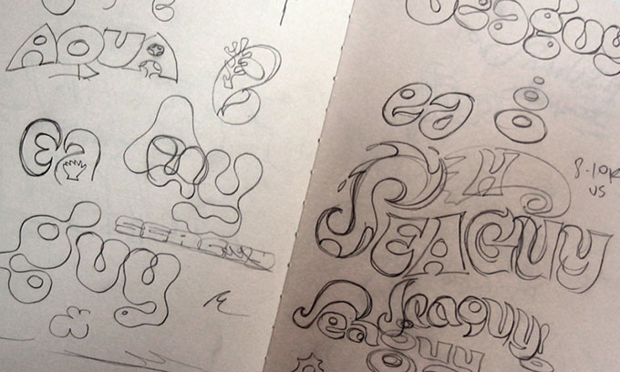
Sketches for one of Rian's logo designs.
Finally, here’s a list of possible sources of reference and inspiration. Please associate freely…
Pop music?
Pop in general. Approachable, hookline design with depth. Grab them with immediacy, keep them with the detail. On iTunes in our studio we are currently playing The Smiths, Electroclash, Ultravox, Heaven 17, Royksopp, Goldfrapp, Kylie, James Brown, Bobby Womack, Steely Dan. The Carpenters, Simon and Garfunkel. Motorhead, Public Enemy. Wasn’t into the Spice Girls that much — sorry Geri. I was drawing comics rather than watching Kids from Fame. You do know way more about hip-hop trainers than I do, though.
Bad movies?
Out of Africa … zzzzzzz … Not enough spaceships and explosions for me. I did cry in Titanic, though. And Dead Poets Society. I’m a big softie.
Monitor

Our designer goes retro-techno in this early experiment — a celebration of TV wall pixeldom. Built with squarish elements in various sizes, the characters have a kind of built-in blur. This results in an interesting property: text set in Monitor becomes easier to read the further away one gets.
The Flintstones?
"Wehey, Barney…" Barney had the sexier wife, don’t you think? The chap who designed a great deal of Hanna Barbera’s output at this time, and drew some of the best of the Dell comics (even though they never carried credits) was Harvey Eisenberg. He was a huge influence on me as a teenager. I’ve met his son, who works at Warner Animation now. Eisenberg is why I like Serge Clerc so much — Clerc channelled that brushy angularity through a hip adult sensibility.
Thunderbirds?
I have a cabinet of Thunderbirds toys. It’s a bloke thing. Girls just think we’re strange.
Comedy?
Flight of the Conchords: “It’s Business time…”; Flanders and Swan: “A Song of Patriotic Prejudice”. (Check it out on YouTube) The first season of My Name is Earl. Monty Python showed us not just comedy, but how to mess with the expected structure of a given thing, in their case a 30 minute TV show. I vividly recall one episode that began with the end credits and ended with the title sequence. No one messes with format and the basic structure like that, except perhaps Alan Moore. And maybe Peter Saville. Moore, Saville and Python. The structural triumvirate!
Playboy cartoons?
Not that into Playboy cartoons — Annie Fannie was always a bit dumb blonde for my tastes, though beautifully drawn by “TV21” veteran Ron Embleton. I rescued several Embleton originals from a skip behind the offices of 2000AD many years ago. This skip was so full of original art that I was actually standing in it, on the art, in order to go through it. I’ve just discovered the work of Arthur Ferrier. He could draw, yessir.
Flea markets?
Let me at them! Junk shops full of mouldy books, mid century modern furniture, paperback SF novels, magazines… The smell of yellowing paper. Mmm.
Pop art?
Well, if you know Lichtenstein’s references, or are familiar with the Foss/Brown debate, you know who the better artists really are.
The fine art world can be culturally myopic. It's obvious that in music, if you’re a DJ, playing something obscure and forgotten loud, in a new context like a club, does not make you the author. The art world equivalent — redrawing something big and hanging it in a gallery — should not make you the author either. If you fiddle with it a bit, that’s called a remix or a cover version. It still does not make you the author. Never mistake an act of curation for an act of creation.
Well, I think we got it covered. Thanks for you words of wisdom, Rian. And good luck with the OpenType conversions.
Hawksmoor

If there were a wooden equivalent of heavy metal, Hawksmoor would be it. It is wood type after years of neglect or overuse, with worn-down corners, chips broken off and surfaces damaged. The upper- and lowercase provide alternate versions of each of the slab-serifed capitals. A great tool for doing rough-and-dirty posters, alt.country music packaging or saloon signage.
Dauphine

With its perfumed, well-behaved elegance, Dauphine is bit of an anomaly in the Device catalogue. Yet is has a lot of fans, who have no doubt used it for logos, chocolate boxes, 25th wedding anniversary invitations, romance novels and gift labels. Dauphine is a double all-caps alphabet — big and small — that recalls the not-quite-geometric hand-lettering on classy 1930s packaging. We like the Alternate version for its luscious long legs and tails on K, R, and Q. Dauphine comes with a leafy decorative variant — a typeface for spring!
Who would you interview?
Creative Characters is the MyFonts newsletter dedicated to people behind the fonts. Each month, we interview a notable personality from the type world. And we would like you, the reader, to have your say.
Which creative character would you interview if you had the chance? And what would you ask them? Let us know, and your choice may end up in a future edition of this newsletter! Just send an email with your ideas to [email protected].
In the past, we’ve interviewed the likes of David Berlow, Dino dos Santos, Cyrus Highsmith, Nick Shinn, Veronika Burian and Underware. If you’re curious to know which other type designers we’ve already interviewed as part of past Creative Characters newsletters, have a look at the archive.
Colophon
This interview was conducted & edited by Jan Middendorp, and designed by Nick Sherman.
The Creative Characters nameplate is set in Amplitude and Farnham; the intro image features Paralucent and Slack Casual; the pull-quotes are set in Paralucent; and the large question mark is in Farnham.
Comments?
We’d love to hear from you! Please send any questions or comments about this newsletter to [email protected]
Subscription info
Want to get future issues of Creative Characters sent to your inbox? Subscribe at www.myfonts.com/MailingList
Newsletter archives
Know someone who would be interested in this? Want to see past issues? All MyFonts newsletters (including this one) are available to view online here.