
This first week of July is a very special week in typographic circles: it’s TypeCon time. The yearly conference organized by the passionately named Society of Typographic Aficionados (SoTA), is the high point of the year for font nerds across North America and beyond. Fans of great music and good food (which combine so well with fine letterforms) are particularly looking forward to this edition as it is taking place in New Orleans, the city of gumbo, Allan Toussaint and Dr John. Several MyFonts people are going to be there — European team members are flying in from places as exotic as Bristol and Berlin. If you are among the lucky folks who will be there too, do come and see us at our stand. And if you’re staying home like the rest of us… well, we hope this newsletter is some kind of consolation. We look forward to hearing from you, be it in person, via our feedback form, our Twitter stream or our Facebook page.
This month’s Rising Stars
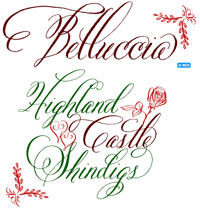
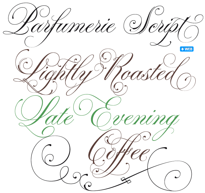
Lettering artist Debi Sementelli, aka “Letterheadgirl”, teamed up with Astigmatic’s Brian Bonislawsky to form Correspondence Ink. Their first joint typeface is Belluccia, a formal script with a rugged edge. Made with wedding invitations in mind, Belluccia mimics custom calligraphy at a fraction of the price. When used with OpenType-enabled software, the font automatically turns on various features (Ligatures, Swashes, Stylistic and Contextual Alternates) to swap out letter sets with alternate versions, allowing you to simply type your message while creating the visual diversity that gives you the unique look of custom lettering. For those who work with software that doesn’t handle OpenType magic, there are separate Standard fonts that make up the styles contained within the Pro font. When buying the Belluccia Pro package, you’ll also receive all the Standard fonts.
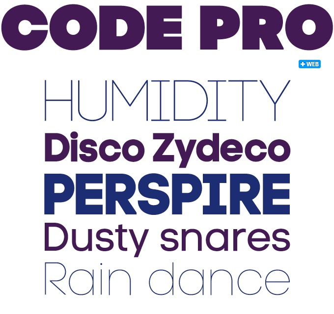
For the best part of last month, Code Pro was at the top of our Hot New Fonts list. It is the latest type family from Bulgaria’s Fontfabric, a microfoundry that specializes in stylish geometric display faces. Code Pro is one of their most successful designs to date. Although it is a clever cross between Avant Garde, Futura and possibly a few more cool, clean sans serifs, Code Pro does look decidedly different. While its pedigree goes back to the esthetics of the 1930s and early 1980s, its look and feel is definitely contemporary. Its extreme Light and Black weights offer great possibilities for spectacular headlines, its middle weights will work both in headlines and medium-length text settings. Check out the free demos of Code Pro Light and Regular!
Text family of the month
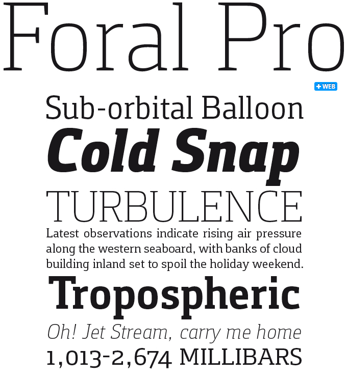
Foral Pro is an excellent new slab serif face by Portuguese designer Rui Abreu. Its basic shape is the rounded square from which so many recent sans-serifs are derived; but in the context of a slab serif (aka “Egyptian”) the feeling is not one of déjà vu. The squarish shapes have a sutbly humanistic touch, lending the typeface just the right balance between cool, clean clarity, and friendly readability.
Foral Pro has what it takes to be useful in demanding environments: a good range of weights, distinctive italics, small caps, multiple figure sets including tabular oldstyle numerals and numerals at small caps height. We can imagine a thousand different uses, from web and editorial use to branding, packaging and signage. All in all, an impressive new release from independent Swedish foundry Fountain.
Follow-Up
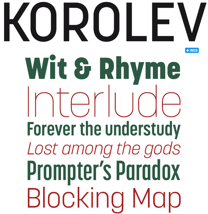
Like many of Rian Hughes’ typefaces, Korolev’s design is informed by Hughes’ enthusiasm and curiosity about the history of type and letterforms. Based on lettering found on a photograph of the displays at the Communist Red Square parade in 1937, the capitals recall the simplicity of constructivist agitprop. Hughes added the lower-case and extrapolated the alphabet into a family of standard, italic, condensed, and compressed versions, each in five weights. The result is a distinctive alternative to DIN and similar “engineers’ sans-serifs”.
If you like this typeface from Device, check out some of their other fonts:
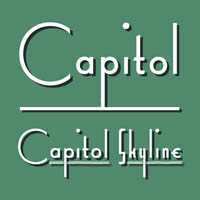
Capitol
Capitol features two faces that epitomize the Streamline Moderne style, Capitol Skyline and Capitol Capitals. Strong geometry, large, open counters, long extenders and a succession of contextual alternates and discretionary ligatures make this a substantial and flexible headline and branding font.
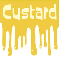 Custard
The playful, funky Custard is a fine example of Hughes’ sensibility to 1950s–1960s popular culture. It is the ideal choice for candy wrapping, teen magazines, toy packaging and the like. Use with bright fresh colors for added “bounce”.
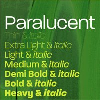
Paralucent
A classic in the Device font library, Paralucent combines the look of 1950s wide sans-serifs with contemporary detailing and a subtle lounge feel. Its combination of round and square shapes, smoothness and sharp edges result in a typeface that embodies the ultimate in cool.
Sponsored Font: Periódico
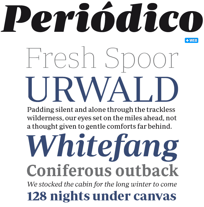
Periódico (“Newspaper” in Spanish) is a large and extremely versatile type family for editorial use. Designed by Eduardo Manso, best known for his wildly successful Geogrotesque, it was originally commissioned by the Spanish daily newspaper ABC. Inspired by old Spanish typographic engravings, mostly from the second half of the eighteenth century, Manso picked typical details from the Spanish tradition as a source of inspiration. Instead of reviving or interpretating these models, he drew a truly original font family from scratch. The result is a distinctive and functional typeface that refers to “old Spanish typography”, yet is truly relevant to our times. While the overall inspiration came from eighteenth-century book types, the type’s proportions were adapted to the demands of today’s printed media for flexible and space-saving fonts. Periódico is presented in 30 different styles, 10 for text (from Light to Bold) and 20 for display sizes (from Thin to Ultra Black), resulting in an extensive system capable of solving all the needs of a large publication.
Have your say
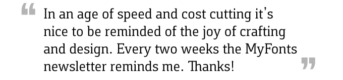
— Tony Richardson, June 9th, 2011
Your opinions matter to us! Feel free to share your thoughts or read other people’s comments at the MyFonts Testimonials page.