The big news of the last month is that MyFonts is now an official distributor for FontFont, one of the world’s most influential type collections. For details, take a look at the news section below. These days the world of type design is even more “democratic” than when FontFont got started – any designer with a well conceived, well executed, well marketed font has the chance to succeed at MyFonts. So, like every month, we know that any of this month’s stars could still be shining brightly in 20 years’ time.
This month’s Rising Stars
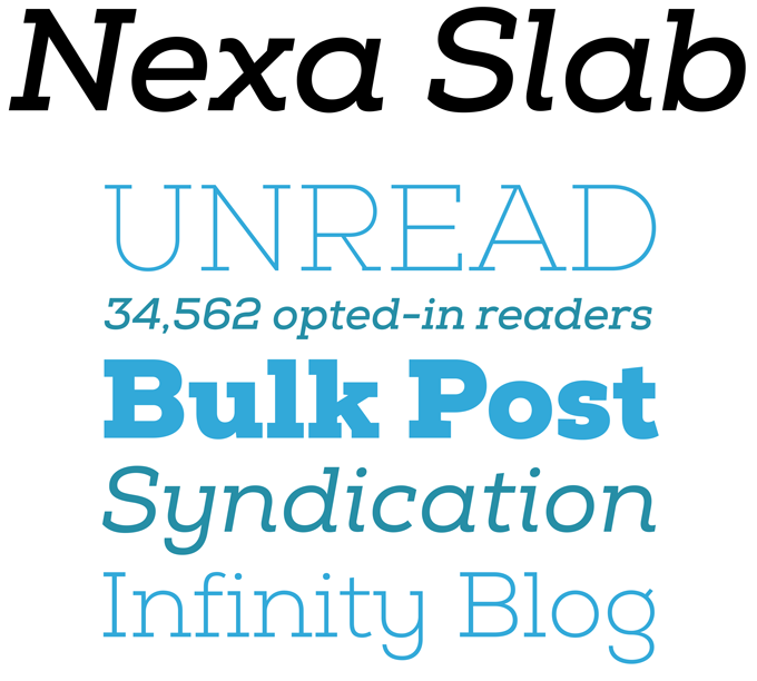
As well as being a bestseller for Bulgarian foundry Fontfabric, Nexa was one of last year’s Fonts of the Year. So it will come as no surprise that designer Svetoslav Simov decided to expand the family, crafting a slab serif based on the same sound geometric skeleton that made Nexa such a successful, clean-cut sans. Contrary to the original Nexa (and similar to HVD’s Supria Sans) Nexa Slab offers two very different slanted styles to accompany the upright: a modernist-looking Oblique, and a more fluid, friendly Italic. Nexa Slab taps into the tradition of classic slab serif fonts such as Lubalin Graph, Rockwell and Memphis, giving the genre a distinct personal twist.
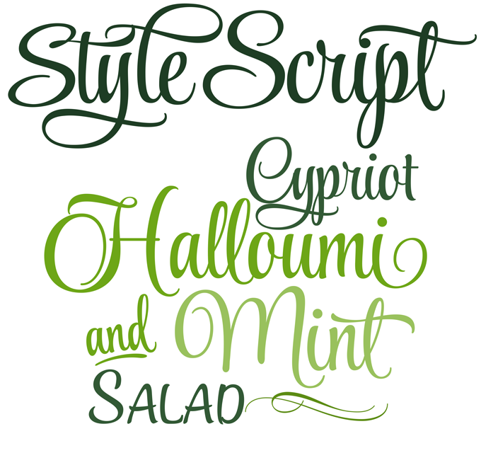
Rob Leuschke is one of those American lettering wizards whose script fonts invariably look fresh and natural — as if they’ve been lifted directly from brush-painted shop fronts and truck doors, or from hand-lettered headlines in vintage magazines. Much of this is brilliant illusion: while the design may be based on a pencil sketch, these are digital curves, perfected on the computer screen, balanced to make each letter look its best next to its neighbors. The new Style Script from Leuschke’s TypeSETit foundry takes a script style from 1950s and ’60s advertising, combining simple charm and brisk detailing with the power of today’s digital design — for which Leuschke got a little help from his friends Maximiliano Sproviero and Mark Simonson. The result is a beautiful upright script in three main styles — Plain, Script and Formal. Design professionals equipped with OpenType-enabled software will have easy access to all of the font’s features and 1275 glyphs; those not so fortunate can still create elaborate typography thanks to the Style Script Family package that includes endings, swashes, ornaments, capitals and each of the three main styles as separate fonts.
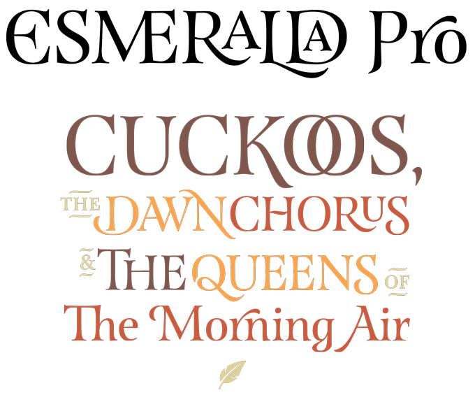
Although Guille Vizzari has only published two typefaces with Sudtipos, his eye-catching designs have certainly added a strong new voice to the prestigious font library. At the core of his successful new Esmeralda (produced in collaboration with Ale Paul) is a fascination with the capitalis monumentalis, the stone-carved capitals of ancient Rome. For the lowercase, Vizzari looked at the “foundational hand” of the Johnston school of calligraphy. What makes Esmeralda shine is a keen eye for detail, and a brilliant sense of rhythm. Classic structures are mixed with a contemporary sensibility for decoration: with more than 1100 glyphs, the font provides a huge arsenal of ligatures, alternative characters, initial caps and connectors; needless to say, all of this works best when using design software with full OpenType functionality.

There’s been a change behind the scenes at MyFonts: new foundries are not simply admitted but go through a selection process which may involve lengthy dialogs about how to improve the design, the naming and the family structure. The Gin and Bourbon font families from the promising Hold Fast Foundry were two of those fonts that visibly grew in strength under our scrutiny; of the two, Gin has been the most successful so far, sales-wise. Both families were distilled from vintage letterforms — old display alphabets and lettering on the labels of classic bottles of booze. Features include: Stylistic Alternates, Discretionary Ligatures, and Multiple Language Support.
Text families of the month
Text typefaces for demanding editorial work need to possess special qualities: excellent readability, a generous range of weights with italics and small caps for all of them, multiple figure sets (lining, oldstyle, table) and ample language coverage. In this section of the newsletter you’ll find recent releases that meet these standards.
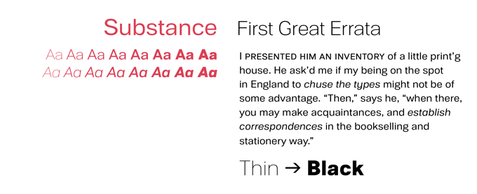
Does the world need yet another Helvetica-like grotesque? The question is almost as pointless as asking whether the world needs one more Bordeaux, or any more Stephen King novels. Flavors differ subtly, and the story is never exactly the same. Marcus Sterz from FaceType has taken a critical look at the grotesque model and with Substance sets out to hone it into a workhorse text and display face that honors content: substance over style. Containing eight weights plus italics (800+ glyphs each) the Substance family is versatile indeed, with small caps, a wide choice of figures styles, ligatures, currency signs, symbols and arrows.
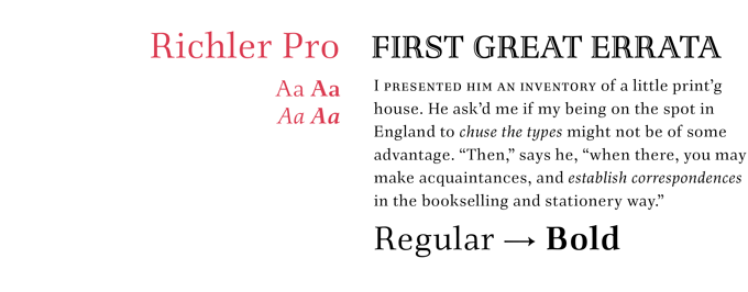
Preto from DizajnDesign is an extensive type family (or “superfamily”) in three styles: Sans, Semi and the variety featured here, Preto Serif. Although it was designed for comfortable reading at small point sizes (say 8 to 10pt in print) your page won’t look calm or bland. No “invisible” typography with Preto Serif. Its long, spiky serifs give it a distinct and energetic character; the Italic, especially, has quirky details that will make it attractive as a display face to users in search of a special look. Language coverage is excellent, and it comes with alternates for complex typesetting plus a set of ligatures that adapt to different tracking values.
News Round-Up
In this section we pick out interesting news snippets from MyFonts’ own kitchen and from the greater world of fonts, lettering and typography.
New on MyFonts: the FontFont collection
 FontFont was started by designers Erik Spiekermann and Neville Brody in 1990, just as it became possible to create fonts independently. It soon became one of the world’s most admired typeface collections, offering an astonishing range of fonts that became contemporary classics (each name preceded by “FF”): FF Meta, Dax, Scala, Blur, Trixie, Quadraat, Mister K, DIN, Tisa, Cocon, Clifford, Kievit, Clan, and many more. FontFonts have long been largely exclusive to the FontShop network. Now MyFonts is proud to announce that we offer the FontFont library in most of the world. Europe, except for Germany, Austria, and the Benelux countries, follows this fall.
Ampersand: discussing web typography
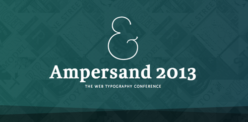 On June 28, 2013, the third edition of the Ampersand conference will take place in Brighton, UK. Ampersand is a one-day conference where knowledgeable web designers and type designers meet and compare notes. It is small-scale and affordable, but the quality of the speakers is top-notch. This year’s line-up includes Erik Spiekermann, Mark Boulton, Nina Stössinger, Andy Hume, and Christian Schwartz. The event will also host the first international student type exhibition, showcasing the best of student type design from around the world. MyFonts is proud to be a sponsor — the event kicks off on Thursday evening, the 27th, with a pre-party at Brighton Music Hall, hosted by our team.
Web fonts at MyFonts

All of the top four Rising Stars fonts are available for licensing as web fonts. Visit Webfonts.info for HTML and CSS versions of this month’s Stars, plus lots of articles, resources and a showcase of web typography in the real world.
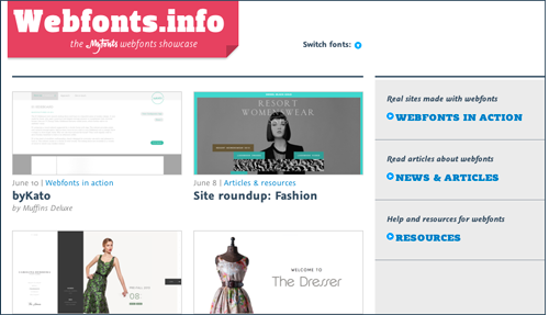
The showcase is now building up a decent collection of real world examples of webfonts in use, but we’re hungry for more! Please use our contact form to send your examples our way for inclusion in the showcase.