
This month’s most popular fonts exude the smell of gingerbread, candles and fresh fir twigs. Not that they’re literally Christmas fonts — we have outgrown snow-covered serifs and star-topped swashes, haven’t we? But there certainly is something festive, cozy and Decemberish about this lot. Perhaps it’s just our imagination, or lack of it. What is absolutely true, however, is that each of these fonts comes from a microfoundry somewhere in this big world — a company run by just one or two hard-working independent designers who dedicate their life to the pursuit of typographic excellence. Beautiful, isn’t it?
This month’s Rising Stars
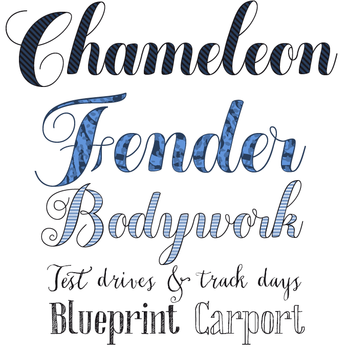
There’s a remarkable trend in display type recently: colorful families consisting of fonts that are very diverse in design, yet work well together. Following the success of Laura Worthington’s Charcuterie, other foundries have come up with families in this vein, with results that look remarkably different. Chameleon by Dutch designer Hanneke Classen is a charming and well-made suite of sixteen fonts based on three basic designs — very distinct, but designed to complement each other. When combined they form a well-balanced toolkit to create lively layouts for invitations, menus, showcards, magazines, brochures, packaging, etc. The basic Chameleon style is a script that comes with six Fill patterns, which can be layered in different colors using an application that allows you to stack text frames. The effect is truly chameleonic. Chameleon Pen and Chameleon Sketch are contrasting styles for adding a nonchalant, hand-written feel to your designs.
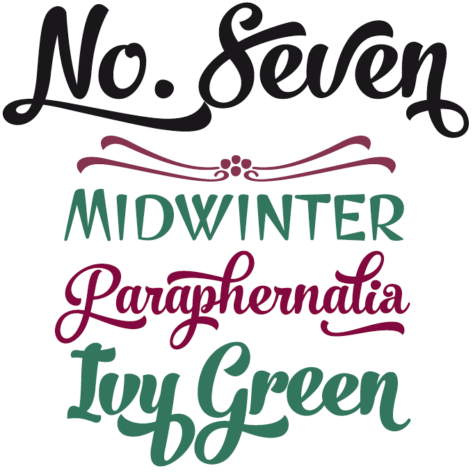
Fenotype’s Emil Karl Bertell has been very productive lately. Following Alek, presented in last month’s newsletter, No. Seven is an even bigger hit: it occupies the #1 spot in our Hot New Fonts list as we speak. No. Seven is a bold brush style script family in three weights, an Ornaments set and a block capital “SmallCaps” font. The family is equipped with a wealth of OpenType features, which can be activated by selecting Swash, Contextual, Stylistic or Titling Alternates, or Discretionary Ligatures in an OpenType-savvy application. Combine the basic font with the Ornaments and SmallCaps sets for maximum visual satisfaction and flexibility. For the best price purchase the complete No. Seven Family. 35% off an already very affordable price, until December 14, 2013.
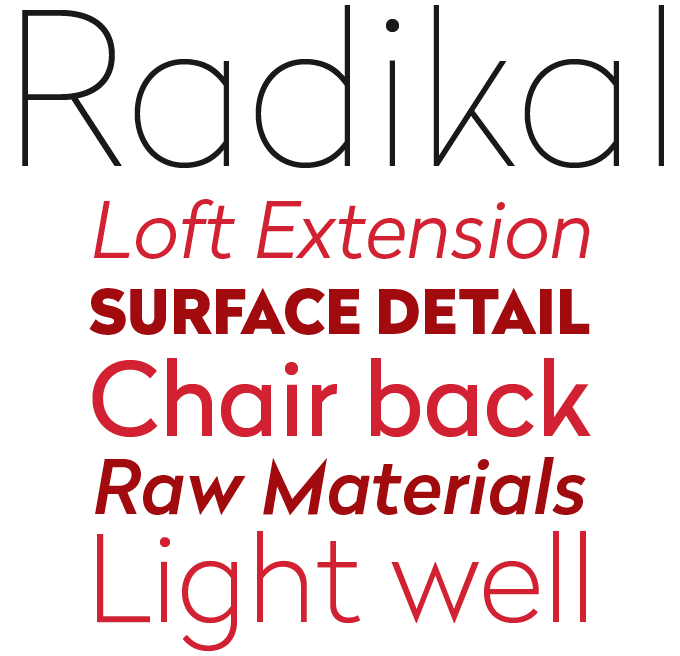
The one-person Nootype foundry, too, has been extremely busy, publishing one quality font family after another. Radikal is their admirable take on the geometric sans-serif model. Easier on the eye than Futura, but sharper and, well, more radical than Avenir, the family is “dedicated to the research of purity,” says its designer Nico Inosanto. The Radikal family includes seven weights, from UltraThin to Black, with corresponding italics. It comes with many numeral styles, and an extended character set to support Central, Eastern and Western European languages.
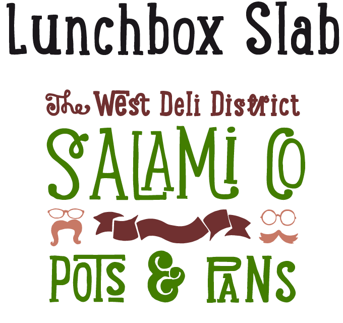
Kimmy Kirkwood’s Lunchbox came out in May this year — a hand-drawn grotesque for informal display settings. The new Lunchbox Slab is its serifed companion. Its quirky charisma, low price and huge character set have proved an irresistible combination. To begin with the latter: Lunchbox Slab may look a bit naïve, but it’s far from primitive. Both Lunchboxes feature over 1,500 different characters, which can be accessed via the OpenType features in the well-known design applications that handle OpenType well. Each letter comes in four versions that flip automatically to ensure that no two letters in a row are identical. The Stylistic Alternates feature activates an extra hand-drawn flourish, loop and slight variation, also with four different styles per letter. There are Small Caps, Discretionary Ligatures, Swashes, and more — and all these options are available in Light, Regular and Bold. Finally there’s Lunchbox Slab Ornaments, with nearly 200 graphics, flourishes, frames, catchwords, text breaks and arrows. Play away!
Text families of the month
Text typefaces for demanding editorial work need to possess special qualities: excellent readability, a generous range of weights with italics and small caps for all of them, multiple figure sets (lining, oldstyle, table) and ample language coverage.
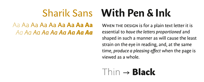
Sharik Sans, says Michał Jarociński of Dada Studio, was named after the brave and smart dog that was the hero in his favorite TV series. Appropriately, it has a warm and gentle personality, does not bark or shout, and serves its master in everyday work. While technically Sharik is a sans serif, it also has the look and feel of something handmade: there’s a calligrapher’s touch in its subtle details and endings. It makes the typeface soft and readable at text sizes, and striking in headlines. The family consists of nine weights plus matching italics and has all the sophistication needed for demanding typographic work in print and on the web. Try combining it with Clavo from the same foundry!
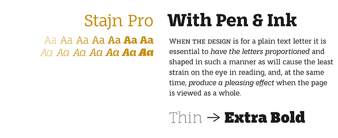
Stajn Pro by Anže Veršnik was designed for setting large amounts of text. Hence the slightly condensed proportions and large x-height, which make the face economic without diminishing legibility. Its sturdy slab serifs make it virtually indestructible as a body text face; but with beautifully drawn extreme weights (from Thin to Extra Bold) it also builds interesting headlines. Its vigorous yet elegant design along with various stylistic alternate makes Stajn Pro a useful and versatile typeface for editorial promotional design.
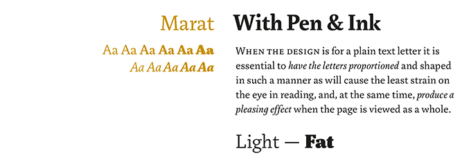
Marat is not entirely new — its earlier versions have been around for several years. But the new Marat is the result of a drastic revamp, with additional weights and more glyphs, so Berlin designer Ludwig Übele decided to relaunch the family. While originally conceived as a magazine face, with its strong serifs and open shapes to guarantee legibility in small sizes Marat evolved into a comprehensive family for general use. With its slightly unusual (yet unobtrusive) construction and round shapes, its appearance is elegant and personable, suited to a wide range of uses, from editorial to corporate and commercial. Its bold weights work surprisingly well in branding and similar uses.
News Round-Up
In this section we pick out interesting news snippets from MyFonts’ own kitchen and from the greater world of fonts, lettering and typography.
One-click font installation is here!
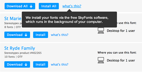 Installing your MyFonts purchases is now much faster and easier. Hit the smart little Install button on any of your font order pages (new or old) to make your fonts appear instantly on your computer.
Setup is quick and easy: you will be prompted to install the free SkyFonts helper app the first time you hit the Install button. From then on, the helper app will work invisibly in the background and you’ll never need to see your font files again, they’ll just work! Install the app on as many computers as you wish (it works on both Macs and PCs), and then your fonts will always be in sync, even if you make your purchases on your tablet device or while in a meeting with your client.
You may have missed…
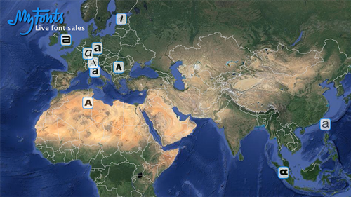
While we’re on the subject of nifty, fontastic innovations: this mashup by our developers of a Google map and our sales reporting tool has been live on our site for a while now, but it’s definitely worth revisiting. We like to think it’s a bit like watching Santa Claus as he flies around the globe dropping parcels down the chimney… or is that just us wanting nothing but typographic presents for Christmas?
Webfonts at MyFonts

All of the top four Rising Stars fonts are available for licensing as webfonts. Visit Webfonts.info for articles, resources and a showcase of web typography in the real world.


ColophonThe Rising Stars nameplate is set in Auto 3 and Proxima Nova Soft. The font samples were conceived and designed by Anthony Noel with contributions from the editor, Jan Middendorp. |
Subscription infoWant to get future MyFonts newsletters sent to your inbox? Subscribe at myfonts.com/MailingList |
Comments?We’d love to hear from you! Please send any questions or comments about this newsletter to [email protected] |