|
Typography is like fashion: trends come and go, and each season has its new favorites, with different shapes and novel concepts. As we noted last month, the one persistent trend this year is chromatic fonts: fonts that can be layered in different colors, combining basic lettershapes with outlines, fills, patterns, shadows and three-dimensional effects, much like in the old days of chromatic wood type. The saga continues: two of this month’s most popular fonts are made for layering. It’s attractive stuff — once you start spicing up your layouts with some of it, it might even become addictive. For the less exuberantly minded, this newsletter offers typefaces that show more restraint: check out our opening sample, as well as the ever-interesting Text Fonts of the Month selection. Enjoy!
|
|
|
This Month’s Rising Stars
|
|
|
|
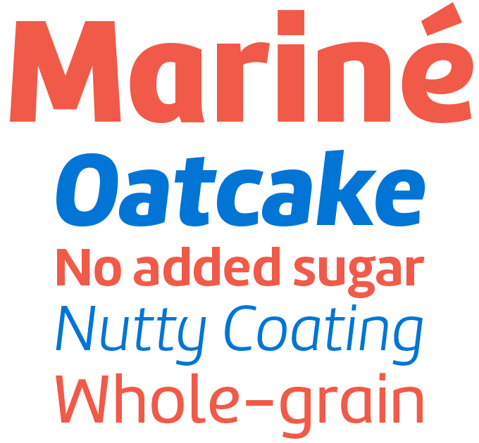
A simplified structure clad in subtly bent strokes — that, in a nutshell, is the concept behind Martin Sommaruga’s Mariné. Combining the crispness of a geometric sans with the friendliness of neo-humanist shapes, Mariné strikes a balance between the affable and the business-like. The family comes in multiple styles. Each of the four weights has an Italic as well as an Oblique (a slanted version of the upright). The fourth variety of each weight is called “Up” and it’s the opposite of a slanted roman: an upright with italic-flavored shapes, giving it a somewhat informal and unusual character — see the words “Mariné” and “Whole-grain” in the sample above. With all these subtle varieties, the family offers a rich palette of typographic nuances for text and display.
|
|
|
|
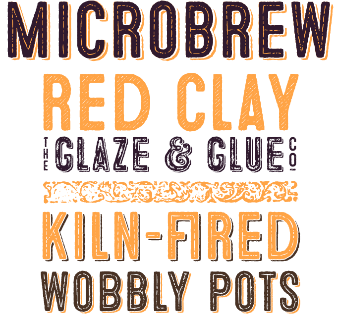
While the more aggressive breeds of 1990s grunge type have all but died out, the mildly distressed and battered retro style that was also invented back then is more popular than ever. Fonts suggesting letterpress-printed, hand-stamped or roughly painted texts are released every week. However, it takes some added value and a touch of authenticity to truly strike gold. Microbrew from Albatross certainly has some of that extra oomph. It includes a set of retro ornaments and catchwords and offers stackable varieties to create multi-colored pieces. It also has alternative variants of the (all-caps) letters in the lowercase positions — efficient and easy to use. To add to the realism, it includes double-letter ligatures. As the name indicates, Microbrew is great for pub signage and beer posters, but it is more versatile than that: how about spicing up your birthday invite, restaurant or coffee shop menu, music or food packaging?
|
|
|
|
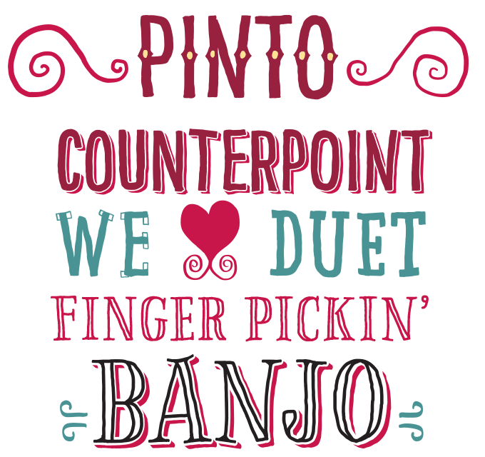
Vienna’s FaceType foundry has an interesting track record, releasing fonts that present an individualist and charming take on popular trends. Pinto is no exception. Designed by by Georg Herold-Wildfellner, it is somehow more European and more stylish than many other casual, hand-drawn skinny all-caps display faces. Combining sans-serif, slab serif and roman styles within one family, the irregular, hand-lettered look ties it all together, adding a human touch. With eleven alphabetic fonts (including Shadows and Dots for two-tone layering) plus Banners, Swashes, and Symbols, Pinto offers a flexible toolbox. Consult the designer’s text on the font page for more details about the rich family structure.
|
|
|
|
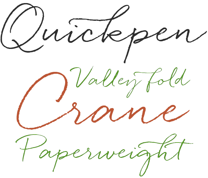
To produce readable handwriting that is simultaneously elegant and informal — that’s not an easy task to pull off. Creating a font that reproduces this kind of writing in a way that makes it look effortless and casual is even harder. So the recent success of Quickpen by Laura Conduris of Trial by Cupcakes is well-deserved. Quickpen was designed to create a carefree, confident piece of faux-lettering — like a quickly-jotted script written with a felt-tip pen or brush. When used in an OpenType-savvy application, ligatures and contextual alternates for lowercase letters enhance the natural hand-written look, while swashes lend a bit more finesse. Quickpen is the perfect script for a design that doesn’t take itself too seriously.
|
|
|
Text fonts of the month
Typesetting for books, scientific magazines, or annual reports requires fonts with special qualities: excellent readability, a generous range of weights with italics and small caps, multiple figure sets (lining, oldstyle, table) and ample language coverage. In this section of the newsletter you’ll find recent releases that meet these standards.
|
|
|
|
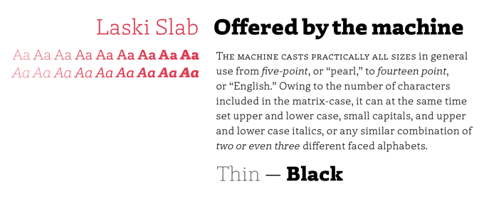
Paula Mastrangelo and Ramiro Espinoza are both Argentinian expats, based in Catalonia and the Netherlands respectively. They struck up a collaboration combining her expertise as a type-obsessed magazine art director and his skills as a designer of intricate script and display fonts. Their first joint venture, released by Espinoza’s ReType foundry, is the splendid Laski Slab. A practical slab-serif family for editorial purposes, Laski Slab is robust and readable, yet beautifully drawn, showing wonderful detailing in larger sizes. An attractive stencil variety for display purposes completes the versatile family.
|
|
|
|
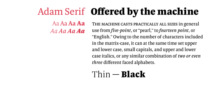
Fatype is a new foundry that recently signed up with MyFonts, but Estonian co-founder Anton Koovit is no newcomer. A graduate of KABK Type & Media in The Hague, Koovit published fonts with other vendors before creating Fatype with Yassin Baggar. His Adam Serif is a beautiful multi-purpose family with sturdy serifs and a low contrast, making it an ideal face for small sizes, while unique details give it a lot of character in bigger sizes. Although designed for book printing, several magazines and newspapers have chosen the family over the past few years. Adam Serif is the oldstyle companion to the original Adam, a sans-serif which will hopefully hit MyFonts’ shelves soon.
|
|
|
|
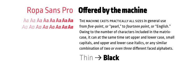
Ropa Sans Pro by Botio Nikolchev is a new family in the heavily populated genre known as “squarish sans” (a sans-serif based on a round-cornered, rectangular skeleton) but it has several characteristics that make it stand out. It’s narrower than most, which can save space when used wisely (and not too small!) and is great for headlines. While its upright style references the technical aesthetics of early 20th-century DIN alphabets, the more humanist Italic creates a unique flavor. It comes in eight weights plus italics, and separate small caps fonts. Four styles (Ropa Sans, Ropa Sans SC, Ropa Sans Italic and Ropa Sans SC Italic) can be downloaded for free.
|
|
|
News Round-Up
In this section we pick out interesting news snippets from MyFonts’ own kitchen and from the greater world of fonts, lettering and typography.
|
|
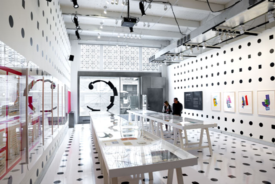
Century: 100 Years of Type in Design
In only a few years the interest in typefaces, typography and lettering has grown far beyond the graphic design community. People from all walks of life now buy fonts and like reading about type design and history.
Naturally, Monotype has a special interest in helping to spread awareness and knowledge about typography. With the exhibition Pencil to Pixel, the company opened up its impressive century-old archives, parts of which are now also permanently on display online.
The most recent exhibition curated by Monotype is Century: 100 Years of Type in Design, which will be on display until June 18, 2014 at New York’s AIGA National Design Center. The exhibition, designed by Abbott Miller from Pentagram, celebrates 100 years of type as a constant influence in the world around us. It features pieces from the archives of several design institutions, including the Condé Nast Archives, the Herb Lubalin Center and the Hamilton Wood Type Museum.
|
|
Spanish type in the spotlight
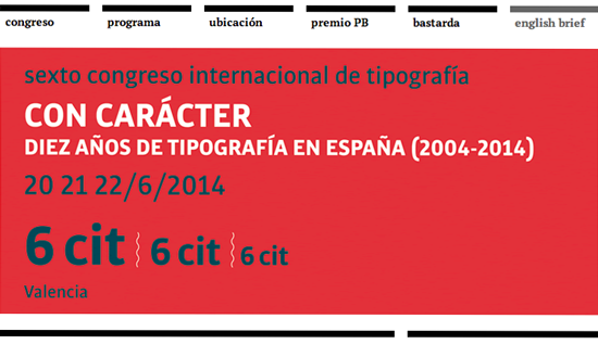
For Spanish-speaking typophiles, or those who would like to brush up their Spanish, what better excuse than a great typography conference in one of Spain’s most lively cities? The International Typography Congress in Valencia is a biennial conference notable for its intelligent programming and friendly atmosphere. Titled 6cit, its sixth edition will take place on June 20, 21 and 22, 2014. Organized by the Association of Designers of the Region of Valencia (ADCV), the conference celebrates its ten years of existence, and will focus on what has happened in Spanish type and typography during that decade. The congress will be held in Spanish, but there’s an English summary on the website.
|
| |
|
MyFonts on Facebook, Tumblr, Twitter
Your opinions matter to us! Join the MyFonts community on Facebook, Tumblr and Twitter — feel free to share your thoughts and read other people’s comments. Plus, get tips, news, interesting links, personal favorites and more from MyFonts’ staff.
|
|
|
|
|
|
|
|
|
MyFonts Inc. 500 Unicorn Park Drive, Woburn, MA 01801, USA
MyFonts and MyFonts.com are registered service marks of MyFonts Inc. Other technologies, font names, and brand names are used for information only and remain trademarks or registered trademarks of their respective companies.
© 2014 MyFonts Inc
|
|
|
|