


Wählen Sie diesen Lizenztyp, wenn Sie eine app für iOS, Android oder Windows Phone entwickeln und Sie die Datei Font in den Code Ihrer mobilen Anwendung einbetten.
1514 Paris Verand
von GLC
Einzelschnitte ab $20.00 USD

1514 Paris Verand Font Familie wurde
entworfen von
herausgegeben von
GLC. 1514 Paris Verand enthält
1
Stile.
Mehr über diese Familie
Basic typesetting
Letter case
Numerals and scientific typesetting
Typographic variants
Reset
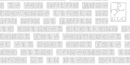
Über die Schriftfamilie 1514 Paris Verand
This set of initial decorated letters was inspired by a font in use in the beginning of 1500s in Paris.
Exactly, we have used the set that Barthélémy Verand employed for the printing of Triumphus translatez de langage Tuscan en François, (from “Triumph” of Petrarque) in the year 1514. Some letters, lacked, have been reconstructed to propose a complete alphabet. It appears that the printer used some letters to replace others, as V, turned over to make a A, or D to make a Q.
The original font’s letters were drawn in white on a black background only, but it was tempting to propose a negative version in black on white.
It is used as variously as web-site titles, posters and flyers design, publishing texts looking like ancient ones, or greeting cards, all various sorts of presentations, as a very decorative, elegant and luxurious additional font.
This font supports strong enlargements remaining very smart and fine. It’s original medieval hight is about one inch equivalent to about four lines of characters.
This font may be used with all blackletter fonts, but works particularly well with 1543 Humane Jenson, 1557 Italic and 1742 Civilite, without any anachronism.
1514 Paris Verand

Über GLC
Gilles Le Corre was born in 1950 in Nantes, France. Painter since the end of 70s, he is also an engraver and calligrapher. He has been learning about medieval art and old books for as long as he can remember. More recently he has made the computer a tool for writing like the quill pen and ink. With it, he aims to make it possible to print books that look just like old ones! Beginning in 2007 he has been trying to reproduce, very exactly, a ...
Mehr lesen