


Wählen Sie diesen Lizenztyp, wenn Sie eine App für iOS, Android oder Windows Phone entwickeln und Sie den Font in den Code Ihrer mobilen Anwendung einbetten.
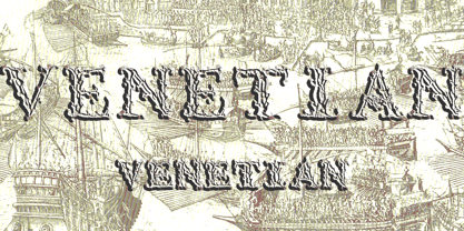
1565 Venetian
von GLC
Einzelschnitte ab $20.00 USD


1565 Venetian Font Familie wurde
entworfen von
herausgegeben von
GLC. 1565 Venetian enthält
1
Stile.
Mehr über diese Familie
Basic typesetting
Letter case
Numerals and scientific typesetting
Typographic variants
Reset
Über die Schriftfamilie 1565 Venetian
Dieser Satz von verzierten Initialen ist eine völlig neue Kreation, inspiriert von den Paternalien des italienischen Renaissance-Graveurs Vespasiano Amphiareo, die um 1568 in Venedig veröffentlicht wurden. Es enthält zwei römische Alphabete: das erste mit großen Initialen, das zweite mit Kapitälchen. Beide enthalten Dorn, eth, L & l slash, O & o slash.
Es kann vielfältig verwendet werden, wie Website-Titel, Plakate und Flyer Design, Verlagstexte, die wie alte aussehen, oder Grußkarten, alle verschiedenen Arten von Präsentationen, als eine sehr dekorative, elegante und luxuriöse zusätzliche Font...
Diese Font ist für Vergrößerungen gedacht, die sehr elegant und fein bleiben. Die ursprüngliche Höhe der Initialen ist mindestens etwa ein Zoll entspricht etwa vier Zeilen von Zeichen, Kapitälchen können die gleiche Höhe wie die Kappen der Font mit verwendet werden, aber decken zwei Zeilen ist besser.
Diese Font kann mit allen GLC-Schwarzschriften Fonts verwendet werden, aber vorzugsweise mit "1543 Humane Jenson", "1557 Italic", "1742 Civilite", "1776 Independence", ohne Angst vor Anachronismus zu haben.
1565 Venezianisch

Über GLC
Gilles Le Corre wurde 1950 in Nantes, Frankreich, geboren. Er malt seit Ende der 70er Jahre und ist außerdem Graveur und Kalligraph. Seit er denken kann, beschäftigt er sich mit mittelalterlicher Kunst und alten Büchern. In letzter Zeit hat er den Computer zu einem Schreibwerkzeug gemacht, das dem Federkiel und der Tinte ähnelt. Damit will er es möglich machen, Bücher zu drucken, die genauso aussehen wie alte Bücher! Seit 2007 versucht er, ein Buch sehr genau zu reproduzieren ...
Mehr lesen