


Wählen Sie diesen Lizenztyp, wenn Sie eine App für iOS, Android oder Windows Phone entwickeln und Sie den Font in den Code Ihrer mobilen Anwendung einbetten.
1584 Rinceau
von GLC
Einzelschnitte ab $20.00 USD


1584 Rinceau Font Familie wurde
entworfen von
herausgegeben von
GLC. 1584 Rinceau enthält
1
Stile.
Mehr über diese Familie
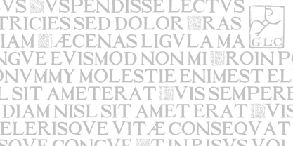
Über die Schriftfamilie 1584 Rinceau
This set of initial letters is an entirely original creation, inspired by French renaissance patterns used by Bordeaux printers circa 1580-1590.
It contains two roman alphabets : the first of decorated letters, the second of single large capitals, all with Garamond style, and a few fleurons using the same background pattern style. Both containing Thorn, Eth, L slash and O slash.
It can be used as variously as website titles, posters and flyers design, publishing texts looking like ancient ones, or greeting cards, all various sorts of presentations, as a very decorative, elegant and luxurious additional font...
This font is conceived for enlargements, possibly strong ones, remaining very smart and very fine (especially decorated initials).
This font may be used with all GLC Foundry blackletter fonts, but preferably with 1543 Humane Jenson, 1557 Italique, 1589 Humane Bordeaux, 1742 Civilite, 1776 Independence without any fear of anachronism.
1584 Rinceau

Über GLC
Gilles Le Corre was born in 1950 in Nantes, France. Painter since the end of 70s, he is also an engraver and calligrapher. He has been learning about medieval art and old books for as long as he can remember. More recently he has made the computer a tool for writing like the quill pen and ink. With it, he aims to make it possible to print books that look just like old ones! Beginning in 2007 he has been trying to reproduce, very exactly, a wide range of historic European typefaces, mainly from medieval and early periods of printing - his favorite period - from 1456 with Gutenberg, up to 1913 with a font inspired by a real old typewriter.
Mehr lesen
Weniger lesen
- Wenn du dich für eine Auswahl entscheidest, wird die Seite komplett aktualisiert.