


Wählen Sie diesen Lizenztyp, wenn Sie eine app für iOS, Android oder Windows Phone entwickeln und Sie die Datei Font in den Code Ihrer mobilen Anwendung einbetten.
Aether Rain™
von Fenotype
Einzelschnitte ab $12.00 USD
Komplette Familie mit 7 Fonts: $20.00 USD


Aether Rain Font Familie wurde
entworfen von
Emil Karl Bertell und
herausgegeben von
Fenotype. Aether Rain enthält
7
Stile und Optionen für Familienpakete.
Mehr über diese Familie
- Aa Glyphen
-
Bestes AngebotFamilienpakete
- Einzelschnitte
- Technische Daten
- Lizenzierung
Basic typesetting
Letter case
Numerals and scientific typesetting
Typographic variants
Reset
pro Font:
$2.85 USD
Paket mit 7 Fonts:
$20.00 USD
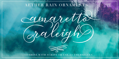
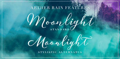
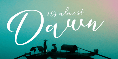
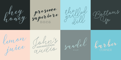
Über die Schriftfamilie Aether Rain
Aether Rain is an elegant modern script family that fits both casual and formal use. Aether Rain includes basic latin alphabets, numerals and punctuation. Aether Rain is equipped with Standard Ligatures that work automatically and it also has Stylistic Alternates (OpenType feature) for each character - and scripts are also PUA encoded so you can access the characters also with Silhouette Studio, Cricut Design Space.
Designer: Emil Karl Bertell
Herausgeber: Fenotype
Foundry: Fenotype
Eigentümer des Designs: Fenotype
MyFonts Debüt: Nov 28, 2017
Aether Rain™
is a trademark of Fenotype Typefaces.
Über Fenotype
Emil Bertell has done it all. Having published his first font files at 16, he was considered to be an international free-font hero while still in his teens. He went on to attend design college, drop out, and become a well-known graphic designer and illustrator. Now one of the most successful type designers from the Nordic countries on MyFonts, the Finland-based designer said in his Creative Characters interview that he’s “had an obsession with visual culture from the beginning.” Before turning his ...
Mehr lesen