


Wählen Sie diesen Lizenztyp, wenn Sie eine App für iOS, Android oder Windows Phone entwickeln und Sie den Font in den Code Ihrer mobilen Anwendung einbetten.
Ashbury
von Hoftype
Einzelschnitte ab $0.00 USD
Komplette Familie mit 10 Fonts: $198.00 USD


Ashbury Font Familie wurde
entworfen von
Dieter Hofrichter und
herausgegeben von
Hoftype. Ashbury enthält
10
Stile und Optionen für Familienpakete.
Mehr über diese Familie
- Aa Glyphen
-
Bestes AngebotFamilienpakete
- Einzelschnitte
- Technische Daten
- Lizenzierung
pro Font:
$19.80 USD
Paket mit 10 Fonts:
$198.00 USD
Über die Schriftfamilie Ashbury
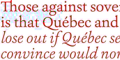
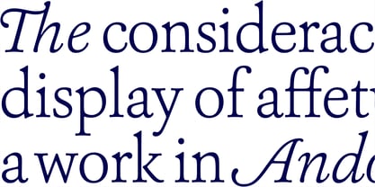
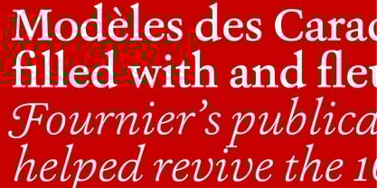
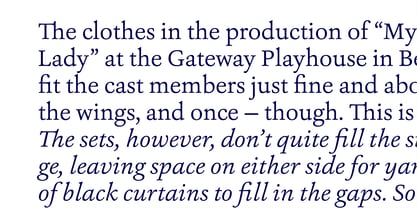
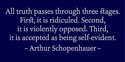
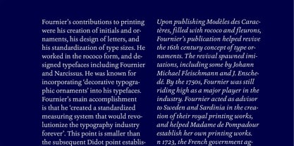
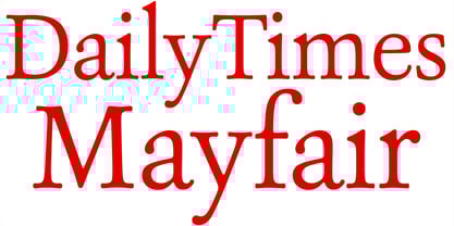
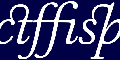
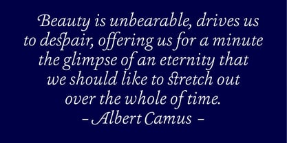
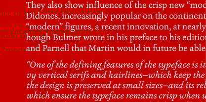
Ashbury derives its inspiration from 18th century transitional types such as Caslon and Baskerville. It is, however, not a revival but interprets formal aspects in a new and individual fashion. With a flowing outline, it remains warm and pleasant but assertive because of its solid stroke weights. It is very well equipped for a wide range of ambitious applications.
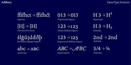
Ashbury comes in ten styles, in OpenType format, and with extended language support for more than 40 languages. All weights contain small caps, swash capitals, standard and discretional ligatures, proportional lining figures, tabular lining figures, proportional old style figures, tabular old style figures, matching currency symbols, fractions, and scientific numerals.
Designer: Dieter Hofrichter
Herausgeber: Hoftype
Foundry: Hoftype
Eigentümer des Designs: Hoftype
MyFonts Debüt: Jun 22, 2012
Ashbury
Über Hoftype
German designer Dieter Hofrichter started his foundry in 2010. Since then, he has remained focused on developing text fonts that integrate the rich history and tradition of typography with contemporary styles. Based in Munich, his first typeface on MyFonts was Impara, a sans serif with lively stroke ductus and distinct humanistic characteristics that is a representation of linear coolness and classic elegance. Since his debut, he has continued to produce beautiful, high quality serif faces. Capita, one of the foundry’s best sellers, is a self-dominated face with a fresh style that avoids the harshness of many slab serifs. Dieter has also seen success with one of his most recent designs, Mangan, a text face that combines classical rationality with contemporary design. “One of our intentions is to utilize the knowledge of the history of type to create contemporary types,” Dieter says. “Style consciousness and many years of experience in type design are our qualifications for producing functional and usable types of high quality.”
Mehr lesen
Weniger lesen
- Wenn du dich für eine Auswahl entscheidest, wird die Seite komplett aktualisiert.