


Wählen Sie diesen Lizenztyp, wenn Sie eine App für iOS, Android oder Windows Phone entwickeln und Sie den Font in den Code Ihrer mobilen Anwendung einbetten.
Beaufort®
von Shinntype
Einzelschnitte ab $59.00 USD
Komplette Familie mit 10 Fonts: $299.00 USD

Beaufort Font Familie wurde
entworfen von
Nick Shinn und
herausgegeben von
Shinntype. Beaufort enthält
10
Stile und Optionen für Familienpakete.
Mehr über diese Familie
- Aa Glyphen
-
Bestes AngebotFamilienpakete
- Einzelschnitte
- Technische Daten
- Lizenzierung
pro Font:
$29.90 USD
Paket mit 10 Fonts:
$299.00 USD
Beaufort Basic
4 Fontspro Font:
$24.75 USD
Paket mit 4 Fonts:
$99.00 USD
Über die Schriftfamilie Beaufort
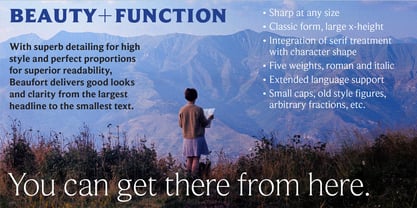
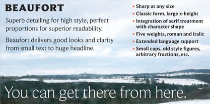
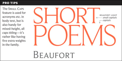
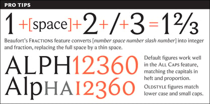
Engaging the issue of scalability, Beaufort® is configured so that serifs render with great sharpness, independent of type size, limited only by device resolution. This scale of effect empowers the typographer with a design axis stretching from awesomely huge to preciously tiny, further enhanced by weights from Light to Heavy, small caps, and alternate figure styles. In style, Beaufort has a number of affinities. In particular, the bold romans recall a kind of “grotesque with small serifs” style popular with sign painters and package lettering artists in the early 20th century, and still going strong. In proportion, the basic Beaufort is in the vein of the classic oldstyle types that descend from
, via the French Oldstyles, or Elzevirs, to
and
in the early twentieth century. Designed for optimum clarity, readibility, and word count, these types have a pronounced angle of stress in the lower case, which is quite large and fairly narrow in relation to the caps. None of the caps are exceptionally narrow, and both cases have an evenness of width that makes for a no-nonsense, orthodox appearance. The strength of the capitals distinguishes these types from those of another “optimizing” era, the 1970s and ’80s, when puny caps made for monotonous text. However, strong though they may be, Beaufort’s caps are not as obtrusive in text as those of Times or Plantin.
Designer: Nick Shinn
Herausgeber: Shinntype
Foundry: Shinntype
Eigentümer des Designs: Shinntype
MyFonts Debüt: Apr 12, 2002
Beaufort®
is a registered trademark of Shinn Type Foundry Inc., and Shinntype is a registered trademark of Shinn Type Foundry Inc.

Über Shinntype
These are Nick Shinn’s designs, firmly rooted in the best of the European and North American typographic tradition as it continually evolves. They are solid in text, providing all the bells and whistles of expert typography, and smart in display, with an impeccable attention to detail. Building on his experience as an art director and graphic designer in the 1980s and 90s, and as a pioneer of digital media, Nick launched Shinntype—one of the first online type foundries—in 1998. Shinntype now presents a rich and eclectic catalogue of unique fonts, tailored to contemporary taste.
Mehr lesen
Weniger lesen
- Wenn du dich für eine Auswahl entscheidest, wird die Seite komplett aktualisiert.