


Wählen Sie diesen Lizenztyp, wenn Sie eine app für iOS, Android oder Windows Phone entwickeln und Sie die Datei Font in den Code Ihrer mobilen Anwendung einbetten.
Bream
von Hackberry Font Foundry
Einzelschnitte ab $24.95 USD
Komplette Familie mit 2 Fonts: $32.95 USD


Bream Font Familie wurde
entworfen von
David Bergsland und
herausgegeben von
Hackberry Font Foundry. Bream enthält
2
Stile und Optionen für Familienpakete.
Mehr über diese Familie
- Aa Glyphen
-
Bestes AngebotFamilienpakete
- Einzelschnitte
- Technische Daten
- Lizenzierung
pro Font:
$16.47 USD
Paket mit 2 Fonts:
$32.95 USD
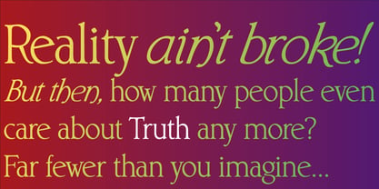
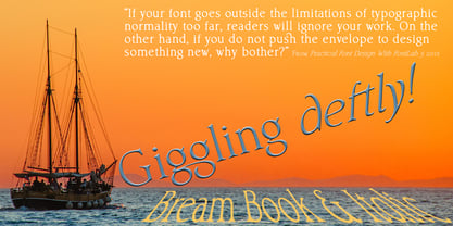
Über die Schriftfamilie Bream
This is the display version of Librum. Librum means “book” in Latin, which I thought was appropriate. Bream is Latin for proclaim—appropriate for display work. The fonts are very close to Librum-Book and Librum-Italic, with the same OpenType features. The glyphs are modified a bit to make them a little more elegant, but that’s not very noticeable. Mainly, the letterspacing and kerning is tighter and more carefully fit to large point sizes. As for classification, I like oldstyle, Venetian, geralde, English oldstyle. There’s discrete modulation, slanted crossbars, full brackets serifs of medium thickness and sharp cut ends. For a great deal, see Librum Book Design Group, for a package containing all fifteen fonts!
Designer: David Bergsland
Herausgeber: Hackberry Font Foundry
Foundry: Hackberry Font Foundry
Eigentümer des Designs: Hackberry Font Foundry
MyFonts Debüt: Jan 19, 2016
Bream

Über Hackberry Font Foundry
- The Hackberry Font Foundry was founded in the 1998 to sell the fonts David Bergsland designed to be used in his digital publishing training books.
- The goal of David’s fonts is to add a hand-drawn edge to them. In this age of increasing technological “slickness” he purposely loosens the structure and adds “air” to the glyphs with breaks.
- All fonts are designed as OpenType Pro fonts with special production features. Almost all of the fonts have oldstyle numbers as well as small cap figures, plus small caps, discretionary ligatures & special dingbats.
- They really shine in book production.
- The production families have contrasting serif and sans serif families both using the same vertical font metrics—for run-in heads and the like.
- At present he mainly writes and designs books.
Mehr lesen
Weniger lesen
- Wenn du dich für eine Auswahl entscheidest, wird die Seite komplett aktualisiert.