


Wählen Sie diesen Lizenztyp, wenn Sie eine App für iOS, Android oder Windows Phone entwickeln und Sie den Font in den Code Ihrer mobilen Anwendung einbetten.
Classic XtraRound™
von Durotype
Einzelschnitte ab $49.00 USD
Komplette Familie mit 14 Fonts: $259.00 USD

Classic XtraRound Font Familie wurde
entworfen von
Ben Blom und
herausgegeben von
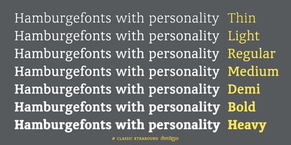
Durotype. Classic XtraRound enthält
14
Stile und Optionen für Familienpakete.
Mehr über diese Familie
- Aa Glyphen
-
Bestes AngebotFamilienpakete
- Einzelschnitte
- Technische Daten
- Lizenzierung
Über die Schriftfamilie Classic XtraRound
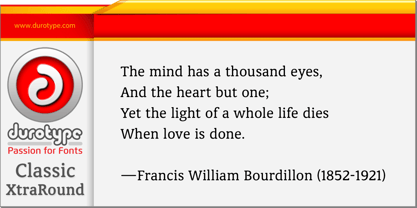
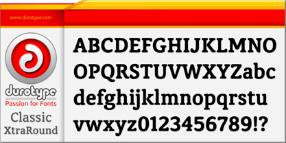
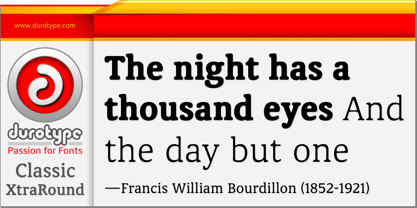
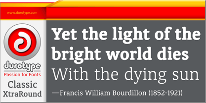
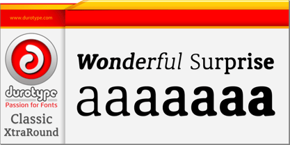
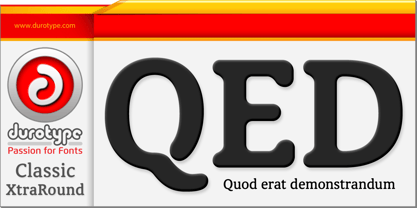
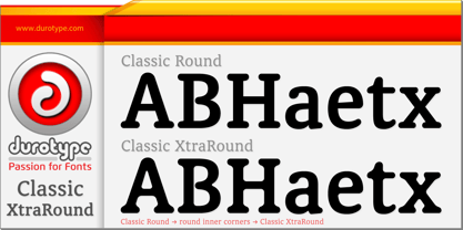
Classic XtraRound is a companion typeface to Classic Round, designed by Ben Blom. Although Classic Round has a lot of roundness, Classic XtraRound has more. Classic XtraRound has maximum roundness — no sharp corners, anywhere.
Classic XtraRound has maximum roundness — and is still legible. It can be used as an interesting workhorse in small text sizes. It makes eye-catching headlines in big display sizes.
Classic XtraRound can be combined in any way with Classic Round, to create an interesting variation and sameness within the same document, brochure, catalog, advertisement, etc.
For more information about Classic XtraRound, download the PDF Specimen Manual.
Designer: Ben Blom
Herausgeber: Durotype
Foundry: Durotype
Eigentümer des Designs: Durotype
MyFonts Debüt: Oct 24, 2011
Classic XtraRound™
is a trademark of Durotype.
Über Durotype
Durotype is an innovative font foundry based in Best, The Netherlands. It has been founded by Ben Blom in 2010. All Durotype fonts are created out of passion for the design involved. They are crafted in a long process of creation and improvement, until the right fusion of the functional and esthetical has been achieved. With whatever passion they are created—Durotype fonts are, in the end, just high-quality tools with a bit of pizzazz. Most of them are rather universal tools: their design doesn’t determine any specific uses. Many of them are very versatile: they have many styles and many glyphs. Many of them are, given their design, crafted in a way to maximize their legibility. Durotype fonts are meant to be durable: in many years from now, they should be just as enjoyable and useful as they are today. Durotype fonts have been deployed successfully in many areas. In financial services, entertainment, and museums. In television, marketing, and corporate identities. In technology, sports, automotive, and real estate. In food, retail, B2B, and health. In e-books, apps, ATMs, and video phones. In web sites, catalogs, signage, and packaging. Et cetera. Durotype’s most successful fonts are Flexo, a squarish design (MyFonts Most Popular Fonts of 2012), and Aspira, a legible geometric family with a very big number of styles. Flexo in use: 1 2 3 4 5 6 7 8 9 10 11 12 13. Aspira in use: 1 2 3 4 5 6 7 8 9 10.
Mehr lesen
Weniger lesen
- Wenn du dich für eine Auswahl entscheidest, wird die Seite komplett aktualisiert.