


Wählen Sie diesen Lizenztyp, wenn Sie eine App für iOS, Android oder Windows Phone entwickeln und Sie den Font in den Code Ihrer mobilen Anwendung einbetten.
Cormac
von Typedepot
Einzelschnitte ab $0.00 USD
Komplette Familie mit 15 Fonts: $180.00 USD

Cormac Font Familie wurde
entworfen von
Alexander Nedelev und
herausgegeben von
Typedepot. Cormac enthält
15
Stile und Optionen für Familienpakete.
Mehr über diese Familie
- Aa Glyphen
-
Bestes AngebotFamilienpakete
- Einzelschnitte
- Technische Daten
- Lizenzierung
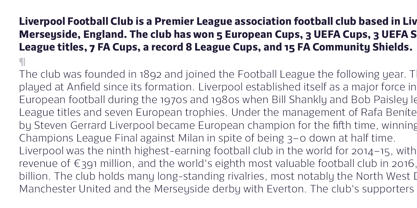
Über die Schriftfamilie Cormac
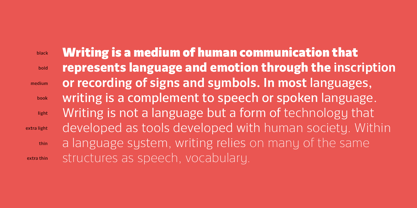
Cormac is a humanist typeface characterized with it's large x-height and slightly flared stems. The word that best describes our ideas in the beginning of the project is "simple" - the idea behind it was to strip the letter forms of everything unnecessary, and yet keep the typeface interesting.
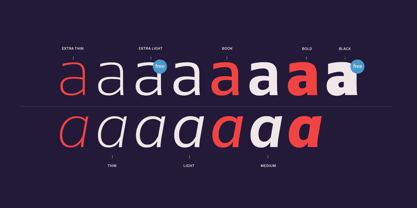
The typeface is friendly without being too cheezy thanks to its humanistic character, flared ascenders and stems reminding of its calligraphic origin. The proportions are closer to the traditional old style typefaces. Cormac is open and readable typeface coming in 7 weights plus their matching 'true' italics - from Extra Thin to Bold.
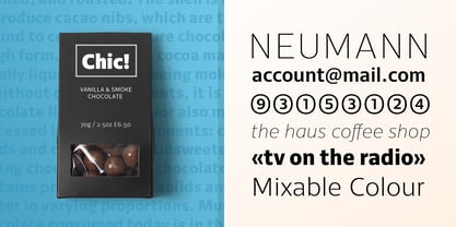
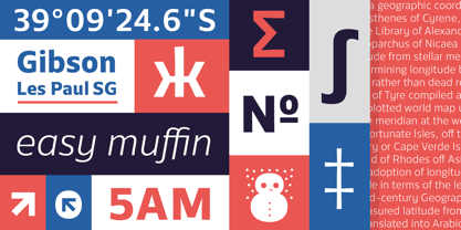
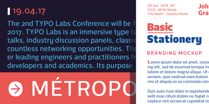
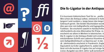
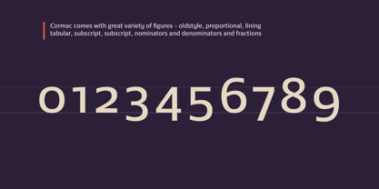
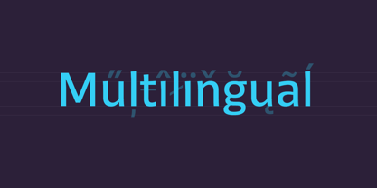
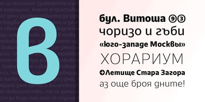
The family comes with Cyrillic support, great range of numerals, fractions, ligatures, alternates and a lot of special characters making Cormac a great solution for greate range of design work - branding, editorial, web, wayfinding, etc.
Designer: Alexander Nedelev
Herausgeber: Typedepot
Foundry: Typedepot
Eigentümer des Designs: Typedepot
MyFonts Debüt: Jan 18, 2017
Cormac
Über Typedepot
Typedepot co-founders Alexander Nedelev and Veronika Slavova say, “In the beginning, Typedepot was a side project, nothing serious – just experimenting with letterforms. Then, in a moment it just felt more right to do this than anything else.” Based in Sofia, Bulgaria, the duo first came upon type design while working as graphic designers in advertising. “We had absolutely no background in type design,” Alexander says, “but we had this project, a logotype for a small company, which we developed to become the Glide typeface.” Two years later they rented an office, took the plunge and started designing type full time. “Now it’s the thing we do and the thing we love to do.” So far they’ve seen great success with Best Seller Centrale Sans. The modern sans serif typeface was featured as one of MyFonts Most Popular Fonts of 2011 and was featured in our Rising Stars Newsletter that same year. The self-taught designers whose foundry started out as a way to experiment with type, say that their main focus is “to design original typefaces for retail and custom use.”
Mehr lesen
Weniger lesen
- Wenn du dich für eine Auswahl entscheidest, wird die Seite komplett aktualisiert.