


Wählen Sie diesen Lizenztyp, wenn Sie eine App für iOS, Android oder Windows Phone entwickeln und Sie den Font in den Code Ihrer mobilen Anwendung einbetten.
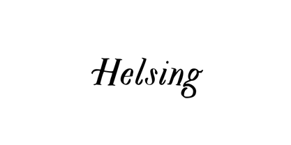
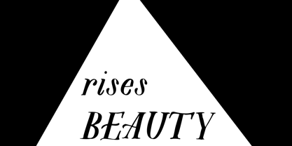
Helsing
von Great Lakes Lettering
Einzelschnitte ab $30.00 USD

Helsing Font Familie wurde
entworfen von
herausgegeben von
Great Lakes Lettering. Helsing enthält
1
Stile.
Mehr über diese Familie
Über die Schriftfamilie Helsing
Helsing is a serif style font inspired by Bram Stoker’s 1897 Dracula as well as Edward Gorey’s rendition of the story. Helsing is characterized by his slighting skewed baseline, subtle texture, thick and thin contrasts, and decorative legs.
Made as a graphic style font, Helsing is perfect for illustrative titles, small bodies of text, and pairing with contrasting lettering style fonts like Asterism.
Designer:
Herausgeber: Great Lakes Lettering
Foundry: Great Lakes Lettering
Eigentümer des Designs: Great Lakes Lettering
MyFonts Debüt: Mar 8, 2014
Helsing
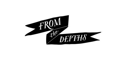
Über Great Lakes Lettering
Dathan Boardman and Molly Jacques Erickson founded Great Lakes Lettering with a mutual appreciation for artful calligraphy. “In 2012 I had been working on lots of calligraphic fonts and came across Molly’s work and was immediately struck by how visceral it was and how it didn’t really look like any other kind of calligraphy that I’ve come across,” Dathan says. “I reached out to her wondering if she had any interest in turning her lettering into fonts.” The duo’s first typeface, Frosted, was released later that year. Dathan and Molly’s bestselling typefaces include Asterism, a calligraphy style font with a moving baseline and lots of shining personality, and Kailey, a hand lettered typeface that was inspired by Molly’s signature lettering style, consisting of bold brush strokes, fluid flourishes, and distinctive characters. Alissa Mazzenga joined the team in 2014 with the the foundry’s debut of her design, Feast; a typeface whose magic seems to reside in the ethereal movement of fluid wisps of ink, forming soft arched lines and design that stands alone. The group’s fonts are best known for working in a variety of settings, both formal and informal. They’ve worked with brands such as Nike and Martha Stewart and have a lot more ahead of them. “We have a lot of exciting collaborations ahead. As our fonts are becoming more refined and more formal, we are reaching a new level of elegance that makes us excited to keep going and keep perfecting our working method.
Mehr lesen
Weniger lesen
- Wenn du dich für eine Auswahl entscheidest, wird die Seite komplett aktualisiert.