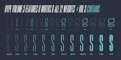
Hype vol 3 0300 Hairline
Hype vol 3 0300 Hairline Italic
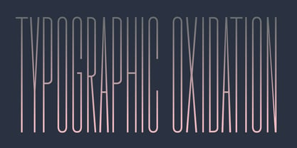
Hype vol 3 0300 XThin
Hype vol 3 0300 XThin Italic
Hype vol 3 0300 Thin
Hype vol 3 0300 Thin Italic
Hype vol 3 0300 XLight
Hype vol 3 0300 XLight Italic
Hype vol 3 0300 Light
Hype vol 3 0300 Light Italic
Hype vol 3 0300 Book
Hype vol 3 0300 Book Italic
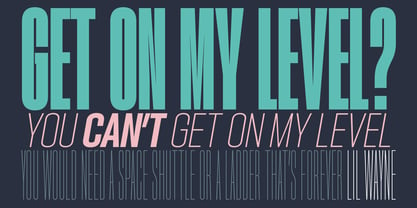
Hype vol 3 0300 Regular
Hype vol 3 0300 Italic
Hype vol 3 0300 Medium
Hype vol 3 0300 Medium Italic
Hype vol 3 0300 Semi Bold
Hype vol 3 0300 Semi Bold Italic
Hype vol 3 0300 Bold
Hype vol 3 0300 Bold Italic
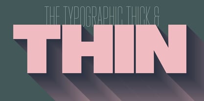
Hype vol 3 0300 Black
Hype vol 3 0300 Black Italic
Hype vol 3 0300 Ultra
Hype vol 3 0300 Ultra Italic
Hype vol 3 0600 Hairline
Hype vol 3 0600 Hairline Italic
Hype vol 3 0600 XThin
Hype vol 3 0600 XThin Italic
Hype vol 3 0600 Thin
Hype vol 3 0600 Thin Italic
Hype vol 3 0600 XLight
Hype vol 3 0600 XLight Italic
Hype vol 3 0600 Light
Hype vol 3 0600 Light Italic
Hype vol 3 0600 Book
Hype vol 3 0600 Book Italic
Hype vol 3 0600 Regular
Hype vol 3 0600 Italic
Hype vol 3 0600 Medium
Hype vol 3 0600 Medium Italic
Hype vol 3 0600 Semi Bold
Hype vol 3 0600 Semi Bold Italic
Hype vol 3 0600 Bold
Hype vol 3 0600 Bold Italic
Hype vol 3 0600 Black
Hype vol 3 0600 Black Italic
Hype vol 3 0600 Ultra
Hype vol 3 0600 Ultra Italic
Hype vol 3 0900 Hairline
Hype vol 3 0900 Hairline Italic
Hype vol 3 0900 XThin
Hype vol 3 0900 XThin Italic
Hype vol 3 0900 Thin
Hype vol 3 0900 Thin Italic
Hype vol 3 0900 XLight
Hype vol 3 0900 XLight Italic
Hype vol 3 0900 Light
Hype vol 3 0900 Light Italic
Hype vol 3 0900 Book
Hype vol 3 0900 Book Italic
Hype vol 3 0900 Regular
Hype vol 3 0900 Italic
Hype vol 3 0900 Medium
Hype vol 3 0900 Medium Italic
Hype vol 3 0900 Semi Bold
Hype vol 3 0900 Semi Bold Italic
Hype vol 3 0900 Bold
Hype vol 3 0900 Bold Italic
Hype vol 3 0900 Black
Hype vol 3 0900 Black Italic
Hype vol 3 0900 Ultra
Hype vol 3 0900 Ultra Italic
Hype vol 3 1200 Hairline
Hype vol 3 1200 Hairline Italic
Hype vol 3 1200 XThin
Hype vol 3 1200 XThin Italic
Hype vol 3 1200 Thin
Hype vol 3 1200 Thin Italic
Hype vol 3 1200 XLight
Hype vol 3 1200 XLight Italic
Hype vol 3 1200 Light
Hype vol 3 1200 Light Italic
Hype vol 3 1200 Book
Hype vol 3 1200 Book Italic
Hype vol 3 1200 Regular
Hype vol 3 1200 Italic
Hype vol 3 1200 Medium
Hype vol 3 1200 Medium Italic
Hype vol 3 1200 Semi Bold
Hype vol 3 1200 Semi Bold Italic
Hype vol 3 1200 Bold
Hype vol 3 1200 Bold Italic
Hype vol 3 1200 Black
Hype vol 3 1200 Black Italic
Hype vol 3 1200 Ultra
Hype vol 3 1200 Ultra Italic
Hype vol 3 1500 Hairline
Hype vol 3 1500 Hairline Italic
Hype vol 3 1500 XThin
Hype vol 3 1500 XThin Italic
Hype vol 3 1500 Thin
Hype vol 3 1500 Thin Italic
Hype vol 3 1500 XLight
Hype vol 3 1500 XLight Italic
Hype vol 3 1500 Light
Hype vol 3 1500 Light Italic
Hype vol 3 1500 Book
Hype vol 3 1500 Book Italic
Hype vol 3 1500 Regular
Hype vol 3 1500 Italic
Hype vol 3 1500 Medium
Hype vol 3 1500 Medium Italic
Hype vol 3 1500 Semi Bold
Hype vol 3 1500 Semi Bold Italic
Hype vol 3 1500 Bold
Hype vol 3 1500 Bold Italic
Hype vol 3 1500 Black
Hype vol 3 1500 Black Italic
Hype vol 3 1500 Ultra
Hype vol 3 1500 Ultra Italic
Hype vol 3 1800 Hairline
Hype vol 3 1800 Hairline Italic
Hype vol 3 1800 XThin
Hype vol 3 1800 XThin Italic
Hype vol 3 1800 Thin
Hype vol 3 1800 Thin Italic
Hype vol 3 1800 XLight
Hype vol 3 1800 XLight Italic
Hype vol 3 1800 Light
Hype vol 3 1800 Light Italic
Hype vol 3 1800 Book
Hype vol 3 1800 Book Italic
Hype vol 3 1800 Regular
Hype vol 3 1800 Italic
Hype vol 3 1800 Medium
Hype vol 3 1800 Medium Italic
Hype vol 3 1800 Semi Bold
Hype vol 3 1800 Semi Bold Italic
Hype vol 3 1800 Bold
Hype vol 3 1800 Bold Italic
Hype vol 3 1800 Black
Hype vol 3 1800 Black Italic
Hype vol 3 1800 Ultra
Hype vol 3 1800 Ultra Italic