


Wählen Sie diesen Lizenztyp, wenn Sie eine App für iOS, Android oder Windows Phone entwickeln und Sie den Font in den Code Ihrer mobilen Anwendung einbetten.
Kindersley Sans
von K-Type
Einzelschnitte ab $20.00 USD
Komplette Familie mit 6 Fonts: $20.00 USD

Kindersley Sans Font Familie wurde
entworfen von
Keith Bates und
herausgegeben von
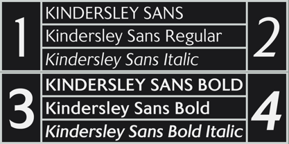
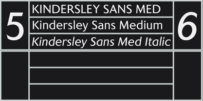
K-Type. Kindersley Sans enthält
6
Stile und Optionen für Familienpakete.
Mehr über diese Familie
- Aa Glyphen
-
Bestes AngebotFamilienpakete
- Einzelschnitte
- Technische Daten
- Lizenzierung
pro Font:
$3.33 USD
Paket mit 6 Fonts:
$20.00 USD
Über die Schriftfamilie Kindersley Sans
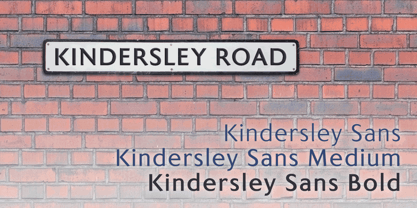
Many street nameplates in Britain use versions of Kindersley serif capitals designed by David Kindersley in the 1950s. K-Type Kindersley Sans is an unfussy alternative to the signage stalwart, perfectly suited to newer environments and more contemporary tastes.
Kindersley Sans is a humanist sans-serif that conserves the Gill-inspired character and some of the calligraphic qualities of Kindersley’s lettering, it retains the Roman proportions and its Britishness, but traditional prettiness and intricacy are discarded in favour of a clean modernity. For purposes where Transport (MOT) is considered too formal and Kindersley too old-fashioned, Kindersley Sans offers an open and amiable up-to-date alternative.
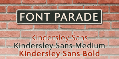
The typeface is comfortably spaced and carefully kerned to deliver beautiful results with ease, and although designed with nameplates in mind, it excels as an all-purpose text face in print and on screen.
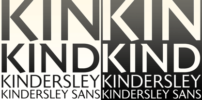
The tail of the uppercase Q has minimal descent to avoid constriction.
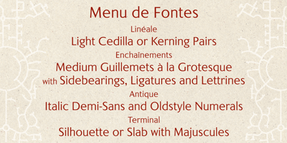
Kindersley Sans includes a lowercase designed for signage with short descenders to prevent unsightly congestion. A generous x-height assists legibility, and characters are designed for easy reading and distinctiveness. The curved foot of the lowercase L distinguishes it from the uppercase i.
The six fonts contain a full complement of Latin Extended-A characters, Welsh diacritics and Irish dotted consonants, so European language nameplates need not be a source of frustration. The ascent and descent of accented characters has been kept to an acceptable minimum.
Designer: Keith Bates
Herausgeber: K-Type
Foundry: K-Type
Eigentümer des Designs: K-Type
MyFonts Debüt: Feb 27, 2017
Kindersley Sans

Über K-Type
K-Type is a small, independent type foundry based in Manchester England, offering a unique range of high quality fonts which are modestly and simply priced for designers, small businesses and large organisations.In addition to creating new typefaces resulting from formal experimentation, many K-Type fonts show the influence of inspirational artists and designers, many exploring the mix of insular and eclectic that has forged the typographical landscape of Britain and America.K-Type is also keen to make affordable fonts from styles which possess cultural currency or an existing social presence, generally redrawn to include comprehensive character sets containing a full complement of Latin Extended-A glyphs. New, previously unavailable weights and italics are often designed and added.
Mehr lesen
Weniger lesen
- Wenn du dich für eine Auswahl entscheidest, wird die Seite komplett aktualisiert.