


Wählen Sie diesen Lizenztyp, wenn Sie eine app für iOS, Android oder Windows Phone entwickeln und Sie die Datei Font in den Code Ihrer mobilen Anwendung einbetten.
Mairy
von Typesketchbook
Einzelschnitte ab $39.00 USD
Komplette Familie mit 18 Fonts: $110.00 USD


Mairy Font Familie wurde
entworfen von
Chatnarong Jingsuphatada und
herausgegeben von
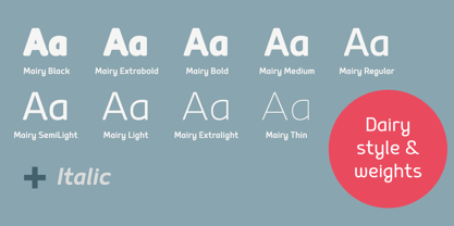
Typesketchbook. Mairy enthält
18
Stile und Optionen für Familienpakete.
Mehr über diese Familie
- Aa Glyphen
-
Bestes AngebotFamilienpakete
- Einzelschnitte
- Technische Daten
- Lizenzierung
Über die Schriftfamilie Mairy
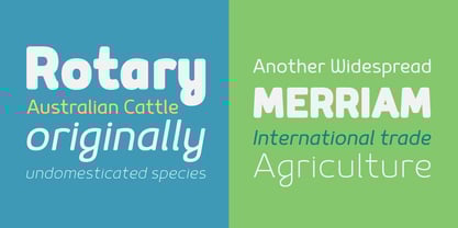
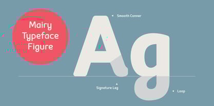
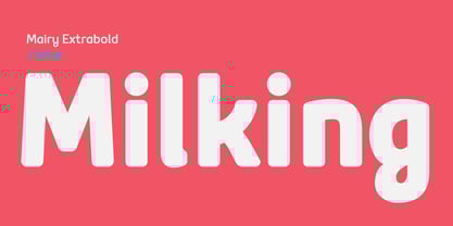
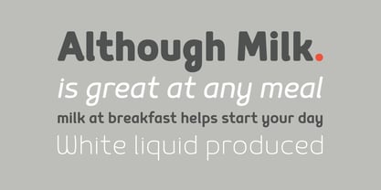
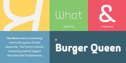
Mairy font family is a modern sans serif font family. Featuring 9 separate weights each followed by own true italics Mairy is positioned somewhere between rounded sans with humanist touch. In fact the humanist presence in Mairy is a little bit more than the usual doze adding more calligraphic elements mostly noticeable in italic weights but also very important in regulars. This symbiosis of Grotesk geometry with handwriting is well balanced regarding contrast and legibility so that at the end we have a highly usable font family. Light weights are very tender and elegant while the old and blacks are soft, friendly and full of vitality. The mid weights are just perfect with their medium contrast and excellent legibility. Mairy is very fresh font family and is surprisingly flexible when it comes to screen or print use – it is optimized for both even if the conditions are poor. Use it with OpenType compatible software and explore its true potential by accessing additional set of ligatures, alternates and multilingual support.
Designer: Chatnarong Jingsuphatada
Herausgeber: Typesketchbook
Foundry: Typesketchbook
Eigentümer des Designs: Typesketchbook
MyFonts Debüt: Jan 13, 2015
Mairy
Über Typesketchbook
Located in the capital city of Thailand, Chatnarong Jingsuphatada started his type design career while working as a graphic designer. Throughout his career, whenever he was unable to find exactly what he needed for his own design projects, he began to create new typefaces rather than settle for ones that didn’t quite fit. He experimented with different designs for 2 years before launching his Superstore Font Foundry, and then in 2012, began selling his typefaces on MyFonts. He made his debut that year with Gusto, a font that explores the intersection of san serif and humanist styles. Finding a strength in his ability to combine different styles of fonts into one, he went on to create Quan, which consists of a very usable, clean and modern sans typeface and a more rounded sub-family.
Mehr lesen
Weniger lesen
- Wenn du dich für eine Auswahl entscheidest, wird die Seite komplett aktualisiert.