


Wählen Sie diesen Lizenztyp, wenn Sie eine App für iOS, Android oder Windows Phone entwickeln und Sie den Font in den Code Ihrer mobilen Anwendung einbetten.
Neutro™
von Durotype
Einzelschnitte ab $0.00 USD
Komplette Familie mit 17 Fonts: $279.00 USD
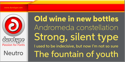

Neutro Font Familie wurde
entworfen von
Ben Blom und
herausgegeben von
Durotype. Neutro enthält
18
Stile und Optionen für Familienpakete.
Mehr über diese Familie
- Aa Glyphen
-
Bestes AngebotFamilienpakete
- Einzelschnitte
- Technische Daten
- Lizenzierung
Basic typesetting
Letter case
Numerals and scientific typesetting
Typographic variants
Reset
Über die Schriftfamilie Neutro
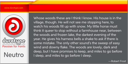
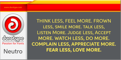
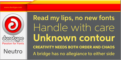
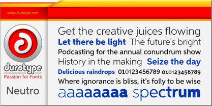
Neutro is a neutral, multi-purpose font family. It is Aspira made more neutral, by removing angled terminals. Neutro’s subtle, fresh geometric personality, makes it ideal for any use where the content is more important than the font used to display this content. As neutral as it may be, its presence is always pleasant in an inconspicuous way.
Neutro is well suited for both text and display use — for graphic design, corporate identity design, magazines, newspapers, books, reports, editorials, web, advertising, signage, etc.
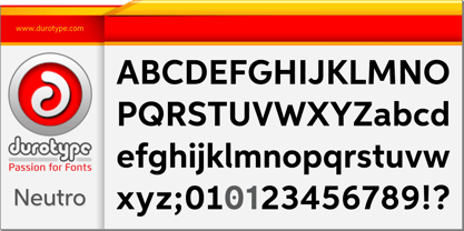
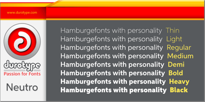
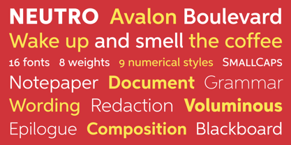
Neutro includes eight uprights and matching italics. Neutro includes nine numerical styles: lining and oldstyle figures (proportional and tabular), small cap figures, superiors, inferiors, numerators, and denominators. Neutro includes small caps, arbitrary fractions, and extensive language support.
Free demo font available.
Neutro in use: 1.
For more information about Neutro, download the PDF Specimen Manual.
Designer: Ben Blom
Herausgeber: Durotype
Foundry: Durotype
Eigentümer des Designs: Durotype
MyFonts Debüt: Jan 12, 2016
Neutro™
is a trademark of Durotype.
Über Durotype
Durotype is an innovative font foundry based in Best, The Netherlands. It has been founded by Ben Blom in 2010. All Durotype fonts are created out of passion for the design involved. They are crafted in a long process of creation and improvement, until the right fusion of the functional and esthetical has been achieved. With whatever passion they are created—Durotype fonts are, in the end, just high-quality tools with a bit of pizzazz. Most of them are rather universal tools: their design doesn’t determine any specific uses. Many of them are very versatile: they have many styles and many glyphs. Many of them are, given their design, crafted in a way to maximize their legibility. Durotype fonts are meant to be durable: in many years from now, they should be just as enjoyable and useful as they are today. Durotype fonts have been deployed successfully in many areas. In financial services, entertainment, and museums. In television, marketing, and corporate identities. In technology, sports, automotive, and real estate. In food, retail, B2B, and health. In e-books, apps, ATMs, and video phones. In web sites, catalogs, signage, and packaging. Et cetera. Durotype’s most successful fonts are Flexo, a squarish design (MyFonts Most Popular Fonts of 2012), and Aspira, a legible geometric family with a very big number of styles. Flexo in use: 1 2 3 4 5 6 7 8 9 10 11 12 13. Aspira in use: 1 2 3 4 5 6 7 8 9 10.
Mehr lesen
Weniger lesen