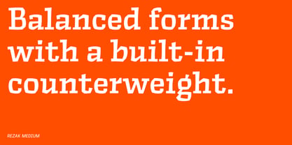
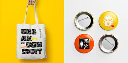
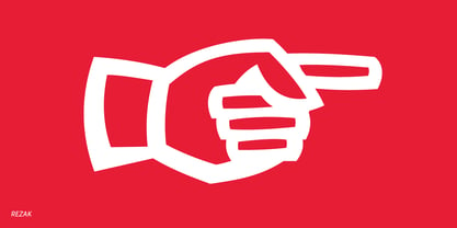
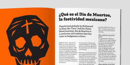
Nothing is hidden in the simplistic forms and overt aesthetic of Anya Danilova’s Rezak font family. Rezak is not a type family directly from the digital world, but was inspired by the stout presence of cutting letters out of tangible material: paper, stone, and wood. With only a few cuts, the shapes remain dark and simple. With more cuts, the shapes become lighter and more defined, resulting in a dynamic type family not stuck within one specific category.
The Black and medium weights began as one approach before separating into display and text categories. The four text weights were created through pendulum swings in design direction that experimented with contrast, angles, tangent redirections, and the amount of anomalies allowed. The text weights are vocal when set larger than ten points and subtle at smaller sizes. The tech-heavy Incised display style came last, employing a surprising range of trigonometric functions to make it behave exactly as desired. Its look can result in something distinctive and emotional or completely over-the-top.
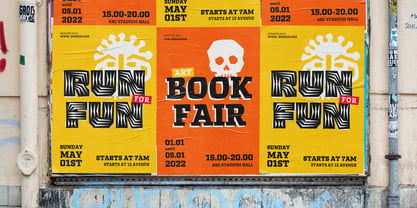
Most normal typefaces change only in thickness; Rezak changes in intention, highlighting the relationship between dark and light, presence and absence, what’s removed and what remains. Rezak’s Black and Incised display styles are like a shaft of light in reverse and are perfect in situations of impact: websites, headlines and large text, gaming, call-outs, posters, and packaging. The tone works for something from youthful or craft-oriented to organic and natural products. Try these two in logotypes, complex print layering, branding, and words-as-pattern for greater experimentation.
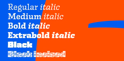
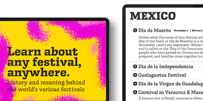
The text styles are bold, energetic, well informed, and round out the family with four weights (Regular, Semibold, Bold, Extrabold) and matching italics for a family grand total of ten. These jaunty styles work well in children’s books, call-outs, movie titles, and subheads for myriad subjects such as architecture, coffee, nature, cooking, and other rough-and-tumble purposes.
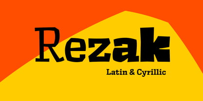
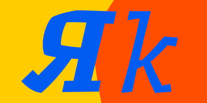
Rezak’s crunchy letters are meant to expose rough, daring, or dramatic text. A further benefit is that this family is not sequestered within one specific genre or script, so it can be easily interpreted for other scripts, such as its current Latin and extended Cyrillic which supports such neglected languages as Abkhaz, Itelmen, and Koryak. Rezak’s push toward creativity and innovation, with an eye on typography’s rich history, reinforces our foundry’s mission to publish invigorating forms at the highest function and widest applicability.
Über TypeTogether
Veronika Burian and José Scaglionemet and developed a respectful kinship while completing their Master’s degrees in type design at University of Reading, UK. Established in 2006, TypeTogether is an independent, cosmopolitan type foundry that creates text typography for intensive digital and print editorial use. We have grown into a core team living worldwide and invested in the daily work, networked with other type designers who intermittently cooperate on specific projects.
Through our unique, diverse, curated font platform, TypeTogether creates innovative and stylish solutions to the greatest problems in the professional typography market.
The advantage of being a small but highly specialized company is that we are able to work closely with our clients to accomplish their goals and to respond quickly to their requirements. To carry an organisation’s unique voice across all communications, TypeTogether creates custom type solutions for discerning clients worldwide. Distinct advantages in your market can be gained through logotype creation, commissioning a brand new typeface, modifying existing typefaces, or extending language support.
TypeTogether creates cross-platform OpenType fonts of recognised aesthetic and technical excellence and which perform well in continuous reading. Our internationally awarded catalogue — honoured for its high quality, usefulness, personality, and ability to grab attention — spans many languages and scripts and is diligently expanding each year.
Mehr lesen
Weniger lesen


