Wählen Sie diesen Lizenztyp, wenn Sie eine app für iOS, Android oder Windows Phone entwickeln und Sie die Datei Font in den Code Ihrer mobilen Anwendung einbetten.
Telemachus
von Typodermic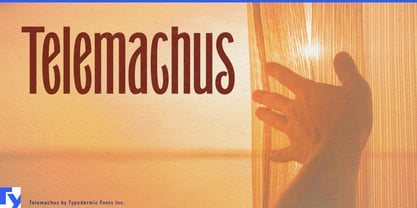

- Aa Glyphen
-
Bestes AngebotFamilienpakete
- Einzelschnitte
- Technische Daten
- Lizenzierung
pro Font:
$10.62 USD
$7.86 USD
Paket mit 16 Fonts:
$169.95 USD
$125.76 USD
Über die Schriftfamilie Telemachus
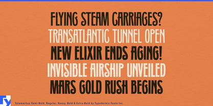
Step into the world of Telemachus, where typography becomes a time-traveling adventure. This masterful creation from Typodermic Fonts doesn’t just nod to the past—it shakes hands with it, then strolls confidently into the present.
Imagine a typeface that whispers tales of 19th-century printing presses while speaking fluently to modern design sensibilities. That’s Telemachus. It’s like finding a beautifully preserved pocket watch that not only tells time but also predicts the future. Telemachus takes the best of Grant No. 2’s distinguished serifs and those sharp, tapered curls, then strips them down to their essence. The result? A sleek, sans-serif silhouette that’s narrow enough to slide into tight spaces but bold enough to command attention. It’s not trying to be the coolest kid on the block—it’s the quiet confidence of knowing your great-grandfather’s suit is suddenly back in fashion.
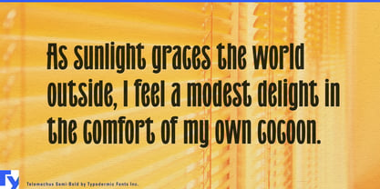
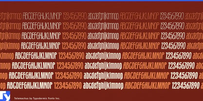
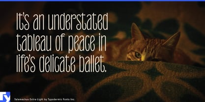
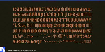
With eight weights ranging from whisper-thin to unapologetically heavy, each accompanied by its italic counterpart, Telemachus gives you a full wardrobe of typographic options. It’s like having a time machine with 16 settings, each one ready to transport your designs to a perfect blend of then and now. Telemachus speaks volumes in dozens of languages, from Afrikaans to Zulu, making it a polyglot’s dream. It’s ready to tell your story across borders and through time, proving that good design truly is a universal language.
So, why settle for a typeface that’s stuck in one era when you can have Telemachus—a typeface that’s comfortable in any decade? Download it now and watch as your designs bridge centuries with effortless grace. With Telemachus, you’re not just choosing a font; you’re making history… stylishly.
Designer: Ray Larabie
Herausgeber: Typodermic
Foundry: Typodermic
Eigentümer des Designs: Typodermic
MyFonts Debüt: Apr 10, 2024

Über Typodermic
Welcome to Typodermic Fonts, a spirited type foundry rooted in Nagoya, Japan, started by the Canadian typeface designer, Raymond Larabie in 2001. Our library brims with 500+ diverse typefaces to fuel creativity in graphic design, advertising, web, and app development. As digital type pioneers, we adopted web fonts and app licensing early, consistently pushing the design envelope. With Canadian heart and Japanese precision, we're your global partners in extraordinary typography. Explore Typodermic Fonts—where creativity meets character.
Mehr lesen
Weniger lesen
- Wenn du dich für eine Auswahl entscheidest, wird die Seite komplett aktualisiert.


