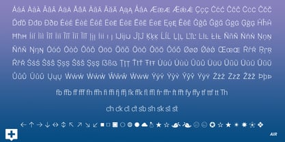
Air-Thin
Air-Thin Italic
Air-Thin Oblique
Air-Ultra Light
Air-Ultra Light Italic
Air-Ultra Light Oblique
Air-Light
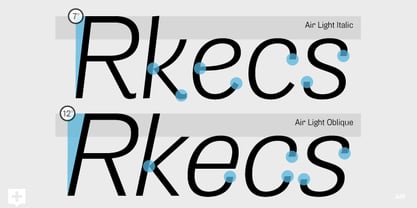
Air-Light Italic
Air-Light Oblique
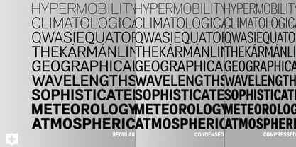
Air-Regular
Air-Regular Italic
Air-Regular Oblique
Air-Medium
Air-Medium Italic
Air-Medium Oblique
Air-Semibold
Air-Semibold Italic
Air-Semibold Oblique
Air-Bold
Air-Bold Italic
Air-Bold Oblique
Air-Heavy
Air-Heavy Italic
Air-Heavy Oblique
Air-Black
Air-Black Italic
Air-Black Oblique
Air Compressed-Thin
Air Compressed-Thin Italic
Air Compressed-Thin Oblique
Air Compressed-Ultra Light
Air Compressed-Ultra Light Italic
Air Compressed-Ultra Light Oblique
Air Compressed-Light
Air Compressed-Light Italic
Air Compressed-Light Oblique
Air Compressed-Regular
Air Compressed-Regular Italic
Air Compressed-Regular Oblique
Air Compressed-Medium
Air Compressed-Medium Italic
Air Compressed-Medium Oblique
Air Compressed-Semibold
Air Compressed-Semibold Italic
Air Compressed-Semibold Oblique
Air Compressed-Bold
Air Compressed-Bold Italic
Air Compressed-Bold Oblique
Air Compressed-Heavy
Air Compressed-Heavy Italic
Air Compressed-Heavy Oblique
Air Compressed-Black
Air Compressed-Black Italic
Air Compressed-Black Oblique
Air Condensed-Thin
Air Condensed-Thin Italic
Air Condensed-Thin Oblique
Air Condensed-Ultra Light
Air Condensed-Ultra Light Italic
Air Condensed-Ultra Light Oblique
Air Condensed-Light
Air Condensed-Light Italic
Air Condensed-Light Oblique
Air Condensed-Regular
Air Condensed-Regular Italic
Air Condensed-Regular Oblique
Air Condensed-Medium
Air Condensed-Medium Italic
Air Condensed-Medium Oblique
Air Condensed-Semibold
Air Condensed-Semibold Italic
Air Condensed-Semibold Oblique
Air Condensed-Bold
Air Condensed-Bold Italic
Air Condensed-Bold Oblique
Air Condensed-Heavy
Air Condensed-Heavy Italic
Air Condensed-Heavy Oblique
Air Condensed-Black
Air Condensed-Black Italic
Air Condensed-Black Oblique