


Wählen Sie diesen Lizenztyp, wenn Sie eine App für iOS, Android oder Windows Phone entwickeln und Sie den Font in den Code Ihrer mobilen Anwendung einbetten.
St Atmos™
von Stereotypes
Einzelschnitte ab $29.00 USD


St Atmos Font Familie wurde
entworfen von
Sascha Timplan und
herausgegeben von
Stereotypes. St Atmos enthält
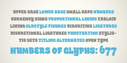
1
Stile.
Mehr über diese Familie
Über die Schriftfamilie St Atmos
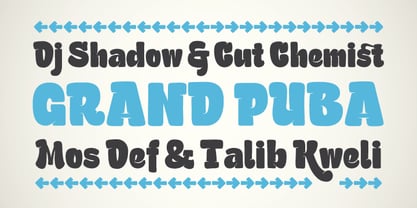
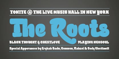
St Atmos was the first commercial typeface of Stereotypes, the first of what’s likely to become a significant collection of headline fonts. The massive ink traps at Atmos give this typeface something of a three-dimensional feeling.
Designer: Sascha Timplan
Herausgeber: Stereotypes
Foundry: Stereotypes
Eigentümer des Designs: Stereotypes
MyFonts Debüt: Aug 6, 2009
St Atmos™
is a trademark of Stereotypes.
Über Stereotypes
Stereotypes is a one-man foundry based in south-west Germany, run by Sascha Timplan. A long-time DJ, Sascha’s introduction to letterforms came in the form of documentary films on hip-hop culture and graffiti. “Ultimately, it was my love for music that brought me to graphic design,” he said in his 2014 Creative Characters interview. “I always had sketchbooks with me and my main interest apart from DJing was graffiti. I only drew on paper, never walls. I wasn’t able to draw people or cartoon characters, so what I was left with was lettering.” Since joining MyFonts in 2009, his foundry has produced a collection of diverse, original and very useable typefaces. “I feel that all of my fonts from the early years belong in the category of display faces,” he said. “Now, hopefully, the time has come to design more text fonts or type systems such as Christel, which I’m really proud of.” Sascha has also seen great success with St Ryde, a humanistic sans-serif face that was named one of MyFonts Top Fonts in the year of its release. The name of his foundry, Stereotypes, is a nod to his passion for both typography and music – it has nothing to do with cliched ideas. Of his ever-growing knowledge and skill in his art, he says, “As in most creative disciplines, a long period of self-study in type design is almost inevitable. If you want to persist, you have to work on yourself every day. It’s the school of hard knocks.”
Mehr lesen
Weniger lesen
- Wenn du dich für eine Auswahl entscheidest, wird die Seite komplett aktualisiert.