


Wählen Sie diesen Lizenztyp, wenn Sie eine App für iOS, Android oder Windows Phone entwickeln und Sie den Font in den Code Ihrer mobilen Anwendung einbetten.
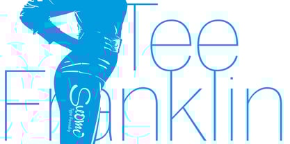
Tee Franklin™
von Suomi
Einzelschnitte ab $19.00 USD
Komplette Familie mit 14 Fonts: $200.00 USD

Tee Franklin Font Familie wurde
entworfen von
Morris Fuller Benton,
Tomi Haaparanta und
herausgegeben von
Suomi. Tee Franklin enthält
14
Stile und Optionen für Familienpakete.
Mehr über diese Familie
- Aa Glyphen
-
Bestes AngebotFamilienpakete
- Einzelschnitte
- Technische Daten
- Lizenzierung
Über die Schriftfamilie Tee Franklin
The British Vogue commissioned this typeface for their magazine re-design in 2001. After studying the originals of Morris Fuller Benton and the existing versions, this font was designed with all new thin weights. Just when the family was finished, Vogue informed that they had decided to use American Typewriter instead. Bastards. But here is a true classic typeface with a facelift. The pun intended.
Tee Franklin has seven weights with obliques, the Heavy being just slightly heavier than the existing versions from Adobe and ITC, and moving down to totally new Ultra Light, using Luc(as) de Groot's formula to keep the weights optically correct.
The glyphs are the same as the Morris Fuller Benton's original from 1902, except for the upper case Q, which was re-designed with a loop in the counter for added differentiation.
Designer: Morris Fuller Benton, Tomi Haaparanta
Herausgeber: Suomi
Foundry: Suomi
Original Foundry: ATF
Eigentümer des Designs: Suomi
MyFonts Debüt: Nov 6, 2009
Tee Franklin™
is a trademark of Suomi Type Foundry.
Über Suomi
Suomi Type Foundry is a company dedicated to creating high quality typefaces. The company was founded by Tomi Haaparanta, who has been designing typefaces since 1990. Tomi Haaparanta's fonts are already distributed by Linotype, Monotype, ITC, T-26 and Psy/Ops, and in January 2004 he decided to set up his own font foundry. The philosophy of Suomi Type Foundry is to make extensive type families, so the user has more to choose from; too often you find a great typeface, but the weight is not just right. Our fonts often come with an average of seven weights, so it is likely that you will find the right weight. Also we do not want to exclude any users, so we try to keep the range of our type library as versatile as possible, from comfortable types for text setting, to signage type families, to more evocative fonts for brand design. And sometimes stuff just for fun.
Mehr lesen
Weniger lesen
- Wenn du dich für eine Auswahl entscheidest, wird die Seite komplett aktualisiert.