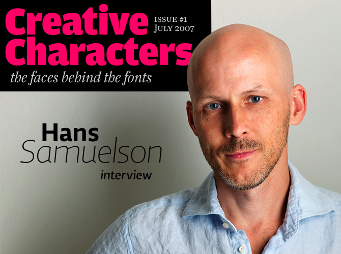
Welcome to the first issue of Creative Characters!

You’re reading the first issue of a new monthly newsletter from MyFonts. Creative Characters is dedicated to the people behind the fonts – the type designers. Last fall, we began interviewing designers as part of Rising Stars, our monthly newsletter on bright new fonts. These conversations got increasingly fascinating (and pretty long, at times!) so we decided they deserved their own platform. Here it is: Creative Characters. We hope you enjoy it.
Hans Samuelson of Stockholm, Sweden, is a freelance graphic designer specializing in package design and typography. His packaging assignments for food products such as cider and chocolate naturally led to the design of typefaces evoking class and taste. Out of this passion to create the right font for each project grew Samuelstype – a one-man foundry that joined MyFonts this spring. Although Hans’ typefaces are quite varied in style, they can be recognized immediately – they are all called ‘Samuels’. We asked him why, plus a lot more, and he was happy to answer…
Could you tell us something about your background as a graphic designer? When and how did you begin specializing in type?
In my late teens my school years passion for drawing shifted towards a fascination for calligraphy, an interest which deepened and lasted for many years. Probably because it is a very controlled form of design; an area where you gain a lot from attempting and finally mastering shapes of letters. To become a professional calligrapher would never have been a realistic aim, though, and I found work as an assistant graphic designer at an industrial design studio in Stockholm called RLD. From there I went to the Berghs School of Communication to study graphic design. By this time my interest in letterforms had become a passion for typography, and I had done a few type designs, although I had no means to produce them for commercial purposes.
It wasn’t until the mid-1990s that I took it to the level of actually producing fonts. I was now the co-owner of a major design studio, Embrink in Stockholm, doing package design for many of Sweden’s large companies and brands.
I became a freelance designer in 2004 and have since spent more and more time on typeface projects.
Did you receive any formal training in type design?
Not really, other than the few classes that were given at Berghs.
Victoria Samuels
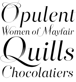
Victoria began life as a custom font for a chocolate box design project, so it breathes a sense of quality and luxury. Not only does Victoria have airy, open capitals, it also comes with a very nice set of alternate capitals with luscious swashes.
Although your typefaces cover a wide range of styles and genres, they all belong to the same family – the Samuels family. Only their “first names” are different. That’s not exactly how we would normally define a type family. Is there something that connects them – other than having been drawn by the same designer?
Using personal first names for my fonts is a result of my relation to them. As soon as they are named they also have a face and a personal character. I am not the first to do it but possibly the first to do it consistently. A type family would usually be a group of fonts based on the same cut. I have simply broadened the definition.
For Maya, my latest design, I considered leaving the concept, but in the end I felt it had a certain relevance. It does tie together, as you call it, “a wide range of styles”.
Could you say something about your method in designing type? Do you start with hand-rendered drawings? Or do you construct fonts directly on the screen?
I am old school in the sense that I always start on paper. I need to isolate the basic idea or shape on an independent medium to keep the idea separated from the process. This way it works better as a reference when the work is under way. Also, I find that the pen gives more freedom in finding and exploring shapes.
The major design work is done in Adobe Illustrator, testing shapes and thicknesses and building the basic system. The basis is often a semibold, and from that I make an ultrathin. Any other weight is drawn within the frames constituted by these two.
Andrew Samuels
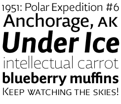
Originally designed as a custom font for a software company, Andrew Samuels has become the most widely used of Hans Samuelson’s fonts. Andrew is an all-purpose sans-serif with powerful, idiosyncratic shapes that make it stand out from the crowd. Thanks to its open shapes, it remains eminently legible even at small point sizes. Andrew's OpenType versions come with small caps in the Light and Regular upright styles.

Pencil and pen: Hans Samuelson likes to explore letterforms by hand.
Andrew Samuels and Rosemary Samuels are both original and interesting sans-serifs. Could you tell us a little more about the ideas behind these fonts and the purposes you had in mind when making them?
Andrew Samuels is one of my older designs and was drawn to work as a headline as well as a text font. As with many designs, the starting point here was the “a”. The somewhat crude cut is meant to provide interesting details when used at a large size and to help connect the letters when used in smaller sizes. Andrew was developed as a custom font for the Nocom Software Company.
Rosemary Samuels dates back to a holiday drive in Scotland, where I was inspired by road sign type. It has much smoother and friendlier shapes; someone called it humanistic and I think that description fits well. It was intended as a text font rather than for headlines and I have found it to be one of my most useful designs. Rosemary became a supporting corporate font for Spendrups Breweries.
Your serifed typefaces, April and Rebecca Samuels, are rather small families. Do you have plans for extending them?
I agree that they are not as extensive as they have potential for. It is simply a matter of priorities. April is first in line to be extended with a light version and possibly a bold.
Rebecca’s main feature is that it’s designed to need a minimum of kerning (to perform well in applications that do not handle kerning). It is a complete set in the traditional sense and has been met with some interest. Rather than extending it further I will try to create a sans serif version.
Rosemary Samuels
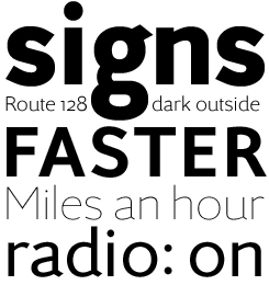
When driving across rural Scotland, designer Hans Samuelson noticed the sturdy, legible type on the road signs. He took these great functional forms as a starting point for Rosemary SemiBold, the original weight of this typeface.
True to its calling as a font for traffic and signage, Rosemary Samuels comes with wonderfully clear, crisp numeral figures, in lining and oldstyle versions. No italics (yet) – but great for magazine headlines.
One of your specializations is package design, and several of your alphabets were originally made for packaging. What makes you decide to design a custom font for a project? Is that done a lot in Sweden?
When working with package design in the food and drink area (which is my specialty) you are creating personalities; identities that you want people to relate to and to come back to and recognize as their choice. To me this means text, image and color are free to interact in order to create a unique expression. Usually, this means I draw the name or logo for the product in question. If this results in lettershapes worth developing further I do that, and if this results in a font I go back and apply it to the product or project. This goes back and forth until the result is either an applied font or an independent one.
My impression is that it’s becoming more and more frequent that agencies incorporate custom fonts in corporate design projects or major campaigns.
Would you say there is a specific Swedish or Scandinavian style in type design?
I really couldn’t say. We have a reputation for a design style that is airy, blond, minimalist and functional, but whether this applies to type design as well I am not sure. I do find we have a preference for plain and straightforward styles rather than more flourished or decorated ones.
Rebecca Samuels
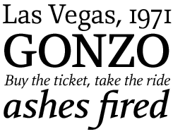
Rebecca is an attempt at a letterform in between the classic serif and a modern typewriter style. For font design specialists: Rebecca’s slightly mechanical character is a deliberate result of the low number of anchor points used to draw the letterforms.
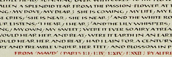
Calligraphy sample by Hans Samuelson
Who are your typographic heroes?
I would say Eric Gill or perhaps Edward Johnston among the classics. Both true artists with groundbreaking achievements in treatment of letterforms. Among the living it would be Gerard Unger. All his designs bear his unquestionable characteristics and I find that brave.
What are you plans for the near future, type-wise?
Apart from the extensions mentioned above, I have just launched Maya Samuels, a sans for both headline and text. It will be followed by an italic version shortly.
Also, I try to diversify as much as possible and go into new regions. Hence I am working on a headline face unlike any of my others, inspired by the 1920s Art Deco-shapes. The working title is “Arnold”.
Thank you very much, Hans. We hope the Samuels family will keep growing!
Colin Samuels
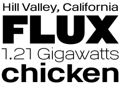
Colin Samuels is wide, straightforward and confident. It's the perfect voice for headlines and slogans that want immediate attention. Colin is a contemporary grotesque with retro influences.
Who would you interview?
Creative Characters is the new MyFonts newsletter dedicated to people behind the fonts. Each month, we will be interviewing a notable personality from the type world. And we would like you, the reader, to have your say.
Which creative character would you interview if you had the chance? And what would you ask them? Let us know, and your choice may end up in a future edition of this newsletter! Just send an email with your ideas to [email protected].
If you're curious to know which type designers we've already interviewed as part of past Rising Stars newsletters, have a look at the Rising Stars archive.
This issue’s font credits
featured fonts
supporting fonts
- “MyFonts, July 2007”: Bryant
- introductory image: Amplitude, Farnham, and Andrew Samuels
- pull-quotes: Rosemary Samuels
- big question mark: Farnham
Comments?
Please send any thoughts you'd like to share with us about this newsletter to: [email protected]


