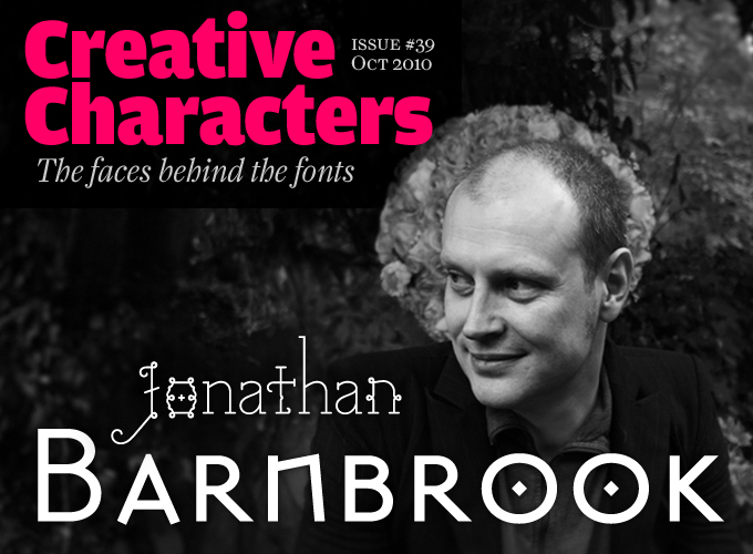
Photo by Teri Varhol
This month’s interviewee has been one of the truly original voices in British design and typography since the early 1990s. With his foundry Virus and a design practice built around vocal criticism of global politics and business, he’s about as far from design establishment orthodoxy as you can possibly get. He has worked in close collaboration with renowned artists such as David Bowie and Damien Hirst. His typefaces are at once classically informed and subtly confrontational; with names like Exocet and Infidel, these fonts defy expectation with sophisticated layers of meaning and finely nuanced shades of grey — welcome to the cult of Jonathan Barnbrook, where nothing is ever simply black or white.
Throughout your career, you have been working both as a graphic designer for high-profile clients and as a type designer. In what way do these two activities complement each other? Do they conflict sometimes?
They usually complement one another. I do like the fact that we can go ‘deeper’ into a job by designing a proper font for the project and further the design solution behind it by doing so. I also think it helps with the aesthetic fine-tuning of a job such as a corporate identity — you can design the logo and all of the parameters around it like the colors, etcetera — but the font gives a job a distinctive voice and for me is one of the most important pieces in the jigsaw.
Was it letterforms that got you interested in becoming a graphic designer in the first place?
Yes, because they created the tone of voice for everything in my life when I was young. The first ones I noticed were for the music bands I liked, I wasn’t really conscious of it but in the band logo the letterforms absolutely represented the viewpoint and ideology of the band. I used to copy them painstakingly on all my school books. I remember using the letterforms then for other things like a letterhead, and thinking: “I can create a whole universe for myself, that is the way I want it to be.” That is still the attraction of letterforms for me today.
Do you ever use fonts by others when doing graphic work, such as CD packaging or books or an identity for an event?
Yes of course, there are times when my fonts will not be appropriate, and you can have all kinds of fun subverting other people’s typefaces, or you can simply enjoy the beauty of the drawing in another font. I do often use more ‘nostalgic’ typefaces and try and lay them out in a contemporary way. That conflict of the typeface which is loaded with history and all of the atmospheres and assumptions of a layout that can only come from this time can be a very interesting thing to play with.
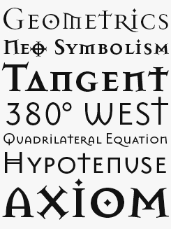
Mason Serif & Sans
Like much of Barnbrook’s work, his Emigre classic Mason is a web of contradictions, effortlessly weaving together the historical with the modern, incorporating Russian and Greek characteristics with classic British influences from Eric Gill and Edward Johnston. It has found a diverse audience, from the BBC and Walt Disney, who were drawn to its ecclesiastical voice, to the horror and and gothic subcultures in books, film and music.
You published several typefaces with Emigre, yet decided to set up your own foundry, Virus. Why go it alone?
Emigre think very carefully about the fonts they release and I had rather a lot of other fonts that needed to be published. I could have released them through another foundry, but I thought it better to do it through my own. I really wanted to be able to describe the whole range of emotional and intellectual reasons for releasing the fonts — releasing a typeface is like when a band releases an album. It describes your emotional state of mind at that moment. Full of layers of meaning, echoes of creative influences, vessels for ideologies that are prevalent or that you are interested in. I felt it wasn’t possible if they became a simple a-z released by somebody else.
Some people think ‘Virus’ is the worst possible name for a foundry. I’m sure it was meant as a provocation. What connotations does the name have for you?
Well, you know, I am a contrary kind of person; the worst possible reason can be the best possible reason because it will force people to rethink what they decide is normal. Plus, at the time I set up Virus in 1997, type design was just starting to come to terms with affordable computers being able to create fonts. Up until then it was quite a stuffy, dull profession. Suddenly though, a lot of young people were able to release fonts and the scene exploded. So first this name was to say that this was something quite subversive, not mainstream. Second that it was absolutely linked to the computer, not traditional methods. Third, it was to do with a statement from William Burroughs I found intriguing — he said “language is a virus from outer space”. I liked the idea of this thing falsely imposed that infected us all.
Interestingly, as the fonts were sent out on floppy disks at the time, the disk was packaged warning people that serious harm would come to their computer, without reference to the font. I really thought that it should be an expression of the new ideologies that were coming into graphic design at that time because of new technology.
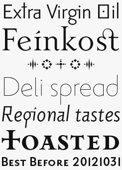
Priori Serif & Sans
Although versatility and neutrality aren’t qualities usually associated with Barnbrook’s output, the Priori family has enough of each to qualify it as a genuine if unconventional text face. As with Mason, Priori is a product of its environment, Barnbrook absorbing and filtering the visual language of London. As rich in alternative characters and as connotative as you’d expect of a Barnbrook project, with a wide range of weights, small caps, lining figures and both sans and serif versions, Priori makes for expressive and distinctive copy in editorial, advertising and corporate literature.
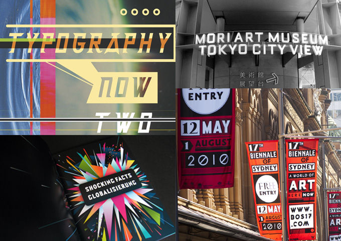
Clockwise from top left, Barnbrook used Delux on his design for the cover of Typography Now 2; Signage for the Mori Art Museum in Tokyo using Bourgeois; Barnbrook’s identity design for the 17th Biennale of Sydney; The Little Book of Shocking Global Facts, written, edited and designed by Barnbrook.
You are known as somebody with strong social and political views, something that is also reflected in some of your font names and type specimens. Why use typefaces to say something about the state of the world?
Because it was impossible not to. When I first started designing, it seemed like typeface design was an untouchable profession and you had to train like a monk to even attempt it. Yet it was so closely linked to language there seemed to be a big gap where typefaces could respond to how people spoke at this moment. I wanted to put that into the work. Then of course you look at the buildings that letterforms are most visible on, and they are usually religious, governmental or retail. So it seemed odd not to be honest and discuss these influences on typography. Finally I am afraid I find it very difficult to separate what I believe from what I put into the work. So it seemed natural to put the meaning that was going into many of the other more political works into fonts as well. It creates a very interesting tension when people sit down to use them for a specific message.
With political discourse so central to, and visible in, much of your work, are you often expected to take a certain viewpoint? And do your politics influence your design process, and vice versa?
I don’t have a particular political leaning. I try to be first and foremost a human being and someone who is concerned about other people. I am interested in people being free, but absolute freedom is as paralysing as restriction. So I am all for a structured society, it just has to be the right kind. This is explored in relation to design with the work I did for the Anti-Design Festival: I am not ‘anti-design’ because a world without design just means chaos and that would get us nowhere. It’s more that I want a different structure for design with a different value system.
It looked as if your recent identity work for the Sydney Biennale adopted your signature style, something of a rarity for branding assignments. Was it part of your brief to show a strong personality, and did your contribution go beyond the identity itself?
I’m not comfortable with the terms ‘signature style’ or ‘strong personality’; I think first what is best for the client — I absolutely never promote myself or the studio through my work. Rather it is just that maybe our work is more identifiable because of the combination of our fonts and a visual language we like to use — anyone who knows the history of my work will be aware of it. I am sure a lot of the people who went to the Biennale had no idea about us, which is the way it should be. It had to work as a strong identity appropriate for the theme of the Biennale.
The director of the Biennale is very forward thinking; I have worked with him before and he long ago realized the cultural value of design and architecture in this kind of event, whereas I think many other curators are either a bit snobby or a bit frightened of such things. So in addition to the branding work, I was also invited to do a series of artworks which were located on an island in Sydney Harbour where the main exhibition was. You can see them here and here.
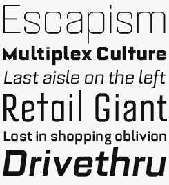
Bourgeois
You innocenty thought you were just using a nice, squarish sans serif. But there's a layer of irony here: using a font called Bourgeois may force designers to reflect upon their own complicity in the state of the world. As Barnbrook says: “The Bourgeois Family would like to help the world’s big problems, trouble is they only know how to discuss small ones?” Nevertheless, Bourgeois is Virus Fonts’ best selling typeface, and the largest to boot, with 40 styles available from Light to Ultra in condensed, italic and alternate versions
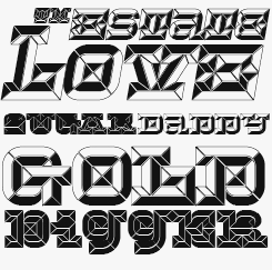
Hopeless Diamond
“Hopeless Diamond” was the nickname test pilots gave to early prototypes of the B2 Stealth bomber – the radically dark and angular military aircraft designed to dodge radar detection while on combat missions. Its namesake, although just as acutely sharp-edged itself, is unlikely to remain under the radar wherever it is deployed, bringing a substantial and weighty presence, not to mention a certain amount of bling, to brands, posters and packaging. In three styles with italics and alternative forms — also available as OpenType.
How do you design your fonts — do you do a lot of sketching on napkins, or do you keep a sketchbook? Or is it straight to the computer?
There are so many different influences. Some of them are atmosphere, some of them are conceptual. So it depends on the font, though I will generally sketch the fonts very roughly by hand. It’s very important that they are ‘out of focus’ in a sketchbook in pencil at the beginning, so I can start to get the feeling right. These drawings are only a few centimeters big. I will then work a letterform over and over again, match it with others in the font, make it almost part of my handwriting. This also happens even with the more modular fonts as it is the best way to work out the system of construction. Often when other people look at these drawings they are incomprehensible, but they have enough information inside them for me to understand the identity of the typeface. Once I feel I am getting somewhere I will start to draw on the computer — it makes the letterform absolute, pure positive and negative. So there is a lot of refining that goes on until I am happy with it. It’s a long process but the end result of being able to write one simple word in letters you have designed makes it worthwhile still. Even better is that people write to you and show you the work they have done in a font. Often they will use it in a way you hadn’t expected and that is a very enlightening experience.
Many of your typefaces have incorporated references to letterforms and styles of the past. In what ways should design history matter to today’s designers?
I think every graphic designer should have a proper knowledge about the history of typography. When you sit down at the computer you should be aware of all the ideologies and influences that have brought you to that moment. Typography in particular relies on existing models of familiarity which influence legibility and the message that people get from a font. It seems false not to acknowledge that when you draw the letterforms. Of course, most designers base their work on historical research in a fairly conventional way, but what I am talking about is whether or not you are explicitly saying something positive or negative with your models of letterforms. For instance, I use the cross a lot in my designs, and on one level it is saying that historically western typography has been linked with the church, while on another level it’s a symbol that a lot of people have a negative view of. On yet another level it plays with the idea that once a word is printed it still seems to have an authority in quite a totalitarian way and finally it’s a direct reminder of the ‘classical’ aesthetic which influenced me so much. I like the fact that all that can coexist in one font.
But there is more to it than that: A typeface can be a ‘collage’, ?a ‘synthesis’ of a time, a place, or something you want to say. It’s the opposite of the historical research, because you construct using different letterforms from different sources which somehow fit together and make something new. My first two fonts Prototype and Bastard were some very early advanced experiments in this. More recently Priori from Emigre does the same thing. It doesn’t adhere to one historical model but it’s a historically based font for our time.
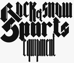
Bastard
The name may sound harsh, but it is simply the translation of a bona fide script genre. ‘Bastarda’ was a hybrid of gothic forms and the rounder shapes of humanist writing. But Barnbrook’s signature blackletter has other connotations as well. The font is steeped in critical allusions to fascism, industrialization and all-pervasive corporate influence. There is also a more complicated relationship at work here: the tension between the historically familiar Fraktur character and the overtly digital aesthetic will make for confrontational yet engaging design.
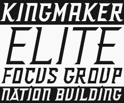
Delux
An all caps, acutely angled and sickle-sharp display face with a military character derived from defunct aircraft, Delux’s two weights make for uncompromising headlines and title pieces. Aside from an alternative ‘A’ and a few extra spurs on some of the ‘lowercase’ glyphs, Delux is uniform and regimentally regular; a specialist instrument for forthright implementation.
Do you think your work — especially the typefaces — display an English, British or European identity?
I think my typefaces are absolutely informed by my immediate environment, so yes, my work does have that English / British / European identity. It used to be that typography would absolutely give you a sense of where you were but that is becoming less and less so now, therefore I like to include things that are still unique to my own environment. I think the best that all of us can do is be true to our experience of the world that is around us. It’s the thing that will make all of our work unique.
Are you often surprised, amused or annoyed about where some of your typefaces end up?
I am first very happy that people find the fonts interesting and relevant enough to be used. I don’t know if that’s a disappointing answer, but I think we should all have a sense of humor about ourselves, there’s no point getting upset. I feel extremely privileged that I have some impact on contemporary visual language and that my visual ideas coincide with other people’s. Unlike many designers I do think the world would be a really boring place if everything was perfectly designed. We need a clashing of visual styles, naivety, alien influences to keep design alive and what is often bad can become what we regard as rather good.
Tourette
We can’t repeat the entertaining if compulsively rude description from Virus’s specimen book here, but can only say that, given a chance, the exquisite Tourette Extreme — and its plainer, more anonymous sister, Tourette Normal — would excel both in polite society and in riskier, edgy situations. Just don’t expect them to always behave.
As far as I know, you have been working on your own or just with a couple of assistants or interns for more than fifteen years. Has it been difficult not to grow?
Well, to maintain the standard of the work it’s essential to remain small. Every job in the studio is the result of discussions between the people here, of an atmosphere of not having to be too business-like in our attitude, of being able to laugh while working, of knowing everybody well, of not having to take jobs on to just pay the bills. I do know because of our skill we have an influence and interest far beyond the size of our company and I hope that this provides hope for people just starting in the profession; that you can do large jobs, do the work you want to do, not compromise your principles and still survive.
You seem like quite an uncompromising individual, but are there many occasions when you must choose the lesser of two evils when it comes to accepting commissions?
Well, you will be surprised at the amount of people who say I am very easy to work with! I think the basis of getting good work done is not to be involved with any kind of fight with a client but that you have their trust, then they can let go a bit and have confidence to let you lead them rather than serve them. I think you have to really like people to be a good designer, it’s not a solitary activity. As for accepting clients or not, economies are complex, so it’s often very difficult to actually say when somebody is creating ‘harm’ or not. so I usually go on my instinct. You can tell quite quickly whether you are ‘comfortable’ with what a client does. However, I do believe in dialogue, so if someone who I wouldn’t normally work for came to me and said “I actually want to try and operate differently” I would be happy to listen.
Who do you consider to be your peers, in both the graphic and the broader design worlds? Who else manages to mix politically motivated work with a commercial practice?
I don’t really know... and that’s because I hardly ever keep up with what is going on in graphic design. I am passionate about it of course, but I would rather be ‘doing’, than reading or seeing stuff. I would rather not look at other designers’ work as I understand the process they have gone through to get to it.
I am very interested in other areas of human activity — I could name more philosophers or electronic avant-garde musicians than graphic designers, those are the kind of people that I tend to follow. I do know though that it’s pretty rare, being politically involved for a designer is a lot of effort, and most people would rather have a comfortable life and not worry too much about such things. It’s quite easy to be a ‘nice designer’ without using your brain too much.
It’s far more interesting to look at experiments in another field and see if it can be applied to graphic design. For instance I am thinking about how to apply the ideas of Samuel Beckett to typography; the absent parts of a conversation, the pauses and the spaces being as important as the spoken word. Currently the most interesting thing is the idea of epic theatre by Brecht and how it could be applied to design.
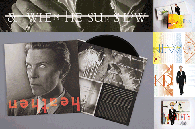
And finally, here is a question that many of our readers may be dying to ask: what was it like to work with David Bowie?
I am happy to say he is pleasure to work with. It is always interesting to see how much ‘being worshipped’ affects people. They can become a spoiled child, a person detached from reality. I am happy to say that David Bowie is none of these. He has come out of a pretty ‘eventful’ life — drug addiction, leader of rebellion for a generation, messiah to each wave of disaffected youths — with a sense of humor and a level head. He is always very good in his criticism, respectful of my creativity and respectful of the people who like his music. I just wish more of the famous people who I had worked with were like him.
I always think it’s a great test if you like somebody’s music or art more after you have worked with them than before, as you get to see them at their worst, when they are angry, disappointed, egotistical, but (and I hope I don’t sound too gushing) I have gained an insight into his work knowing the person, and I like it much more because of it. He really has been the perfect person to work with. Thankfully he seems to enjoy working with me too as we are continuing to collaborate on a few projects.
We can’t wait to see the outcome. Thank you for your insights!
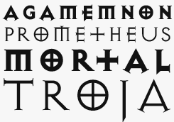
Exocet
A long-standing favorite for designers working with potentially controversial or sensitive material (make that marketable and controversial material), Exocet is nevertheless a somewhat enigmatic beast. Its name, like much of Barnbrook’s work, invites militant associations yet this is a classically proportioned all caps display face; open and elegant, much of its character is derived from ancient Greek stone-carved forms, lending it an ancient feel while remaining decidedly cutting-edge.
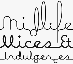
Expletive
Quietly spoken and imaginative, Expletive is a circular connecting script with occasional, unexpected exclamations. Available in two weights, the alternate versions of each throw letters off the baseline and ascenders into the stratosphere, creating distinctive, almost pattern-like lines of text that — used in moderation — remain intuitively legible, in spite of their shifting foundations. Use with unrestrained exuberance, however, and your titles and headlines will take on an electric dynamism. The glyphs also work particularly well in pattern and border making — try setting lines of alternating character versions.
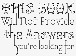
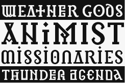
Infidel
Infidel, rooted in manuscripts created by mediaeval monks draws on the serenity, beauty and spirituality of those religious texts to counter the negativity generated towards religion by the World Trade Center attacks. These are archaic letterforms, by turns intriguing, alien, beautiful and ugly, but ultimately this is a stylish contemporary face, heavily pictorial and well suited to graphic intensive or illustrative applications.
Available now:
Creative Characters, the book
Creative Characters is the MyFonts newsletter dedicated to people behind the fonts. Each month since July 2007, we have interviewed a notable personality from the type world.
The first two years of these interviews have now been collected in a beautifully produced book. Twenty-six interviews, expanded with case histories, behind-the-scenes imagery and superb examples of fonts in use.
Interviewees include David Berlow, Jim Parkinson, Cyrus Highsmith, Ray Larabie, Nick Shinn, Rian Hughes, Alejandro Paul, Dino dos Santos, Veronika Burian, Ronna Penner, Gert Wiescher, Hubert Jocham, P22, Underware and Jos Buivenga.
Order the book now at Amazon.com, or at a good bookshop near you.
Meanwhile all Creative Characters interviews will remain accessible in our online archive.
Colophon
This newsletter was edited by Jan Middendorp and designed using Nick Sherman’s original template, with specimens and type descriptions by Anthony Noel.
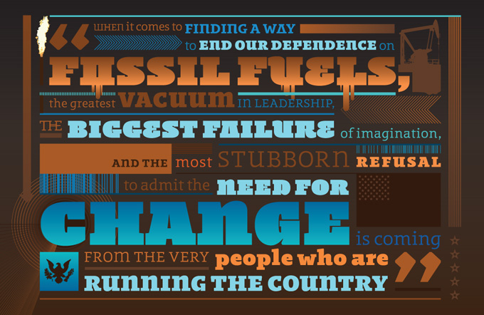
The Creative Characters nameplate is set in Amplitude and Farnham; the intro image features Tourette and Mason Sans; the pull-quotes are set in Regime Bold Italic; and the large question mark is in Farnham.
Comments?
We’d love to hear from you! Please send any questions or comments about this newsletter to [email protected]
Subscription info
Want to get future issues of Creative Characters sent to your inbox? Subscribe at www.myfonts.com/MailingList
Newsletter archives
Know someone who would be interested in this? Want to see past issues? All MyFonts newsletters (including this one) are available to view online here.

