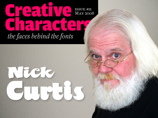
As soon as we published our first Creative Characters interview last summer, requests began pouring in to interview the man behind Nick’s Fonts, one of our most successful foundries. “Please interview the prolific Nick Curtis!” wrote our customer Sandra. “He really seems to have his finger on the pulse of popular culture. I’m a fan, can you tell?” She is not the only one: Nick Curtis has many admirers, and it’s easy to see why. His fonts are among the tastiest, freshest and sassiest MyFonts has to offer. Plus, there’s an awful lot of them, and their variety is baffling. How does he do it?
On your MyFonts bio page, we can read about the precise moment your “love affair with typefaces” began: when you were about 14, you found a fat green binder filled with type specimens from a Dallas printing shop. What made those alphabets so alluring to you? Did you start copying letterforms—or drawing your own—then and there?
When we learn to read and write, the process is vitally dependent on letterforms—learning to distinguish one from another, learning their sounds and their shapes—but the act of “appreciating” the diverse forms is practical, rather than aesthetic. Thus, at some point in the process of learning to read and write, the medium fades into the background, and the message becomes the focus of our attention. Or, put another way, we are taught to pay attention to what is being said in print, but not how it’s being said.
As I leafed through the two hundred-plus pages in my found binder, reading “Matchless in power among the arts of men is the art of typography” in typeface after typeface, it gradually dawned on me that each one was different, some in very obvious ways, some in very subtle ways. Perhaps more important, I began to get a sense of the differences in tone—or attitude—conveyed by the different designs. This was a kind of epiphany for me: the letterforms themselves began to assume a new meaning, and I began to understand what this oft-repeated sentence meant. So, yes, I began copying the letterforms first, so I could understand—at least approximately—what it was that made each alphabet different from the others, and each letter within each alphabet the same as its brothers and sisters. It was the beginning of a learning process that still continues today.
Jaunty Gent
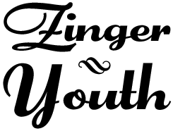
Pre-1940 German script and display fonts are a never-ending source of delight. One of those forgotten treasures is Rheinhold Kräftig by Erich Mollowitz, published by the Hamburg foundry of J. D. Tennert & Sohn in 1936. Nick Curtis subtly reworked the original letterforms, extending them and beefing them up a bit. The result: Jaunty Gent, a script that struts across the page with a determined stride.
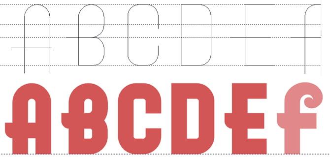
Work in progress for an upcoming font of Nick's.
That binder seems to have helped you decide to go to art college. With hindsight, is it important to have had formal education? What were the most important things you learned?
Actually, I enrolled as a commercial art major at a liberal arts college. The discipline was directed by Walter Ender, who was a recognized eminence in the Dallas commercial art community. He did absolutely gorgeous work, but he tended to achieve his ends by sparing no expense in the printing of his designs. My first two years in the program were devoted to basic art courses—drawing, anatomy, painting and printmaking—with specialization in one’s major occurring in the third and fourth years. As it turned out, by the time I reached my junior year, the college had decided it could no longer afford to print the exquisite pieces that Mr. Ender designed, and the commercial art major was terminated. So, for reasons too Byzantine to recount, I switched my major to English.
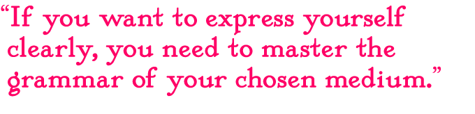
The most important thing I learned from my art courses was, to quote my printmaking teacher: “Technique, technique, technique.” As it happens, technique is to art what grammar is to English. If you want to express yourself clearly, you need to master the grammar of your chosen medium and, at least in my experience, formal education is the best way to learn that grammar.
Smart Frocks
The most successful of Nick’s recent offerings, Smart Frocks was inspired by a sign in a 1930s London storefront. Describing Smart Frocks as “singularly stylish, hip and haughty and decidedly Deco,” the designer is confident that this font is a new way to outsmart the competition. Included in Nick’s irresistibly priced Feb 2008 6-Pack.
In a recent Rising Stars newsletter, we referred to you as a typographic time traveler. What makes letterforms from the past so fascinating to you? Would you describe yourself as nostalgic?
The typography of a particular point in time is as unique as many other aspects of popular culture at any particular point in time. What I find exciting about discovering and reviving these particular letterforms is that doing so not only allows me to be a typographic time traveler, but it allows me to take other people along on the journey.
I’m not sure that “nostalgic” is the right word; all things considered, the “good old days” weren’t necessarily uniformly good, but it can be comforting to remember them fondly from time to time.
Where do you find your sources of inspiration? Flea markets? Libraries? Travels around the world? Do you collect precious samples of lettering?
Inspiration can be found in the most mundane and unexpected places: I found the inspiration for Quigley Wiggly, one of my early freeware fonts (which mysteriously showed up on a new HP computer that I bought last year), on a toothpick wrapper. Many other typefaces were inspired by vintage posters, which can be found on numerous sites on the internet. I have taken advantage of my close proximity to Washington, DC, the past ten years and have become a registered researcher at the Library of Congress, and I have yet to tap the Maurice Annenberg Collection of type specimen books located nearby in College Park, MD.
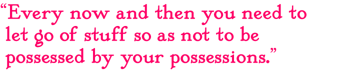
As far as collecting goes, over the course of the last three or four years I’ve trawled websites like eBay and Alibris to amass a collection of over 400 type-related books, from handlettering chapbooks to vintage type specimen books, and also have a small collection of vintage wood type and electrotypes. However, as much as I would like to hold onto all of these goodies, every now and then you need to let go of stuff so as not to be possessed by your possessions… if you know what I mean. So, as I digitally capture the images that interest me, I plan to “repatriate” the major portion of my library through my website in the coming months.
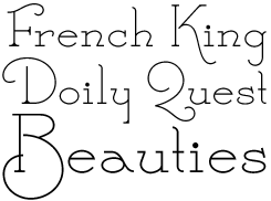
Tulpe Fraktur
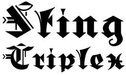
And now for something completely different. Among the avalanche of new and rediscovered blackletter fonts, Tulpe Fraktur is one of the weirdest and wackiest. Based on a sample of hand-lettering from 1920s Germany, Tulpe combines Art Deco sensibilities with blackletter forms. The two gorgeous Deco vignettes alone are worth the price of the font.
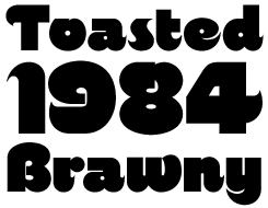
Mikey Likes It Corpulent
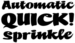
Fat and sassy, this ultra bold brush font is based on the works of lettering legend Mike Stevens as seen in his book, Mastering Layout. Pick it when in need of a can't-miss headline, or try it to set a short introductory text in magazines or brochures.
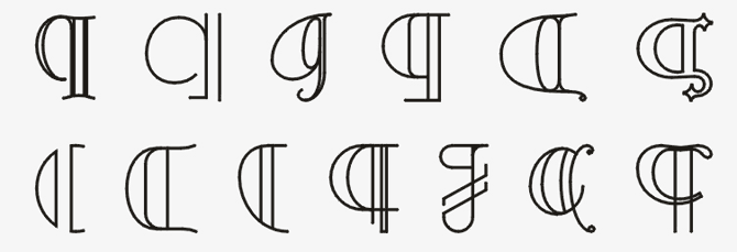
A variety of Nick's sketches for several different pilcrows.
With more than 300 fonts, you’re one of the most prolific type designers on MyFonts. Your range of styles is amazing: from Art Deco to psychedelia, from circus to surf. Is there a particular style you find yourself most at ease with, an era where you feel most at home?
As I was growing up in the 1950s, commercial television was growing as well, and was nowhere nearly as neatly packaged and programmed as it is today. Broadcasters with hours to fill relied heavily on movies and cartoons from the 1930s and ’40s, and so I was exposed to a lot of the popular culture from generations preceding mine. It wasn’t until several years later that I realized the beginnings of my love of Art Deco began with the Warner Brothers cartoons and Marx Brothers movies I saw as a child. Then the ’50s developed its own style, reflected in influences as diverse as Saul Bass and Soupy Sales (to say nothing of Jay Ward and Bill Scott). When Push Pin Studios, among others, reintroduced Art Deco to mainstream advertising in the mid-’60s, it felt like a kind of homecoming to me.
Some of your fonts, like Jaunty Gent and Engels Stabenschrift, are faithful revivals; some are reinterpretations, others are new variations on a familiar theme. Do you prefer one way of working over others? Is one more difficult than the other?
I routinely apply the Goldilocks principle: if an original design seems “just right,” I go with what I have at hand and translate it into Bézier curves as faithfully as I am able. In a sense, this approach is more demanding because it requires matching an objective standard. On the other hand—metaphorically speaking—sometimes the porridge is too hot or too cold, so I make changes in some or all of the letterforms as I see fit. In the end, I suppose it all boils down to a matter of personal taste. Thankfully, more often than not, it appears that enough people accept my decisions to make my efforts worthwhile.
Major Production
Ever wondered where movie poster designers find those compressed fonts to set the credits? Well, here is one that some of the pros actually use. Major Production offers two all-caps alphabets: the uppercase letters are ultra condensed, the lowercase are approximately a third the size of the uppercase. Also included are various logos and symbols suited for real (or fake) film posters or media packaging.
You seem to have produced a lot of your lettering work in the pre-digital era. What has the advent of the computer changed for you? Do you still draw by hand when you begin working on a new typeface?
In the pre-digital era, “Undo” meant erasing, painting out or trashing the whole project and starting over. Likewise, testing subtle variations meant starting over, working to a certain point, then trying a different tack at some point in the process. So, in purely economic terms, the personal computer’s impact has been tremendous: not only has its use virtually eliminated the expense of art supplies, but it has also reduced the amount of effort necessary to explore different options. So, most of the time I work exclusively on the computer—although, from time to time, I do break out the trusty old pencil and paper to try out some quick variations, especially if those variations are radically different from one another.
When you choose the next typeface to work on, is that a purely intuitive decision? Or do you have marketing plans, clients that want particular styles, or perhaps your own graphic projects?
I suppose that, in addition to the Goldilocks principle, I also work by the Garden Party principle, first postulated by Rick Nelson: you can’t please everybody, so you’ve got to please yourself. I tend to pursue projects that interest me, and hope that they will interest other people, as well. Of course, I don’t ignore the vox populi, especially since MyFonts makes it so easy for me to gauge public acceptance. If a particular font proves to be a particular favorite among buyers, I try to analyze its appeal and generate offerings that are conceptually, but not necessarily stylistically, similar. Sometimes it works, sometimes it doesn’t.
Here’s a question some of your colleagues may want to ask you: how do you manage to be so productive?
Two reasons, probably. First, I’m very comfortable with my tools. I draw my outlines exclusively in CorelDRAW, which I’ve been using since version 1. Version 9 is my favorite, perhaps because I served as a Tier 1 beta tester and was intimately involved in its development. This familiarity allows me to knock out the basic shapes very quickly, leaving ample time for fine-tuning later.
Second, I try to keep things interesting by juggling a lot of balls at once. Typically, at any one time I probably have a dozen or more projects in the works. I’ll open a project and work on it for as long as it doesn’t seem like work; then I’ll save it and move onto another project, applying the same criterion. This approach tends to keep each project fresh, and keeps the wheels of industry churning effortlessly.
Well, please keep those wheels turning; we look forward to seeing more of your creations in the future.
Calamity Jane
One of Nick’s most popular recent fonts, Calamity Jane is not easily overlooked. Its lowercase letters come from a turn-of-the-twentieth-century typeface named Amsterdam, and the uppercase letterforms come from a 1930s logotype for the Théâtre Moderne in Paris. Included in Nick’s Fonts Mar 2008 6-Pack.
Edgewise
Nick calls Edgewise a “gentle giant”—which is a fitting way to describe this strikingly bold font. Based on a typeface named “Ryter Night”, Edgewise is hefty yet playful; its combination of clean lines and whimsical details make it one of the most idiosyncratic alphabets in Nick’s collection.

Who would you interview?
Creative Characters is the MyFonts newsletter dedicated to people behind the fonts. Each month, we will be interviewing a notable personality from the type world. And we would like you, the reader, to have your say.
Which creative character would you interview if you had the chance? And what would you ask them? Let us know, and your choice may end up in a future edition of this newsletter! Just send an email with your ideas to [email protected].
During the past year, we've interviewed the likes of Christian Schwartz, David Berlow, Dino dos Santos, Ronna Penner, and Underware. If you’re curious to know which other type designers we’ve already interviewed as part of past Creative Characters newsletters, have a look at the archive.
Credits
This month’s interview was conducted and edited by Jan Middendorp and designed by Nick Sherman.
Supporting fonts
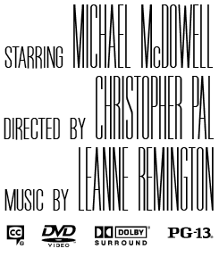
The Creative Characters masthead is set in Amplitude and Farnham; the intro image features Mikey Likes It Corpulent and Edgewise; the pull-quotes are set in McKenna Handletter; the large question mark is set in Farnham, and the small URL at the top is set in Unibody 8.
Unsubscribe info
This message was sent to:
[email].
It is never our intention to send unwanted e-mail. If you no longer wish to receive this newsletter, you may change your subscription settings at: www.myfonts.com/MailingList
Comments?
We’d love to hear from you! Please send any questions or comments about this newsletter to [email protected]