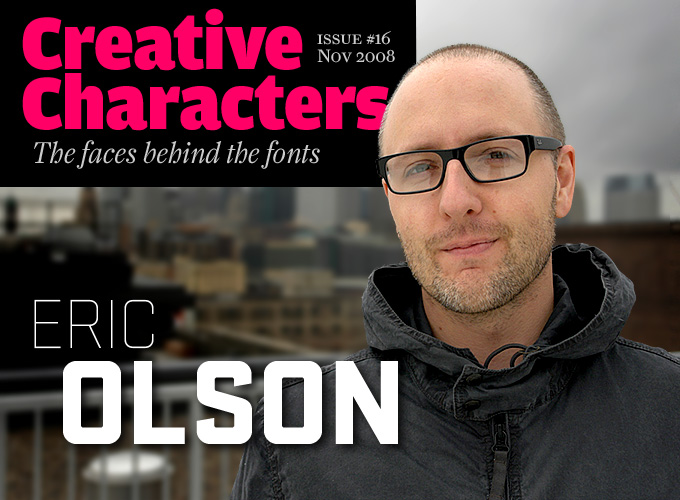
In a relatively short time span Eric Olson’s Process Type Foundry has become one of the most successful micro-foundries in the US. His retail fonts, such as a the cool, clean Bryant and the highly fashionable Klavika, enjoy increasing popularity in print as well as on screen. In addition, he has worked on a wide range of assignments for clients ranging from Chevrolet to the Walker Art Center in Minneapolis, his home town. All this is good news for typography, because Olson’s typefaces are carefully drawn, well-equipped and original. They’re also quite extensive: you might say that Eric Olson is a family man.
Eric, you've worked in and around Minneapolis during a large part of you career. Is it an attractive city for designers and artists to work in?
It must be, because there are thousands of them here. It doesn't move with the pace of New York or London. And if you've decided to stay, chances are you find that valuable. It seems to follow that, with the slower pace, the room for working naturally opens up and things start to happen.
You're a full-time type designer and the principal of your own foundry. Was this something you envisaged when you designed your first typefaces in the late ’90s?
Never. When I designed my first typefaces I was in design school and very focused on becoming a graphic designer so the thought never crossed my mind. At the time my dream was to design magazines and album covers and drawing typefaces was just a way to make my graphic design more original. I think along the way I realized designing type was really satisfying and soon I couldn't stop.
Designing type all day, every day – does it ever get boring?
There is a certain amount of tedium associated with type design because it's exacting work – and maybe that notion is at the root of your question – but the detailed construction and care of every glyph is what really makes a typeface sing. Attempting to get the total system of a font into harmony might be frustrating, annoying, or exasperating but never boring. And of course, when you publish your own typefaces, you become involved with every aspect of running a business and that means there is always something to do besides just drawing letters. Customer questions have to be answered, new website features need to be implemented, ads have to be designed, or whatever the business requires at the moment. In fact, it is often a luxury to be able to focus solely on designing type for hours on end.
Klavika
There have been other squarish sans-serifs before and after Klavika, but Eric Olson’s typeface has been recognized as something of a milestone in the genre. It is clean and technical, but has retained a certain friendliness. It is also easier to read in longer texts than other typefaces of its kind. No wonder that Klavika has been used by the likes of Nokia, NBC and the Boston Phoenix. Features like small caps, true italics, extended language support and multiple numeral styles make Klavika an versatile workhorse typeface.
Klavika Basic is a "lite" version of the popular sans-serif; its character set is less extensive, its price is very affordable.
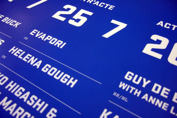
Print design by Allon Kaye using Stratum
You worked as a graphic designer before, taking commissions from clients such as the Walker Art Center. Do you think it is important for type designers to be able to identify with their users, i.e. have first-hand experience of how graphic design works?
It can't hurt. As a type designer one of my challenges is to make work that graphic designers find useful and I find interesting. That’s hard to pull off, but there are other disciplines that face similar challenges. Think of jazz fusion! It's music for musicians and only marginally for ordinary listeners. First hand experience of the field is helpful in this respect because it establishes parameters for use (make it durable) and lays out expectations (make it do everything). Obviously perfection isn’t possible, but these parameters can be a reality check along the way.
A large part of the fonts that are released in the USA are revivals and reinterpretations of faces from the past. You are one of the designers who are constantly pushing boundaries, trying to come up with original solutions. Does this make you feel different?
No, I don't feel different, and though it's been relatively limited, I've dabbled in that area a bit. I suspect the revival-based approach in America is coming to an end in terms of impact because the context for using this work is shrinking along with the reasons for creating it.
Do you mean that that users are getting more and more interested in contemporary letterforms?
I have a hunch that users have always been interested in contemporary letterforms. I like to think graphic designers are taking their role as messengers of contemporary information more seriously and given that, revivals present a problem. They arrive with historical baggage, conservatism, pre-defined outcomes and an inherent denial of possibility. Unless the goal is to honor these qualities or make light of them, why would a graphic designer use fonts like this when making work reflective of their time?
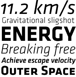
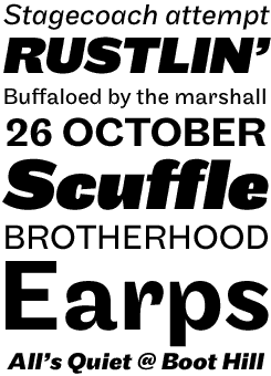
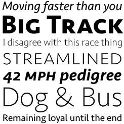
Bryant
Bryant’s geometric shapes and rounded angles were inspired by the mechanical lettering kits used in pre-digital times by draftsmen and amateur sign makers. Bryant is now an extensive family in three widths, for branding, editorial design, packaging and posters.
Bryant Pro, the most extensive and versatile sub-family, has italics for all weights, plus an “Alt” series with interesting alternative shapes. Bryant Condensed, the mid-width member of the series is condensed in name, but its body width is similar to many standard grotesques. It's equally suited for text and display work. For situations where large point sizes and maximum letter count need to coexist, Bryant Compressed is the narrowest of the Bryant sub-families. Sharp stem joins and increased contrast allow this face to keep the Bryant style while maintaining a narrow width.
When designing a new typeface, say a contemporary sans-serif, what are the things that inspire you? The street? Art and architecture? Other designers’ work?
It really depends on the situation but I am often inspired by the ways in which graphic designers abuse fonts. It represents a legitimate desire on their part to make a typeface perform a particular function, a function it was probably not designed to perform. That missing function points the way to new designs or possibilities. For example, sans-serifs are often chosen for long passages of text – despite conventional wisdom. Is it possible to design a typeface that meets this requirement? Not all of these questions end up as typefaces (or maybe a series of ideas end up in one typeface), but they open up avenues of exploration I might not have traveled down myself.
When you begin designing a new typeface – assuming it is not an assignment with a precise briefing – where do you start? Is there an element of marketing, of trying to find a new niche?
It usually starts with an impulse driven by one of two reasons. One, I have a big idea. For example, “what if a typeface could do this?!”. And second, “what if I designed it this way instead?”. This is my formal idea. Both of these approaches then fail, every time almost without exception. I then put the results in a folder and file them away being careful to keep them for another time. I have a few hundred of these on various hard drives around the studio gathering dust. It's only years or months later while showering, biking or drawing that the solution will hit me and I'll dig the files out and start again. As you can imagine, my non-client work evolves quite slowly!
Do you do sketches on paper at all, or is all your type designing work done on the computer?
In the very early stages of a design, I like to rough out letterforms by hand but I rarely refine them on paper because they're only skeletal and quite crude. The point, however, is to set the pace and get a rough idea of the proportions of the typeface. From there on out, I work almost entirely on the computer. I am better able to take those initial sketches and quickly generate many possible combinations of letterforms or spacing, and most importantly, see how the glyphs work together. This is simply much harder to do on paper. If I'm really stuck, I might use a broad nib pen to emulate the letterforms I'm working on to remind myself of the rhythm of the letterforms. I try not to pick favorites, though, when choosing which way I work. I use the tool that is best for the task at hand and not necessarily the tool one might expect a type designer to use. Better work comes out of possibility and experimentation, rather than expectation.
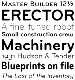
Maple
This is how fellow type designer Mark Simonson described Maple when he chose it as one of Typographica’s typefaces of 2005: “Other type designers have mined the 19th-century English grotesque, but Eric Olson gives it an energetic crispness which makes earlier attempts seem a bit stuffy. Maple captures the exuberant quirkiness of the grots without slavishly imitating them.”
Maple comes in four weights plus italics: an attention-grabbing face for magazine headlines, brochures and identities.
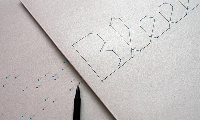
Print design by Allon Kaye using a connect-the-dots variation of FIG Script
When designing custom-made fonts, what would your ideal client be like?
Something similar to my relationship with the New York Times Sunday Magazine comes closest to an ideal. The art directors Arem Duplessis and Gail Bichler, aside from being talented typographers, planned and expected the project to take many months rather than weeks. Custom jobs almost never go that way. A client may know ahead of time they want a custom typeface, but rarely commit to the idea until they’re just eight weeks away from desperately needing the fonts. At that point, any time that could have been used to reflect on the work is completely out of the question. Clients deserve much better, but they have to acknowledge that typeface design follows its own particular schedule. There is simply a lot of raw production work that has to happen and it takes time. But, as with all things, it’s much easier said than done.
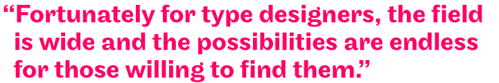
Having performed a wide array of design-related jobs, how would you describe the role of type design – is it a catalyst, an area for expression and research, or merely the production of modest and practical tools?
At the risk of sounding all inclusive; all of the above. Fortunately for type designers, the field is wide and the possibilities are endless for those willing to find them. When I speak with other type designers or attend conferences, I'm always taken aback by the range of pursuits within the field. We have a lot in common, but for the most part, there is very little overlap between what each of us does when compared with other fields. It feels like there is legitimate room for pursuit in any of the interpretations you list above.
What is your most challenging prospect when thinking of future designs?
Probably the prospect of irrelevance. I've designed many fonts to satisfy my own curiosities and likely always will, but the fonts I release to the public have to be durable. To make something durable, but also fresh and relevant, is terribly difficult and I'm certain I’ve fallen short of this many times.
Find Replace
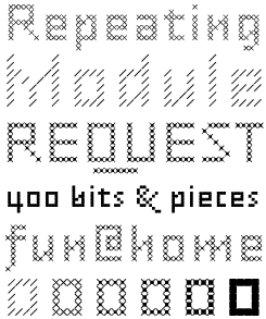
FontLab, the application that most professional type designers use for making fonts, has a Find and Replace function that is normally used for eliminating unwanted curves or elements throughout a font. Olson used it as a design tool, replacing each of the vector-drawn “pixels” or modules that make up the font’s characters by crosses, hatches and other elements. The result is especially interesting because the fonts all share the same widths, and can be layered to dazzling effect.
One of your best selling fonts is Klavika. I once read that you almost abandoned it. What happened?
Just the usual I guess. I'm always second guessing myself and after all these years, I've come to think that's just how I work. If I could have one wish in my daily working life, it would be to have automatic objectivity and unfamiliarity. If I could just turn on my computer and look at something I've been working on and be a complete stranger to it. Can you imagine that? That would change everything! But alas…
Klavika has now become so successful that other people are imitating it. What do you think when you see a design that is too close for comfort?
Mostly I find the imitations confusing. It should be said, the difference between influence and imitation is pretty important. With Klavika I was influenced by, amongst other things, Bell Gothic Black and Dave Farey's amazing Cachet. Klavika wears these influences on its sleeve but they're only a starting point or reminder along the way. The goal was to make something new and hopefully that's apparent. The imitations you mention are efforts to get in on something and make a few dollars. Unfortunately there's a long history of this in type design. Have a look at many of the phototype catalogs from the 1970s. I'm not sure why you'd want to repeat this because there must be easier ways to make money.
What's been the biggest thrill in seeing your fonts used by others?
Well, it’s just generally seeing my fonts used by others, period. It never gets old.
Thanks Eric! We're looking forward to seeing even more of your typefaces on MyFonts.
Seravek
Seravek is chic, unobtrusive and very legible. Well-designed, with a touch of Gill Sans, Seravek is one of those contemporary sans-serifs with a humanist touch that convincingly demonstrate how today’s sans can be a perfectly legitimate text font – even for setting entire books. Although it’s not called “Pro”, the full Seravek family is just that, equipped with multiple figure styles, lots of ligatures, a broad range of supported languages, small caps, and much more. The more affordable Seravek Basic has a limited character set, but will provide the average user with exactly the same quality of design.

Who would you interview?
Creative Characters is the MyFonts newsletter dedicated to people behind the fonts. Each month, we interview a notable personality from the type world. And we would like you, the reader, to have your say.
Which creative character would you interview if you had the chance? And what would you ask them? Let us know, and your choice may end up in a future edition of this newsletter! Just send an email with your ideas to [email protected].
In the past, we’ve interviewed the likes of Christian Schwartz, Dino dos Santos, Jim Parkinson, Mário Feliciano, and Underware. If you’re curious to know which other type designers we’ve already interviewed as part of past Creative Characters newsletters, have a look at the archive.
Colophon
This interview was conducted & edited by Jan Middendorp, and designed by Nick Sherman.
The Creative Characters nameplate is set in Amplitude and Farnham; the intro image features Stratum; the pull-quotes are set in Maple; the large question mark is in Farnham, and the small URL at the top is in Unibody 8.
Comments?
We’d love to hear from you! Please send any questions or comments about this newsletter to [email protected]
Subscription info
Want to get future issues of Creative Characters sent to your inbox? Subscribe at www.myfonts.com/MailingList
Share this!
Know someone who would be interested in this newsletter? Send them here to view it online.