
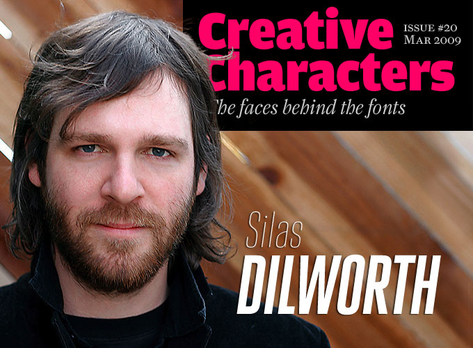
Photo by Rachael Porter
Silas Dilworth has the kind of technical instinct that many of us are envious of. He can repair your car or motorcycle. He taught himself the technicalities of high-end font production and web programming. Yet he has also trained as a painter, and it shows. His letterforms are economic yet elegant: with minimal means, they provide typographic style and character. He is one half of TypeTrust, a platform for high-quality typefaces. Meet Silas Dilworth, a type designer who does not believe in retirement.
Silas, it seems you have tried out several career options before becoming a type designer. You studied painting and digital imaging, experimented with photocopiers and even worked for an insurance company. How did all of this add up to get you interested in type?
Before I viewed art as a career path, I was always more interested in computers and engineering. I grew up with Lego, BMX bikes, and video games. My father is mechanically minded and he taught me a lot about cars and motorcycles. He encouraged me to be an engineer by the time I started high school. I excelled in math and really enjoyed technical drawing. I spent a lot of time building complex Lego Technic contraptions and plastic model kits, or drafting concept cars and dream houses with a ruler and compass. It seemed a likely trajectory to study mechanical engineering or even architecture, but in the end I grew tired of calculus and more interested in unbridled artistic expression.
But after my first semester at art school, I got restless and wanted to get a taste of the real world. So I went to work for an insurance company. In retrospect, that job has been rather influential. I started as a data-entry temp working on health insurance claims processing. The backbone of the operation was a Kodak microfilmer/scanner the size of a refrigerator that was hooked up to a PC with Optical Character Recognition (OCR) software. We were processing thousands of claims per day submitted by hospitals and doctors’ offices all over the US. This was the mid-90s, and the majority of the claim forms were still poorly filled out by dot-matrix printers that were misregistered or sorely needed a fresh ink ribbon. The job entailed eight hours at a monochrome PC terminal, manually correcting the OCR errors in the digital version against stacks of hardcopy claims. I started to appreciate the subtleties of letterform structure and legibility when the machine would mistake an S for a 5, or a Z for a 2. A well-designed and clearly printed typeface saved us a lot of time making those little corrections.
I eventually landed the position as the microfilming technician on the second shift. Perfect hours for a night owl. The slower pace and typically lighter workload allowed me some time to tinker with the OCR software and the Kodak machine. The whole process was essentially the opposite of printing but very similar in a mechanical sense. I was operating this complex contraption that figuratively lifted the words from the printed page and returned them to digital form. I’ve never worked in a print shop, but I think that subconsciously this experience gave me a similar, somehow backwards, understanding of the printed word.
Then you went to back to art school?
Quite naturally I grew tired of the monotony of office life. I wanted to surround myself with curious, creative people. I wanted to learn how the art world functioned. I focused my studio classes on drawing and painting because it was familiar and accessible. I was always recognized for my drawing abilities since childhood, and I’ve always enjoyed making images and thinking and talking about them. I was even more interested in seeing what other people would create and hearing what they have to say. I was never quite as interested in the academics of art history or traditional studio techniques as much as understanding “why we make art.”
In the end, art school taught me that I was most interested in the mechanics of visual communication, where written language and picture-making collide. Design school, as I understood it, was about the practice of effective visual communication. A fine arts curriculum — especially at the School of the Art Institute of Chicago — was less about guidance and tradition and more about exploration and discussion. Although this experimental setting appealed to me, my work became more attuned to graphic design in traditional media from a painter’s perspective.
Breuer Text & Headline

In this age of no-frills sans-serif typefaces, it is not an easy task to come up with something new; with Breuer Text and Breuer Headline, Silas Dilworth has done an impressive job. Breuer Text has a straightforward nuts-and-bolts structure but, despite the underlying squarish skeleton, is also rather elegant and reader-friendly. It will make an excellent secondary typeface in a complex editorial design project, for pull quotes, running titles and subheads (check out the small caps and small caps figures) but will also work well for moderate lengths of body copy.
The pair of Breuer Headline fonts is the display complement to Breuer Text. With its sturdy, geometric structure and friendly details, it lends an authoritative rhythm to slogans and titles. All Breuers come with small caps, oldstyle figures and tabular figures.
Facebuster

This single-weight bold face does two things at the same time: it draws attention to the message, and it makes you smile by doing so in such an outrageous manner. The negative space (the “white” of the letters) is minimal, so you have to make sure you’re using it big enough. If you do, the effect is unique — loud yet playful, a striking typeface for posters, book covers and magazine headlines. Facebuster comes equipped with OpenType small caps.
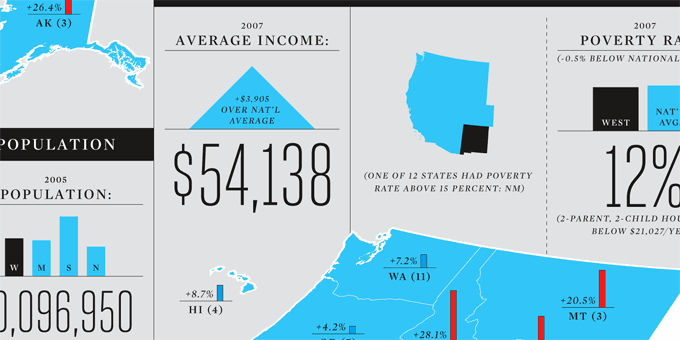
Detail of an informational graphic designed by Nicholas Felton (of The Feltron Report fame) making prominent use of Dilworth's Heroic Condensed. Courtesy of Nicholas Felton.
So you gradually gravitated towards graphic design and typography?
Right. While I spent my studio time navel-gazing in the company of painters, I started spending more of my time working as the Communications Director with the Student Union Galleries. Quite consciously, I was balancing the professionalism and clarity that were required in this role with the playfulness and poetics that painting allowed. I was also working for Whole Foods Market as a signmaker. I had access to brand new Mac G4s, Quark, and Adobe applications at both jobs and I started becoming more acquainted with — and fond of — computers than paint and paper. Although I had very little critical feedback regarding the merit of my design work, I was learning. More importantly I was also fiddling with a large collection of often inadequate fonts.
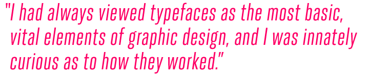
I’ve always been the type of person that needs to know how things work from the smallest part on up. I had always viewed typefaces as the most basic, vital elements of graphic design, and I was innately curious as to how they worked. When I started playing around with fonts and type design, I discovered a world of nearly limitless expressive freedom and purposeful, indisputable technicality. I saw a marriage of creative opportunity and practical constraint.
Between 2001 and 2004 you worked at T-26 as a font technician, type designer, webmaster and administrator — your introduction to the world of fonts. What were the most important things you learned there?
Most of my time was spent with font submissions and new releases. I worked intimately (and obsessively) on hundreds of new releases. My personal initiative was to bring each release up to a respectable level of professionalism. Whether the fonts were usable was almost inconsequential. I just made sure they were built well. I learn by taking things apart, and that was basically my job: to take apart some really inventive, unique fonts and make them as solid and complete as they could be. I even reworked some of the classic selections from the library, fixing PostScript errors and fleshing out kerning tables. (The funny coincidence was that I had already been doing this back at Whole Foods Market… fixing old T-26 fonts that wouldn’t print.)
I collaborated with designers that were submitting their first (and sometimes only) typefaces. More importantly, I worked with a prolific handful who were really dedicated to building a business of their creativity: Rian Hughes of Device; Peter Bruhn of Fountain; Gareth Hague of Alias; Nick and Adam Hayes of Identikal; Gabór Kóthay and Amondó Szegi of Fontana; Anuthin Wongsunkakon; Charles Anderson a.k.a. Charles Andermack a.k.a. Chank Diesel; and my current TypeTrust business partner, Neil Summerour of Positype. They all made me see the long-term potential of type design and inspired me to give it a go myself.
All in all, I learned that I could run a type foundry on my own. I taught myself the technical side of font production, I learned the legal ropes of EULAs, I saw what would sell. I came out of the experience with respectable chops and a versatile eye, ready to pursue my own vision.
Tell us about the ideas behind your TypeTrust portal and foundry.
TypeTrust essentially came about because I wanted a direct outlet for my typefaces. I wanted to do it all on my own at first, but I realized that a partnership would be more fun, educational, rewarding, and a little less work. I started bouncing some ideas back and forth with Neil Summerour in early 2005 while I collected my T-26 unemployment and taught myself web development.
Neil began releasing his first typefaces through T-26 around the same time I started there. In a way, we grew up in the business together and had a good rapport, even if it was almost exclusively via e-mail. Between the two of us, we had everything to start an online shop. I brought the technical and practical experience of running a foundry and organizing the website, while Neil brought the business savvy, boundless creativity, and endless optimism it takes to start a new business.
We steered TypeTrust toward a distribution model rather than a foundry to build a brand. I had incorporated as Dilworth Typographics Inc to take on some major custom type design clients, and Neil was quickly growing his design and marketing firm, Sliced Bread Co in Athens. So we kept TypeTrust as a neutral zone. Neil used some rusty Portuguese and invited Dino dos Santos of DSType aboard, and I extended invitations to a handful of others to get the ball rolling. We’re still not sure how far to take it in this direction because we want to balance the reseller role with a recognizable brand. I use the TypeTrust name at MyFonts, and Neil still uses his Positype brand, but the income is separate. It’s a rather loose affiliation, but it’s intentionally the foundation for a long-term operation. I don’t believe in retirement, and I’m looking forward to designing type on into my old age. Neil jokes about early retirement so he can kick back in his home office, design type full-time, and enjoy his family. We’re on slightly different tracks to the same destination, but TypeTrust is the common goal.
When you began taking type design more seriously, were there any specific aspects of this activity that surprised, confused or worried you?
Nope. I really felt quite comfortable from the beginning. Type design is a very forgiving activity. You’re still allowed to make huge mistakes because the majority of your blunders will go completely unnoticed or even be praised for “breaking the mold.”
Heroic Condensed

Many condensed or compressed grotesques are spin-offs of existing text families. Heroic Condensed is different. The family was conceived from scratch with a structural logic of its own: a fusion of pure geometry and optical balance. There’s a simple geometric skeleton at its core, but the forms have been polished and fined-tuned to obtain even color and visual neutrality across its impressive range of eight weights. With obliques and small caps for each weight, Heroic Condensed is a versatile headline family for a wide array of uses.
Vandermark

Vandermark, writes Dilworth, “began as a simple daydream of what became the n glyph. I considered the elegant balance of a terminal stroke that would never join its supporting stem. The premise was simple, but further experimentation was required for other parts of the alphabet.”
The result is an attractive hybrid. Technically Vandermark is a sans-serif with some chracteristics of a stencil font; but thanks to its strong vertical contrast and classicist structure you could also see it as a kind of faded Bodoni, a modern face that has lost its serifs and some of its hairlines.
Considering the font’s improvisational development, it was only fitting that it was named after a jazz musician, Chicagoan Ken Vandermark.
Cooter Deuce

Cooter was conceived as an homage to what Dilworth calls “suburban graffiti,” the kind of quick hand lettering that you might find plastered across sale signage at the hipster boutique of your local mega-mall. Cooter Deuce is a reworked, more sophisticated version of that earlier pop hit.
The original Cooter’s randomly-distributed solid and counter-punched letterforms have now been extended to encompass two complementary fonts: Regular, with counters; and Plugged, where the counters are, well, plugged. In addition, Cooter Deuce has been re-drawn with more consistently square proportions, and a handful of glyphs have been entirely redesigned.
As you said earlier, type design is as much about practical constraints as it is about expression. Many of those constraints result from the fact that type depends on conventions. Some of your fonts seem to play with this — they move close to the edge of what is still recognizable and legible. Are you attracted by extremity? By transgression?
I don’t think any of my work is truly transgressive. It’s certainly not my mission. I’m always very concerned with legibility and making things recognizable. I don’t want my typefaces to confuse anyone. If they lean toward extremity, there has to be an inner logic across the character set to justify it. That’s also part of the charm of decorative typefaces. You can get pretty wild with the overall design, but there’s a world within it that has to achieve some semblance of order and respect for convention.
People sometimes say that in type design, everything has been done. Do you find it difficult to come up with ideas for new typefaces? How do you decide whether an idea is worth pursuing — is it pure intuition, or is some degree of calculation involved? Do you do market research or informal surveys?
It’s a balance of intuition and casual research. I listen to what my designer friends have to say about type. They usually have greater insight into what works for them and for their clients because they get to actually use fonts more than I ever do. I keep an eye on what’s popular, but I keep a closer eye on what doesn’t work. I design type because I have an opinion on how things might be better or simply more appealing to the end user. I’ll quit type design when every fashion is perfected. I haven’t begun an ambitious serif or script yet because there are so many good ones already. I’m not sure I could improve on Jonathan Hoefler’s eponymous gem, or Peter Matthias Noordzij’s PMN Caecelia, or Nick Shinn’s Scotch Modern, or Alejandro Paul’s advanced OpenType script faces, but I do see a lot of opportunity for new sans-serifs simply because I can never seem to find a favorite.
Sansarah

Sansarah is based on the handwriting of Sarah Faust, a photographer and designer at Columbia College, Chicago. At the time the font was commissioned, her handwriting style was part of the school’s graphic identity. When the time came for Mrs Faust to take maternity leave, Silas Dilworth was asked to recreate the alphabet as a font, so that the school’s brand could be maintained consistently “sans-Sarah.” For this retail release, the original fonts were expanded to include a full character set, including six alternates for the most common lowercase letters. In OpenType-savvy applications, the stylistic alternates feature will automatically rotate the alternates for a more varied, natural appearance. Magic!
Silas and his Kawasaki KLR650 in the hills of Los Angeles. Photo by Rachael Porter.
Is there any type designer, today or in the past 100 years, whom you admire, or even envy?
I’ve always idolized Adrian Frutiger and Matthew Carter for their humble sensibility — their designs are always quite practical and usable. Envy is a sinister word, but I might confess to coveting H&FJ’s or Jim Parkinson’s client lists. I often wish I started designing type 100 years earlier so I could work with Morris Fuller Benton at ATF. I’ve been really lucky to work with Rian Hughes. He’s a prolific designer, an astute businessman, a knowledgeable academic, and a creative perfectionist.
Outside type design, which are the activities you enjoy most? In what ways do they influence your work as a designer?
I ride a Kawasaki KLR650… a big ol’ street-legal dirtbike. It’s a simple, grotesque machine and has a supportive fanbase. I burned out my motor on I-90 returning to Chicago from TypeCon in Buffalo last summer. After a 120-mile ride home in the cab of a flatbed tow truck, I rebuilt the engine myself in my driveway with salvaged parts that some guy sold me through KLR650.net. It’s a true DIY motorcycle — really simple to maintain and modify. Good for tinkerers. Good for learning about the incredible internal combustion engine. Most importantly, it provides a sensory escape from the computer desk. Whenever I get tired of taming Bézier curves or endlessly adjusting the side bearings of a twelve-weight font family, I can hit the twisties up the Angeles Crest Highway or re-grease half a dozen roller bearings.
Everafter

Everafter is a display typeface that poses as an old-fashioned text face. It doesn’t have a single straight line. The vectors were all drawn and tweaked by hand (and mouse) for a soft, wobbly appearance. The result is a serif typeface that doesn’t take itself too seriously — a picturesque font for fairytales, herb teas and incense. Though it is kind of naive, it is not stupid: OpenType features include oldstyle figures, fractions, ornaments and contextual alternates.
What do you think will be the most significant development in type design in the next few years?
I’m not one to make predictions or foster great expectations, but I’m rooting for more consistent application support for the progress that the font biz has made in the past ten years. OpenType has such amazing potential, and I’d like to see it stick around for another decade. So many of us type designers have poured a lot of energy into its promises.
I would love to see more work done in the intellectual property arena too. It’s upsetting to read the colophon of a best selling novel or the masthead of a major publication and find no typographic information whatsoever. I’m quite skeptical of centralized power and even unionization, but the font world is sometimes like the Wild West. I hope we find a balance between cooperation and independence so we can establish the sort of rights granted to musicians or photographers. This is another reason I wanted to start my own foundry. I can state the terms of use that I believe are fair and begin to claim the reward for what is very difficult, thoughtful, and valuable work.
As a type designer and co-owner of a small font foundry, what has the collaboration with MyFonts meant to you so far?
The MyFonts business model has been a huge inspiration to my entrepreneurial activities and a boon to my bank account. I’ve never read any Ayn Rand, but I’m sure we’d all make her proud.
Thank you, Silas! We’re looking forward to seeing the TypeTrust catalogue grow.
Reservation Wide

Sometimes — like if you were designing a vintage Blue Note LP cover or a hard-boiled crime novel — you simply crave a wide sans-serif with a difference. That’s when Silas’s latest offering Reservation Wide comes to the rescue. OpenType stylistic alternates for a, g and t allow you to add extra modernist traits. Hand-drawn curves and angled stroke endings temper the otherwise rigid proportions of the family, lending it an unusual liveliness.

Who would you interview?
Creative Characters is the MyFonts newsletter dedicated to people behind the fonts. Each month, we interview a notable personality from the type world. And we would like you, the reader, to have your say.
Which creative character would you interview if you had the chance? And what would you ask them? Let us know, and your choice may end up in a future edition of this newsletter! Just send an email with your ideas to [email protected].
In the past, we’ve interviewed the likes of Christian Schwartz, Dino dos Santos, Jim Parkinson, Mário Feliciano, and Underware. If you’re curious to know which other type designers we’ve already interviewed as part of past Creative Characters newsletters, have a look at the archive.
Colophon
This interview was conducted & edited by Jan Middendorp, and designed by Nick Sherman.
The Creative Characters nameplate is set in Amplitude and Farnham; the intro image and pull-quotes feature Heroic Condesnsed; and the large question mark is in Farnham.
Comments?
We’d love to hear from you! Please send any questions or comments about this newsletter to [email protected]
Subscription info
Want to get future issues of Creative Characters sent to your inbox? Subscribe at www.myfonts.com/MailingList
Newsletter archives
Know someone who would be interested in this? Want to see past issues? All MyFonts newsletters (including this one) are available to view online here.