
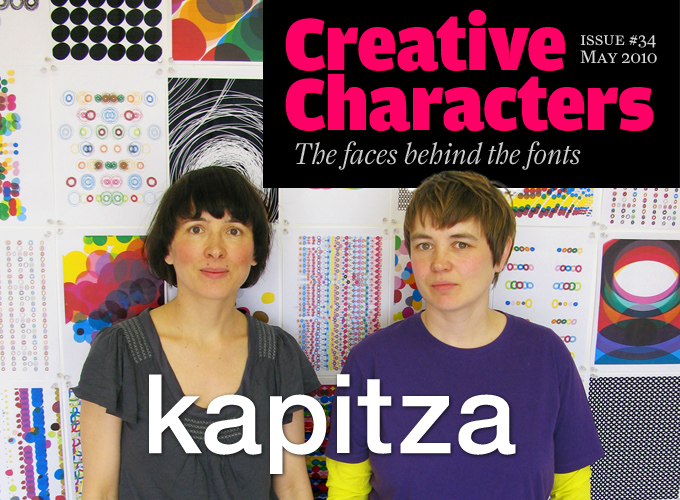
Based in London, the Kapitza sisters are originally from a village in southwest Germany. After working for pioneering companies in digital media, they set up their studio kapitza in London’s East End and discovered a niche crafting picture and pattern fonts. Working in the intersection between illustration, art and type design, they have become highly regarded in the UK and abroad. A stunning book showcasing the endless possibilities of Geometric, their suite of minimalist pattern fonts, has brought them even more recognition. Joining MyFonts a year ago has proved to be an excellent move for both parties. Meet Nicole (left, above) and Petra Kapitza, city dwellers and nature lovers.
You were born and raised in Oberndorf, Germany, and both ended up in London studying graphic design at Camberwell College of the Arts. How did that come about?
NICOLE: I originally studied to become an art teacher. But I wasn’t very comfortable with the curriculum, which was very broad and included things like perspective and pottery. So I dropped out and sat down for six months to work on a new portfolio. I was accepted at the State Academy of Fine Arts in Stuttgart to study illustration. One of my teachers was Heinz Edelmann [of Yellow Submarine fame]. I think he was influential in that he awakened my interest in minimalism — to distill an idea to its very core, instead of drawing pretty pictures with a lot of detail.
Meanwhile Petra had gone to Britain to study footwear design. When I came over to visit, I really liked it there and I arranged to study graphic design for one year as an exchange student at Camberwell College of the Arts.
PETRA: Although I really liked certain aspects of footwear design, I wasn’t comfortable with pursuing a career in the fashion world. So after finishing my course, I applied to Camberwell College and got accepted on a degree course in graphic design. I already had a year of work experience in an advertising agency where I had first worked with an Apple computer — which I loved. This was another reason why I preferred graphic design. Back then, no computers were used in footwear design, which felt a bit old-fashioned.
What were the main things you learnt at Camberwell College?
NICOLE: Our most influential teacher there was probably Dirk Van Dooren of the design group Tomato. Dirk encouraged us to concentrate on our personal interests and ideas, to make a project expressive and individual in style and not to follow fashions. There was a lot of freedom. Stuttgart, where I went back to graduate, was very different, very advertising-oriented. Your work had to look sleek.
After graduation you both found work in Berlin.
Yes, we absolutely wanted to live in Berlin; it felt like such an exciting place to be. So in 1996 I did the rounds of the Berlin agencies with my illustration portfolio. But as all the studios were really small — mostly just two people — it seemed impossible to find a job. Then we read an article about this brand new interactive design company called Pixelpark. They’d not had many trained designers applying — very few graphic designers were considering a career in digital media back then — and they hired us both. We designed interactive CD-ROMs for rock bands and began doing web design. We did projects for huge clients, including banks, with teams of maybe two or three people. It was great fun designing for the Web in those days, it was all so new! There were no rules established yet and as designers we were basically user interface designer, information architect and art director all rolled in one.
Our experience at Pixelpark opened a lot of doors when we moved back to London the next year — which is what we always wanted. Petra went first and worked at MTV, SYZYGY, Oven Digital and the BBC. She was a part of the original team at the launch of BBC News Online, which was very exciting.
What makes London so attractive to you?
To say it bluntly: you always get a kick up the bum! There’s an enormous cultural variety and it is continually changing. You can’t stand still, you keep moving because you have to. And it’s expensive to live here so you have to keep working.
Why did you decide to found your own company together?
We had been talking about setting up together for a while and had done some projects together, even before we started kapitza. We realised that we work very well together. When we finally felt that there was less and less creative freedom in the jobs we were doing we decided to give it a go and set up kapitza. Web design as we knew it from the early days had changed a lot. Information architecture and user experience design took over many of the tasks that graphic designers used to do in new media design. The designer’s job felt more and more like coloring — you were hired to “make things look nice.” You weren’t allowed to make important design choices any more.
geometric circle 02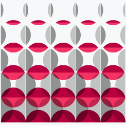
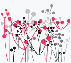
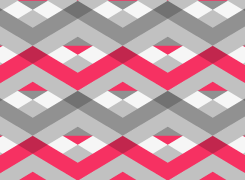
Geometric is a suite of fonts offering a wide variety of basic shapes — circles, triangles, stripes, corners, waves and many more — which can be combined and layered to create myriad patterns.
we love nature leaves
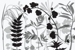
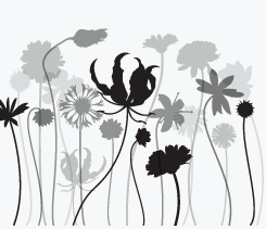
The life of plants is among the Kapitzas’ favorite subjects: They have lovingly digitized hundreds of silhouettes of leaves and flowers. Their most successful recent font is We Love Nature Leaves, a charming collection of foliage illustrations.
ice flowers
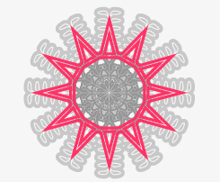
Although inspired by shapes found in nature, the Snow and Ice Flowers fonts are stylized and clean. Ice Flowers was derived from the earlier snowflake font Snow. It is a much bolder interpretation of the theme, with strong black and white contrasts.
manhattan

The Kapitzas began their series of silhouette “portraits of an area” at home, in London. Their trips have since taken them abroad as well. Hence the recent Paris and Manhattan fonts.
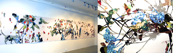
Cycle is a piece measuring 1.5 by 11.5 meters (approx. 5′ × 35′) printed on a single sheet of paper. It was the Kapitzas’ contribution to the exhibition Death Is Part Of The Process curated by artist David Mabb (Void Gallery, Derry, 2005).
Since starting up in 2003, the kapitza studio has done book and exhibition design, but gradually specialized in creating picture fonts using abstract shapes and silhouettes. How did that evolve?
Our work on outlined shapes started with a series of flower paintings. We’ve always taken photographs of flowers and plants, and for these paintings we converted a few of them into outlines by computer. These were transferred to canvases and painted in manually with a single color. They were one-off paintings we made for ourselves; we never intended to sell them or produce them as a series. It was a self-initiated project motivated by our interest in the beauty of organic shapes — those irregular, yet very powerful lines.
Then came the exhibition on William Morris in the Whitworth Gallery in Manchester. The curator, David Mabb, knew us from previous projects and asked us to design the catalogue. We were invited to illustrate it in our own style, using Morris’ work as a source for a contemporary interpretation. So we researched his textile designs and traced several flower patterns and other elements.
Your third and largest project based on the concept of organic silhouettes was for another art project curated by David Mabb — an exhibition titled Death Is Part Of The Process. You designed an 11.5-meter-long mural using images that referred to the exhibition’s theme of mortality.
That piece, “Cycle”, took its inspiration from the Vanitas or ‘Memento mori’ paintings from the Baroque period. These are still lives that meditate on death and transience, using symbols like skulls and empty glasses and withered flowers. We’ve always been fascinated by the complexity and the depth of those paintings. You can look at them forever and keep discovering new things. So that is what we set out to do: create our own modern-day ‘Memento mori’, combining images of people and animals and plants into a piece about life cycles. We used very personal imagery, which made it very powerful.
At first we tried simple colored silhouettes, but then realized that would be too flat and too bleak. The theme of the exhibition was so serious… We felt we needed something that had multiple levels and was more open to interpretation, letting viewers find meaning in it for themselves. And so we went back to the photographs we had used for making the outlines, many of which had been taken around where we live in the East End of London and in Germany. We put them into the artwork, so that the result was layered: you had images within images.
It was totally exciting to work on such a large scale. In fact we have been looking for an opportunity ever since to do another mural. The size of the installation meant that the artwork ‘surrounded’ the viewer and we got lots of positive feedback of people being very moved.
posy
Posy is a picture font halfway between the minimalism of the Geometric series and the botanical realism of We Love Nature. The shapes are unmistakably plant-like but lack the irregularities of real plants. Posy is a fantasy, the kind of plant you might find in dreamy animated cartoons or on a synthetic planet.
we love nature stems
Among the most elegant and fragile of the image collections is We Love Nature Stems. This series of sensitive “portraits” of stem flowers works beautifully in monochrome settings as well as layered in a variety of colors.
And so you realized the concept of silhouette images worked very well for you.
Yes. We had made lots and lots of outline drawings of people and plants from photographs taken in our neighbourhood. And the people silhouettes especially were really exciting: they were so incisive, you could really see the character of each person. So we wondered: what can we do with that?
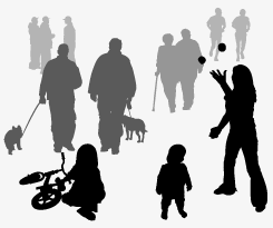
We had the idea of using those people silhouettes to make a portrait of individual areas. We work in the East End and the contrasts between one area and the next are enormous. A place like Brick Lane is just a ten minutes’ walk from where we are, but the street life is very different in character. So we started using those silhouettes to portray each area. The outline images make them anonymous as individuals, but all those people together create a certain atmosphere, don’t they?
You also made portraits of places like Paris and Manhattan...
We never went anywhere especially to make photos for our fonts. But anywhere we travel we take pictures. Our work is where our lives take us, really. All our work is inspired by our daily life — areas we pass through on our way to the studio, people we see when we travel, plants we admire on walks in the park and in the countryside back home. We always have a camera with us to record things that inspire us. These photographs form the basis of our fonts and illustrations.
How about the Cyberkids series?
The idea for that series kind of came from the profile pictures on Facebook and similar websites. The new generation of kids become familiar with things like chatrooms at a very early age and the of use digital media is so self-evident to them. We studied without using a computer, which seems weird today. People who are maybe ten years younger than us grew up in a totally different way. New stuff comes out at an incredible speed. So we are trying to portray that new “pixel generation”. Most of these pictures were not based on photographs, they are more stylized. Pure illustration.
brick lane

Based on photographs taken in the area of the same name, Brick Lane paints a poignant portrait of this bustling London neighbourhood.
victoria park
A world away but barely a ten minute walk from Brick Lane, Victoria Park is the source for this font, beautifully capturing its peaceful atmosphere.
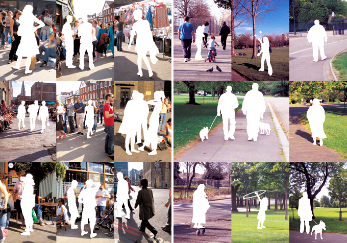
Different atmospheres: photographs taken in Brick Lane and Victoria Park as material for the silhouette fonts.
Then came the Geometric series: a huge collection of minimalist pattern fonts which you then used as the material for a stunning book.
Well, we are quite excited about font design software. It’s a very straightforward design tool, but it has endless possibilities that not many people seem to use. Possibilities for making patterns, for instance. We began playing around with the software, asking ourselves: what is the simplest thing you can do with it? For instance, if you put a circle there and move it around a bit within the Em-square [so that it appears in a different position in each glyph] you’re already creating a pattern. We are constantly exploring the possibilities of the software, trying to find unexpected ways to use it. It’s a bit like programming, on the simplest level. Make patterns simply by varying the leading and spacing, or by layering frames on top of each other.
Basically, all the work we do nowadays starts out with an idea for a font. First we do a font, and then we start getting ideas to create projects with them. What we like about it is that it is a set of shapes, contained it itself, like a box of tools, and you can give it a name.
So Geometric started with this simple idea about playing with very basic geometric shapes. We were very surprised as more and more things kept coming out. The idea just ran away with us.
Did you realize that some of your patterns would look like a parody of the disco style of the seventies?
We weren’t really concerned to show any particular style. Our ambition was to show that you could design an endless amount of patterns with the Geometric pattern font collection which vary greatly in style. This is also what the artists of the op-art movement have experimented with. Especially Bridget Riley, who is a great inspiration to us.
You share a passion for minimalist design and art. What is so fascinating about it, and (besides Bridget Riley) which artists and designers have inspired you most?
We like that clarity of form and color of minimalist designs. Uncluttered designs tend to be visually stronger and more powerful. We find inspiration in the work of John Maeda, Josef Müller Brockman, Wim Crouwel and Otl Aicher amongst others.
We aim to make our illustrations as beautiful as the flowers and plants they were inspired by. We still feel that even our decorative flower illustrations are minimal and clear and that there isn’t a contradiction with our love for minimalist design.
geometric drop & circle 04

Each of the Geometric fonts consists of variations on a basic shape, which can be used as normal letters in a font. To “draw” the wings of the butterfly we typed “C–R–g–u” in Geometric Drop 01, then made a layer of grey outlines by typing “A–T–a–t” and a layer of dots using Geometric Circle 04. We added some extra kerning and leading to create space between the shapes.
geometric stripe 01
The Geometric fonts offer endless possibilities for creating both regular and irregular patterns – see the spreads from the Geometric book, below.
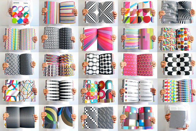
Double page spreads from the Geometric book (Verlag Hermann Schmidt Mainz, 2009).
MyFonts sells just one ‘alphabetic’ typeface you designed — a font called Lunar Orbiter. Did you ever consider becoming a designer of ‘regular’ type?
We love typography and type and are planning to design some experimental alphanumeric headline fonts in the future (see also the Moonscape font at T26, designed by Nicole in 1995).
What are the most interesting projects you are working on right now?
We are currently working on a rather large wall calendar project for the publisher that also published the Geometric book. It’s 140cm by 50cm portrait format and features twelve kapitza illustrations. It’s printed on normal paper as well as wrapping paper, which can be torn off and used as gift wrap.
We are also working on a new book for which — although it is a follow-up to Geometric — we will be using organic patterns alongside geometric ones.
And of course, we will release more fonts. The We Love Nature series will keep growing!
Finally: it took MyFonts a while to convince you to work with us. How do you view your decision now?
It has been great working with MyFonts. Our work has been opened up to a much more wide-ranging audience and we have been getting lots of positive feedback.
we love nature blooms
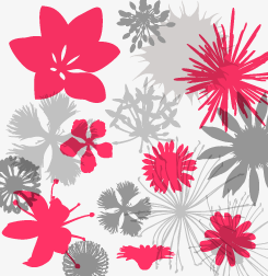
Blooms is the latest addition to the We Love Nature Series: simply flowers. And the best news: there’s more to come.

Who would you interview?
Creative Characters is the MyFonts newsletter dedicated to people behind the fonts. Each month, we interview a notable personality from the type world. And we would like you, the reader, to have your say.
Which creative character would you interview if you had the chance? And what would you ask them? Let us know, and your choice may end up in a future edition of this newsletter! Just send an email with your ideas to [email protected].
In the past, we’ve interviewed the likes of David Berlow, Ronna Penner, Rian Hughes, Alejandro Paul, Tomi Haaparanta, Veronika Burian and Jos Buivenga. If you’re curious to know which other type designers we’ve already interviewed as part of past Creative Characters newsletters, have a look at the archive.
Colophon
This interview was conducted & edited by Jan Middendorp, and designed using a template by Nick Sherman.
The Creative Characters nameplate is set in Amplitude and Farnham; the intro image and pull-quotes feature Helvetica Neue (the studio’s corporate typeface); and the large question mark is in Farnham.
Comments?
We’d love to hear from you! Please send any questions or comments about this newsletter to [email protected]
Subscription info
Want to get future issues of Creative Characters sent to your inbox? Subscribe at www.myfonts.com/MailingList
Newsletter archives
Know someone who would be interested in this? Want to see past issues? All MyFonts newsletters (including this one) are available to view online here.